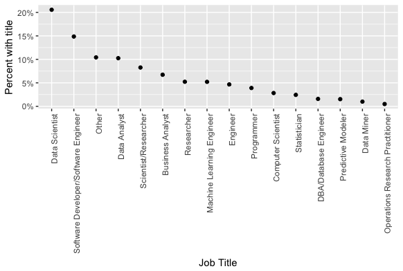
ggplot2 활용 팁
Tidyverse로 배우는 범주형 데이터

Emily Robinson
Instructor
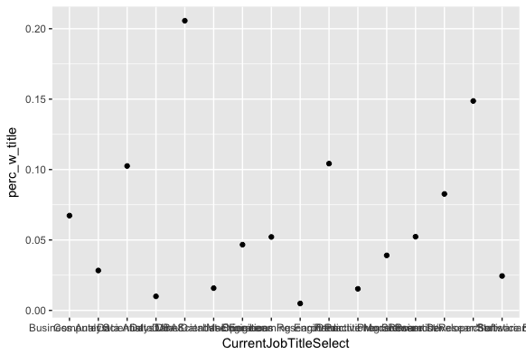
초기 플롯
ggplot(job_titles_by_perc,
        aes(x = CurrentJobTitleSelect,, y = perc_w_title)) +
    geom_point()
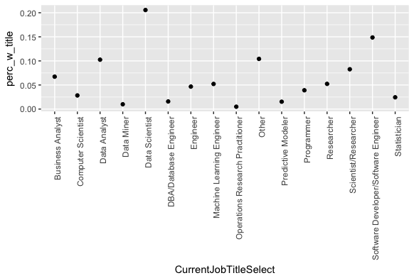
눈금 레이블 각도 변경하기
ggplot(job_titles_by_perc,
        aes(x = CurrentJobTitleSelect, y = perc_w_title)) +
    geom_point() +
    theme(axis.text.x = element_text(angle = 90, hjust = 1))
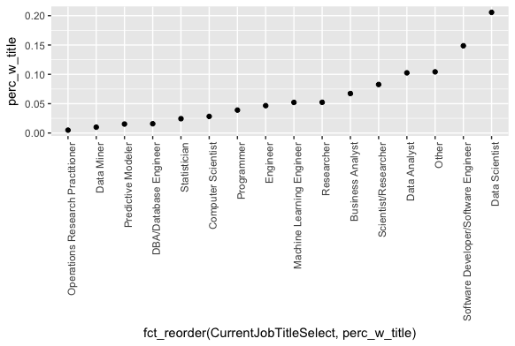
fct_reorder() 사용하기
ggplot(job_titles_by_perc,
   aes(x = fct_reorder(CurrentJobTitleSelect, perc_w_title),
       y = perc_w_title)) +
    geom_point() +
    theme(axis.text.x = element_text(angle = 90, hjust = 1))
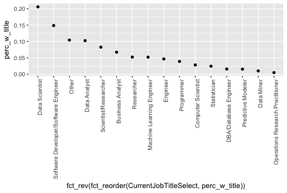
fct_rev() 추가하기
ggplot(job_titles_by_perc,
        aes(x = fct_rev(fct_reorder(CurrentJobTitleSelect,
        perc_w_title)), y = perc_w_title)) +
    geom_point() +
    theme(axis.text.x = element_text(angle = 90, hjust = 1))
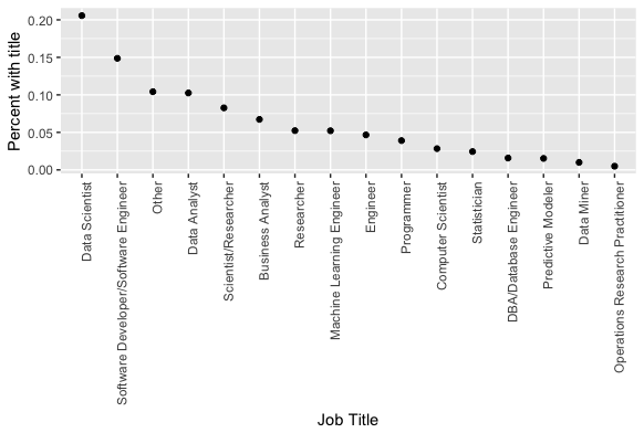
labs() 사용하기
ggplot(job_titles_by_perc,
        aes(x = fct_rev(fct_reorder(CurrentJobTitleSelect, perc_w_title)),
            y = perc_w_title)) +
    geom_point() +
    theme(axis.text.x = element_text(angle = 90, hjust = 1)) +
    labs(x = "Job Title", y = "Percent with title")
% 스케일로 변경하기
ggplot(job_titles_by_perc,
       aes(x=fct_rev(fct_reorder(CurrentJobTitleSelect,perc_w_title)),
           y=perc_w_title)) +
    geom_point() +
    theme(axis.text.x = element_text(angle = 90, hjust = 1)) +
    labs(x = "Job Title", y = "Percent with title") +
    scale_y_continuous(labels = scales::percent_format())