R에서 tidymodels로 모델링하기
David Svancer
Data Scientist
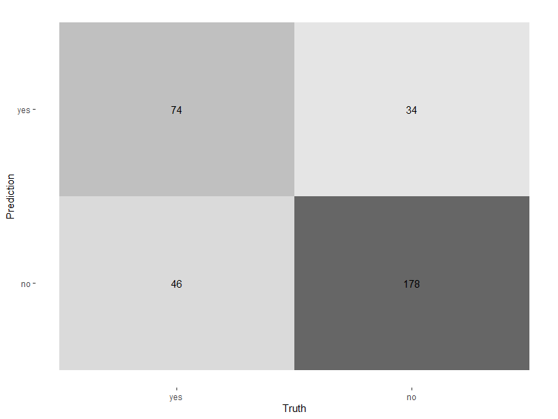
autoplot()으로 히트맵
autoplot()에 전달type은 'heatmap'으로 설정
conf_mat(leads_results, truth = purchased, estimate = .pred_class) %>%autoplot(type = 'heatmap')

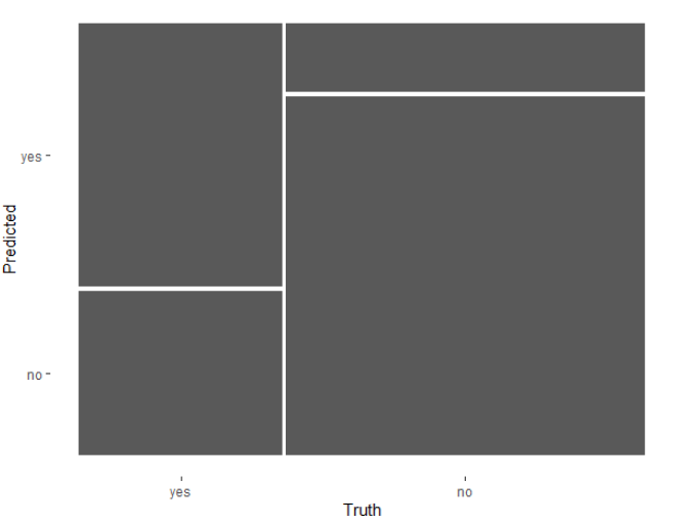
autoplot()으로 모자이크
type을 'mosaic'으로 설정
conf_mat(leads_results,
truth = purchased,
estimate = .pred_class) %>%
autoplot(type = 'mosaic')

autoplot()으로 모자이크
type을 'mosaic'으로 설정conf_mat(leads_results,
truth = purchased,
estimate = .pred_class) %>%
autoplot(type = 'mosaic')

이진 분류의 기본 임계값은 0.5
leads_results
.pred_yes가 0.5 이상이면 tidymodels의 predict()가 .pred_class를 'yes'로 설정leads_results
# A tibble: 332 x 4
purchased .pred_class .pred_yes .pred_no
<fct> <fct> <dbl> <dbl>
1 no no 0.134 0.866
2 yes yes 0.729 0.271
3 no no 0.133 0.867
4 no no 0.0916 0.908
5 yes yes 0.598 0.402
6 no no 0.128 0.872
7 yes no 0.112 0.888
8 no no 0.169 0.831
9 no no 0.158 0.842
10 yes yes 0.520 0.480
# ... with 322 more rows
임계값 범위에서 분류 모델은 어떻게 성능이 달라지나?
.pred_yes 열에 있는 고유 임계값들
| threshold | specificity | sensitivity |
|---|---|---|
| 0 | 0 | 1 |
| 0.11 | 0.01 | 0.98 |
| 0.15 | 0.05 | 0.97 |
| ... | ... | ... |
| 0.84 | 0.89 | 0.08 |
| 0.87 | 0.94 | 0.02 |
| 0.91 | 0.99 | 0 |
| 1 | 1 | 0 |
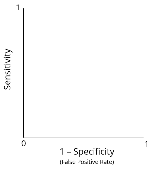
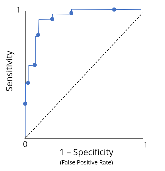
ROC(수신자 조작 특성) 곡선
ROC(수신자 조작 특성) 곡선

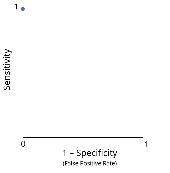
최적 성능은 점 (0, 1)
최적 성능은 점 (0, 1)
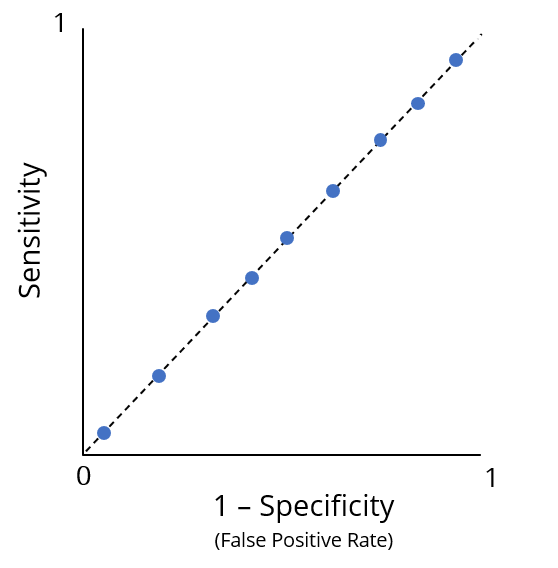
부진한 성능

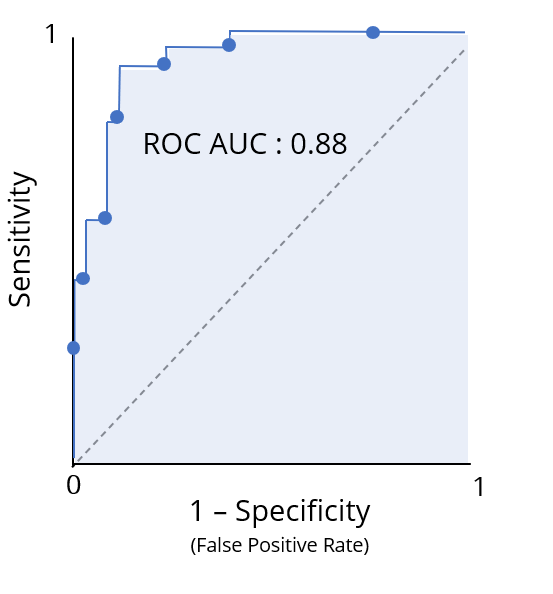
ROC 곡선 아래 면적(ROC AUC)은 분류 모델의 ROC 정보를 하나의 수치로 요약
성능을 학점처럼 해석 가능

roc_curve() 함수
truth 열leads_results의 .pred_yes
.pred_yes의 모든 고유 임계값에 대한 특이도와 민감도를 담은 tibble 반환leads_results %>%
roc_curve(truth = purchased, .pred_yes)
# A tibble: 331 x 3
.threshold specificity sensitivity
<dbl> <dbl> <dbl>
1 -Inf 0 1
2 0.0871 0 1
3 0.0888 0.00472 1
4 0.0893 0.00943 1
5 0.0896 0.0142 1
6 0.0902 0.0142 0.992
7 0.0916 0.0142 0.983
8 0.0944 0.0189 0.983
# ... with 323 more rows
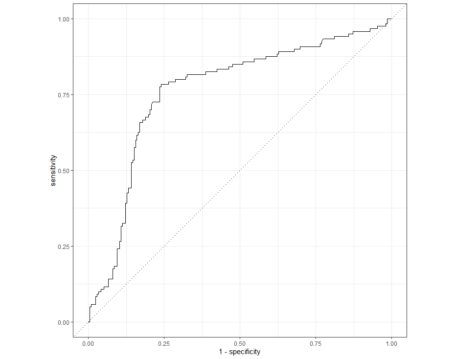
roc_curve() 결과를 autoplot()에 전달하면 ROC 곡선을 그림
leads_results %>%
roc_curve(truth = purchased, .pred_yes) %>%
autoplot()

yardstick의 roc_auc() 함수로 ROC AUC 계산
truth 열roc_auc(leads_results,
truth = purchased,
.pred_yes)
# A tibble: 1 x 3
.metric .estimator .estimate
<chr> <chr> <dbl>
1 roc_auc binary 0.763
R에서 tidymodels로 모델링하기