색상을 신중하게 사용하기
R로 배우는 plotly 인터랙티브 데이터 시각화

Adam Loy
Statistician, Carleton College
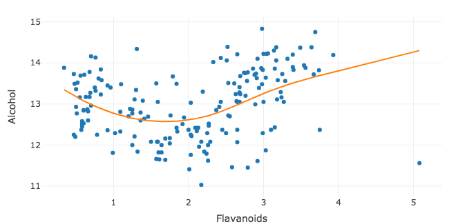
세 번째 변수 추가
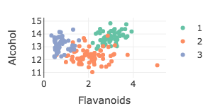
wine %>%
  plot_ly(x = ~Flavanoids, y = ~Alcohol, color = ~Type) %>%
  add_markers()
정량 변수 추가
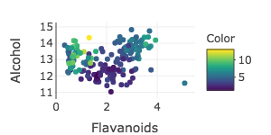
wine %>%
  plot_ly(x = ~Flavanoids, y = ~Alcohol, color = ~Color) %>%
  add_markers()
RColorBrewer 팔레트
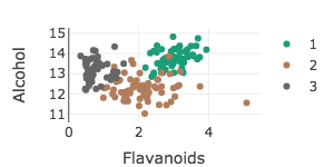
wine %>%
  plot_ly(x = ~Flavanoids, y = ~Alcohol, color = ~Type) %>%
  add_markers(colors = "Dark2")
수동 팔레트
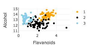
wine %>%
  plot_ly(x = ~Flavanoids, y = ~Alcohol, color = ~Type) %>%
add_markers(colors = c("orange", "black", "skyblue"))

