비율 시각화로 비교하기
Python으로 재무제표 분석하기

Rohan Chatterjee
Risk Modeler
두 회사의 비율 그리기
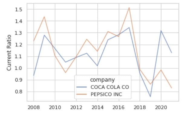
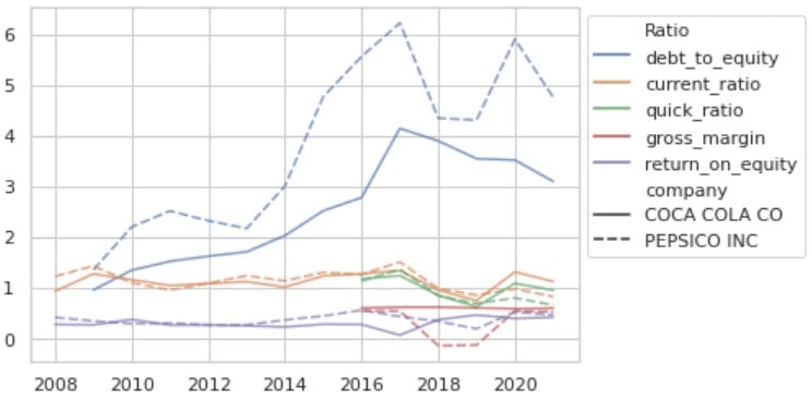
sns.lineplot() 사용 시 과밀 문제
이 그래프는 작은 공간에 정보가 너무 많아 혼잡합니다
sns.relplot() 소개
첫 단계: 세로형(long) 데이터가 되도록 DataFrame을 melt합니다.
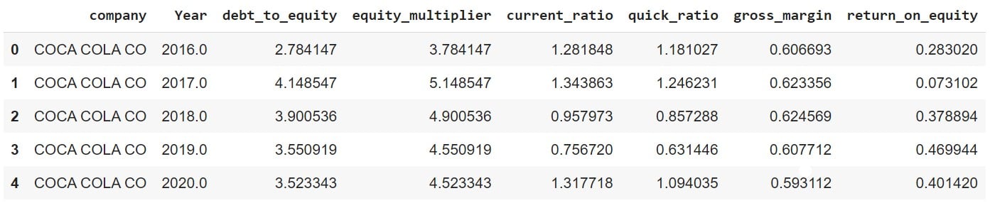
"melt 전" DataFrame:
plot_df.head()
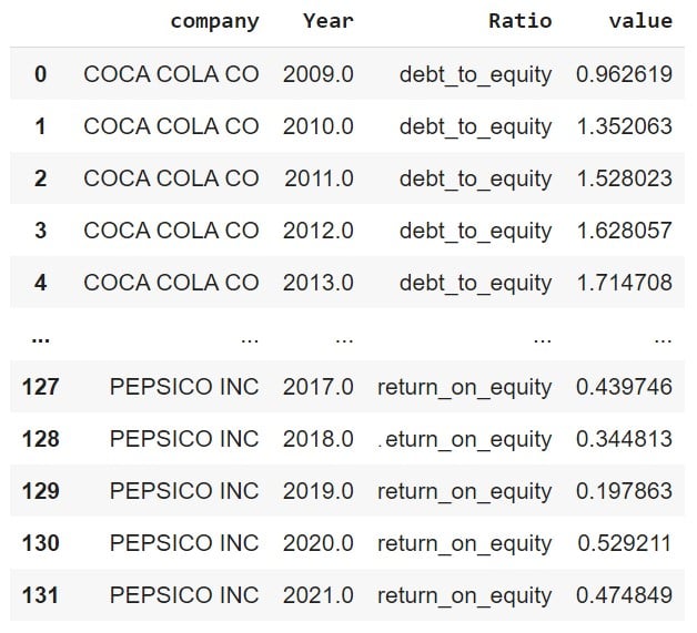
이제 DataFrame을 melt합니다
plot_df_melt = plot_df.melt(id_vars = ['company','Year'], var_name = "Ratio")
sns.relplot()으로 비율 그리기
ax = sns.relplot(data=df_melt, x="Year",
                 y="value", hue="Ratio",
                 alpha=0.7,
                 col='company',
                 kind='line')
ax.set_ylabels('')
ax.set_xlabels('')
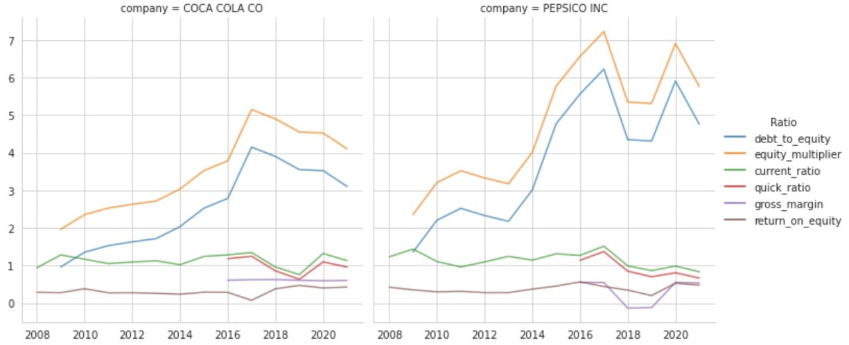
그래프 자세히 보기

