애니메이션 소개

R로 배우는 plotly 중급 인터랙티브 데이터 시각화

Adam Loy

Statistician, Carleton College
CO2 배출과 소득

질문: 이산화탄소 배출과 소득의 관계는 시간이 지나며 달라졌습니까?

world_indicators
# A tibble: 11,387 x 11
  country  year income     co2 military population  urban life_expectancy four_regions
  <chr>   <dbl>  <dbl>   <dbl>    <dbl>      <dbl>  <dbl>           <dbl> <chr>       
1 Afghan…  1960   1210  0.0461       NA    9000000 7.56e5            38.6 asia        
2 Albania  1960   2790  1.24         NA    1640000 4.94e5            62.7 europe      
3 Algeria  1960   6520  0.554        NA   11100000 3.39e6            52   africa      
4 Andorra  1960  15200 NA            NA      13400 7.84e3            NA   europe      
5 Angola   1960   3860  0.0975       NA    5640000 5.89e5            42.4 africa      
# … with 1.138e+04 more rows, and 2 more variables: eight_regions <chr>, six_regions <chr>
R로 배우는 plotly 중급 인터랙티브 데이터 시각화

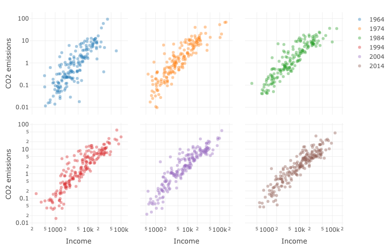
여섯 해의 1인당 GDP 대비 CO2 배출 산점도.

R로 배우는 plotly 중급 인터랙티브 데이터 시각화

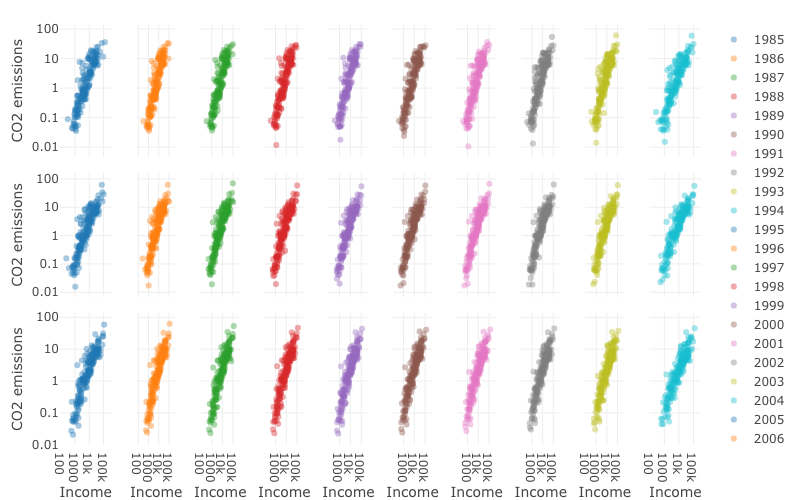
1989–2014년 1인당 GDP 대비 CO2 배출 산점도.

R로 배우는 plotly 중급 인터랙티브 데이터 시각화

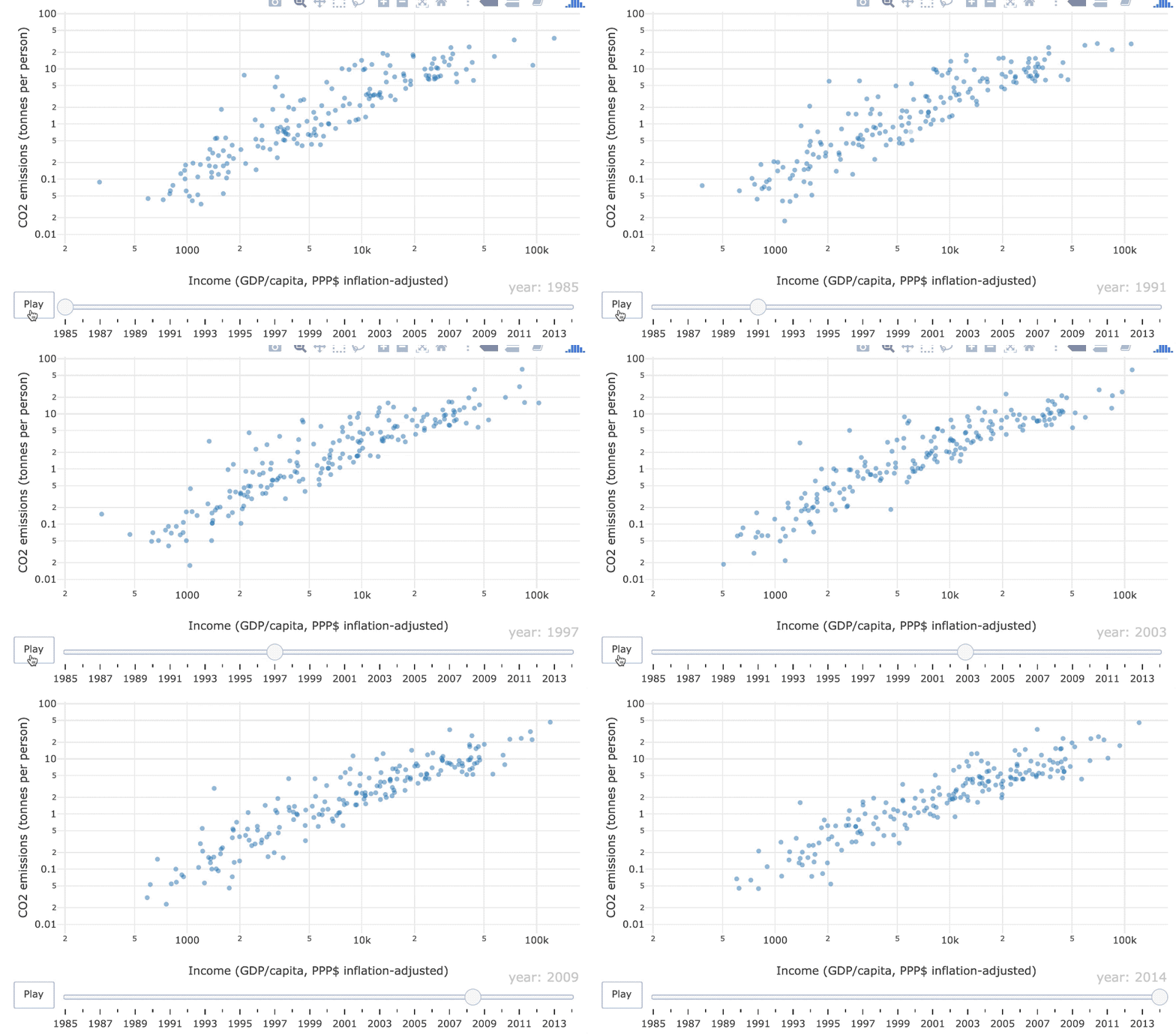
1985–2014년 1인당 GDP 대비 CO2 배출 애니메이션 산점도

R로 배우는 plotly 중급 인터랙티브 데이터 시각화

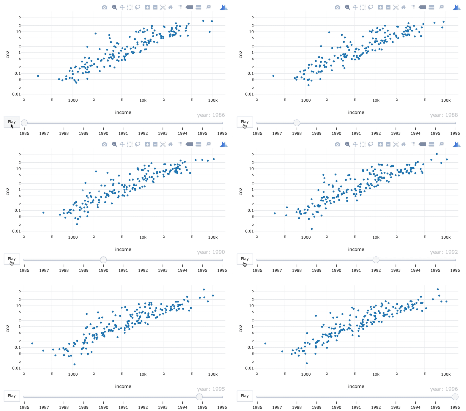
키프레임 애니메이션

프레임 = 특정 시점의 그림

산점도 필름스트립.

R로 배우는 plotly 중급 인터랙티브 데이터 시각화

frame 미학

world_indicators %>%
  plot_ly(x = ~income, y = ~co2) %>%
  add_markers(frame = ~year, showlegend = FALSE) %>%
  layout(xaxis = list(type = "log"), yaxis = list(type = "log"))
R로 배우는 plotly 중급 인터랙티브 데이터 시각화

객체 일관성

하나의 그래픽 요소(예: 글리프)는 특정 데이터 포인트(예: 벨기에)를 나타내야 합니다.
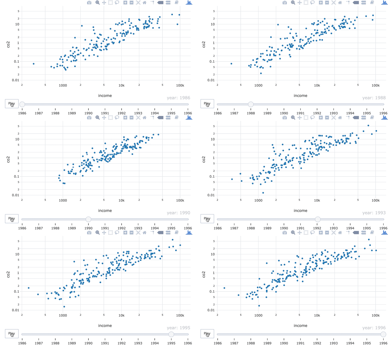
1990년대에 점들의 순서가 바뀌는 GIF.

R로 배우는 plotly 중급 인터랙티브 데이터 시각화

ids 미학

world_indicators %>%
  plot_ly(x = ~income, y = ~co2) %>%
  add_markers(frame = ~year, ids = ~country, showlegend = FALSE) %>%
  layout(xaxis = list(type = "log"), yaxis = list(type = "log"))
21-object-constancy-fixed.gif

R로 배우는 plotly 중급 인터랙티브 데이터 시각화

연습해 봅시다!

R로 배우는 plotly 중급 인터랙티브 데이터 시각화

Preparing Video For Download...