색상, 기호, 크기 활용

R로 배우는 plotly 중급 인터랙티브 데이터 시각화

Adam Loy

Statistician, Carleton College
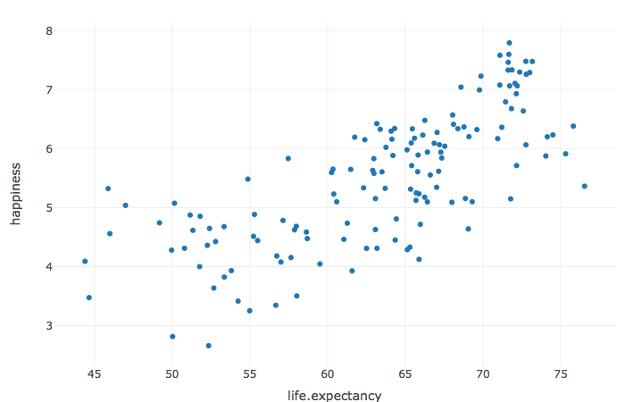
기대 수명과 국가 행복도 산점도.

R로 배우는 plotly 중급 인터랙티브 데이터 시각화

세계 행복 데이터

dplyr::glimpse(happy)
Rows: 141
Columns: 11
$ country         <chr> "Afghanistan", "Albania", "Algeria", ...
$ happiness       <dbl> 2.661718, 4.639548, 5.248912, 6.039330, ...
$ region          <chr> "South Asia", "Central and Eastern Europe", ...
$ population      <dbl> 35530081, 2873457, 41318142, 44271041, ...
$ log.gdp         <dbl> 7.460144, 9.373718, 9.540244, 9.843519, ...
$ income          <fct> low, upper-middle, upper-middle, high, ...
$ life.expectancy <dbl> 52.33953, 69.05166, 65.69919, 67.53870, ...
$ social.support  <dbl> 0.4908801, 0.6376983, 0.8067539, 0.9066991, ...
$ freedom         <dbl> 0.4270109, 0.7496110, 0.4366705, 0.8319662, ...
$ generosity      <dbl> -0.106340349, -0.035140377, -0.194670126, -0.18629...
$ corruption      <dbl> 0.9543926, 0.8761346, 0.6997742, 0.8410525, ...
R로 배우는 plotly 중급 인터랙티브 데이터 시각화

글리프 색상

happy %>%
  plot_ly(x = ~life.expectancy, y = ~happiness) %>%
  add_markers(color = ~income)
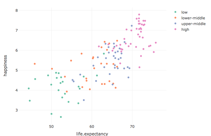
소득 범주별로 색상을 구분한 기대 수명과 국가 행복도 산점도.

R로 배우는 plotly 중급 인터랙티브 데이터 시각화

글리프 기호

happy %>%
  plot_ly(x = ~life.expectancy, y = ~happiness) %>%
  add_markers(symbol = ~income)
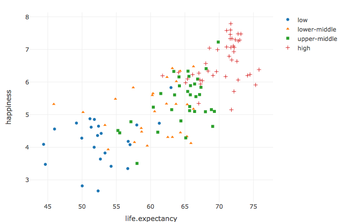
색상과 모양 모두 국가 소득 범주를 나타내는 기대 수명과 국가 행복도 산점도.

R로 배우는 plotly 중급 인터랙티브 데이터 시각화

연속형 변수 기반 색상

happy %>%
  plot_ly(x = ~life.expectancy, y = ~happiness) %>%
  add_markers(color = ~population)
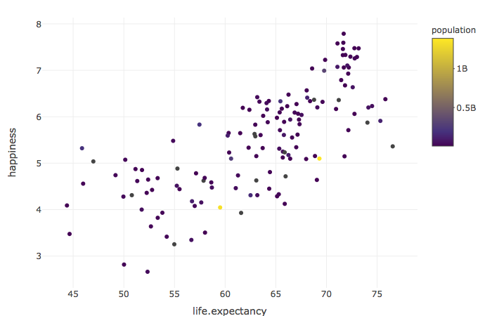
인구수로 색상을 구분한 기대 수명과 국가 행복도 산점도.

R로 배우는 plotly 중급 인터랙티브 데이터 시각화

변환

happy %>%
  plot_ly(x = ~life.expectancy, y = ~happiness) %>%
  add_markers(color = ~log10(population))
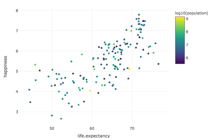
인구수의 로그값으로 색상을 구분한 기대 수명과 국가 행복도 산점도.

R로 배우는 plotly 중급 인터랙티브 데이터 시각화

글리프 크기

happy %>%
  plot_ly(x = ~life.expectancy, y = ~happiness) %>%
  add_markers(size = ~population)
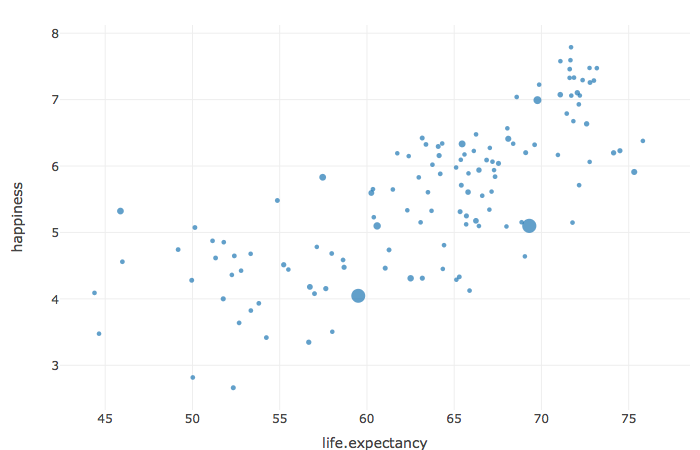
글리프 크기가 인구수를 나타내는 기대 수명과 국가 행복도 산점도.

R로 배우는 plotly 중급 인터랙티브 데이터 시각화

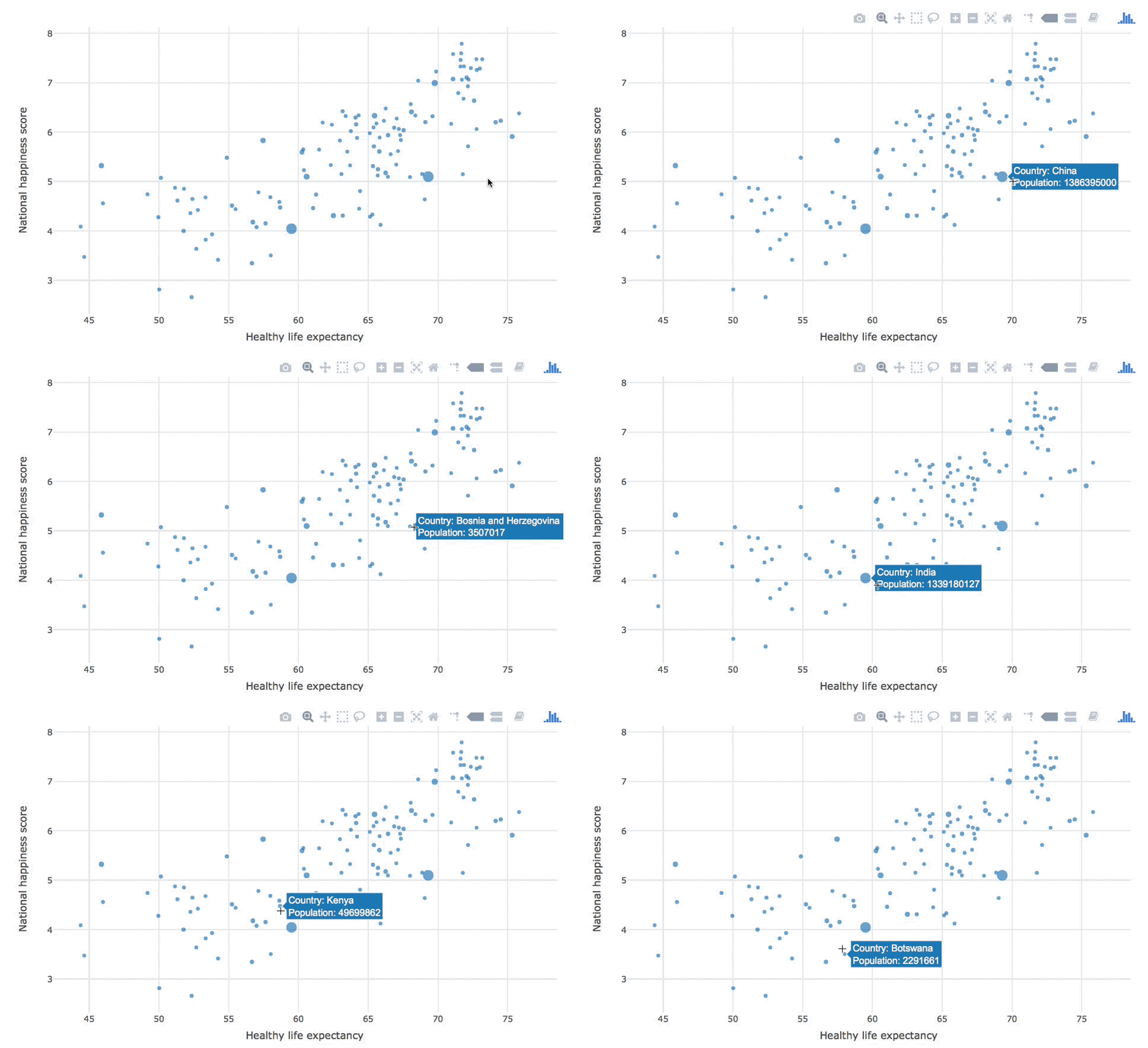
레이블 다듬기

happy %>%
  plot_ly(
    x = ~life.expectancy, y = ~happiness,
    hoverinfo = "text",
    text = ~paste("Country: ", country,
                  "</br> Population: ", population)
  ) %>%
  add_markers(size = ~population) %>%
  layout(
    xaxis = list(title = "Healthy life expectancy"),
    yaxis = list(title = "National happiness score")
  )
R로 배우는 plotly 중급 인터랙티브 데이터 시각화

호버 상호작용 GIF.

R로 배우는 plotly 중급 인터랙티브 데이터 시각화

연습해 봅시다!

R로 배우는 plotly 중급 인터랙티브 데이터 시각화

Preparing Video For Download...