R에서 Trelliscope로 빅데이터 시각화하기
Ryan Hafen
Author, TrelliscopeJS
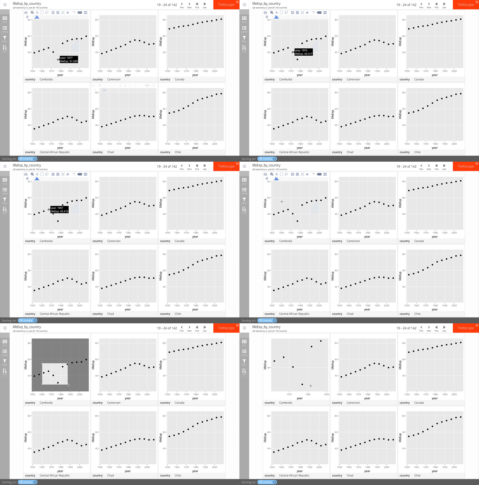
facet_trelliscope()에 as_plotly = TRUE를 추가하면 됩니다.
예시:
gap_life <- select(gapminder, year, lifeExp, country, continent)
ggplot(gap_life, aes(year, lifeExp)) +
geom_point() +
facet_trelliscope(~ country + continent,
name = "lifeExp_by_country",
desc = "Life expectancy vs. year for 142 countries.",
nrow = 2, ncol = 3,
as_plotly = TRUE)

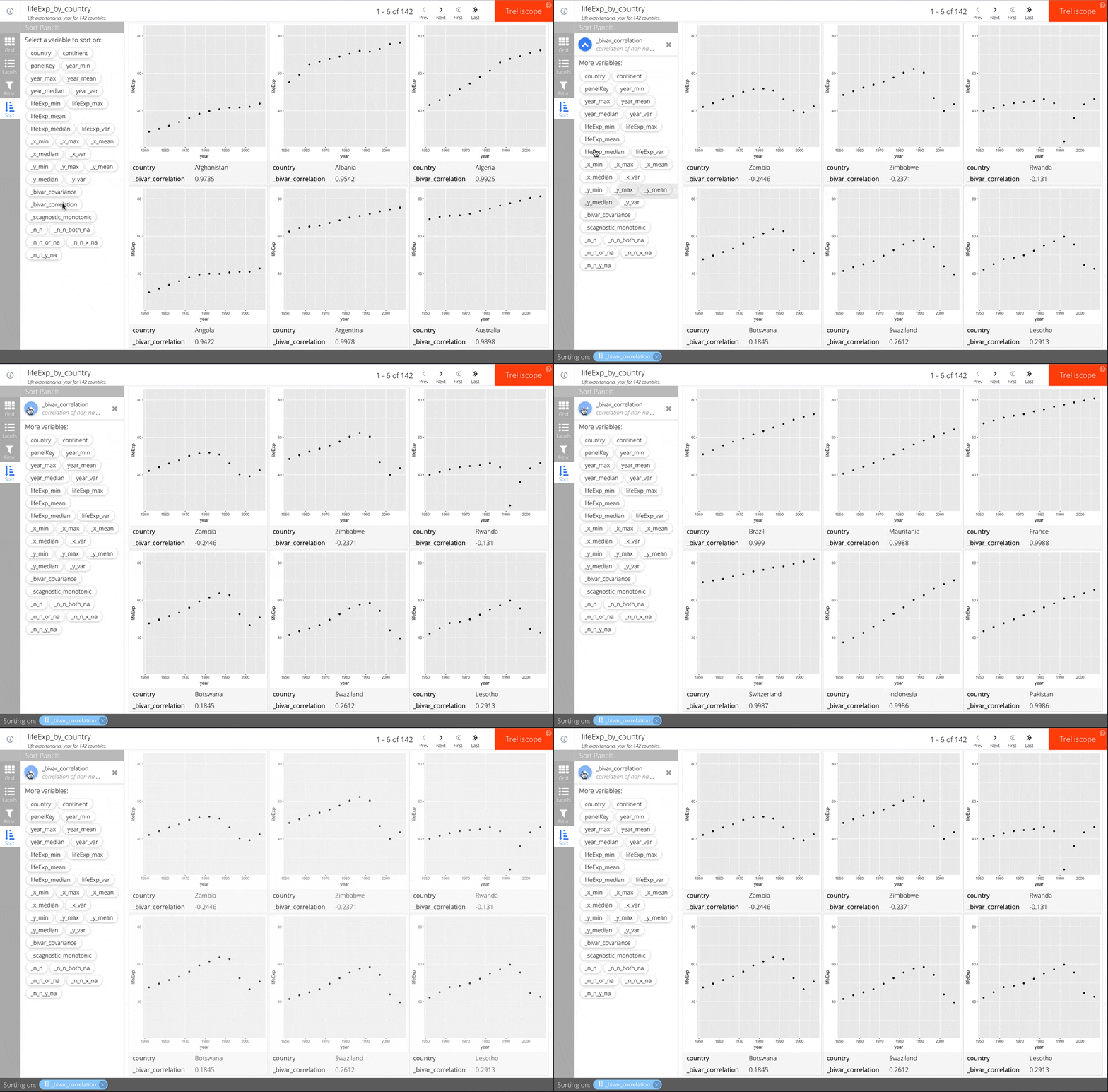
facet_trelliscope()에 auto_cog = TRUE를 추가하면 됩니다.
예시:
ggplot(gap_life, aes(year, lifeExp)) +
geom_point() +
facet_trelliscope(~ country + continent,
name = "lifeExp_by_country",
desc = "Life expectancy vs. year for 142 countries.",
nrow = 2, ncol = 3,
auto_cog = TRUE)
사용 가능한 자동 코그노스틱에 대한 자세한 내용은 autocogs::autocog 도움말을 참조하십시오.

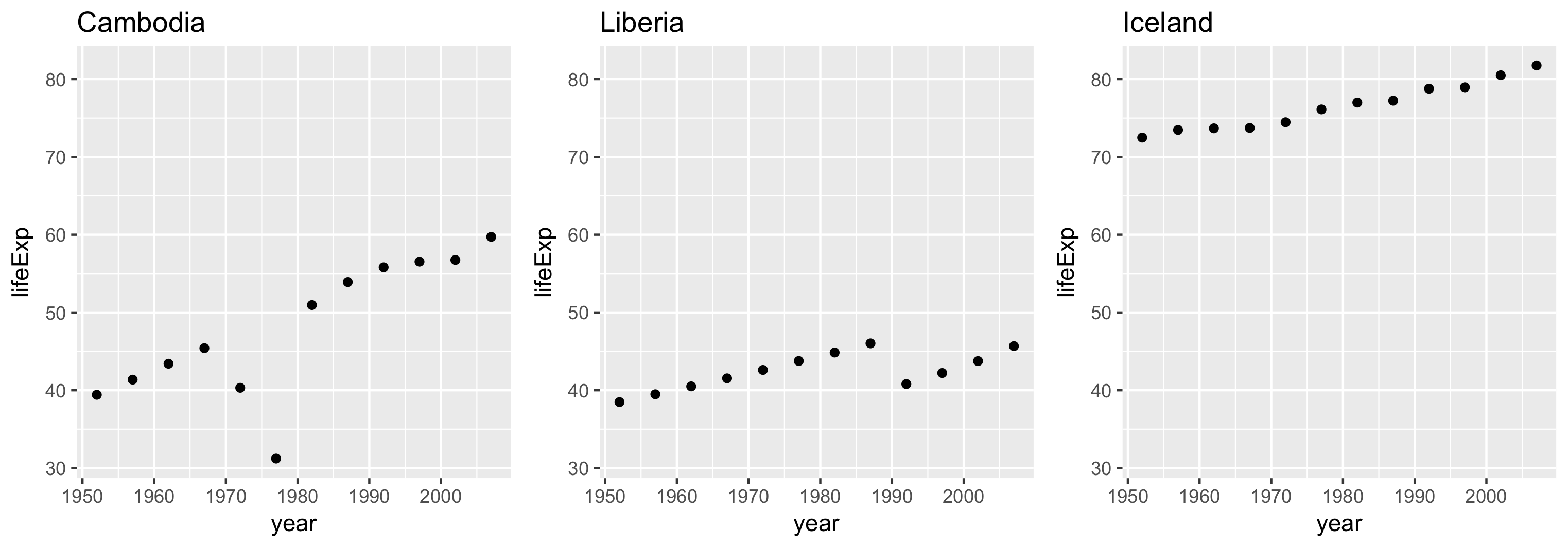
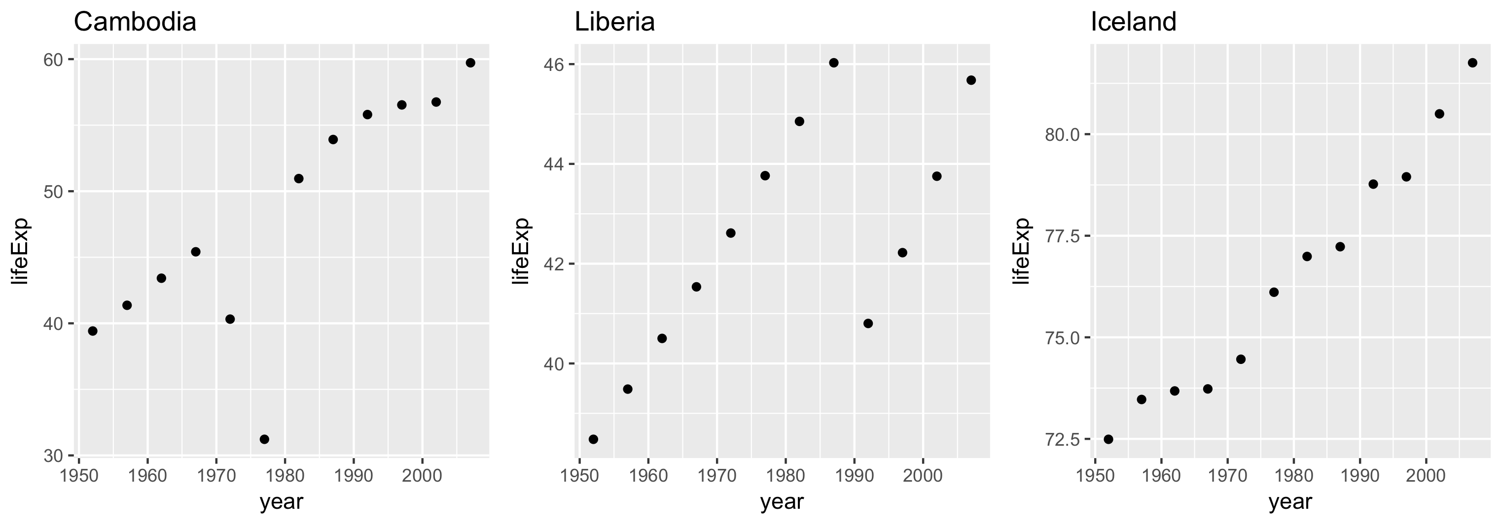
축 한계 범위는 scales 인수로 조정할 수 있습니다.
세 가지 옵션:
"same" (기본값)"sliced""free"각 패널의 한계값이 동일합니다.
패널 간 동등한 비교가 가능합니다.

각 패널의 한계값 범위는 동일하지만 시작점은 다를 수 있습니다.
척도 차이 비교에 유용합니다.
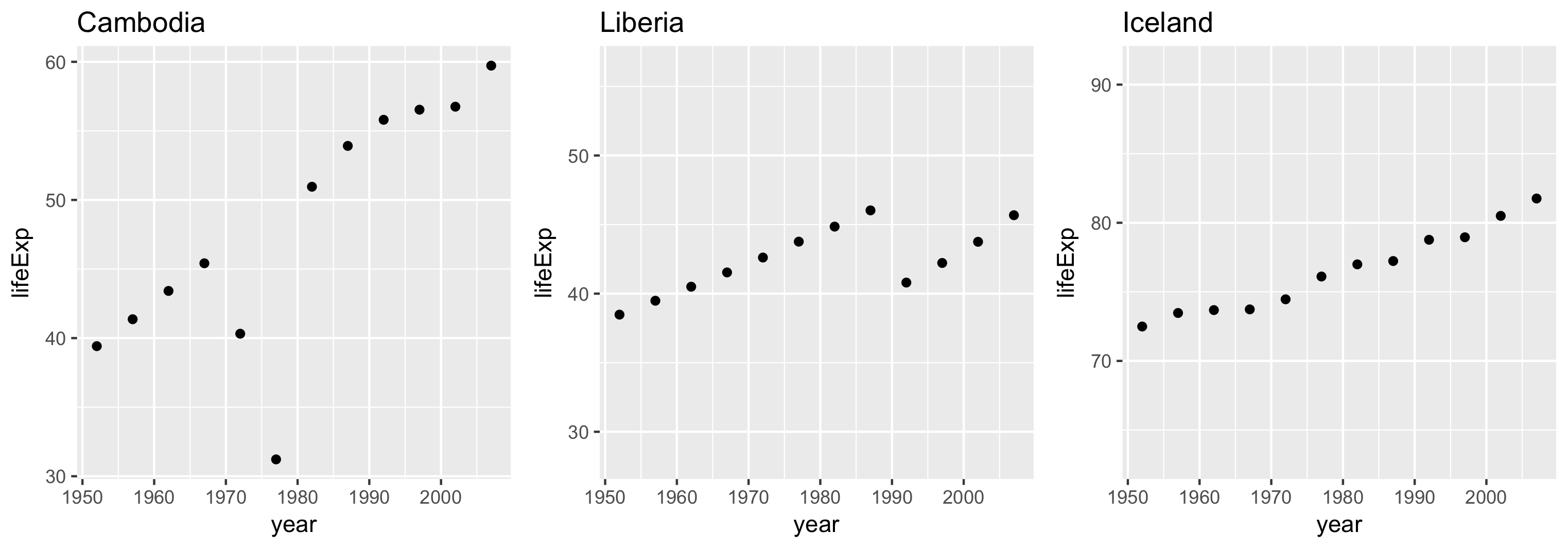
각 패널의 한계값은 해당 패널 데이터의 범위를 기준으로 합니다.

R에서 Trelliscope로 빅데이터 시각화하기