축 사용자 지정

Bokeh로 배우는 인터랙티브 데이터 시각화

George Boorman

Core Curriculum Manager, DataCamp

선형 플롯

source = ColumnDataSource(data=apple)
fig = figure(x_axis_label="Date", y_axis_label="Market Cap ($)")
fig.line(x="date", y="market_cap", source=source)

output_file(filename="unformatted_plot.html") show(fig)
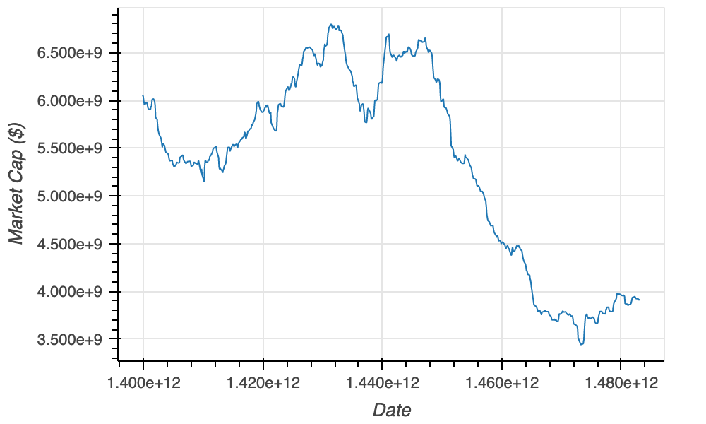
apple_unformatted

Bokeh로 배우는 인터랙티브 데이터 시각화

X축 유형

source = ColumnDataSource(data=apple)
fig = figure(x_axis_label="Date", y_axis_label="Market Cap ($)",

x_axis_type="datetime")
fig.line(x="date", y="market_cap", source=source) output_file(filename="unformatted_plot.html") show(fig)
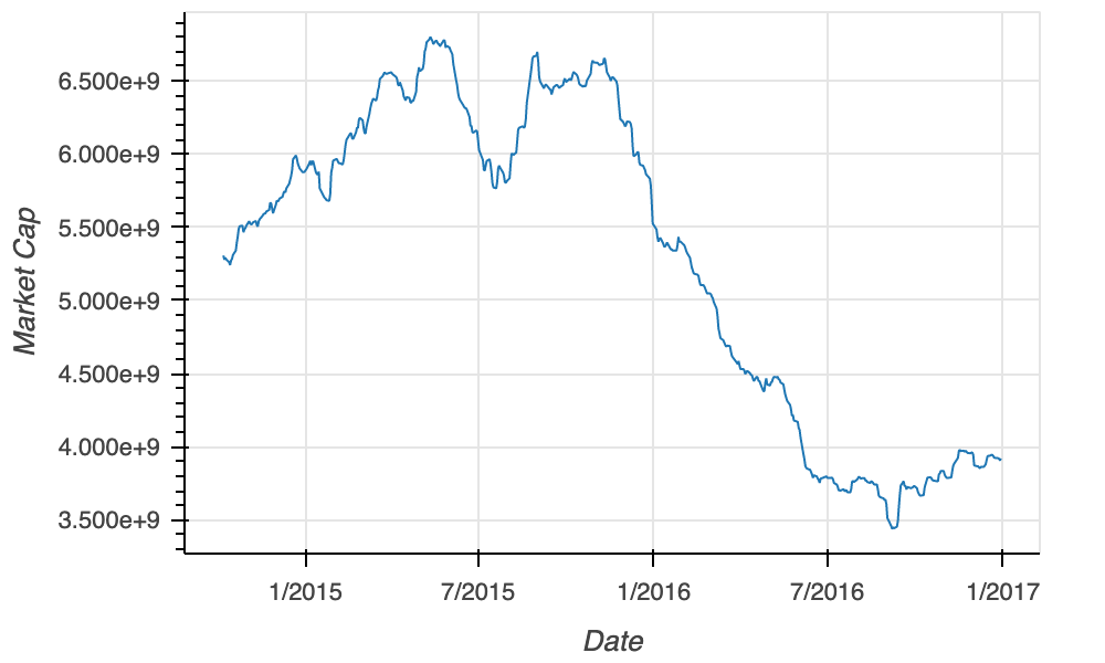
x_axis_type_plot

Bokeh로 배우는 인터랙티브 데이터 시각화

서식 옵션

  • NumeralTickFormatter
  • 인자: format
Value format Output
1500.00 "$0.00" $1500.00
2000.00 "$0" $2000
5000.00 "$0,0" $5,000
1100000 "$0.0a" $1.1m
5000000000 "$0a $5b
  • DatetimeTickFormatter
  • 인자: months
Value months Output
"2018-03-01" "%B %Y" "March 2018"
"2019-10-15" "%b %Y" "Oct 2019"
"2020-02-09" "%b %y" "Feb 20"
  • 기타 인자:
    • microseconds, milliseconds, seconds, minisec, minutes, hourmin, hours, days, years
Bokeh로 배우는 인터랙티브 데이터 시각화

NumeralTickFormatter

from bokeh.models import NumeralTickFormatter

fig = figure(x_axis_label="Date", y_axis_label="Price ($)") fig.line(x="date", y="market_cap", source=source)
fig.yaxis[0].formatter = NumeralTickFormatter(format="$0.0a")
output_file(filename="formatted_y_axis.html") show(fig)
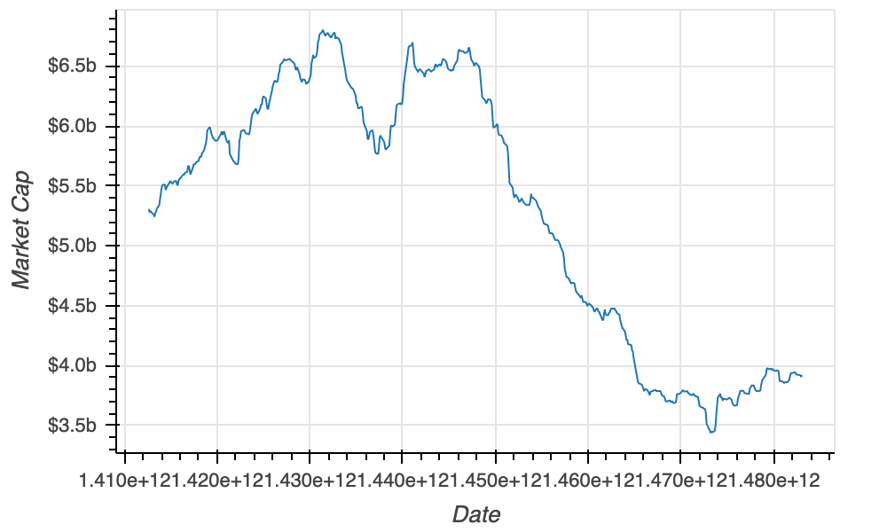
apple_formatted_y_axis

Bokeh로 배우는 인터랙티브 데이터 시각화

DatetimeTickFormatter

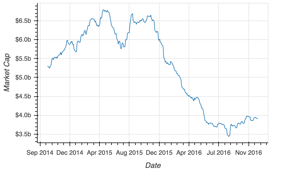
from bokeh.models import NumeralTickFormatter, DatetimeTickFormatter

fig = figure(x_axis_label="Date", y_axis_label="Price ($)") fig.line(x="date", y="price", source=source) fig.yaxis[0].formatter = NumeralTickFormatter(format="$0.0a")
fig.xaxis[0].formatter = DatetimeTickFormatter(months="%b %Y")
output_file(filename="formatted_market_cap.html") show(fig)
Bokeh로 배우는 인터랙티브 데이터 시각화

최종 플롯

apple_formatted

Bokeh로 배우는 인터랙티브 데이터 시각화

연습해 봅시다!

Bokeh로 배우는 인터랙티브 데이터 시각화

Preparing Video For Download...