스타일 추가

Bokeh로 배우는 인터랙티브 데이터 시각화

George Boorman

Core Curriculum Manager, DataCamp

Bokeh 테마

  • caliber
  • dark_minimal
  • light_minimal
  • night_sky
  • contrast
1 http://docs.bokeh.org/en/latest/docs/user_guide/styling.html#using-themes
Bokeh로 배우는 인터랙티브 데이터 시각화

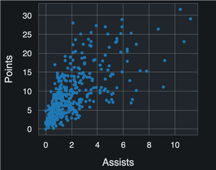
테마 사용

from bokeh.io import curdoc

curdoc().theme = "dark_minimal"
fig = figure(x_axis_label="Assists", y_axis_label="Points") fig.circle(x=nba["assists"], y=nba["points"]) output_file("dark_minimal.html") show(fig)

dark_minimal_nba_scatter

Bokeh로 배우는 인터랙티브 데이터 시각화

데이터 서브셋팅

east = nba.loc[nba["conference"] == "East"]
west = nba.loc[nba["conference"] == "West"]
print(nba.columns, '\n', east.shape, '\n', west.shape)
Index(['player', 'position', 'minutes', 'field_goal_perc', 'three_point_perc', 'free_throw_perc', 
       'rebounds', 'assists', 'steals', 'blocks', 'points', 'team', 'conference'],
        dtype='object') 
(211, 13) 
(215, 13)
Bokeh로 배우는 인터랙티브 데이터 시각화

색상 사용자 지정

fig = figure(x_axis_label="Assists per Game", y_axis_label="Points per Game")

fig.circle(x=east["assists"], y=east["points"], color="blue")
fig.circle(x=west["assists"], y=west["points"], color="red")
output_file(filename="east_vs_west.html") show(fig)
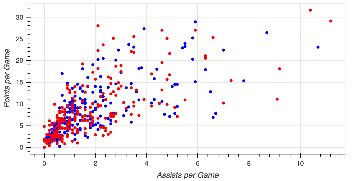
east_vs_west

Bokeh로 배우는 인터랙티브 데이터 시각화

범례 추가

fig = figure(x_axis_label="Assists per Game", y_axis_label="Points per Game")

fig.circle(x=east["assists"], y=east["points"], color="blue", legend_label="East")
fig.circle(x=west["assists"], y=west["points"], color="red", legend_label="West")
output_file(filename="east_vs_west_with_legend.html") show(fig)
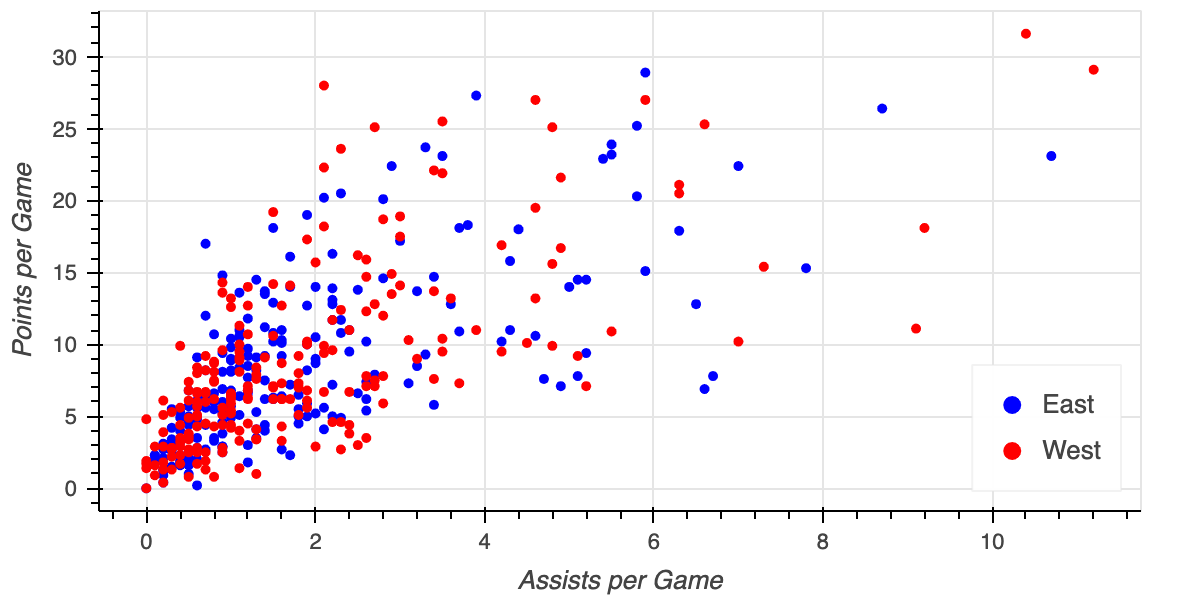
east_vs_west_legend

Bokeh로 배우는 인터랙티브 데이터 시각화

글리프 유형

  • square
    • 정사각형


  • triangle
    • 삼각형


  • diamond
    • 마름모
fig = figure(x_axis_label='Minutes Played', 
             y_axis_label="Points Per Game")

fig.square(x=nba["minutes_played"], y=nba["points_per_game"])
output_file(filename="nba_points.html") show(fig)

nba_square_scatter

Bokeh로 배우는 인터랙티브 데이터 시각화

여러 글리프

fig = figure(x_axis_label="Assists per Game", y_axis_label="Points per Game")

fig.diamond(x=east["assists"], y=east["points"], color="blue", legend_label="Eastern Conference")
fig.triangle(x=west["assists"], y=west["points"], color="red", legend_label="Western Conference")
output_file(filename="multiple_glyphs.html") show(fig)
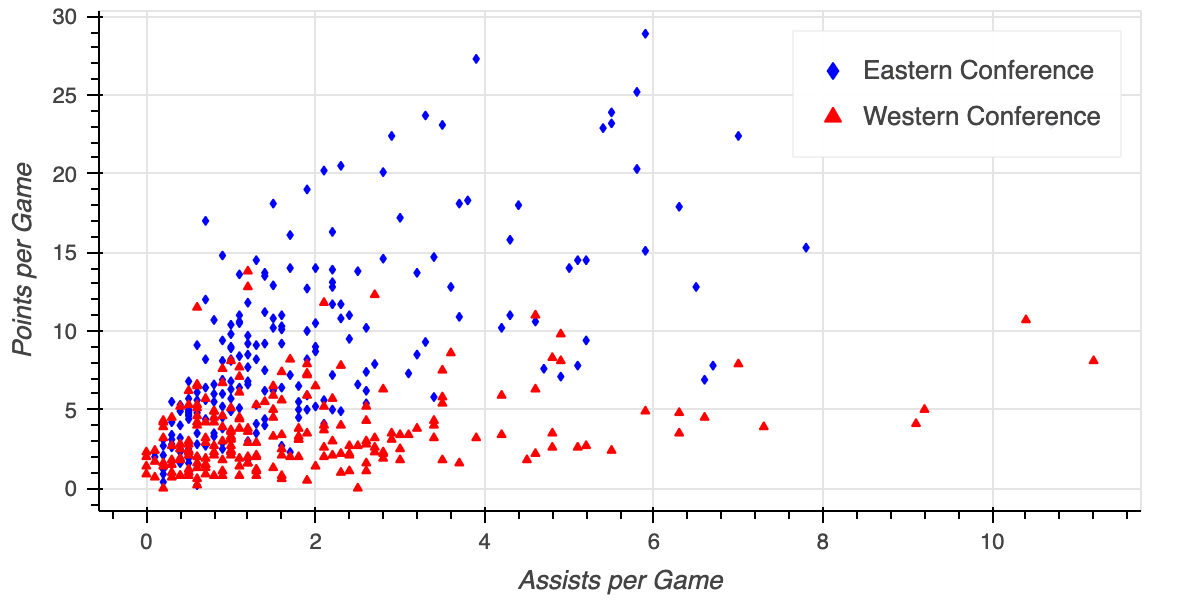
nba_multiple_glyphs

Bokeh로 배우는 인터랙티브 데이터 시각화

데이터셋

print(melb.columns)
Index(['rooms', 'type', 'price', 'date', 'distance', 'bedrooms', 'bathrooms',
       'car', 'land_area', 'building_area', 'year_built', 'council_area',
       'region'],
      dtype='object')
print(melb.shape)
(13580, 13)
Bokeh로 배우는 인터랙티브 데이터 시각화

Ayo berlatih!

Bokeh로 배우는 인터랙티브 데이터 시각화

Preparing Video For Download...