Bokeh 소개

Bokeh로 배우는 인터랙티브 데이터 시각화

George Boorman

Core Curriculum Manager, DataCamp
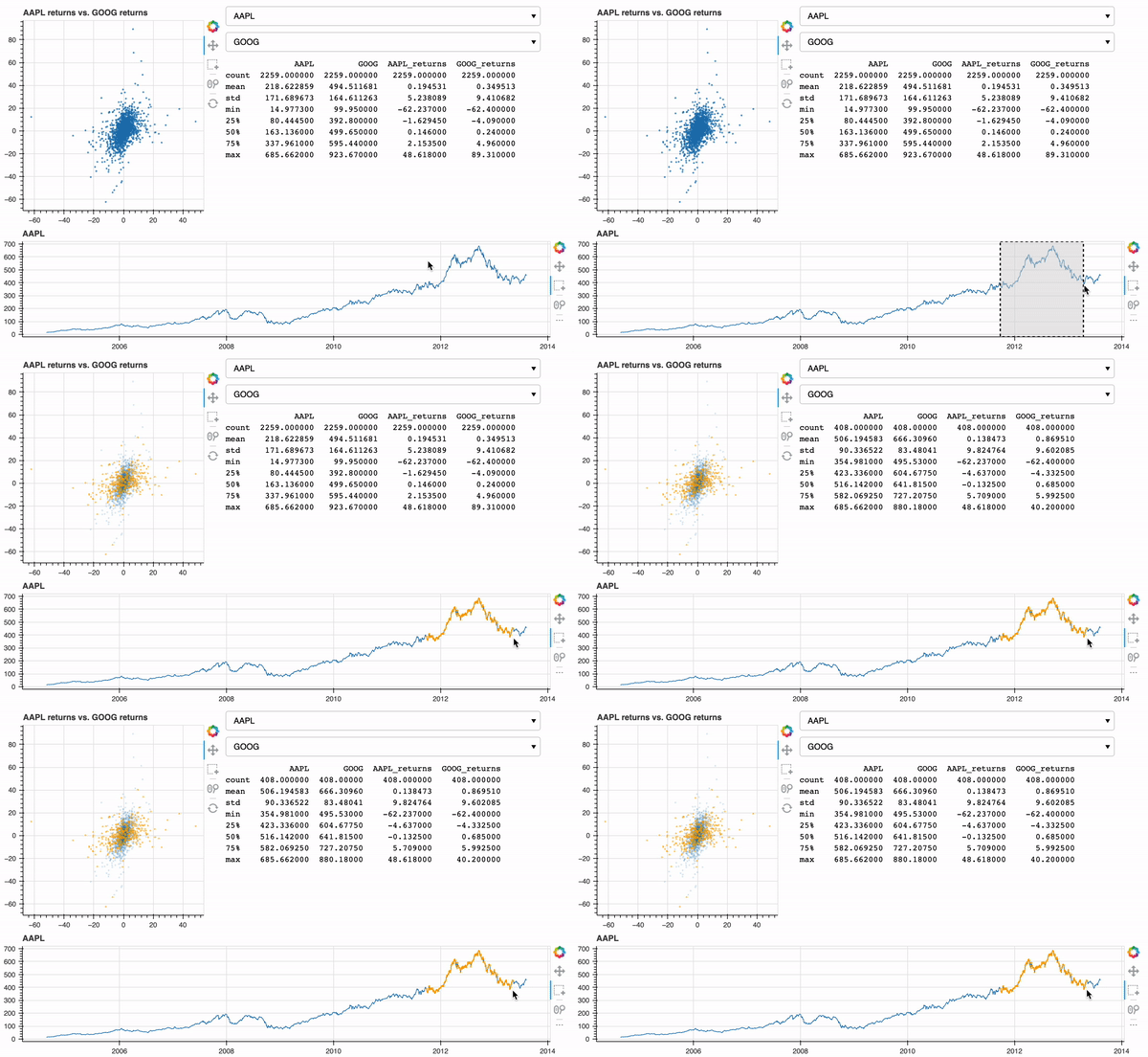
Bokeh란?

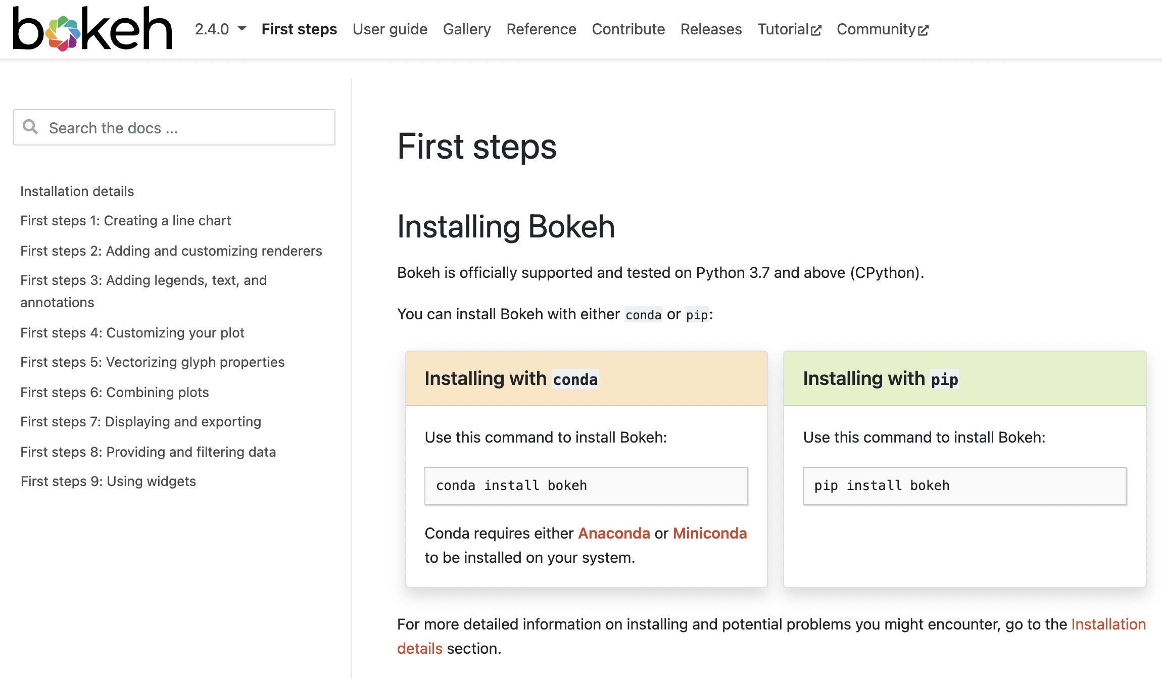
문서 화면

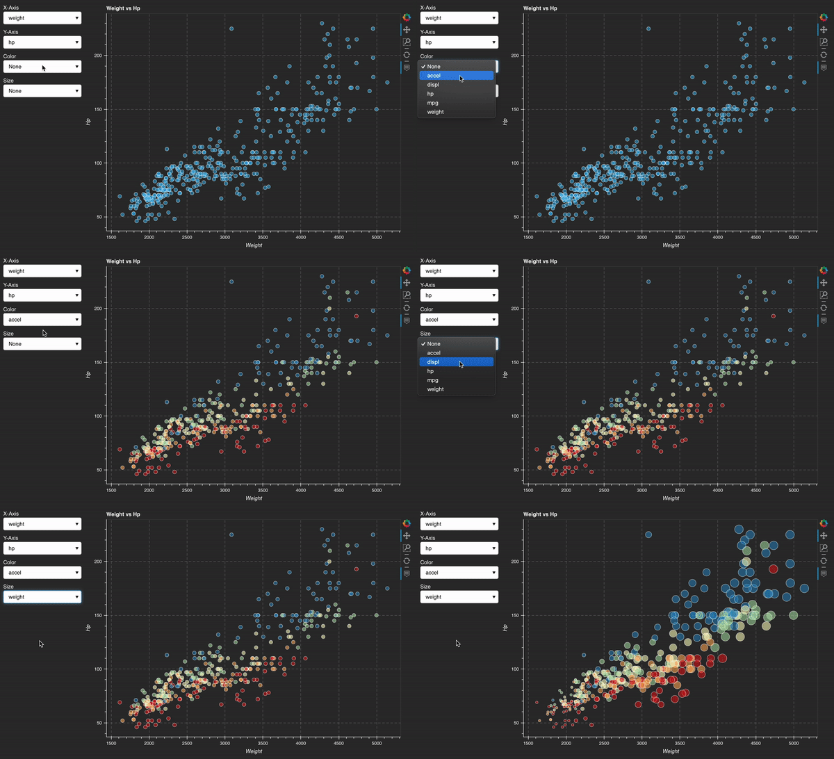
자동차 대화형 예시

Bokeh로 배우는 인터랙티브 데이터 시각화

코스 개요

  • 1장: Bokeh 소개
  • 2장: 시각화 커스터마이징
  • 3장: 시각화로 스토리텔링
  • 4장: 위젯 소개
Bokeh로 배우는 인터랙티브 데이터 시각화
import pandas as pd
nba = pd.read_csv("nba.csv")
print(nba.columns)
Index(['player', 'position', 'minutes', 'field_goal_perc', 'three_point_perc',
       'free_throw_perc', 'rebounds', 'assists', 'steals', 'blocks', 'points',
       'team', 'conference', 'scorer_category'],
      dtype='object')
print(nba.shape)
(424, 14)
Bokeh로 배우는 인터랙티브 데이터 시각화

Figure 설정하기

from bokeh.plotting import figure

from bokeh.io import output_file, show
fig = figure()
output_file(filename="empty_figure.html")
show(fig)

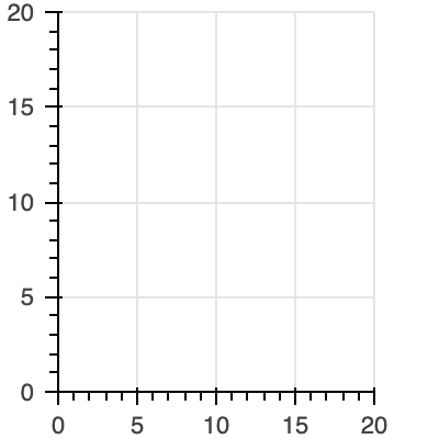
빈 Figure

Bokeh로 배우는 인터랙티브 데이터 시각화

산점도 만들기

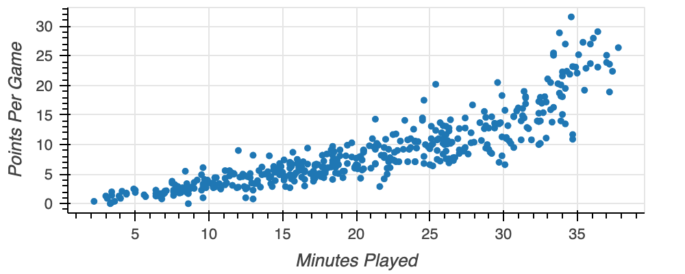
fig = figure(x_axis_label="Minutes Played", y_axis_label="Points Per Game")

fig.circle(x=nba["minutes"], y=nba["points"])
output_file(filename="nba_points.html") show(fig)

nba 산점도

Bokeh로 배우는 인터랙티브 데이터 시각화

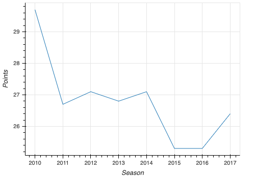
선 그래프 표시하기

fig = figure(x_axis_label="Season", y_axis_label="Points")

fig.line(x=lebron["season"], y=lebron["points"])
output_file(filename="lebron_points_per_season.html") show(fig)

르브론 선 그래프

Bokeh로 배우는 인터랙티브 데이터 시각화

범주형 데이터 그리기

positions = nba.groupby("position", as_index=False)["points"].mean()

fig = figure(x_axis_label="Position", y_axis_label="Points per Game",
x_range=positions["position"])
fig.vbar(x=positions["position"], top=positions["points"])
output_file(filename="nba_points_by_position.html") show(fig)
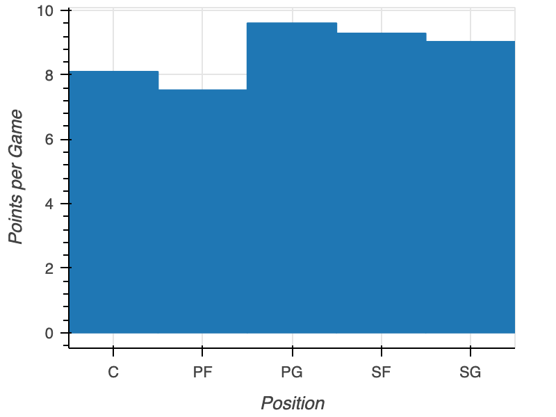
포지션별 득점

Bokeh로 배우는 인터랙티브 데이터 시각화

연습해 봅시다!

Bokeh로 배우는 인터랙티브 데이터 시각화

Preparing Video For Download...