Julia로 시작하는 데이터 시각화
Gustavo Vieira Suñe
Data Analyst

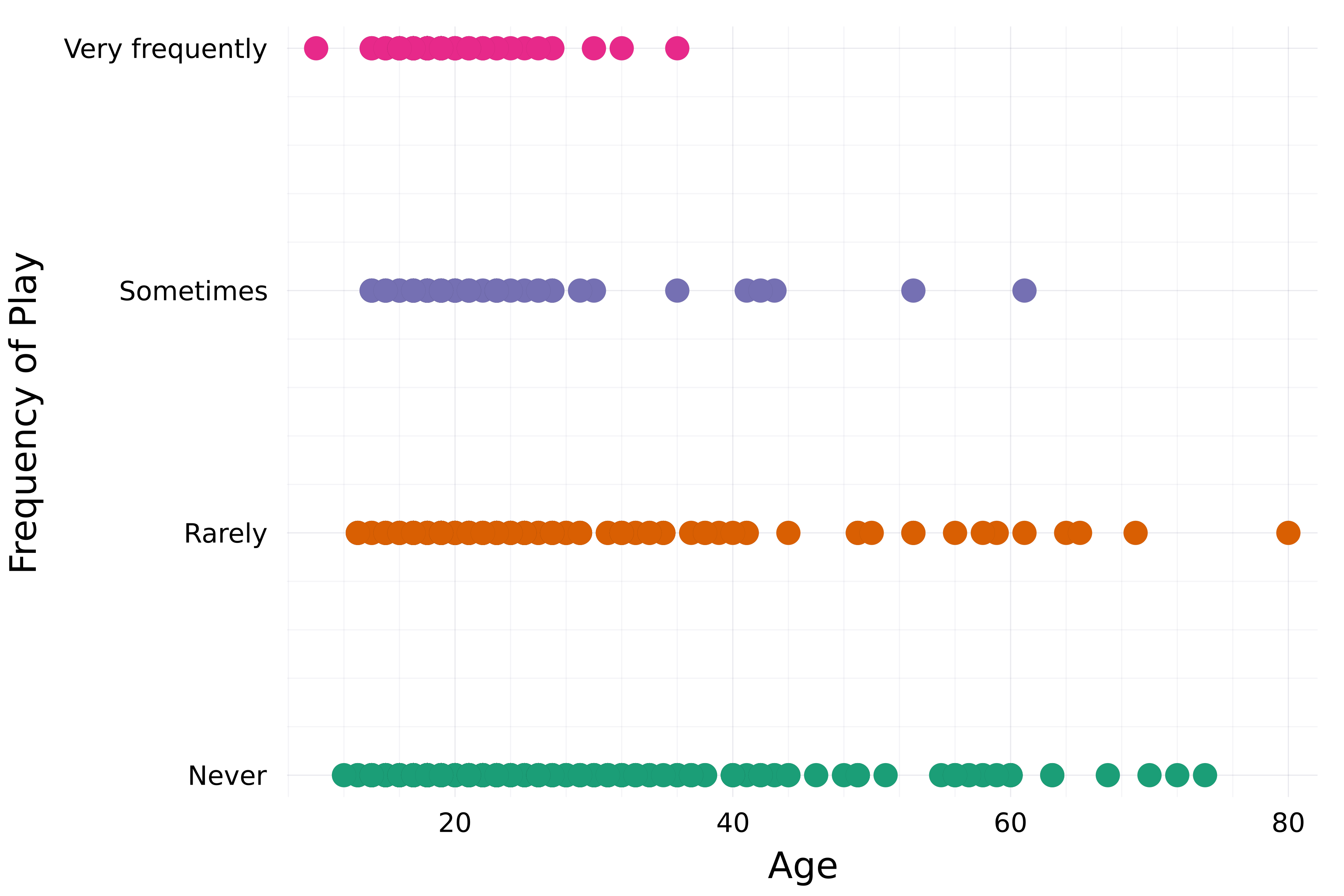
# Set the theme theme(:bright)# Create a scatter plot scatter( streaming.Age, streaming."Frequency [K pop]", group=streaming."Frequency [K pop]", label=false,# Set color palette palette=:Dark2_5 )xlabel!("Age") ylabel!("Frequency of Play")

이전에 본 속성:
title, xlabel, ylabelxticks, ytickscolorlinecolor, linewidthmarkercolorframestyle더 많은 속성:
xlims, ylimsalphalinestylelegend_title, legend_positionmarkersize, markershape...
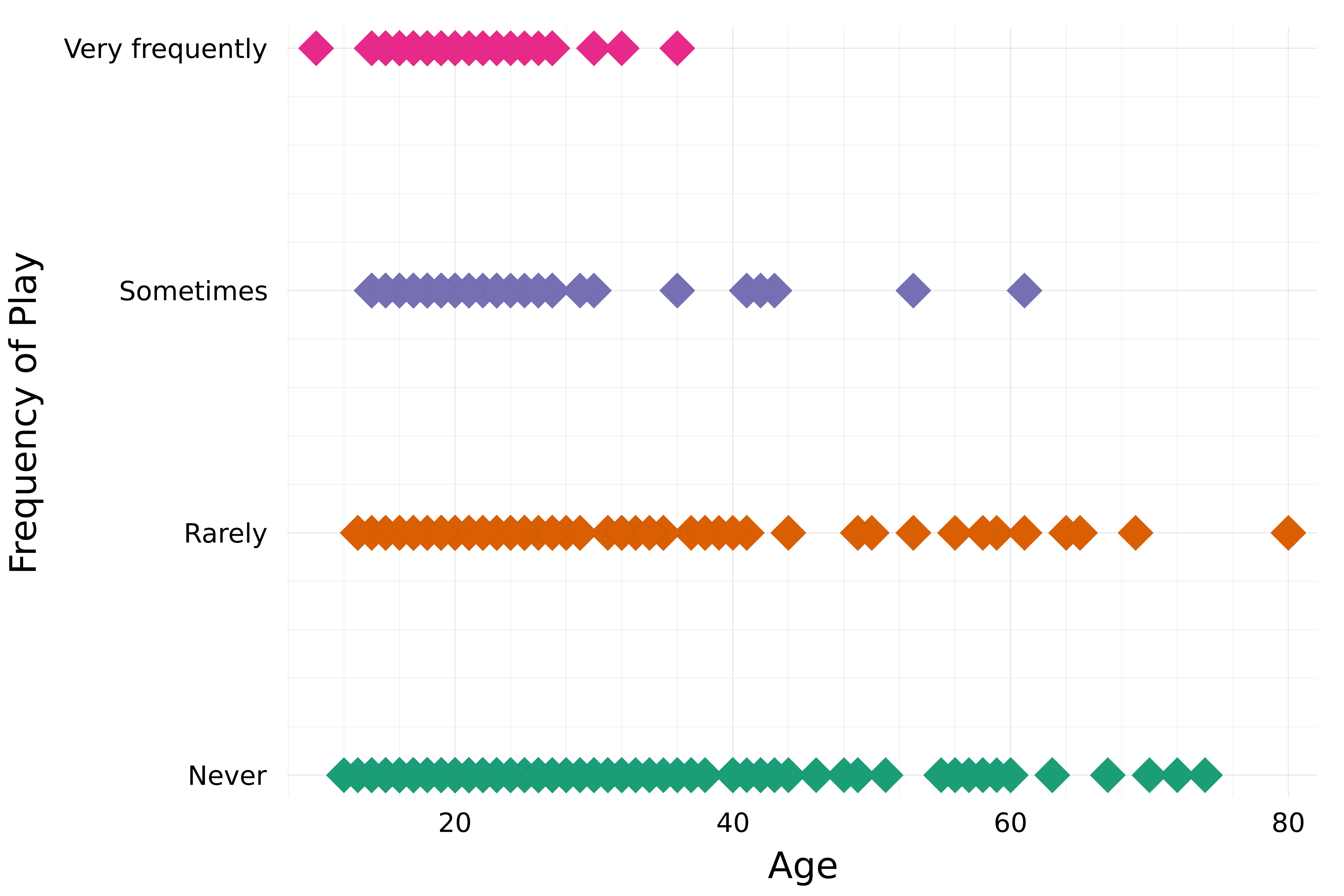
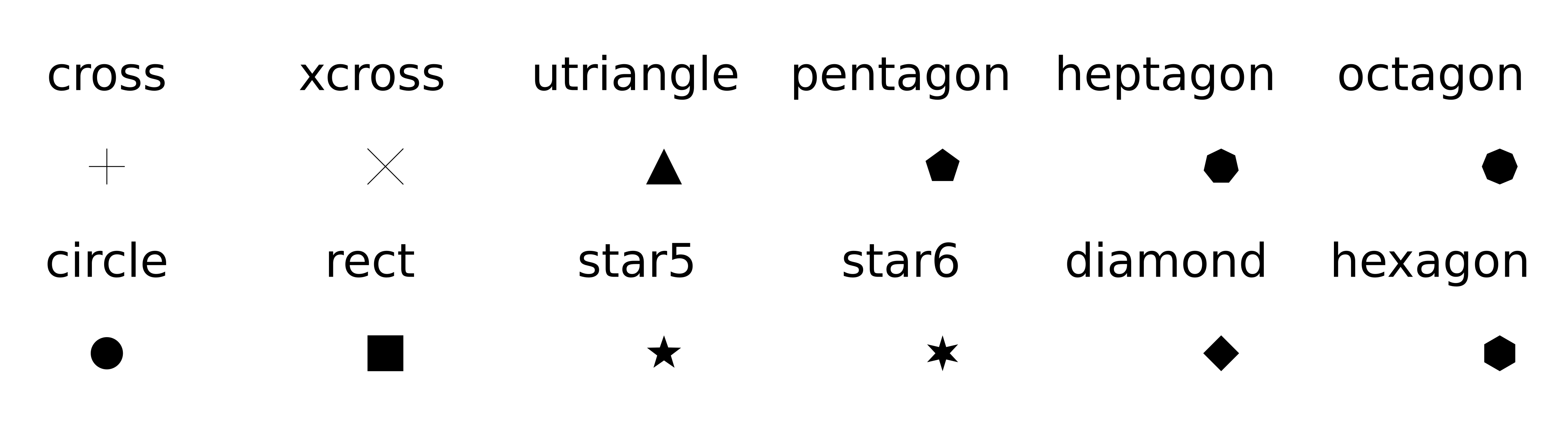
theme(:bright) scatter( streaming.Age, streaming."Frequency [K pop]", group=streaming."Frequency [K pop]", label=false, palette=:Dark2_5# Marker attributes markershape=:diamond, markersize=8, )xlabel!("Age") ylabel!("Frequency of Play")

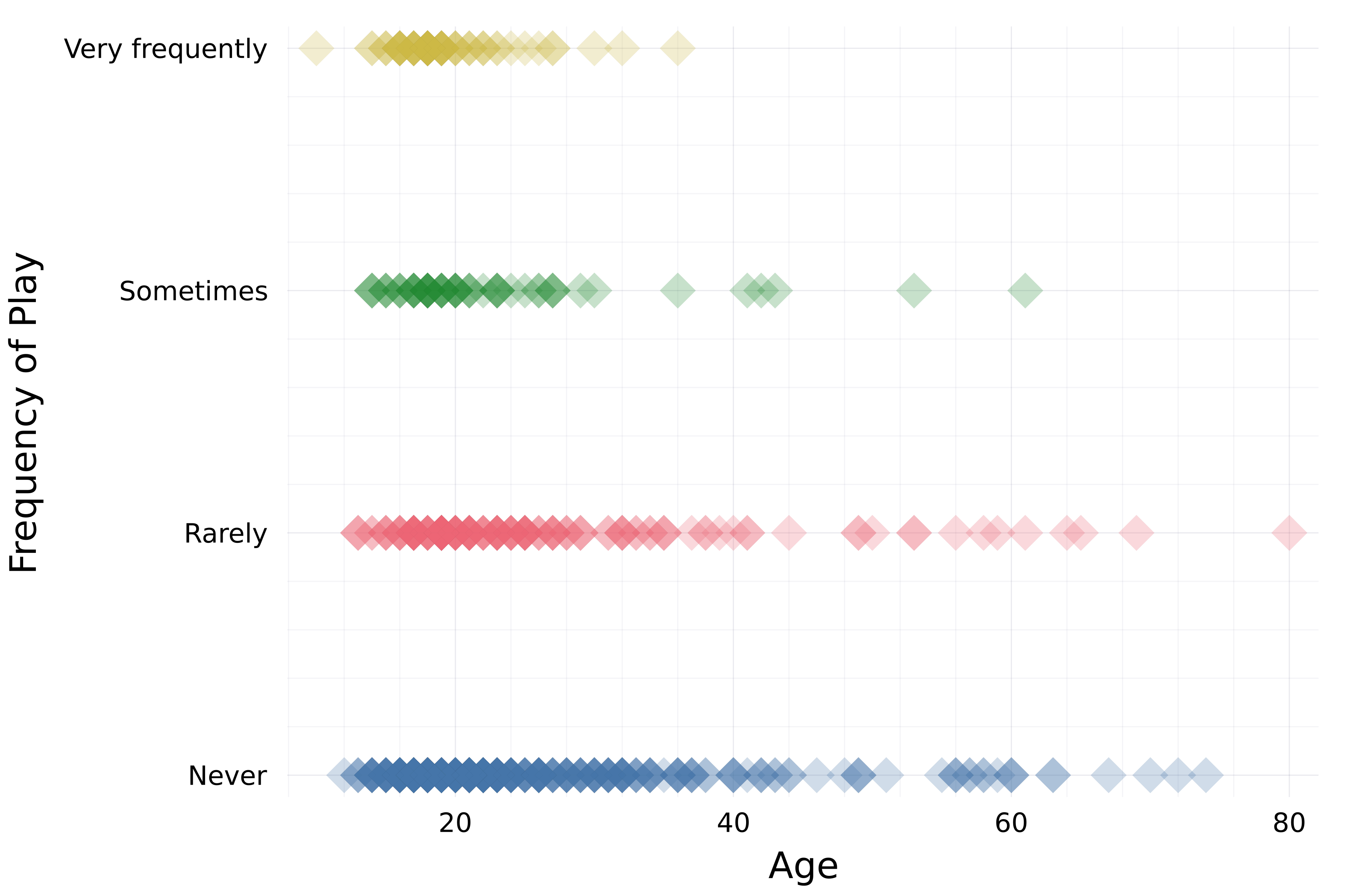
theme(:bright) scatter( streaming.Age, streaming."Frequency [K pop]", group=streaming."Frequency [K pop]", label=false, palette=:Dark2_5 markershape=:diamond, markersize=8,# Opacity alpha=0.25 )xlabel!("Age") ylabel!("Frequency of Play")

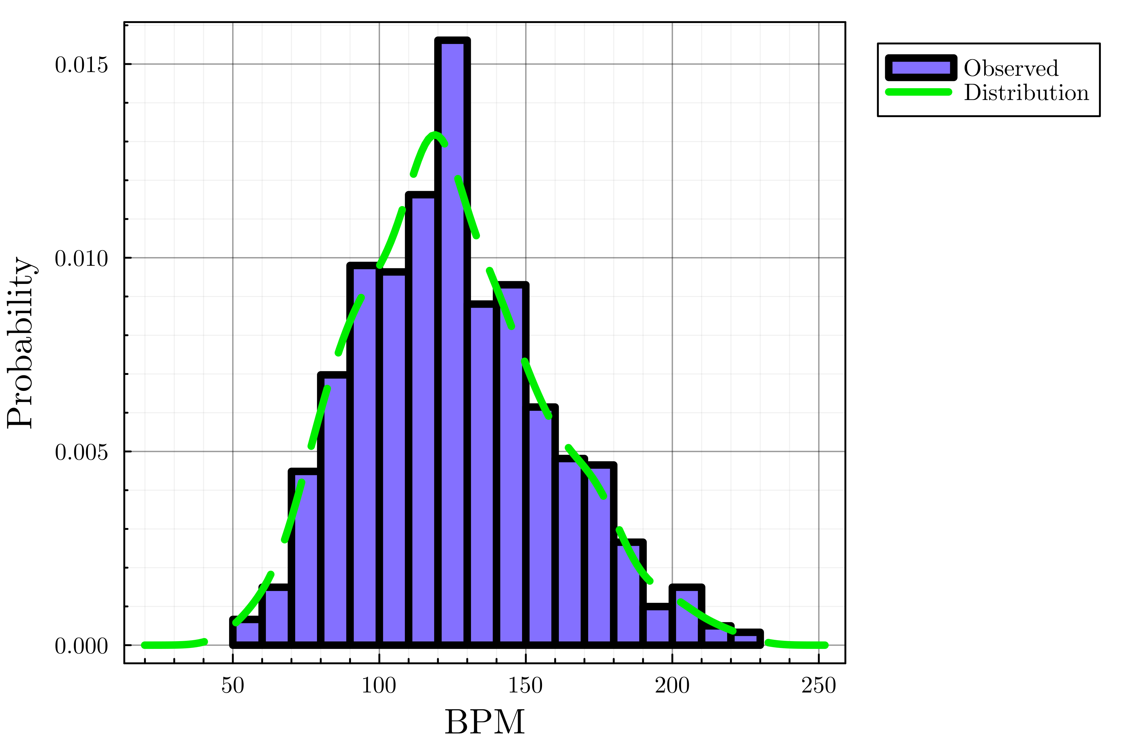
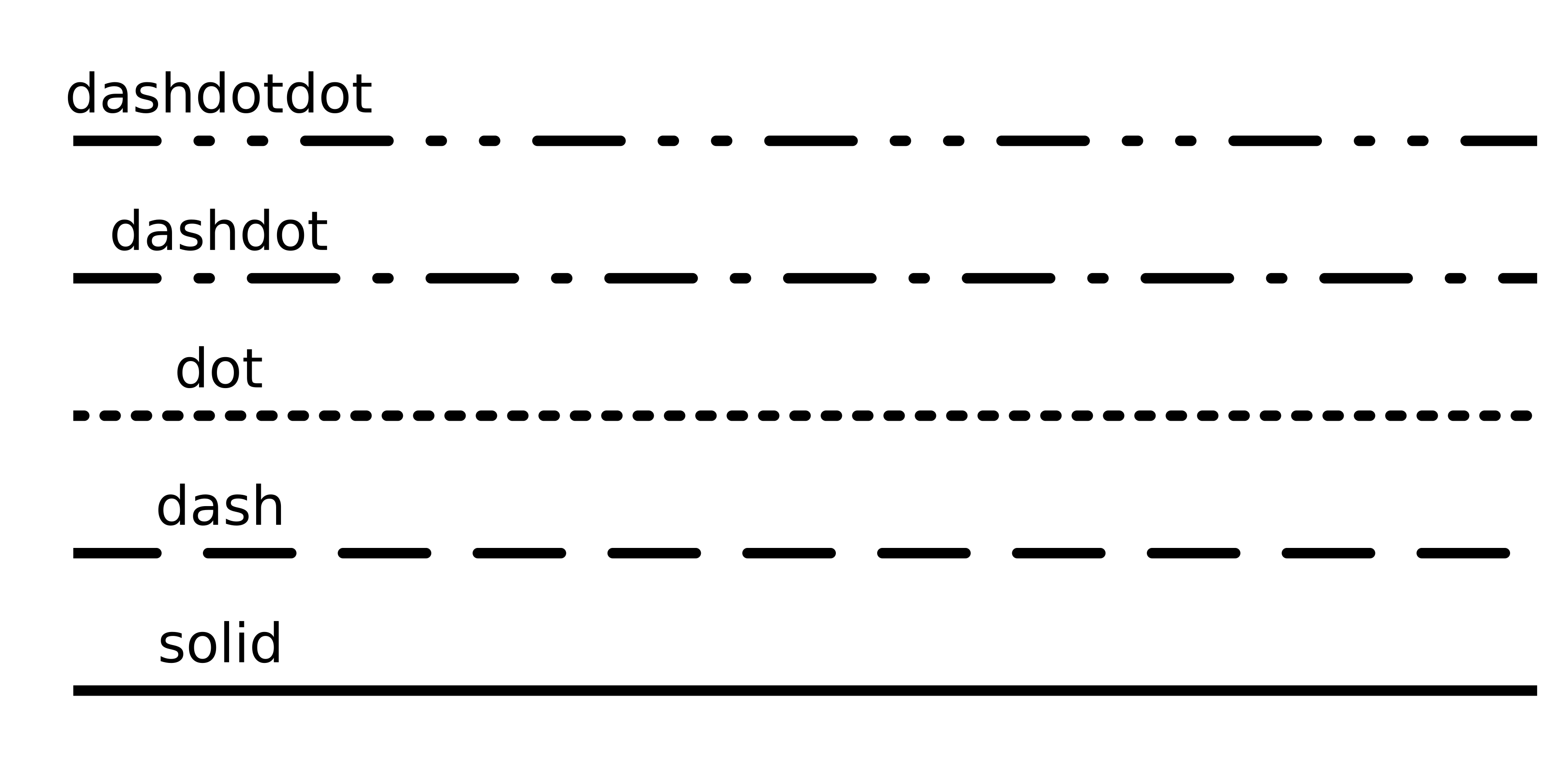
# Set theme and default line width theme(:dao, linewidth=4)# Create histogram histogram(streaming.BPM, label="Observed", color=:lightslateblue, normalize=true)# Add density plot density!(streaming.BPM, label="Distribution", linecolor=:green2,# Line style linestyle=:dash)xlabel!("BPM") ylabel!("Probability")

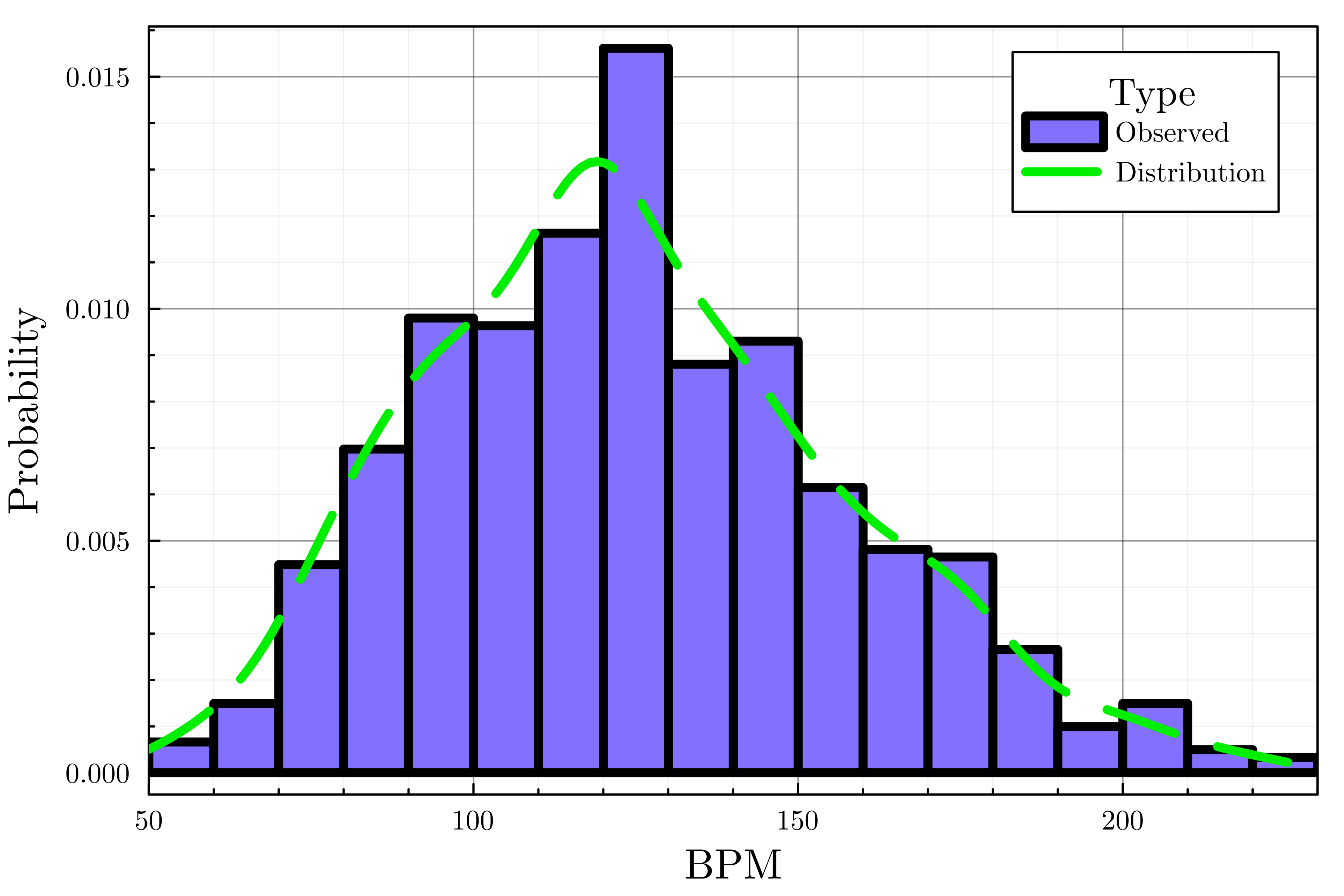
theme(:dao, linewidth=4) histogram(streaming.BPM, label="Observed", color=:lightslateblue, normalize=true) density!(streaming.BPM, label="Distribution", linecolor=:green2, linestyle=:dash# Customize legend legend_title="Type", legend_position=:topright)# Set the x-axis bounds xlims!(50, 230)xlabel!("BPM") ylabel!("Probability")

plot(..., palette=palette_symbol)markersizemarkershape
alpha=opacity_valuexlims!(), ylims!()선 속성: linetyle

범례 속성
legend_titlelegend_position (:right, :left, :top, :bottom, :topright, :topleft, ...)Julia로 시작하는 데이터 시각화