Julia로 시작하는 데이터 시각화
Gustavo Vieira Suñe
Data Analyst

layout)
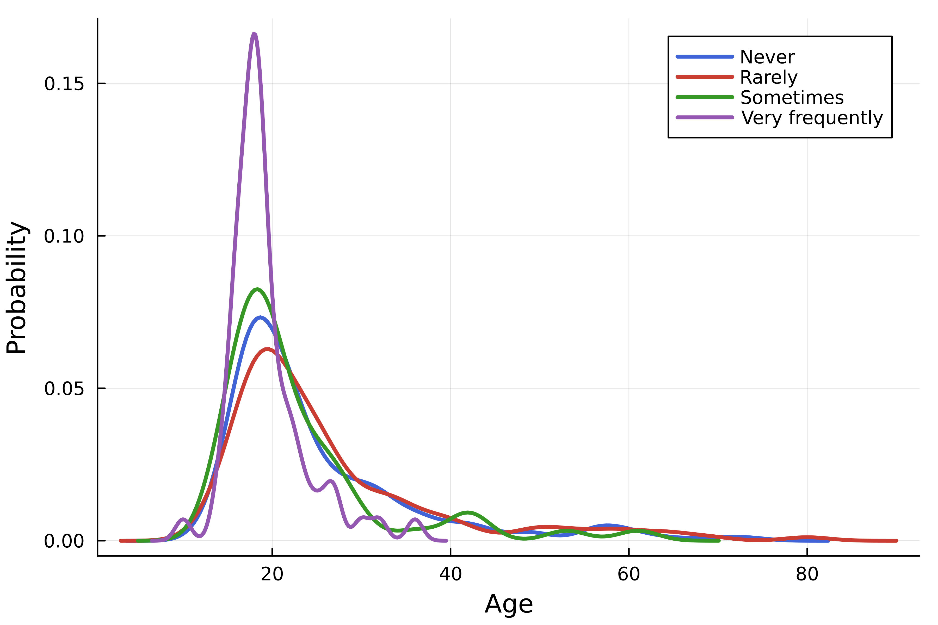
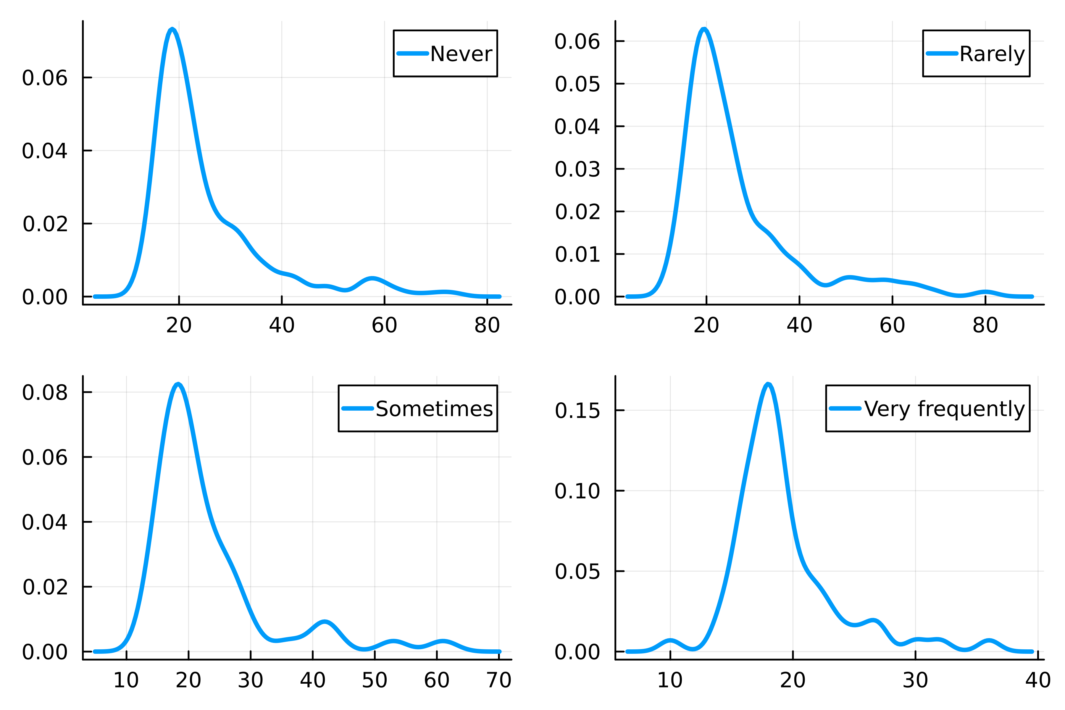
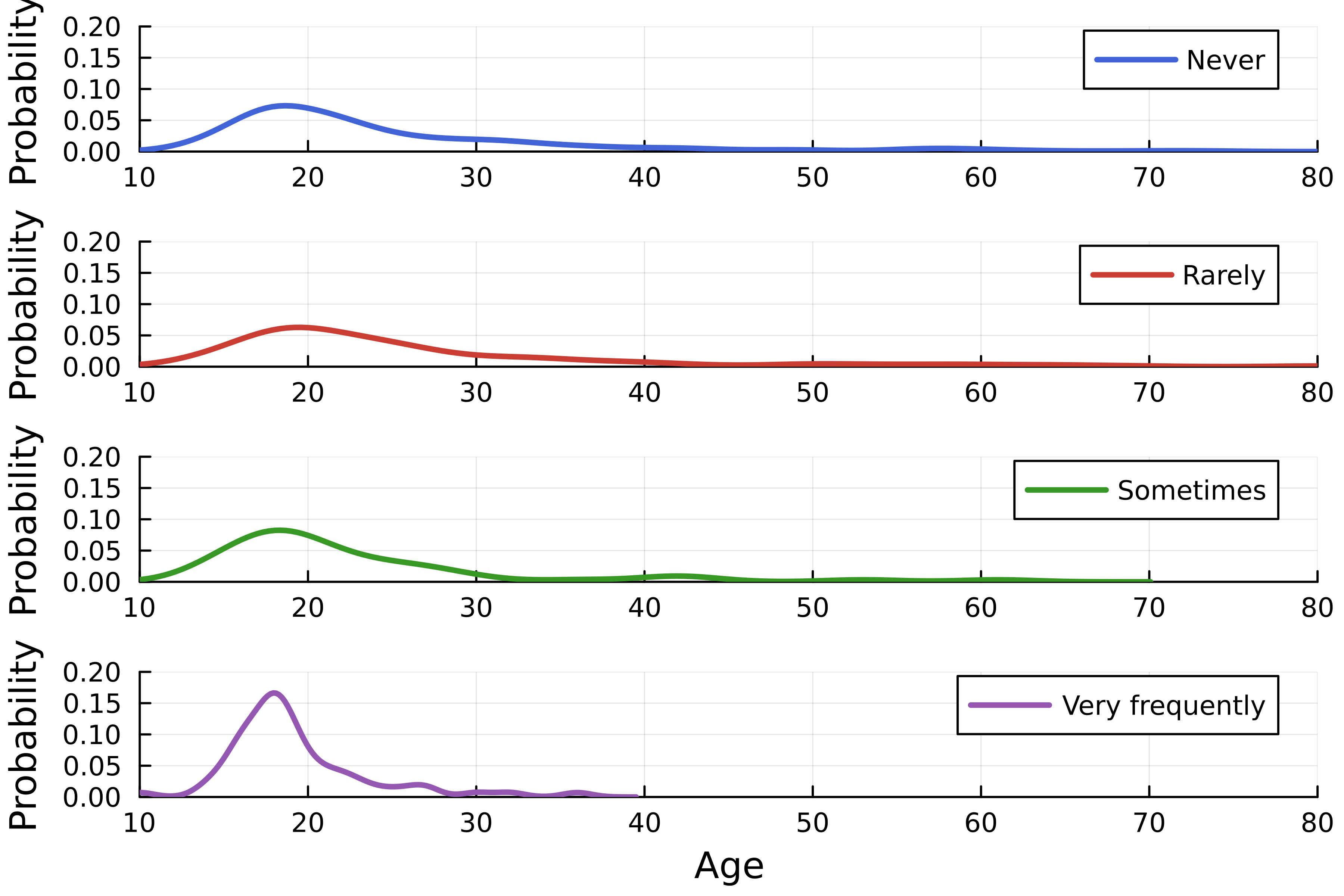
using StatsPlots, DataFrames, CSV # 데이터셋 불러오기 streaming = DataFrame( CSV.File("streaming.csv") )# 밀도 플롯 생성 density( streaming.Age, group=streaming."Frequency [K pop]", linewidth=2.5,# 레이아웃 설정 layout=4, )

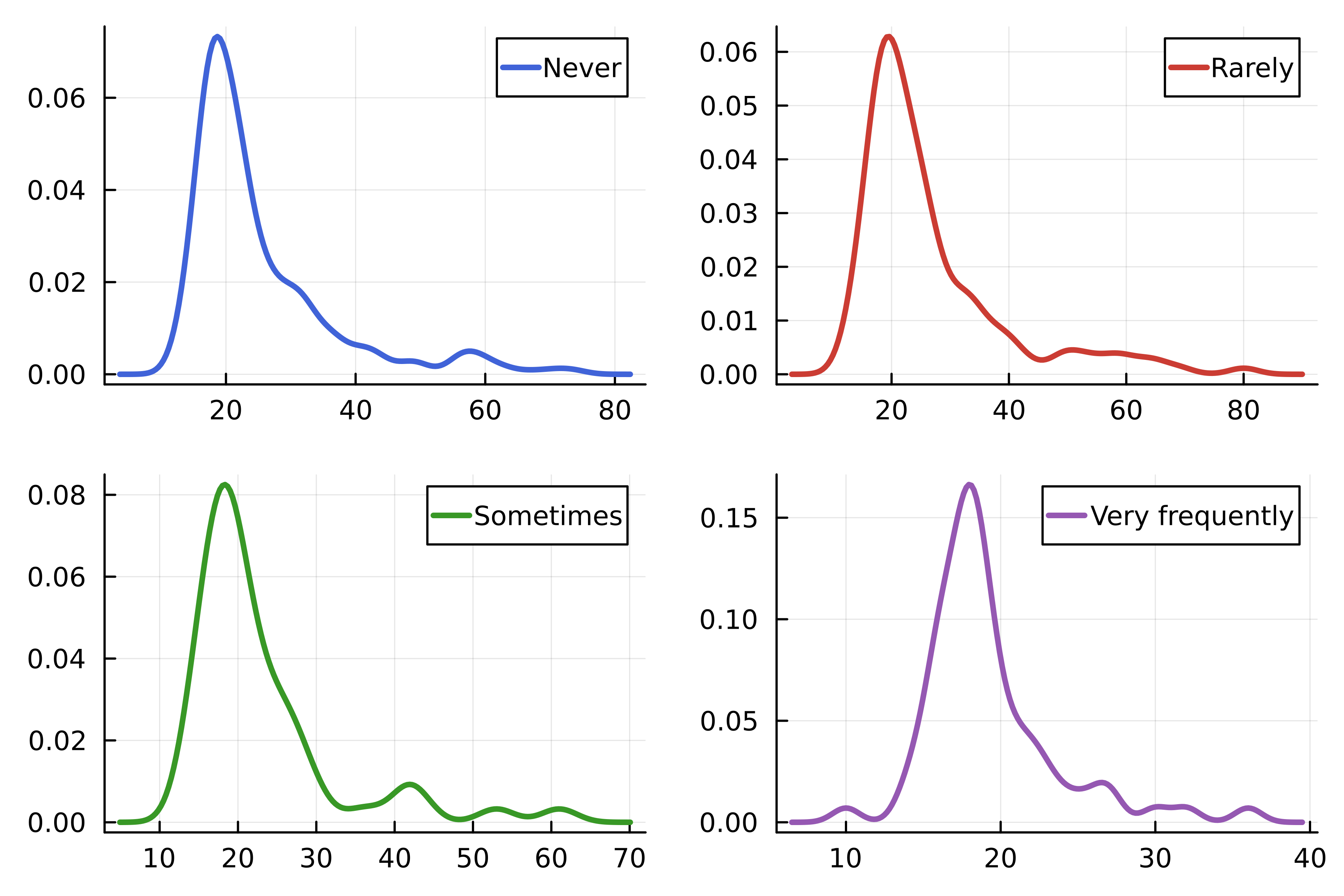
using Colors # Julia 로고 색상 logocolors = Colors.JULIA_LOGO_COLORS colors = [logocolors.blue logocolors.red logocolors.green logocolors.purple]density( streaming.Age, group=streaming."Frequency [K pop]", linewidth=2.5, layout=4, # 선 색상 linecolor=colors, )

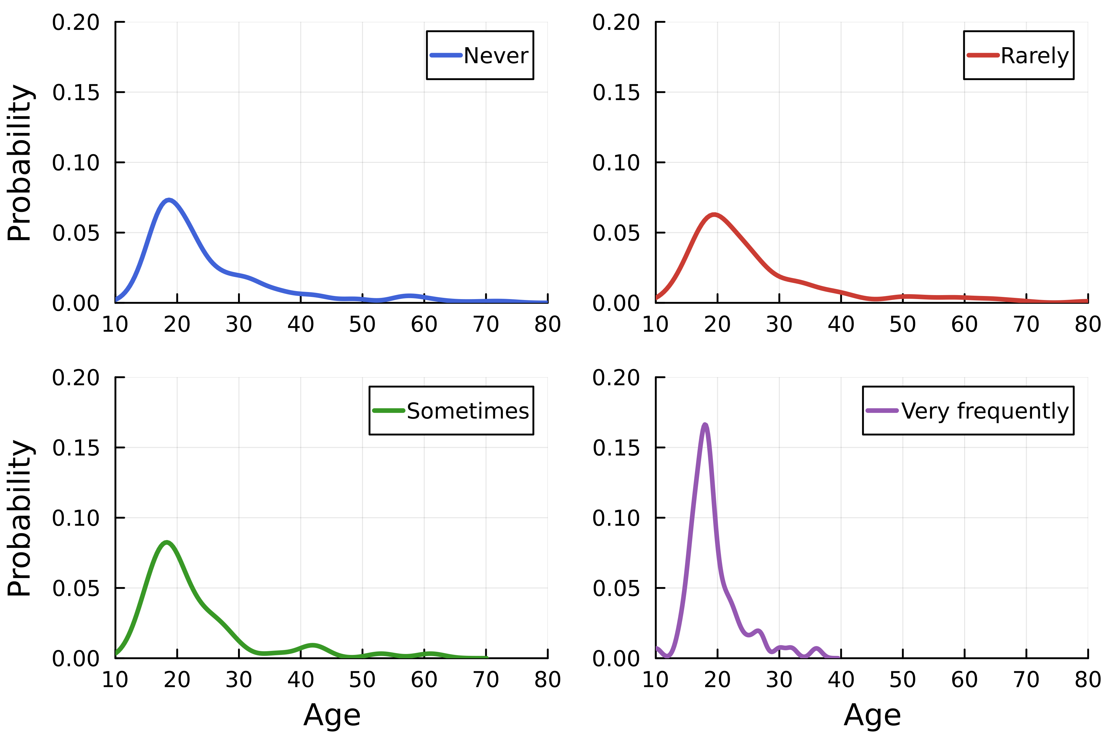
density( streaming.Age, group=streaming."Frequency [K pop]", linewidth=2.5, linecolor=colors,# 레이아웃 크기 layout=(4, 1),# 축 레이블 xlabel=["" "" "" "Age"], ylabel="Probability", )# 축 범위 xlims!(10, 80) ylims!(0, 0.2)


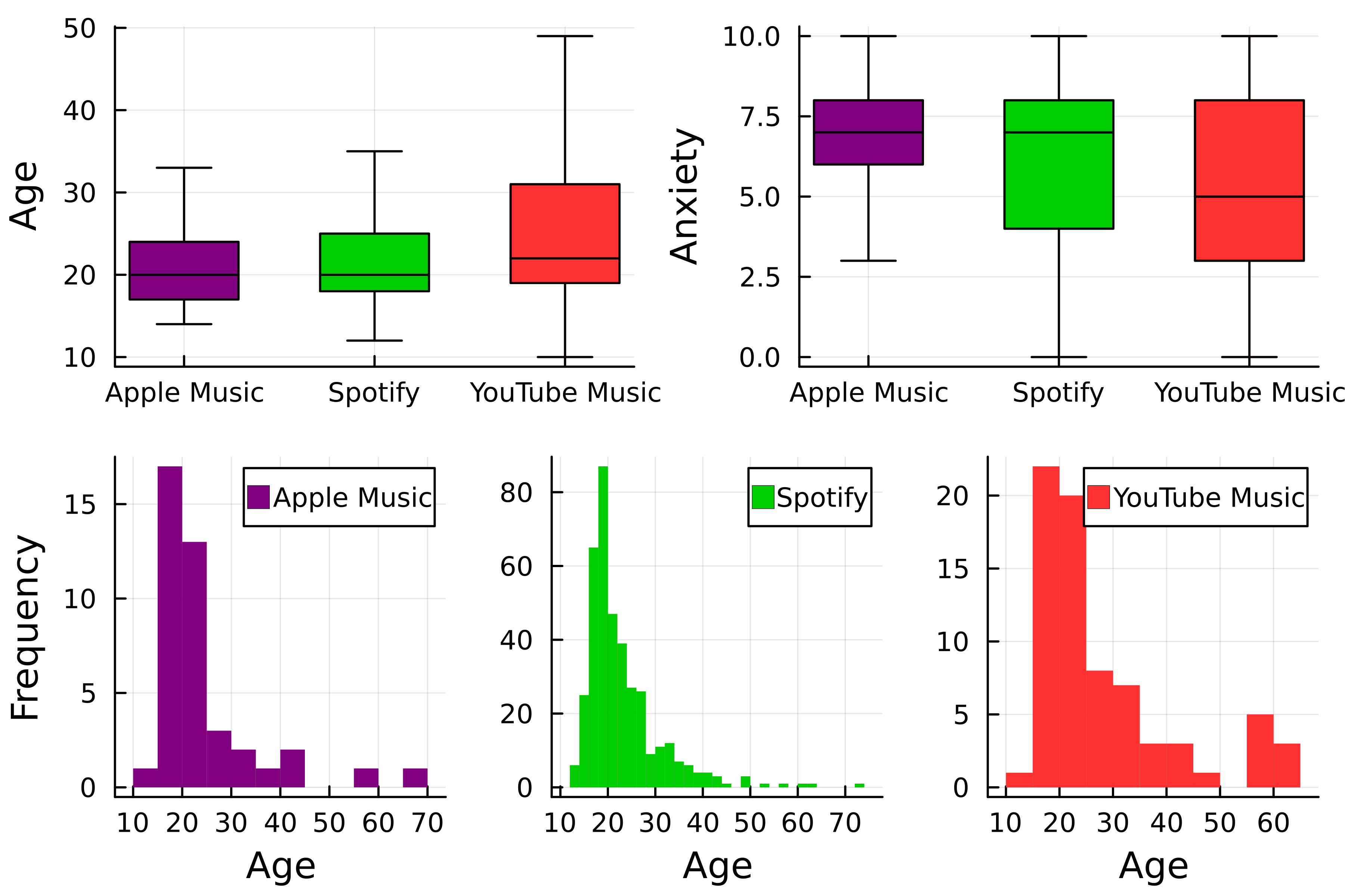
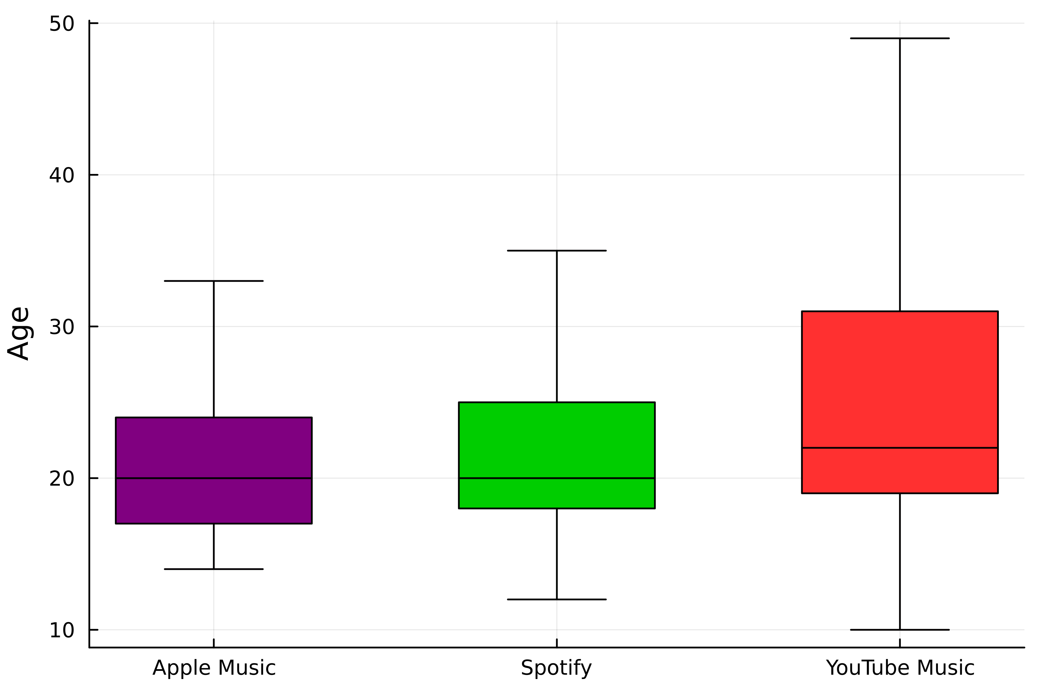
theme(:wong) # 색상 선택 colors = [:purple :green3 :firebrick1]# 첫 번째 박스플롯 p1 = boxplot(streaming."Streaming service", streaming.Age,# 스트리밍 서비스로 그룹화 group=streaming."Streaming service", color=colors,label=false, ylabel="Age", # 이상치 제거 outliers=false)

# 두 번째 박스플롯
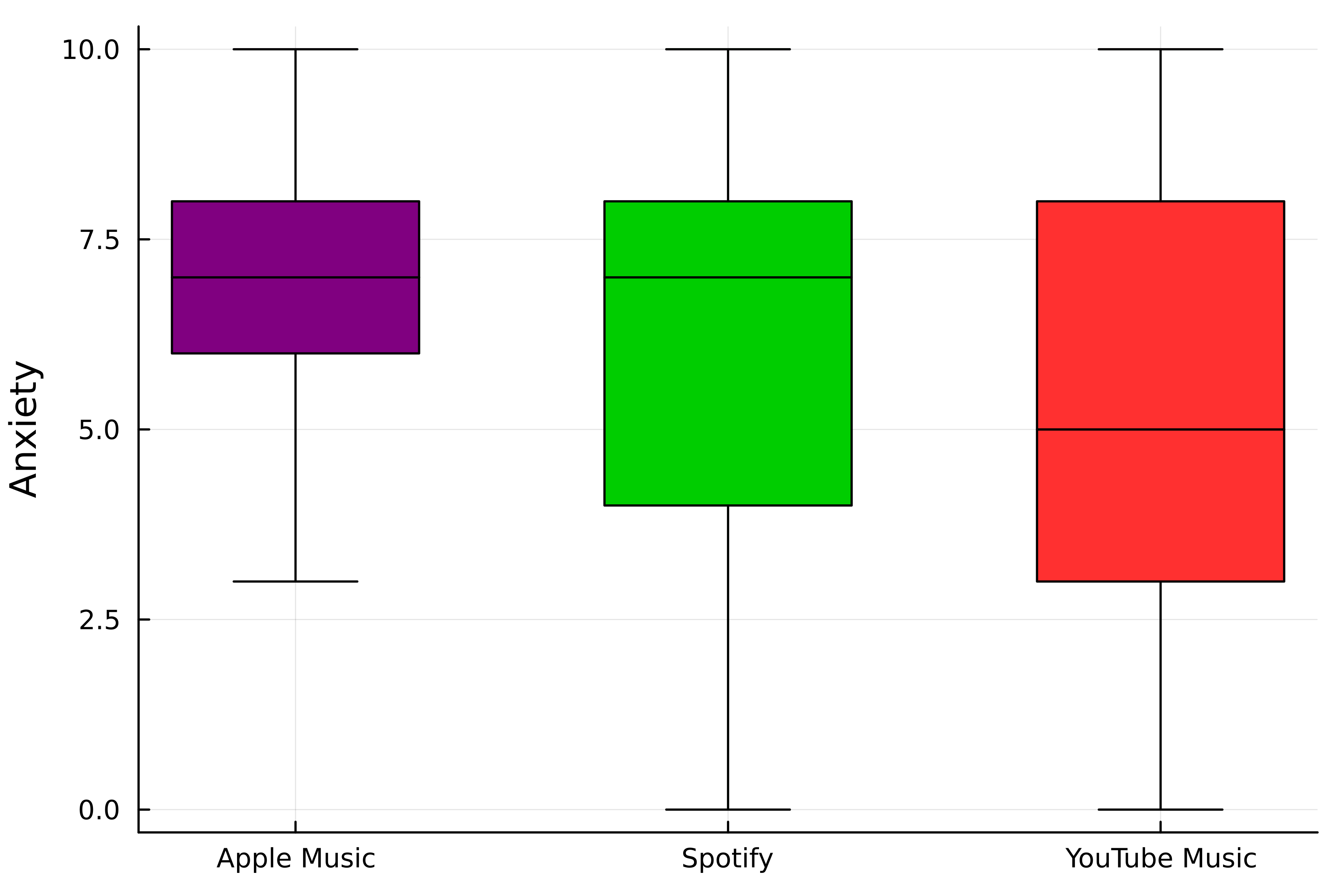
p2 = boxplot(
streaming."Streaming service",
streaming.Anxiety,
# 스트리밍 서비스로 그룹화
group=streaming."Streaming service",
color=colors,
label=false,
ylabel="Anxiety",
# 이상치 제거
outliers=false,
)

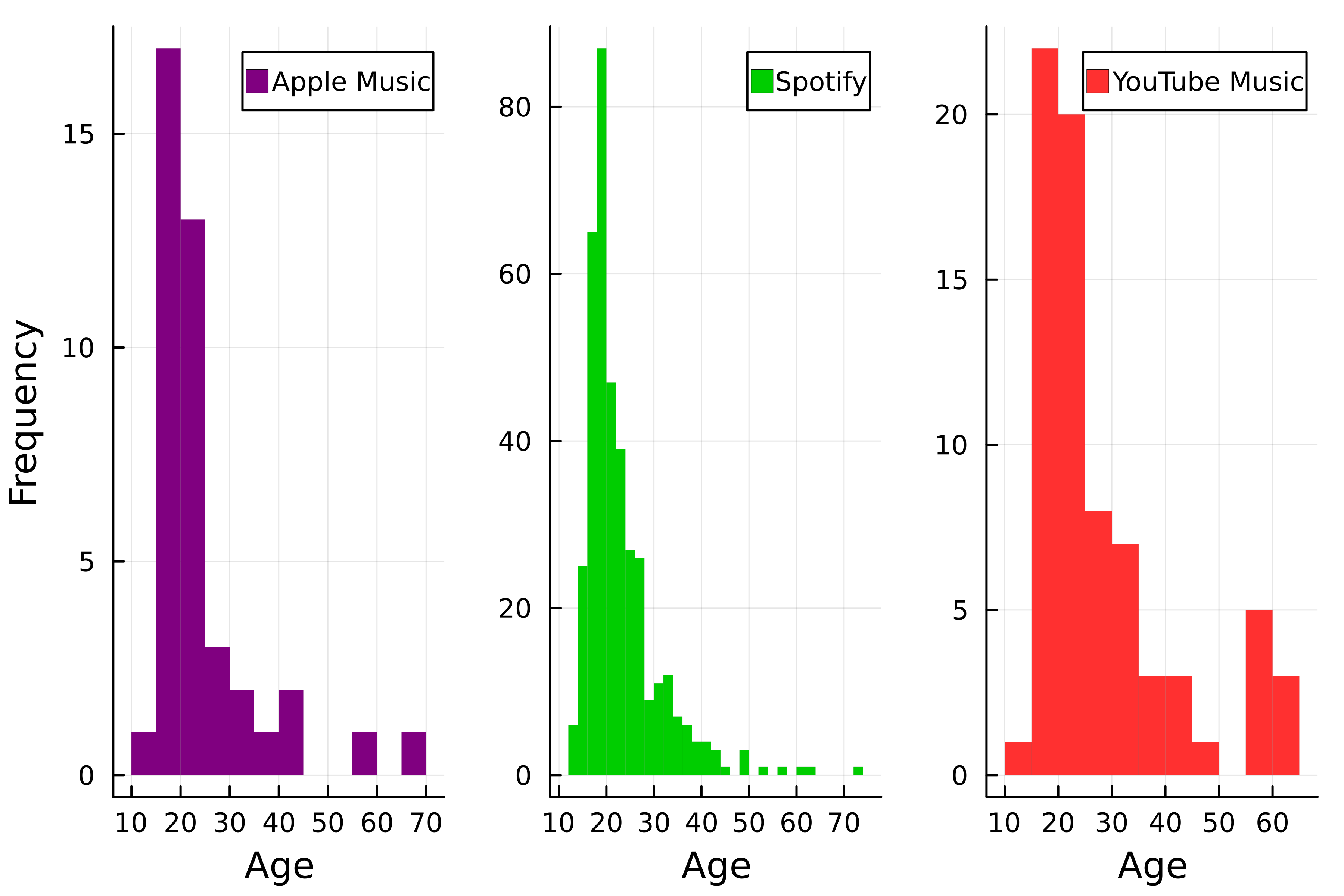
# 히스토그램 p3 = histogram( streaming.Age, group=streaming."Streaming service", color=colors, # 선 제거 linewidth=0,# 레이아웃 설정 layout=(1, 3),xlabel="Age", # y축 레이블 설정 ylabel=["Frequency" "" ""] )

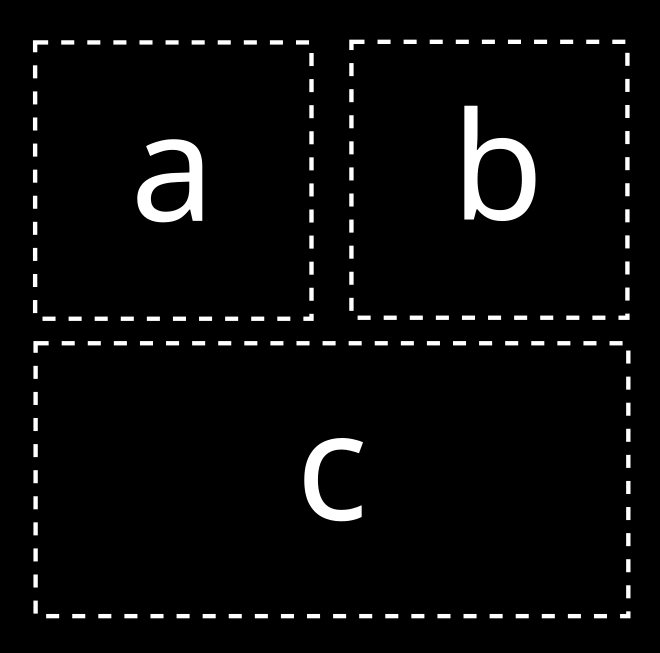
# 레이아웃 선택
layout = @layout [a b; c]

# 플롯 결합
plot(p1, p2, p3, layout=layout)

Julia로 시작하는 데이터 시각화