散布図

データ可視化への理解

Richie Cotton

Data Evangelist at DataCamp

散布図はどんなときに使うべきか?

  1. 連続変数が2つあるとき
  2. 2つの変数間の関係について知りたいとき
データ可視化への理解

ロサンゼルス郡の住宅価格

都市 寝室数 価格(百万米ドル) 面積(平方フィート)
ロングビーチ 1 0.3250 846
ビバリーヒルズ 3 2.1950 2930
サンタモニカ 2 0.5740 1037
サンタモニカ 1 0.5990 576
ビバリーヒルズ 5 3.9500 5600
ロングビーチ 4 0.2999 1571
ウェストウッド 3 0.6950 1913
データ可視化への理解

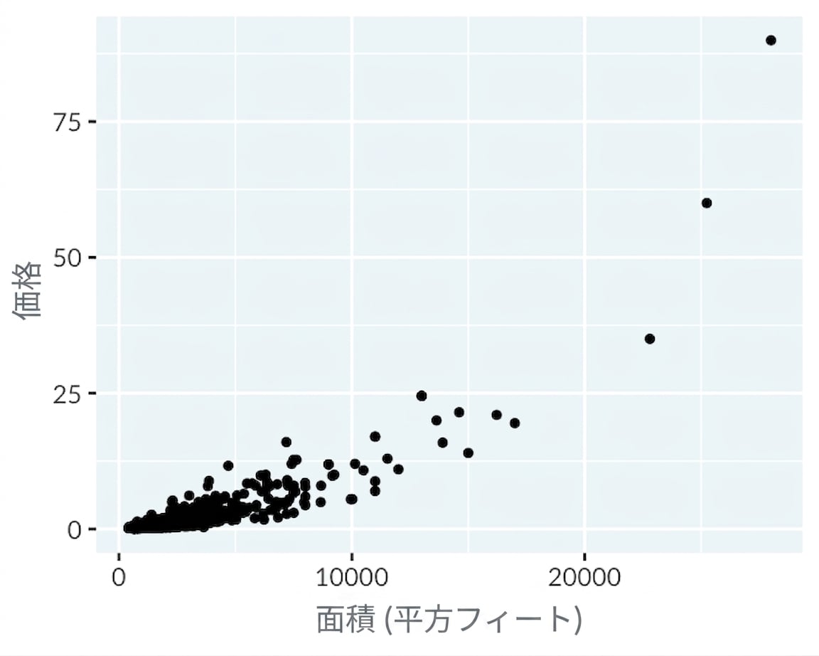
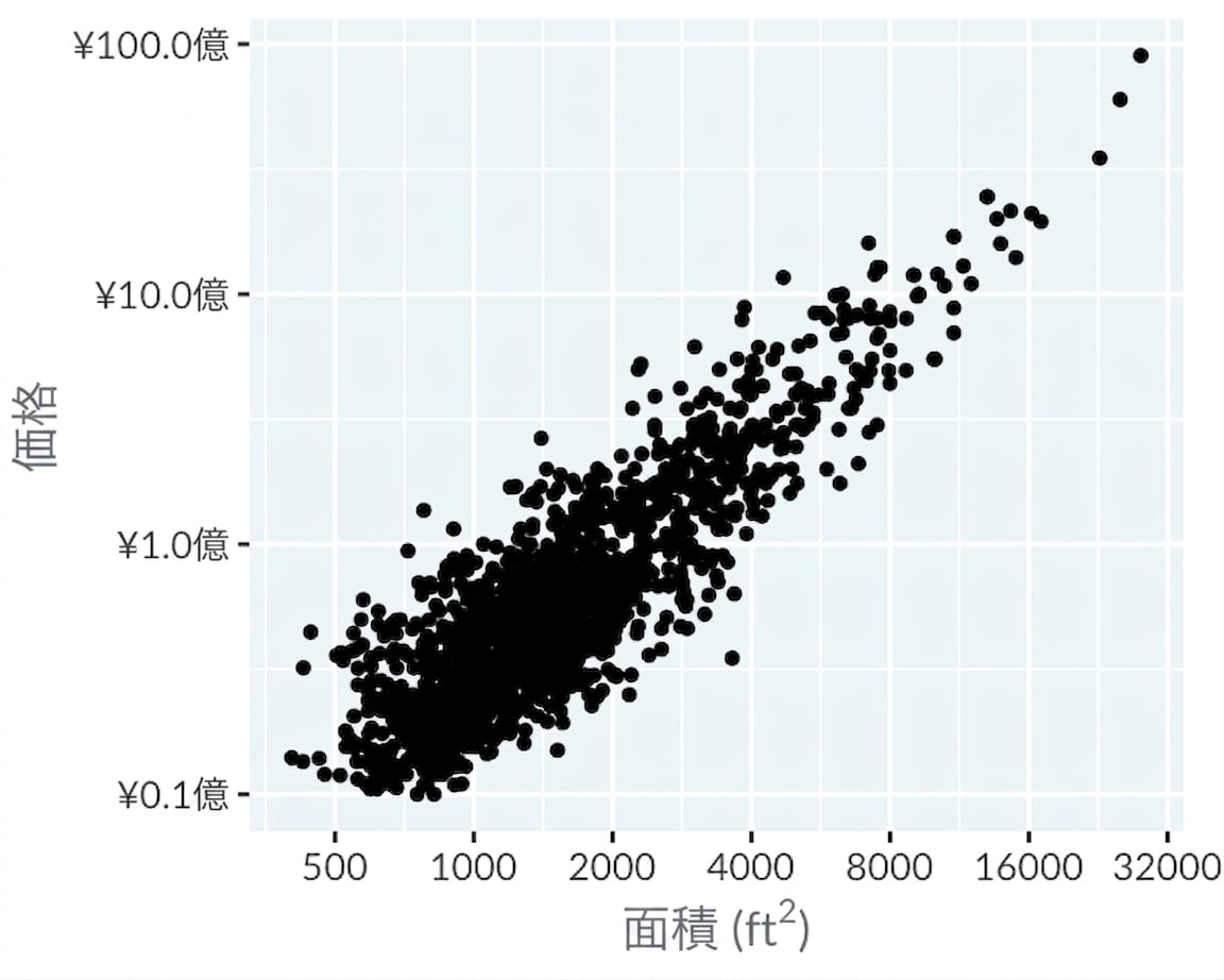
価格 vs. 面積

A scatter plot of Los Angeles home prices versus their area, using linear scales on the x and y axes.

A scatter plot of Los Angeles home prices versus their area, using logarithmic scales on the x and y axes.

データ可視化への理解

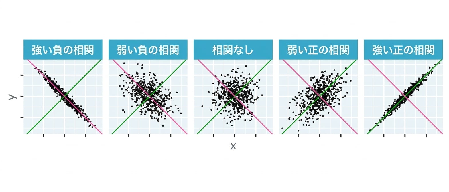
相関

点がどれだけ直線上に並ぶか?A scatter plot of correlations for theoretical pairs of x and y coordinates.

データ可視化への理解

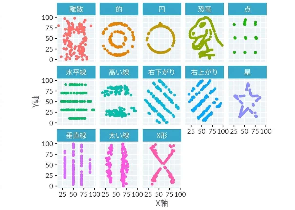
相関が役に立たないこともある

Scatter plots of the 13 datasets in the Dinosaurus Dozen. Each dataset looks very different to the others.

データ可視化への理解

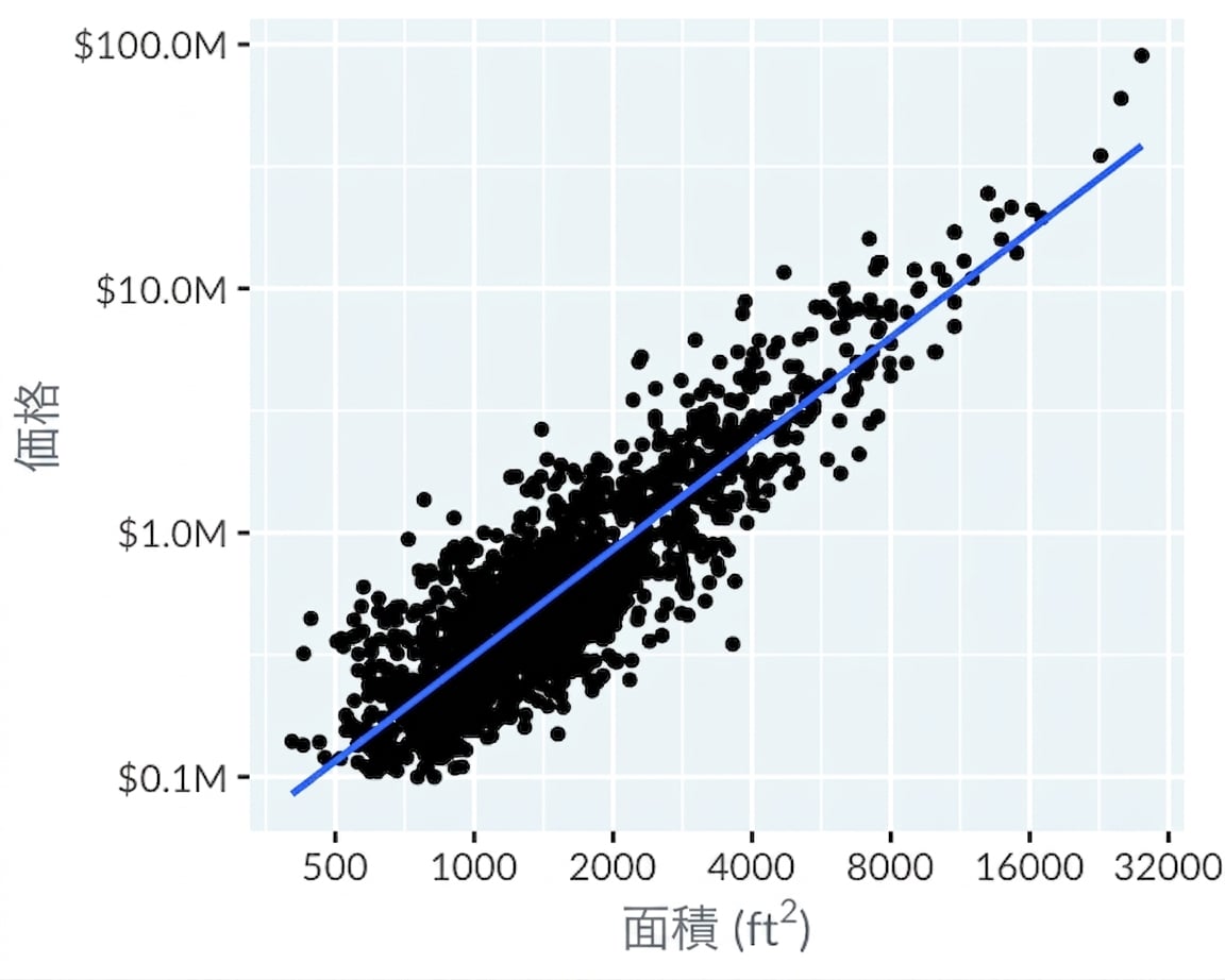
傾向線を追加

A scatter plot of Los Angeles home prices versus their area, using logarithmic scales on the x and y axes. A linear trend line has been added, which is a good fit.

データ可視化への理解

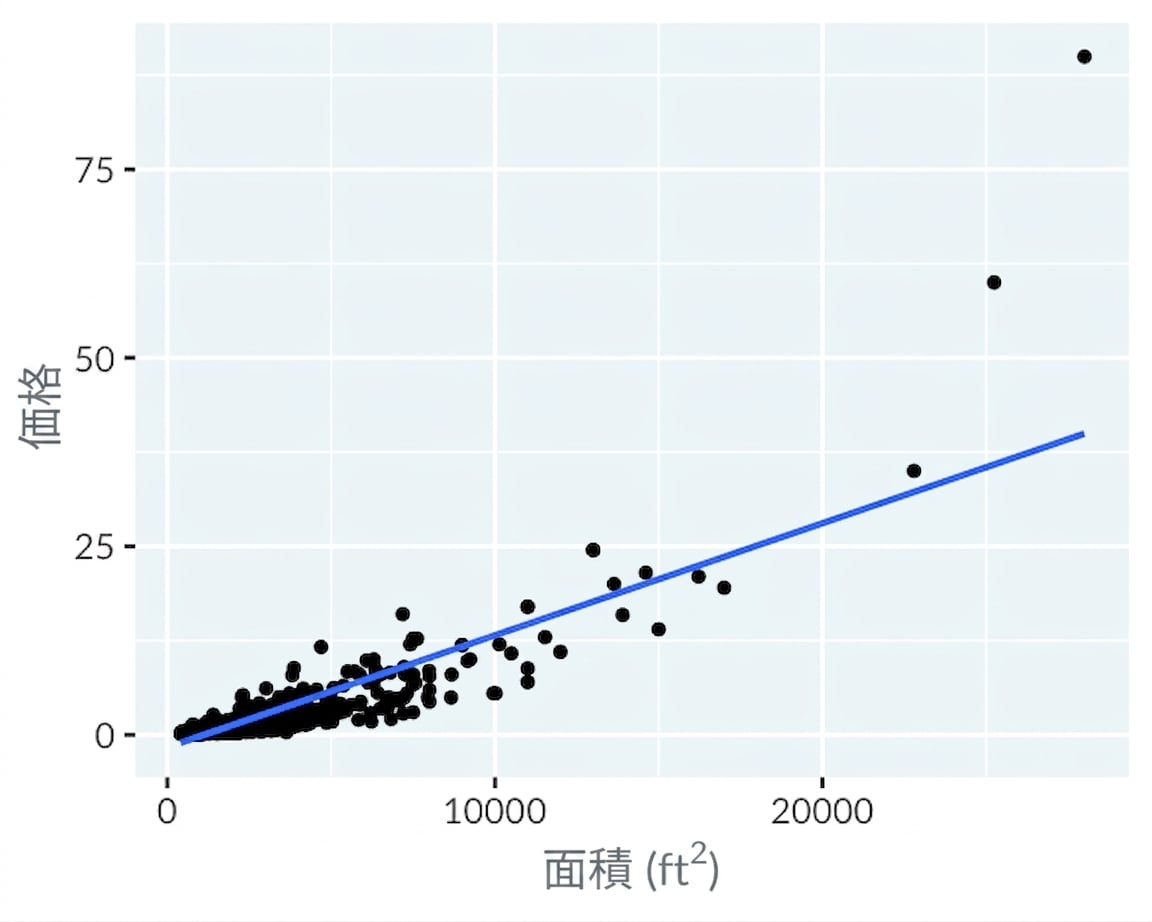
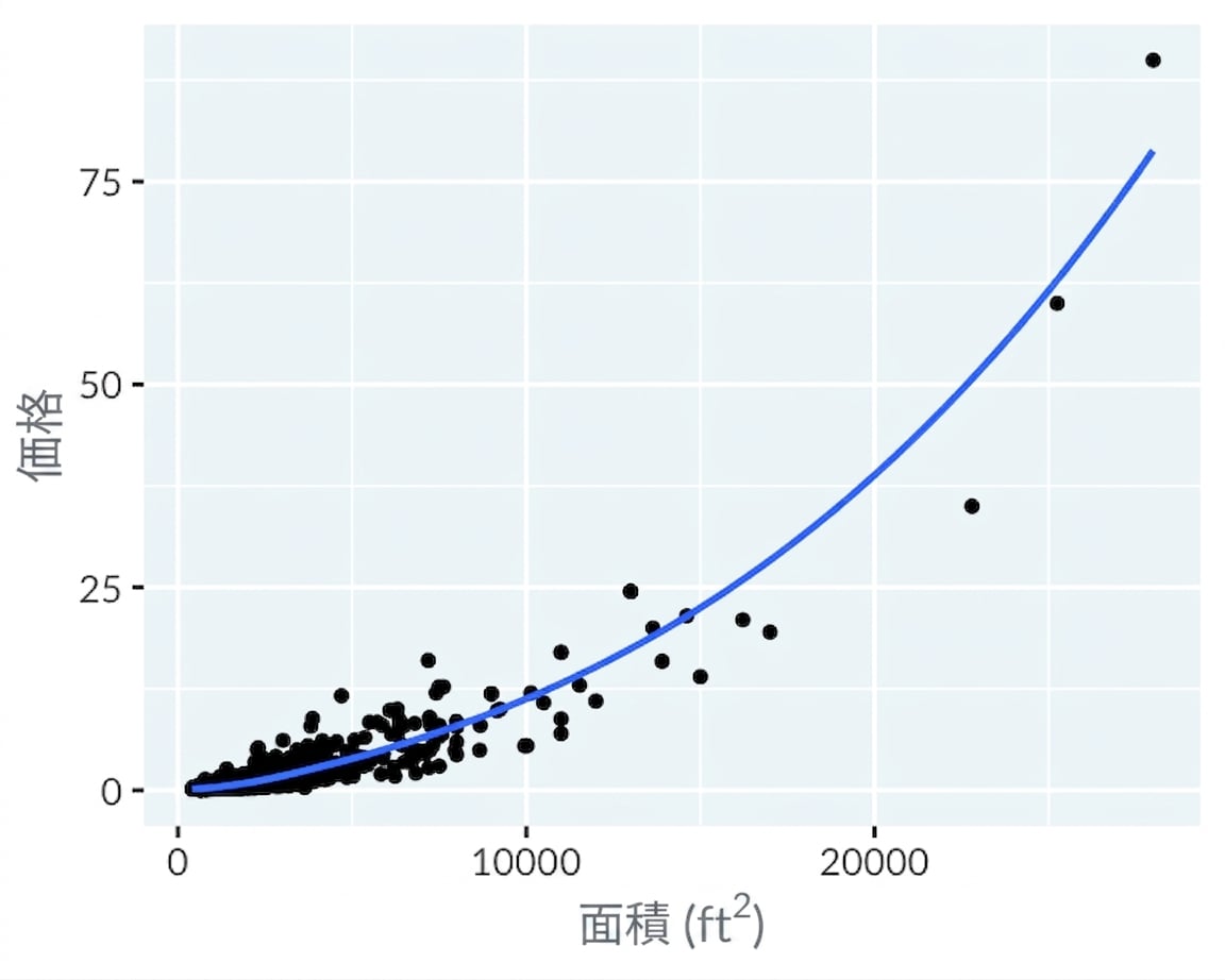
緩やかな傾向線の追加

A scatter plot of Los Angeles home prices versus their area, using linear scales on the x and y axes. A linear trend line has been added, which is a poor fit.

A scatter plot of Los Angeles home prices versus their area, using linear scales on the x and y axes. A LOESS trend line has been added, which is a good fit.

データ可視化への理解

練習しましょう!

データ可視化への理解

Preparing Video For Download...