高次元データ

データ可視化への理解

Richie Cotton

Data Evangelist at DataCamp

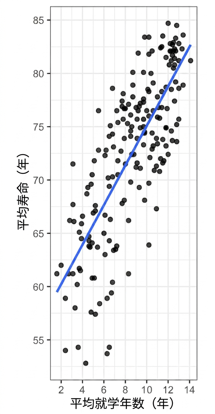
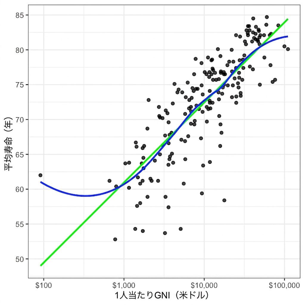
国連の平均寿命散布図

A scatter plot of average life expectancy versus average length of schooling, with a linear trend line.

A scatter plot of average life expectancy versus gross national income per capita, with linear and LOESS trend lines.

データ可視化への理解

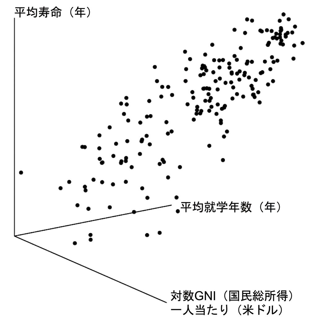
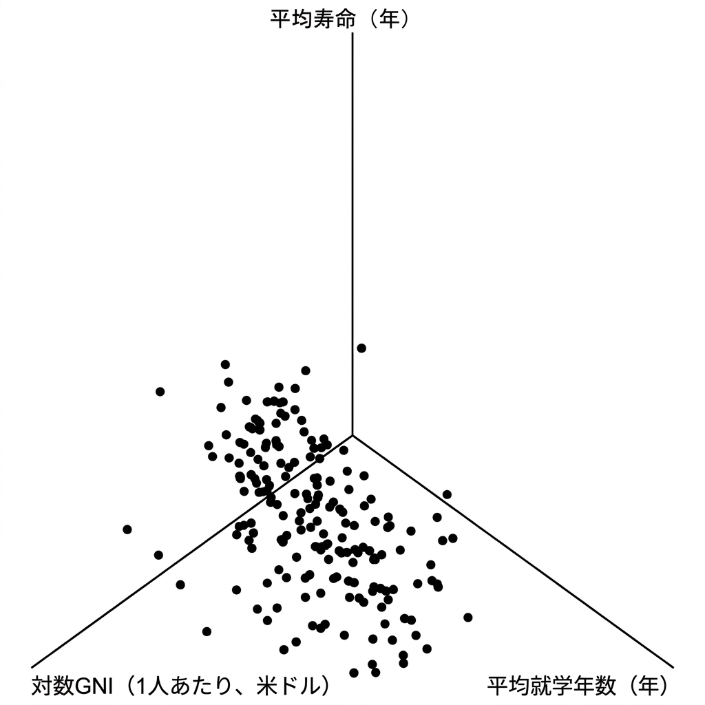
3D散布図

A 3D scatter plot of life expectancy versus gross national income and length of schooling. It's a mess.

Another 3D scatter plot of life expectancy versus gross national income and length of schooling, from a different perspective. It's also a mess.

データ可視化への理解

xとyだけがすべてではない

点の設定

  • サイズ
  • 透明度
  • 形状
データ可視化への理解

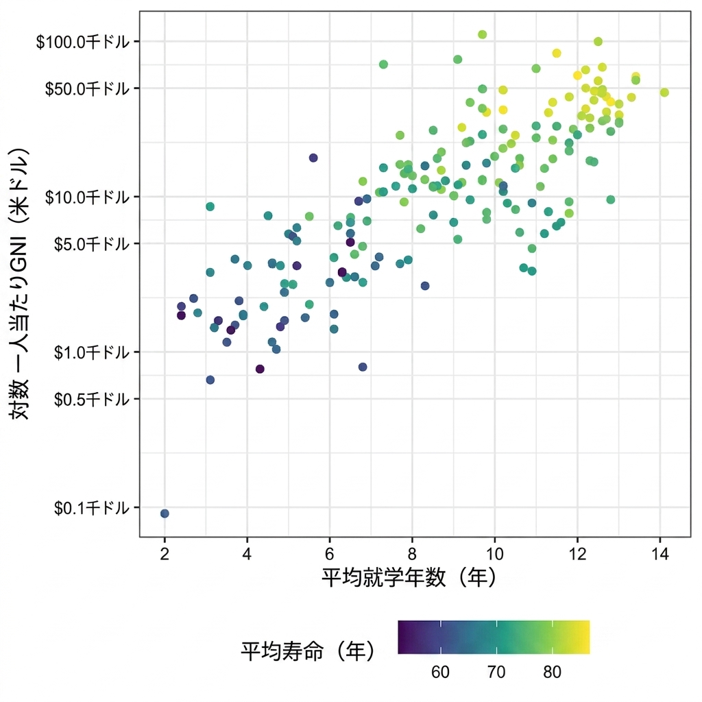
Scatter plot of life expectancy versus GNI with life expectancy as a color axis

データ可視化への理解

サイズ

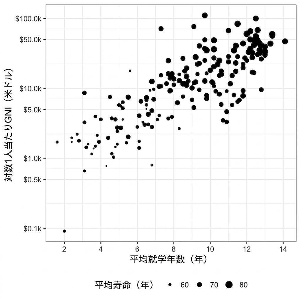
Scatter plot of life expectancy versus GNI with life expectancy represented by size

データ可視化への理解

透明度

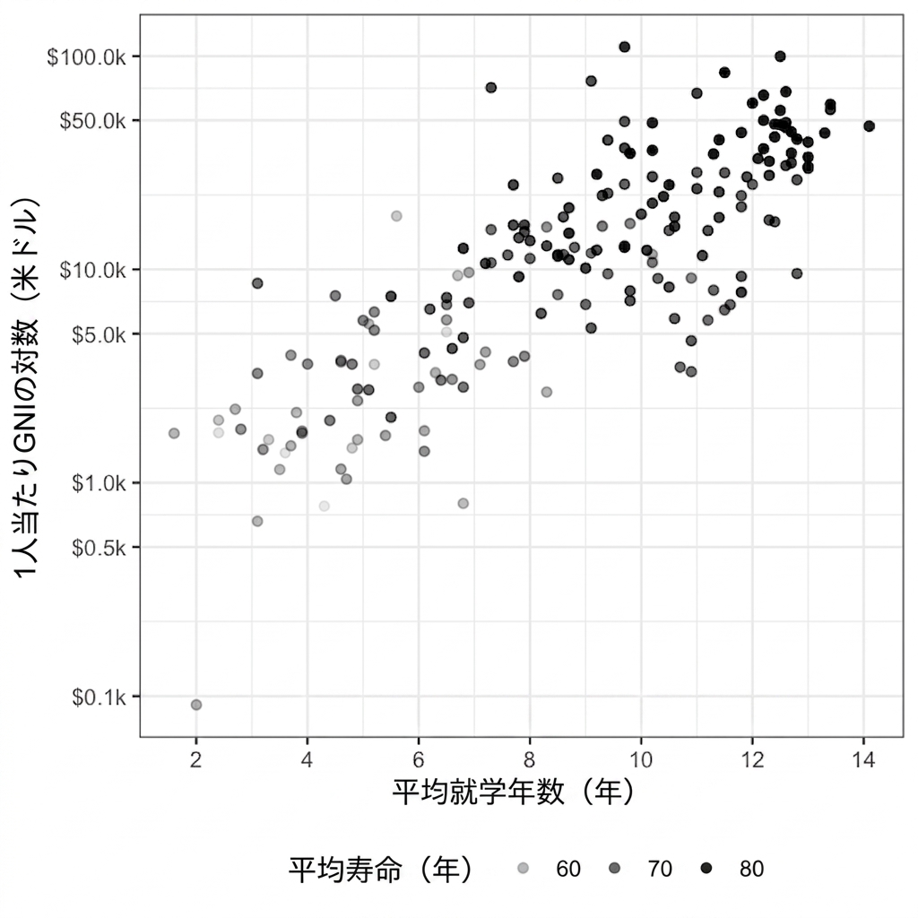
Scatter plot of life expectancy versus GNI with life expectancy represented by transparency

データ可視化への理解

形状

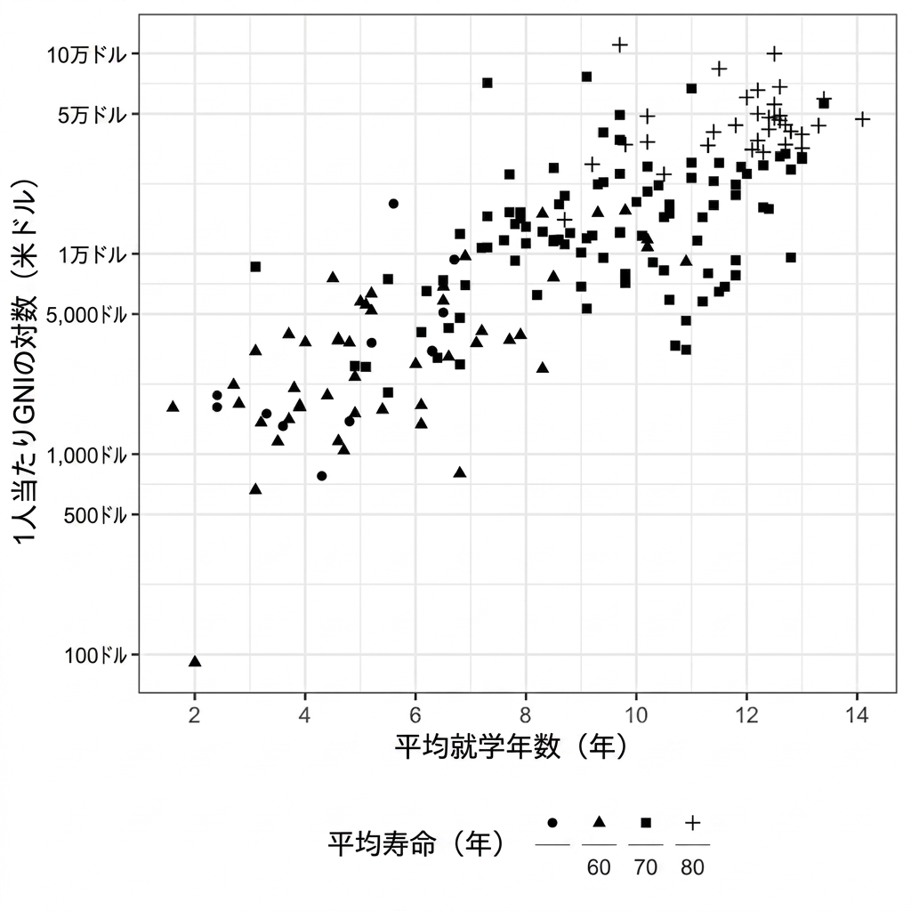
Scatter plot of life expectancy versus GNI with life expectancy represented by shape

データ可視化への理解

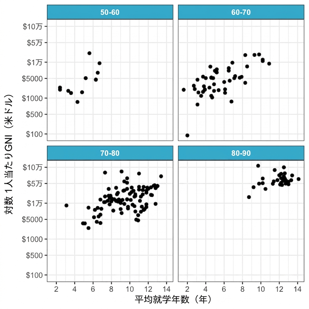
複数のパネル

Scatter plot of life expectancy versus GNI divided into panels by life expectancy

データ可視化への理解

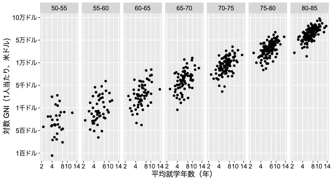
さらに多くのパネル

Scatter plot of life expectancy versus GNI divided into panels by life expectancy with age range of 5

データ可視化への理解

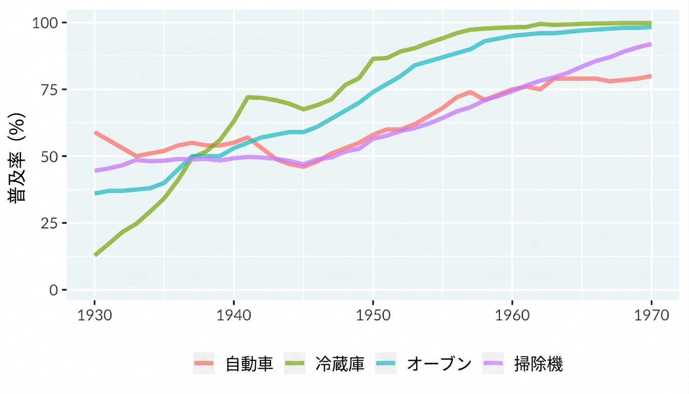
折れ線グラフの要素

  • 太さ
  • 透明度
  • 線種(実線、破線、点線)
データ可視化への理解

A line plot of technology adoption by households in the United States. The x-axis runs from 1930 to 1970, and the y-axis runs from 0 to 100 percent. There are four lines representing adoption of automobiles, refrigerators, stoves, and vacuums.

データ可視化への理解

線種

A line plot of technology adoption using linetype to distinguish technology type

データ可視化への理解

練習しましょう!

データ可視化への理解

Preparing Video For Download...