軸のトリック

データ可視化への理解

Richie Cotton

Data Evangelist at DataCamp

棒の長さの錯覚
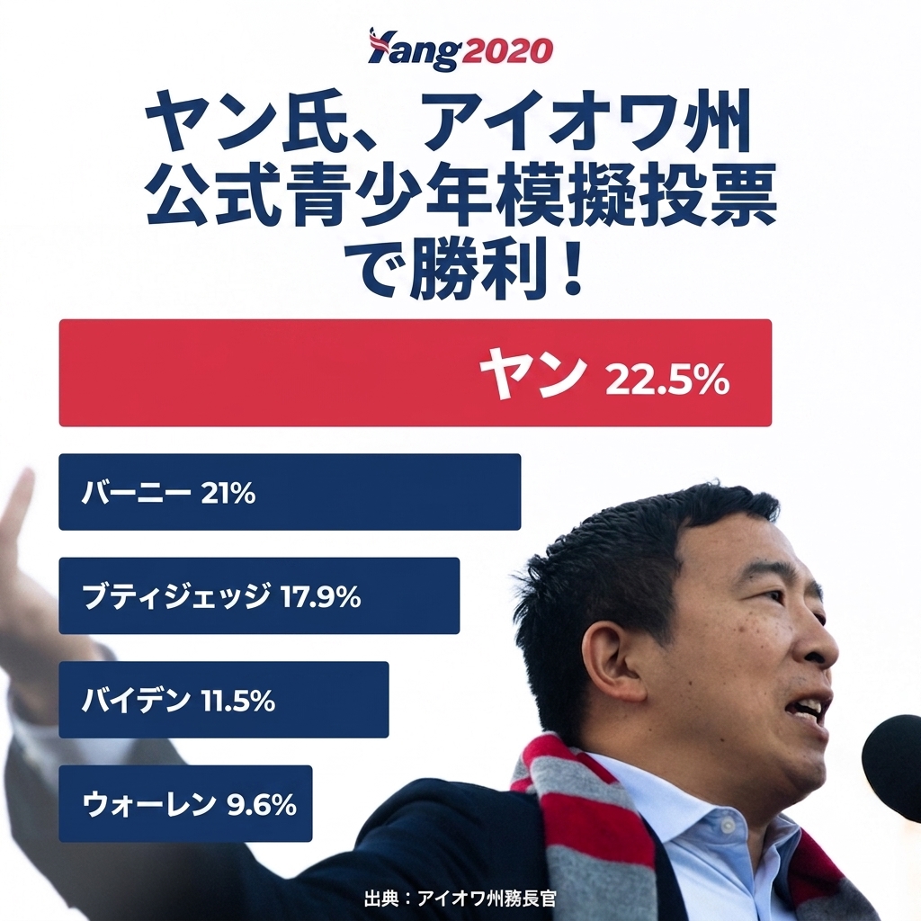
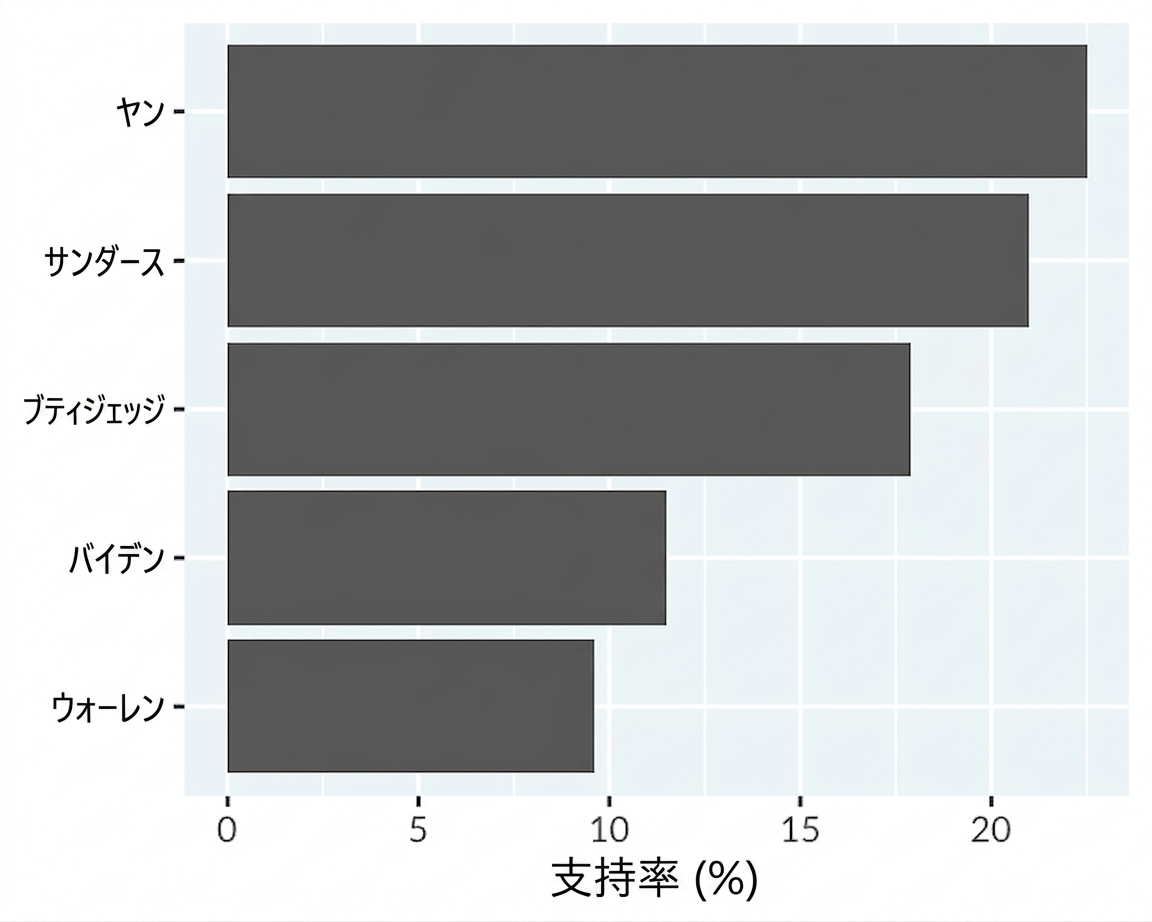
A promotional poster from a political campaign by Andrew Yang, containing a bar plot. The lengths of the bars are not proportional to the numbers shown on the bars.

The Yang bar plot has been redrawn with proportional bars, showing a smaller lead over the second place contestant.

1 https://www.reddit.com/r/dataisugly/comments/exewcc/thats_quite_a_large_15
データ可視化への理解

積み上げ棒グラフの錯覚

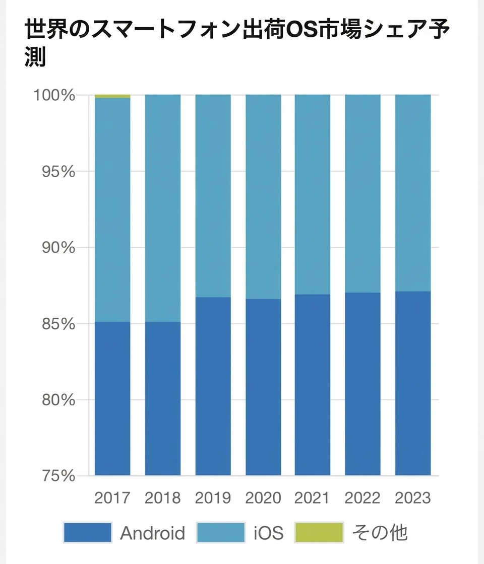
A stacked bar plot from a marketing company showing predictions of the market share for each mobile phone operating system. The y-axis starts at 75% instead of zero.

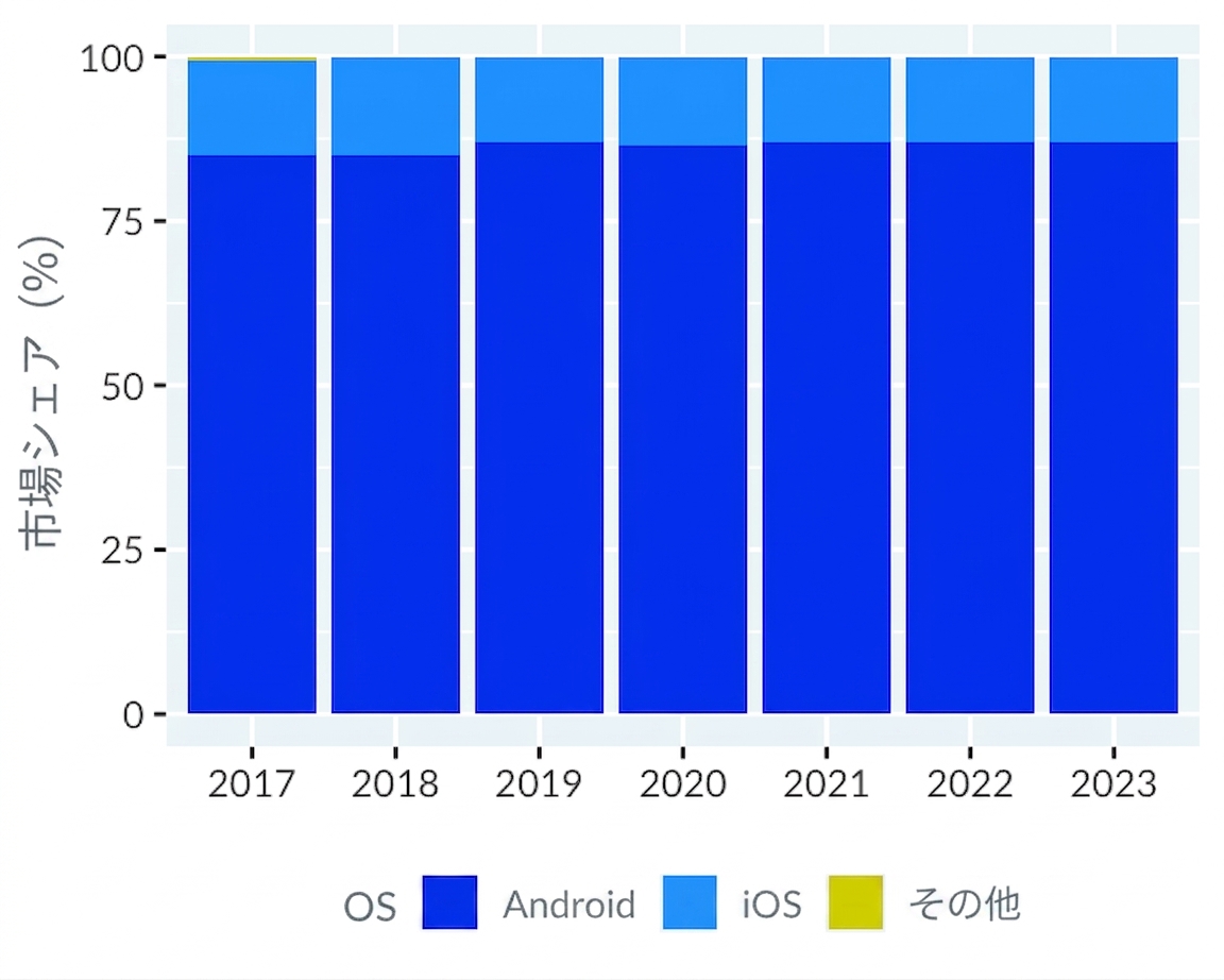
The mobile phone operating systems, redrawn with a y-axis starting from zero. It more clearly displays the popularity of Android.

1 https://www.reddit.com/r/dataisugly/comments/d76ixt/lets_make_13_vs_87_market_share_look_like_5050
データ可視化への理解

誤解を招く二重軸

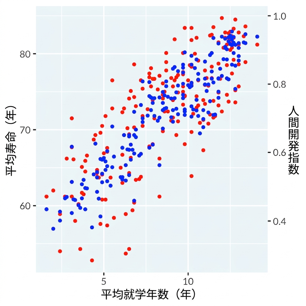
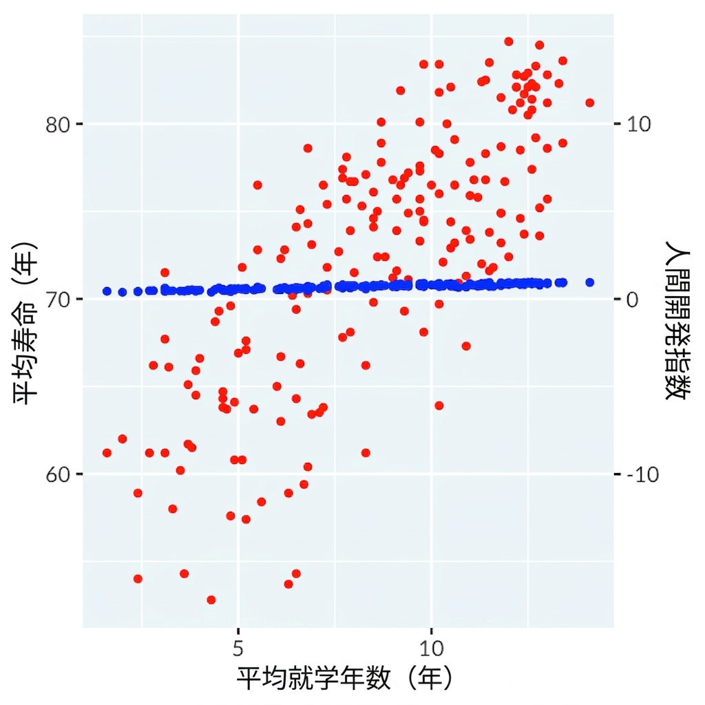
Scatter plot of length of schooling with dual axes of life expectancy and human development index

Scatter plot of length of schooling with dual axes of life expectancy and human development index showing no correlation with adjusted axes

データ可視化への理解

複数のパネルを使う

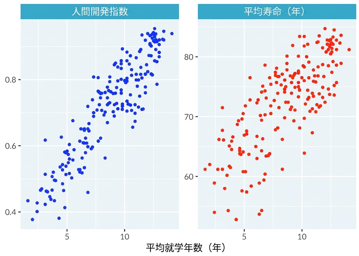
Scatter plot of length of schooling separated by two panels for human development index and life expectancy

データ可視化への理解

練習しましょう!

データ可視化への理解

Preparing Video For Download...