コース修了です!

データ可視化への理解

Richie Cotton

Data Evangelist at DataCamp

ヒストグラム: 分布の表示
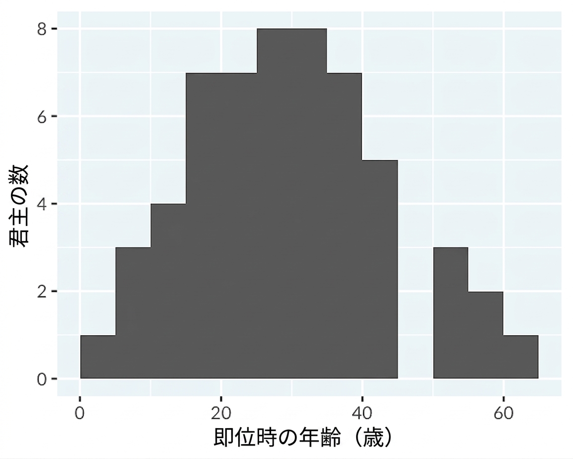
Histogram of the age of ascension of English and British monarchs.

データ可視化への理解

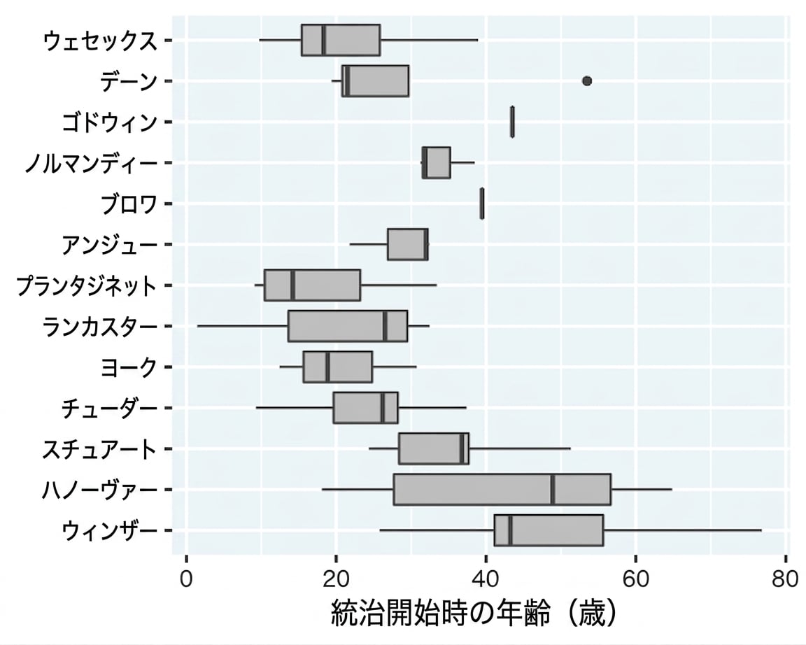
箱ひげ図: 一度に複数の分布の表示

Box plots of the age of start of rule of kings and queens, one for each royal house.

データ可視化への理解

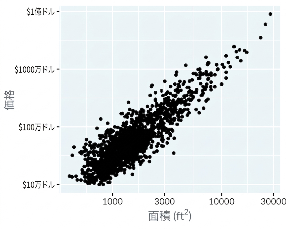
散布図: 2つの数値変数の比較

Scatter plot of LA home prices versus area

データ可視化への理解

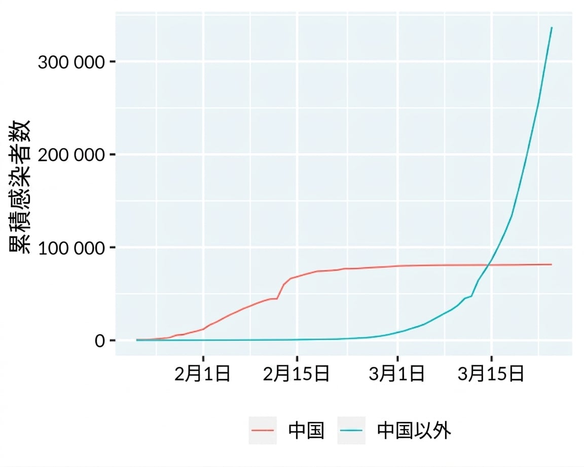
折れ線グラフ:時間経過に伴う傾向の表示

Line plot of COVID-19 cases in China and outside of China

データ可視化への理解

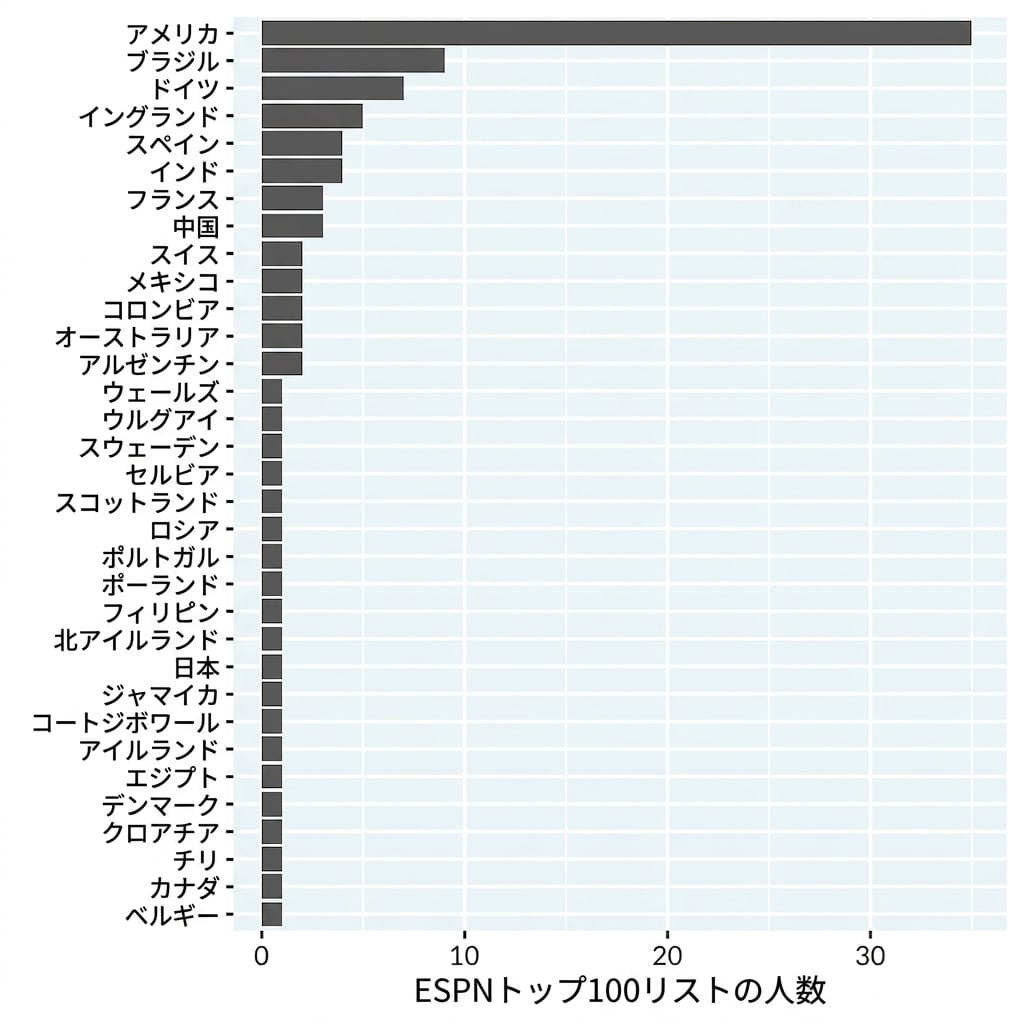
棒グラフ: カテゴリ別の件数の表示

Bar plot of famous athletes by country

データ可視化への理解

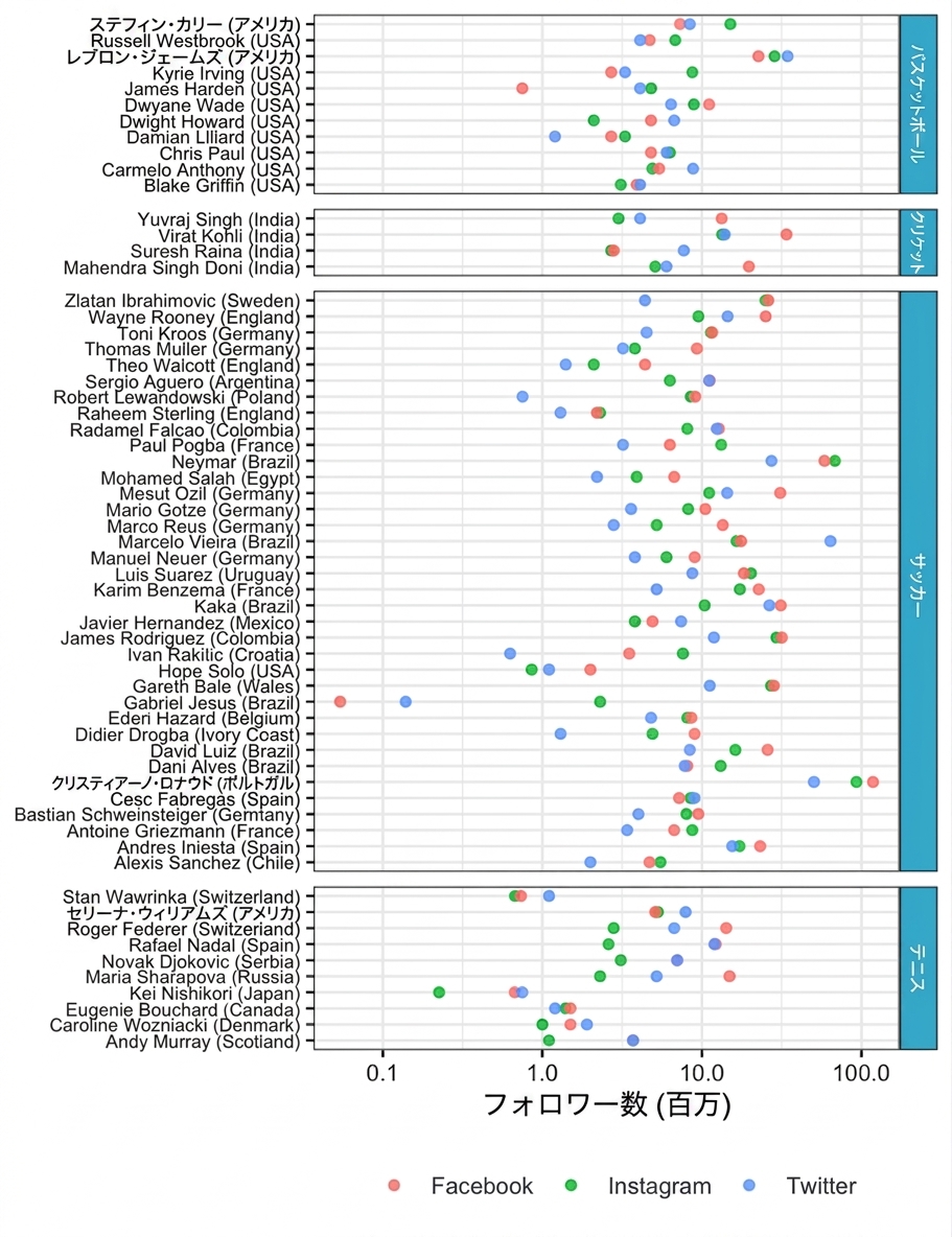
ドットプロット: カテゴリ別に対数スケールの指標を表示

Dot plot of famous athletes by country

データ可視化への理解

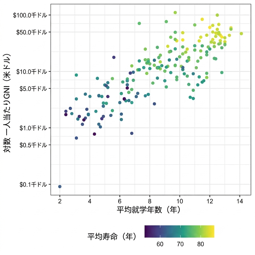
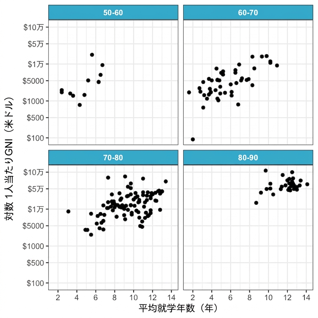
高次元データ

Scatter plot of length of schooling versus GNI in log scale with life expectancy represented as color

Scatter plot of length of schooling versus GNI in log scale split into panels for life expectancy

データ可視化への理解

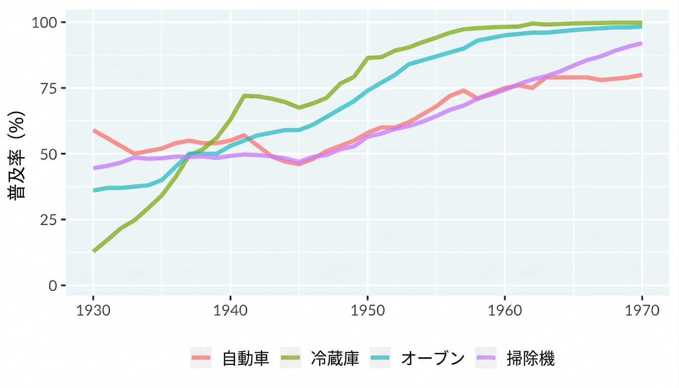
3種類のカラースケール

A line plot of technology adoption by households in the United States. The x-axis runs from 1930 to 1970, and the y-axis runs from 0 to 100 percent. There are four lines representing adoption of automobiles, refrigerators, stoves, and vacuums.

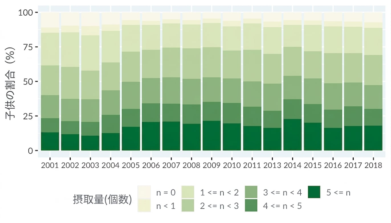
Stacked bar plot of vegetable and fruit consumption by year

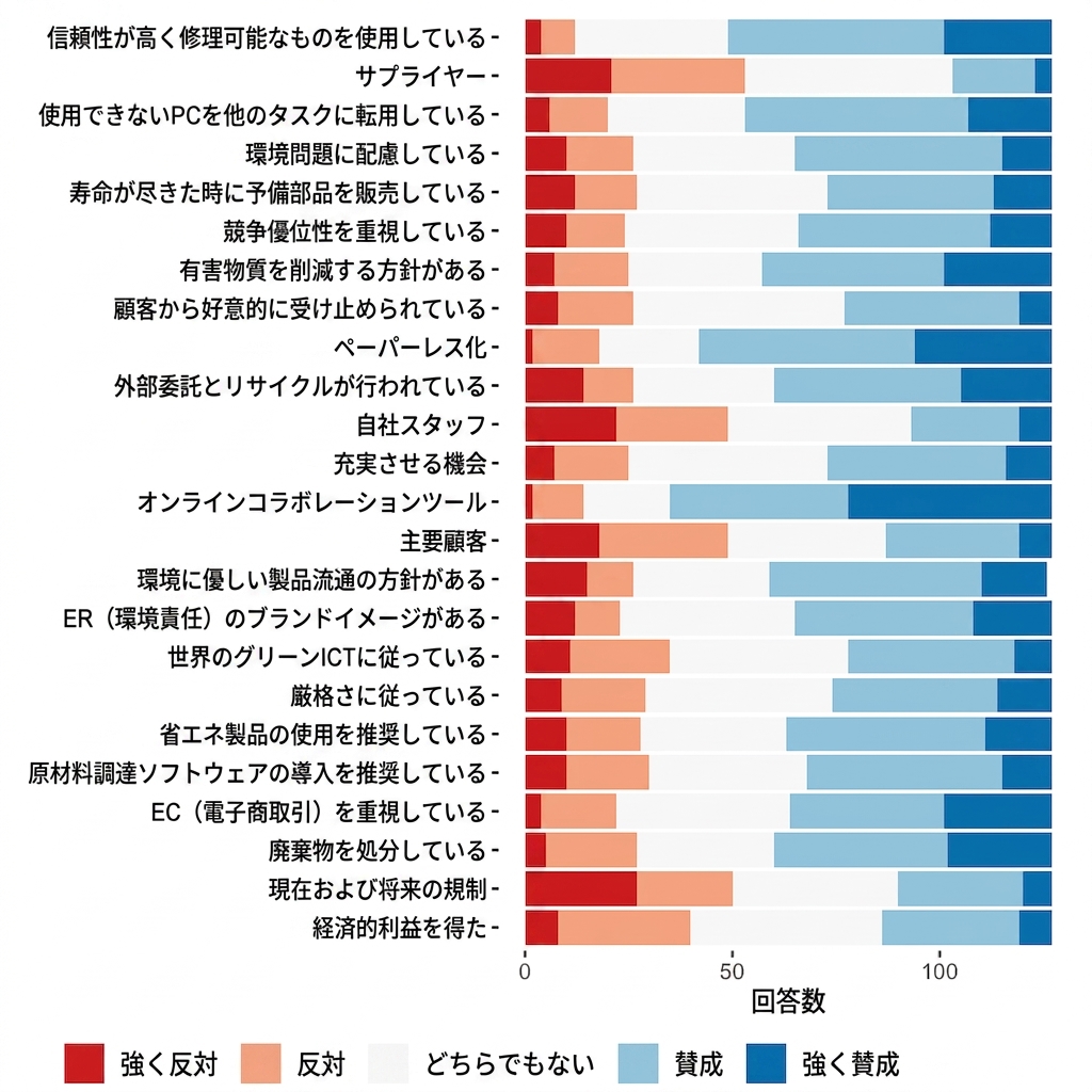
Bar plot of likert survey using a diverging color scale

データ可視化への理解

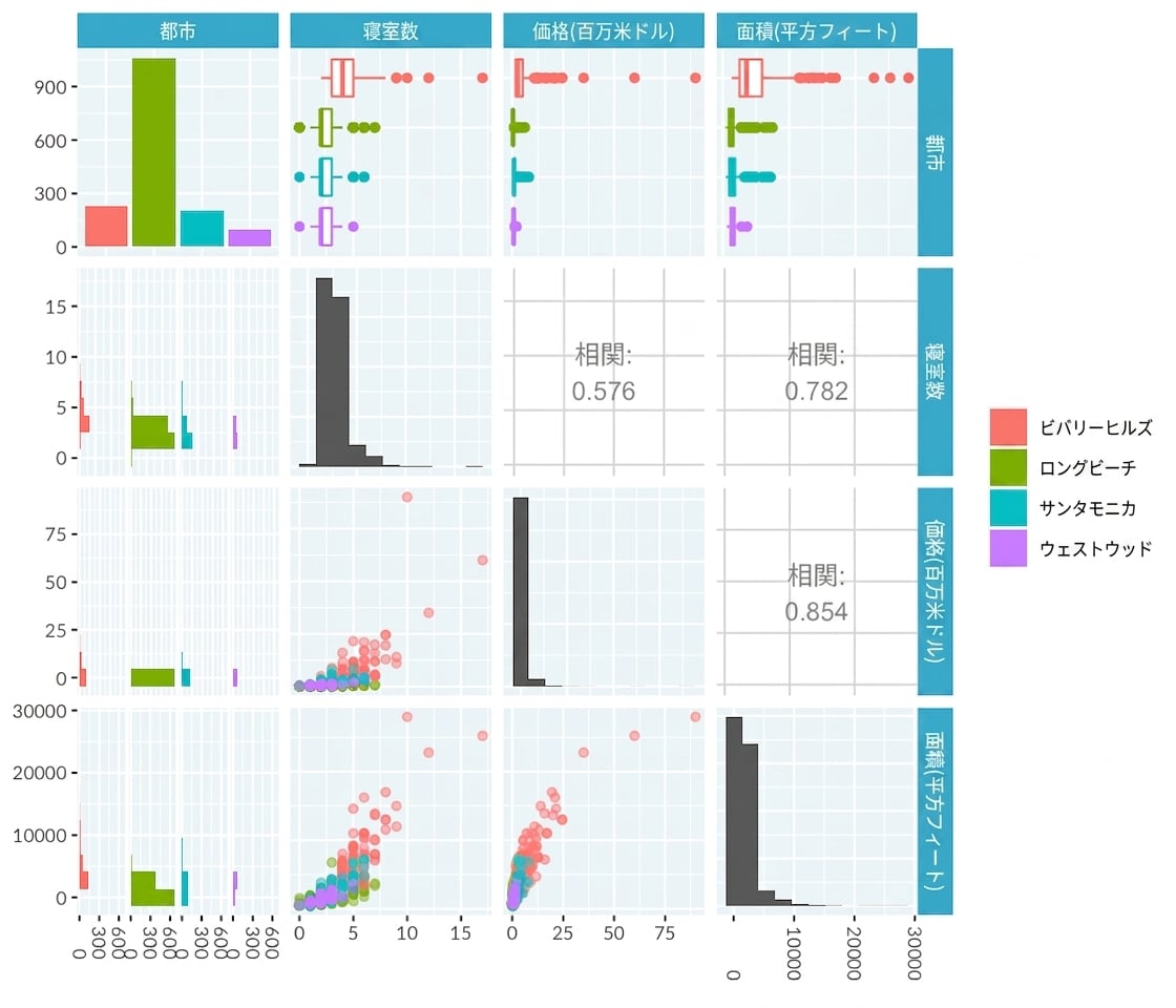
散布図行列: 複数の変数の比較

Pair plot for LA home dataset

データ可視化への理解

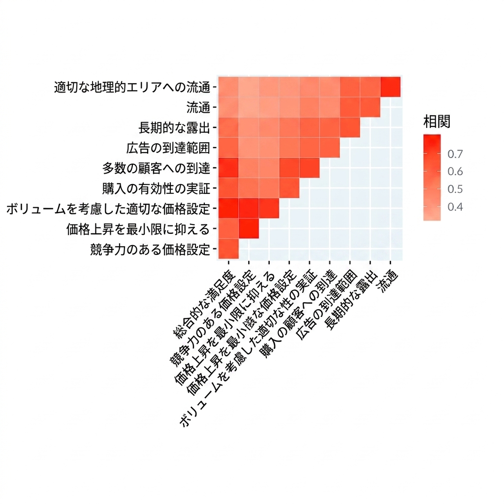
相関ヒートマップ: 関連しあう変数の表示

Correlation heatmap of product satisfaction survey

データ可視化への理解

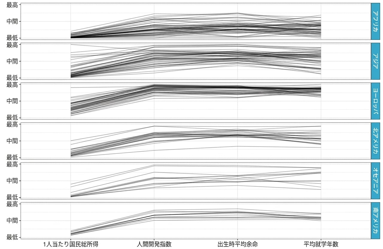
並行座標プロット: 変数間のパターンの発見

Parallel coordinates of country metrics from UN dataset separated by continent

データ可視化への理解

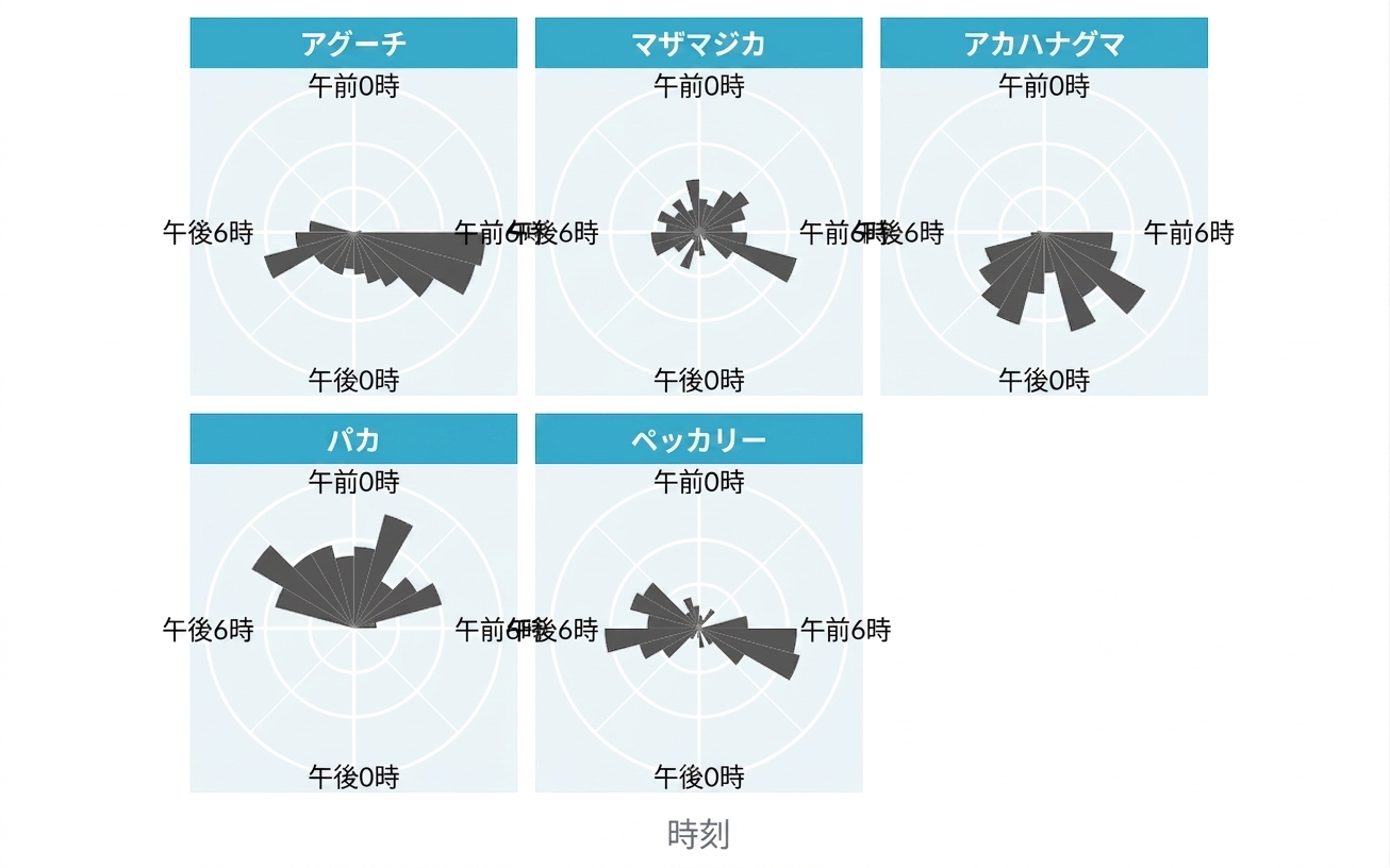
ローズチャート: 周期的な分布の表示

Rose plot of animal activity at different hours

データ可視化への理解

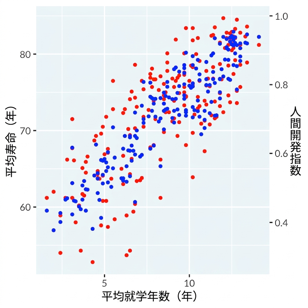
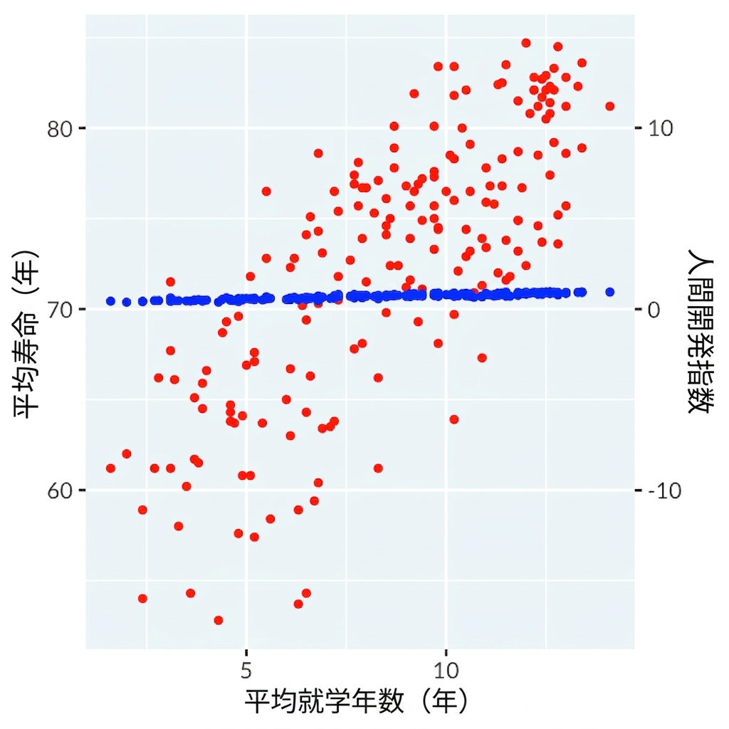
二重軸は悪手

Scatter plot of length of schooling versus dual axes for life expectancy and human development index showing a fake correlation due to misleading axes

Scatter plot of length of schooling versus dual axes for life expectancy and the human development index with adjusted axes showing little correlation

データ可視化への理解

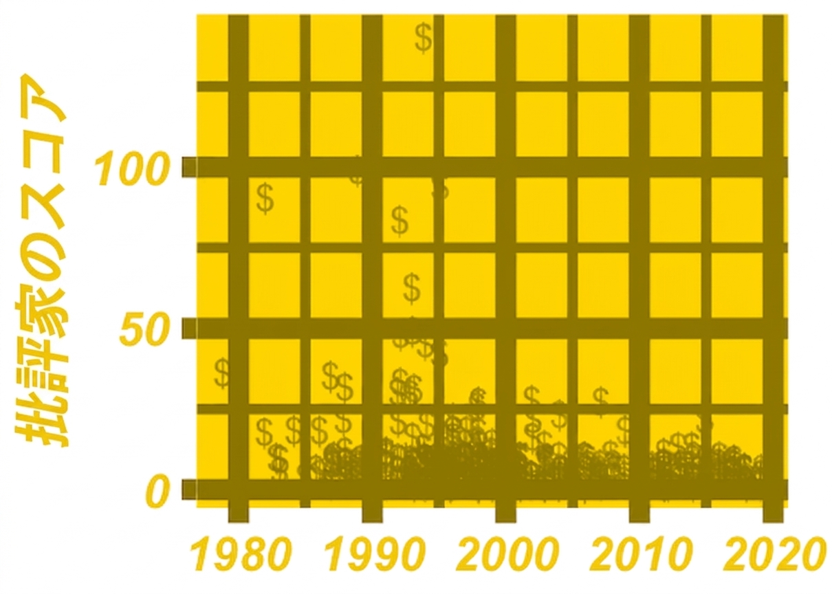
チャートジャンクの排除

Scatter plot of critic scores of hip-hop songs by year with chartjunk

データ可視化への理解

次のステップ

データ可視化への理解

修了おめでとうございます!

データ可視化への理解

Preparing Video For Download...