複数の変数を同時にプロットする

データ可視化への理解

Richie Cotton

Data Evangelist

散布図行列はどんなときに使うべきか?

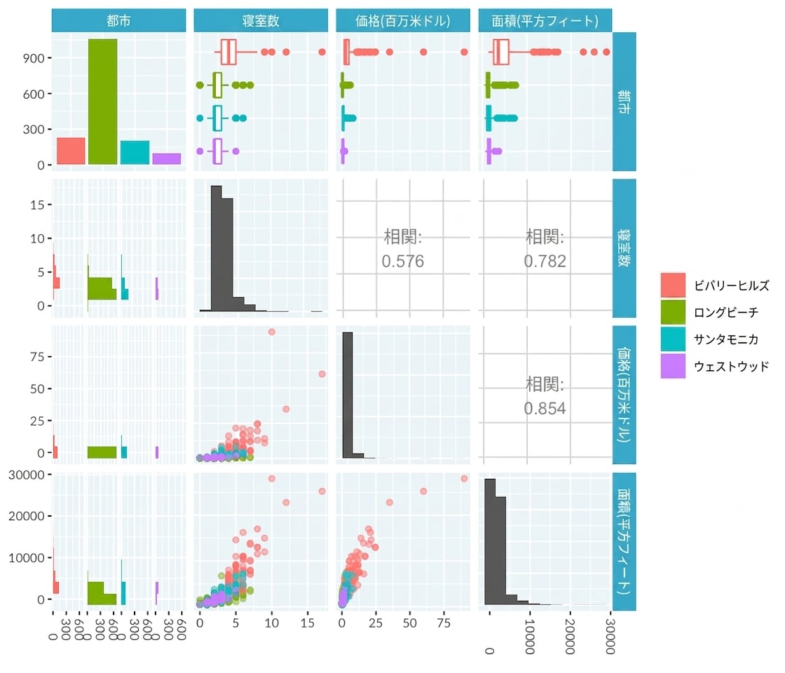
  • 最大10個までの変数(連続変数、カテゴリ変数、またはその両方)があるとき
  • 各変数の分布を見たいとき
  • 各変数ペアの関係を見たいとき
データ可視化への理解

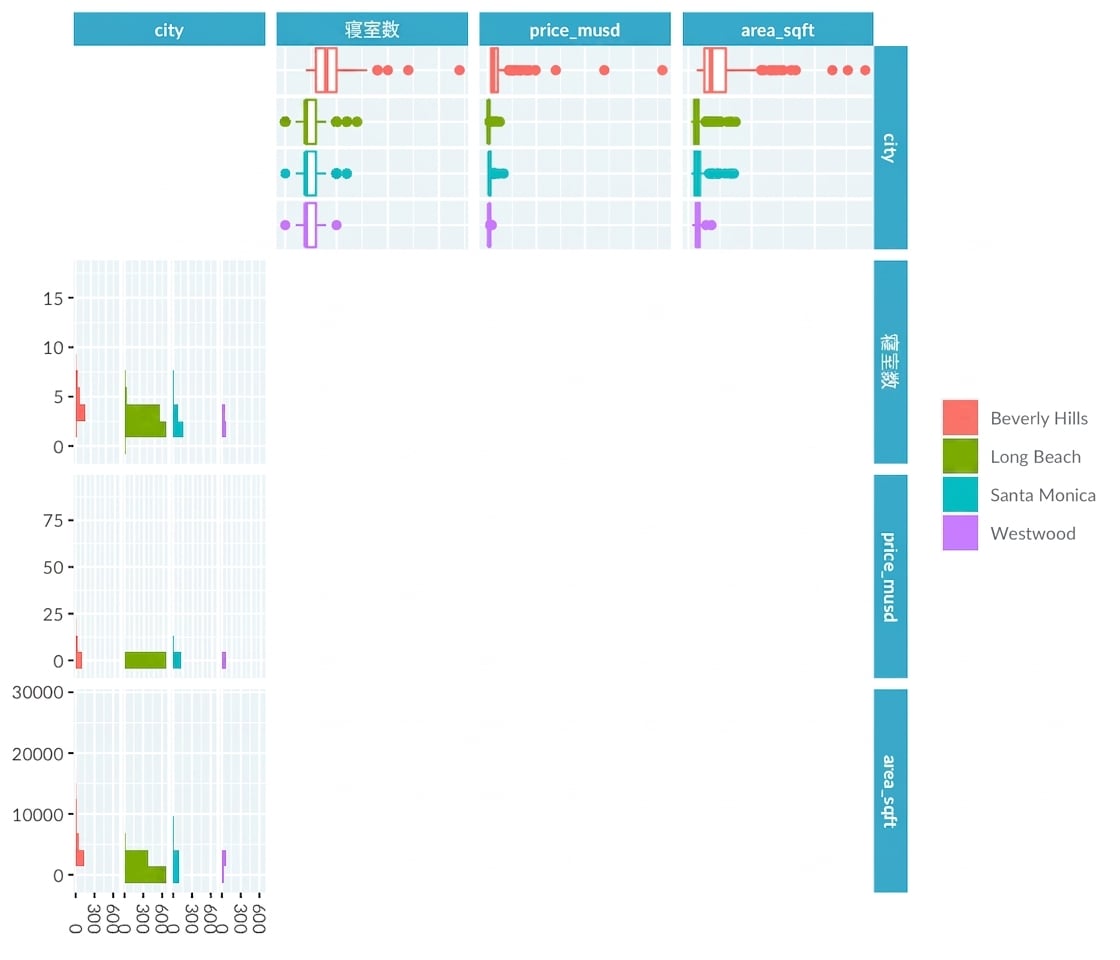
Pair plot of LA home prices

データ可視化への理解

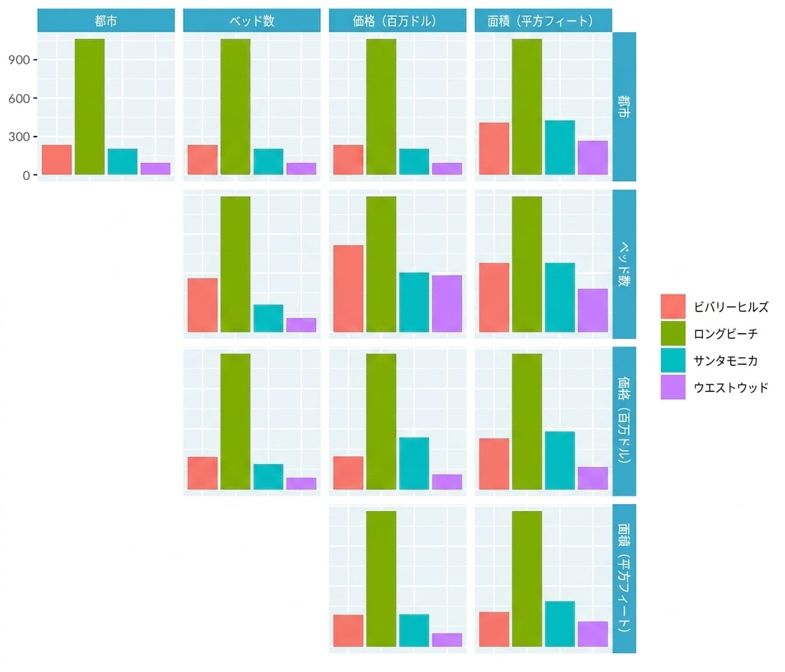
Pair plot of LA home prices only showing distribution of cities

データ可視化への理解

Pair plot of LA home prices only showing distribution of continuous variables

データ可視化への理解

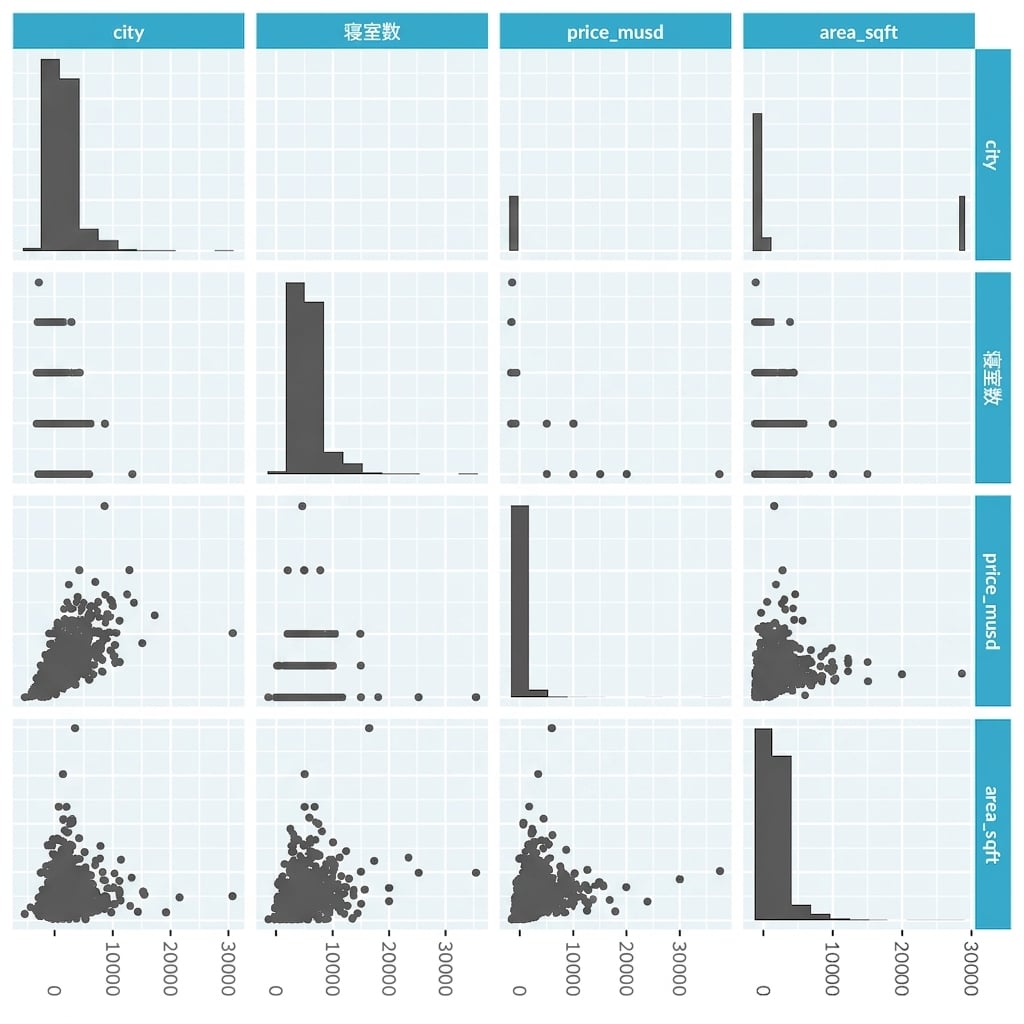
Pair plot of LA home prices only showing relationships between continuous variables

データ可視化への理解

Pair plot of LA home prices only showing relationships between continuous and categorical variables

データ可視化への理解

Pair plot of LA home prices

データ可視化への理解

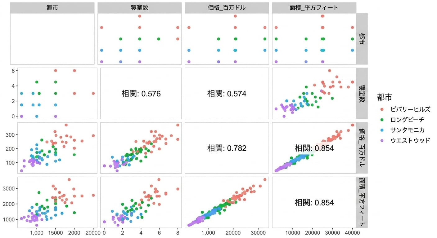
Pair plot of LA home prices only showing panels with correlation numbers

データ可視化への理解

相関ヒートマップはどんなときに使うべきか?

  • 連続変数がたくさんあるとき
  • 各変数ペアの関係の概要が知りたいとき
データ可視化への理解

Correlation heatmap of a customer satisfaction survey for a Yellow Pages advertising product

1 Rossi, Allenby, and McCulloch (2005). Bayesian Statistics & Marketing
データ可視化への理解

国連データセット再び

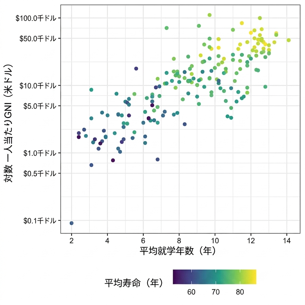
Scatter plot of length of schooling vs GNI with life expectancy represented as color

データ可視化への理解

並列座標プロットはどんなときに使うべきか?

  • 連続変数がたくさんあるとき
  • 変数間のパターンを見つけたいとき
  • 観測値のクラスターを可視化したいとき
データ可視化への理解

並行座標プロット

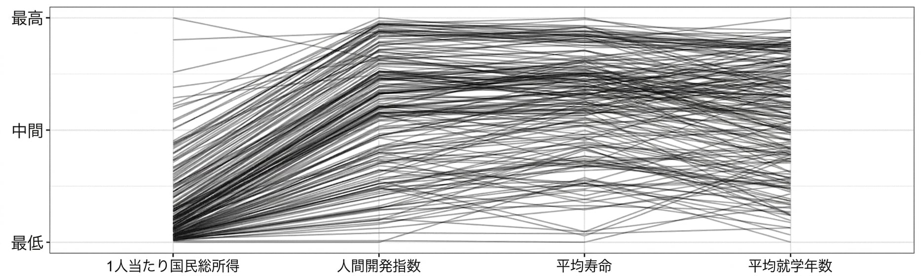
Parallel coordinates plot of GNI, human development index, life expectancy, and average length of schooling years

データ可視化への理解

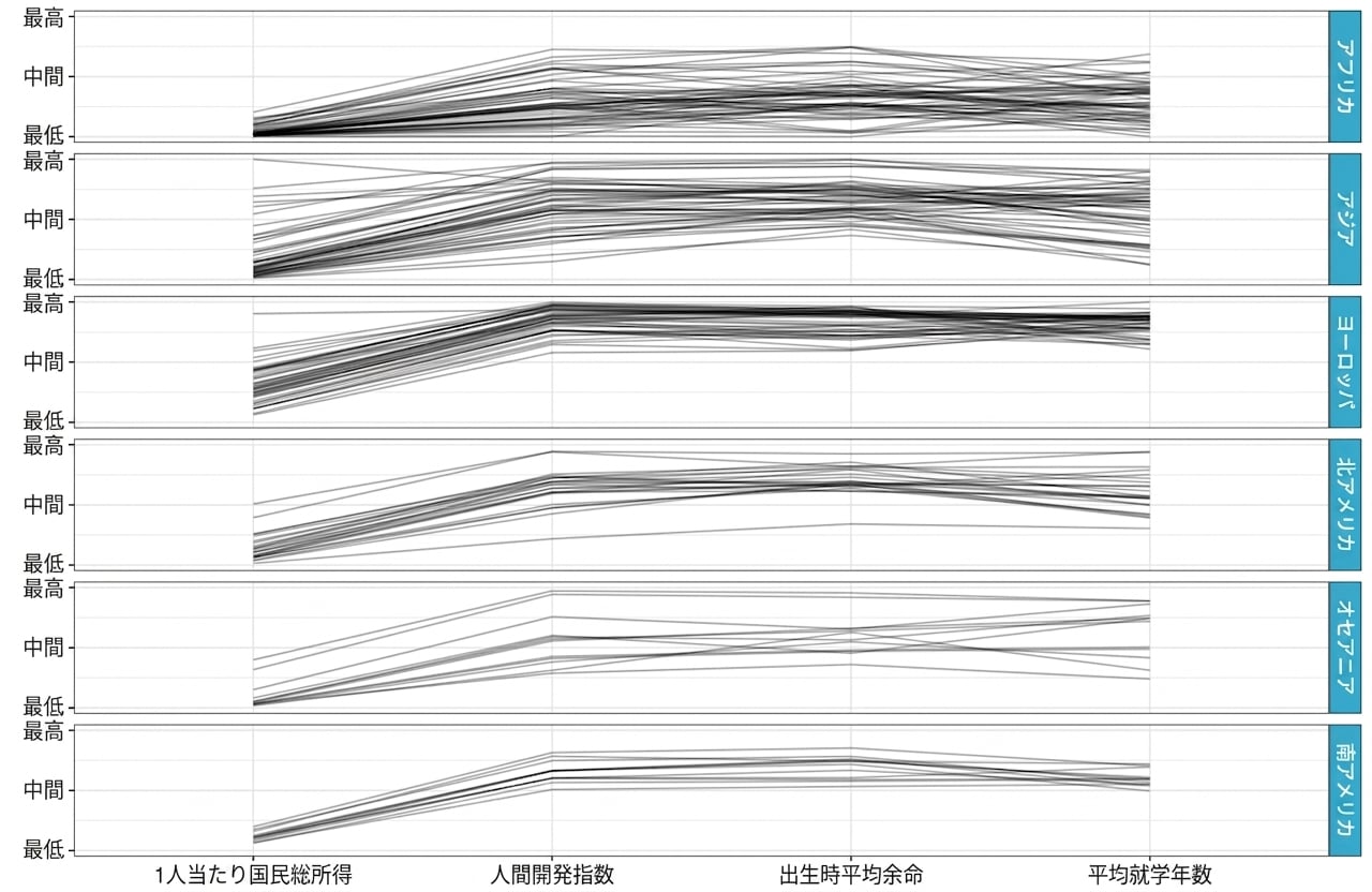
Parallel coordinates plot of GNI, human development index, life expectancy, and average length of schooling years, separated by continent

データ可視化への理解

練習しましょう!

データ可視化への理解

Preparing Video For Download...