情報過多なグラフ
データ可視化への理解

Richie Cotton
Data Evangelist at DataCamp
絵や写真
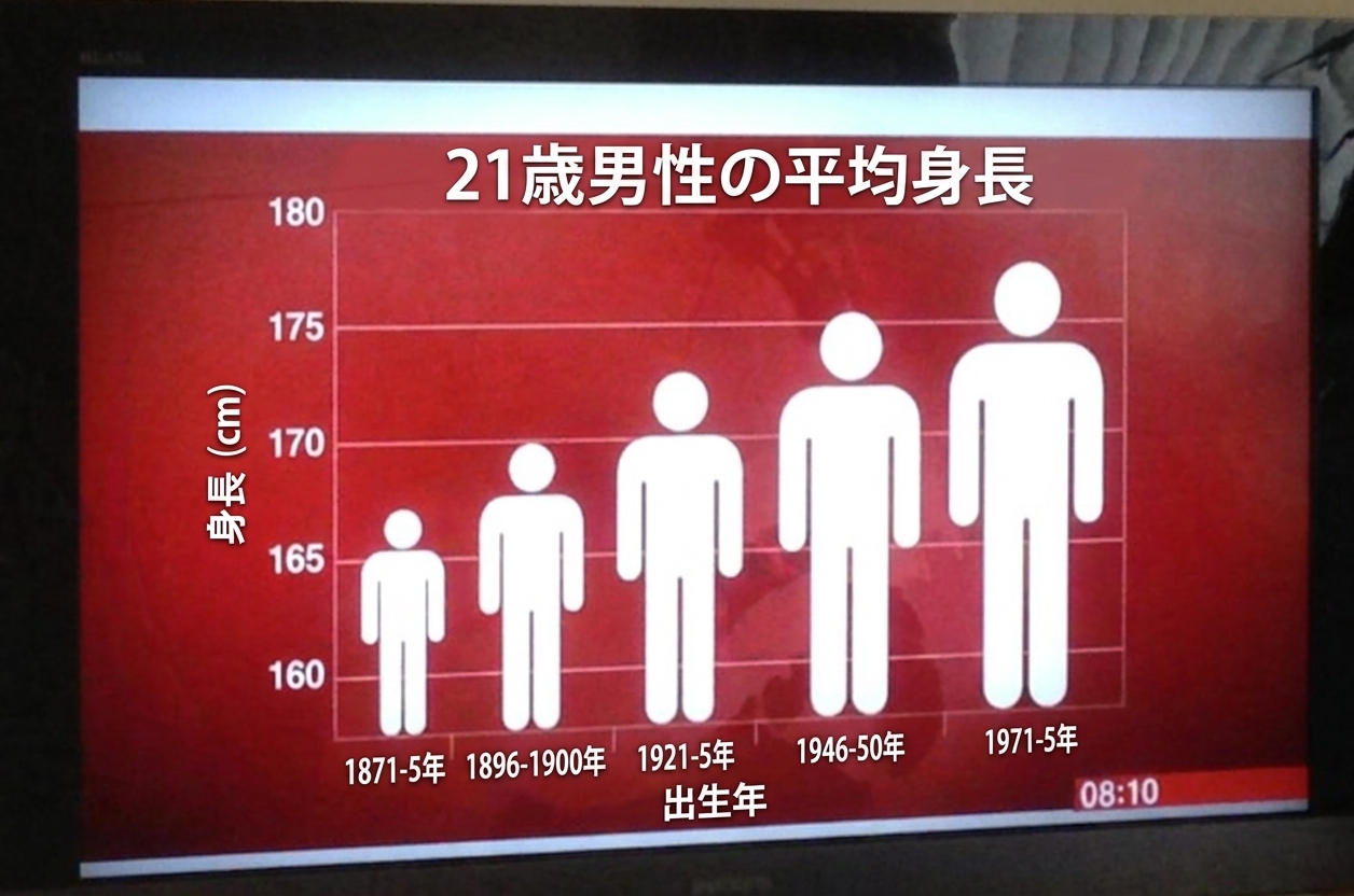
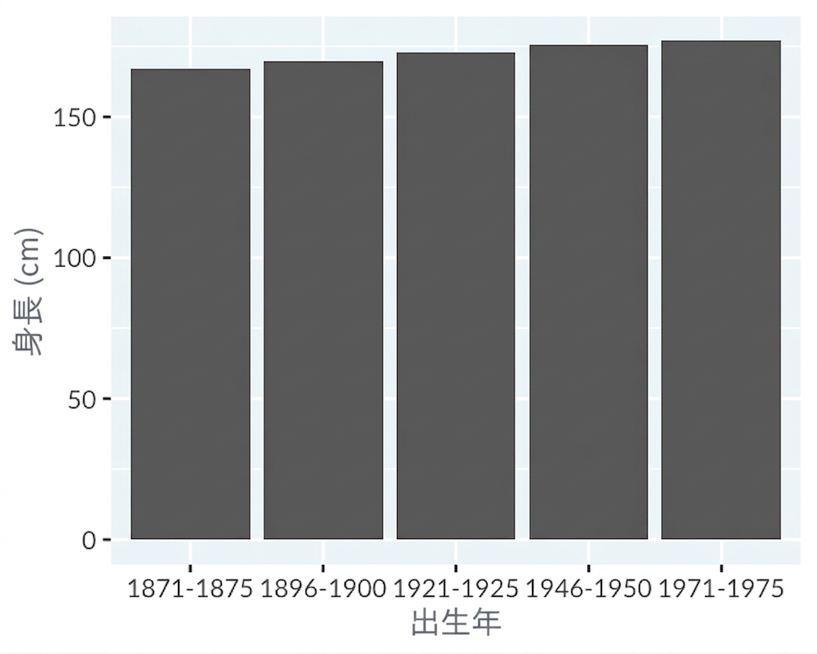
1 https://junkcharts.typepad.com/junk_charts/2013/09/the-incredibly-expanding-male.html
スキューモーフィズム
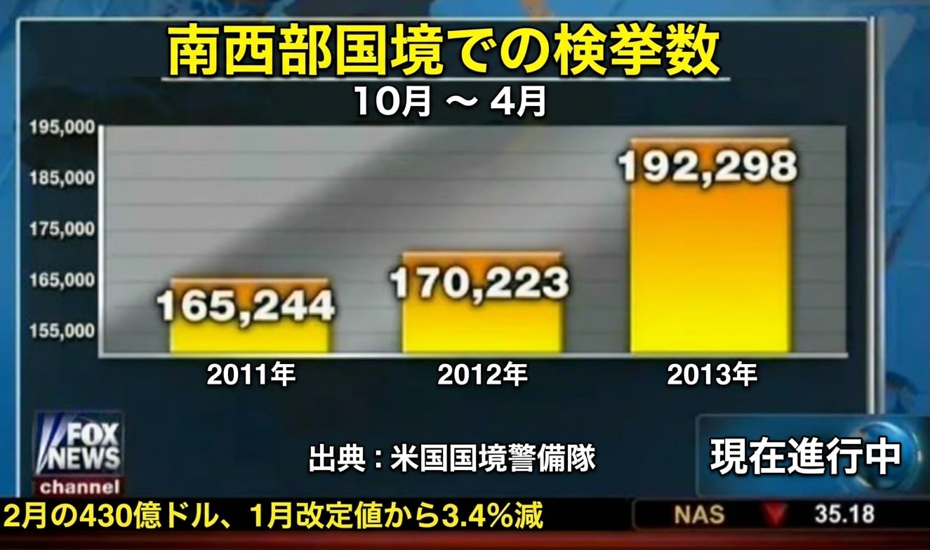
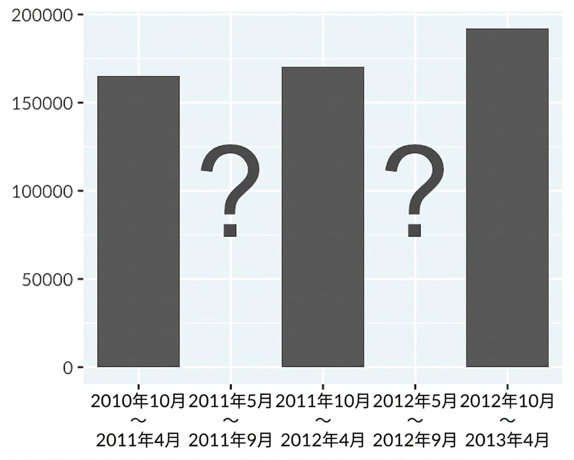
1 https://www.mediamatters.org/fox-news/fox-news-newest-dishonest-chart-immigration-enforcement
3D化
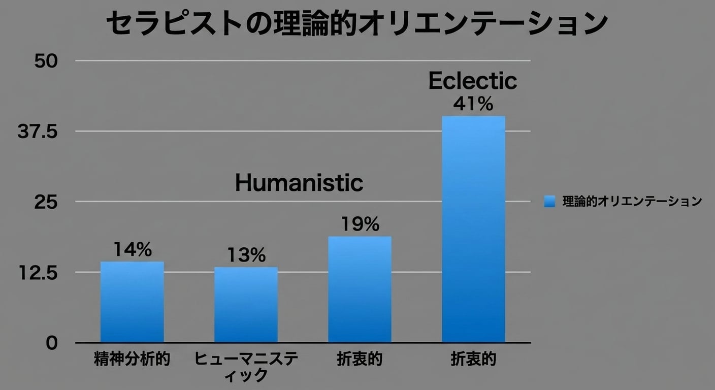
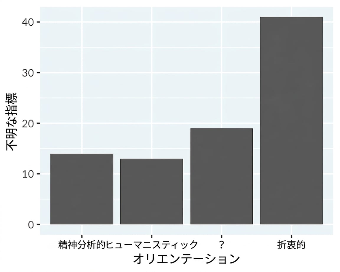
1 https://www.reddit.com/r/dataisugly/comments/dh6yra/an_actual_graph_presented_in_my_psychology
派手な色と線
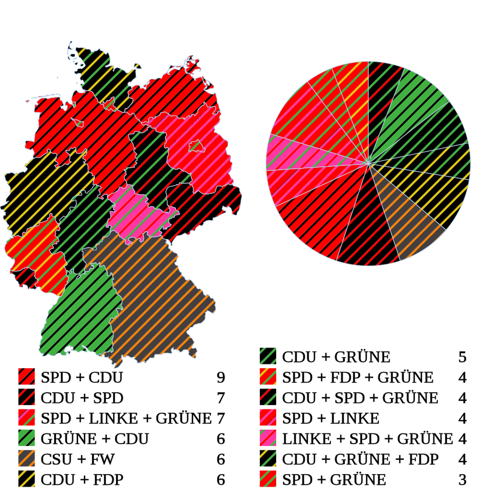
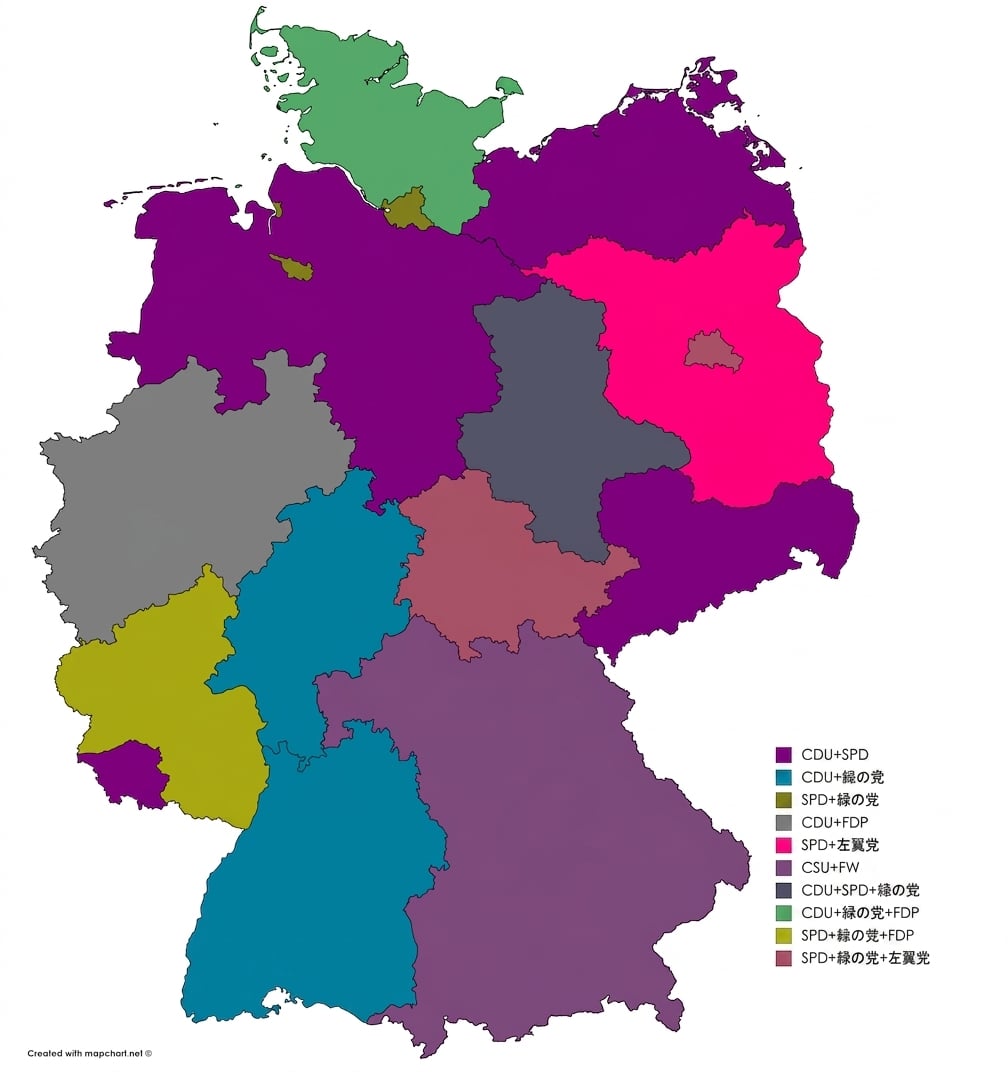
1 https://www.reddit.com/r/dataisugly/comments/cyhle4/wikipedias_image_of_the_distribution_of_seats_in 2 https://imgur.com/y27mRLj

