おめでとうございます

Pythonで学ぶ探索的データ分析

George Boorman

Curriculum Manager, DataCamp

検査と検証
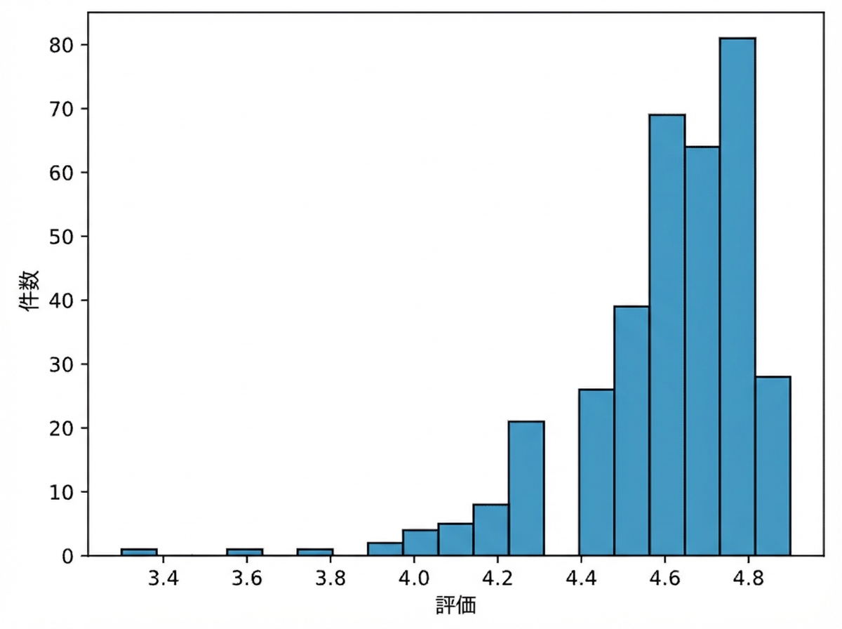
書籍評価のヒストグラム

books["year"] = books["year"].astype(int)
books.dtypes
name       object
author     object
rating    float64
year        int64
genre      object
dtype: object
Pythonで学ぶ探索的データ分析

集約

books.groupby("genre").agg(
    mean_rating=("rating", "mean"),
    std_rating=("rating", "std"),
    median_year=("year", "median")
)
|  genre      | mean_rating | std_rating | median_year |
|-------------|-------------|------------|-------------|
|   Childrens |    4.780000 |   0.122370 |      2015.0 |
|     Fiction |    4.570229 |   0.281123 |      2013.0 |
| Non Fiction |    4.598324 |   0.179411 |      2013.0 |
Pythonで学ぶ探索的データ分析

欠損値への対処

print(salaries.isna().sum())
Working_Year            12
Designation             27
Experience              33
Employment_Status       31
Employee_Location       28
Company_Size            40
Remote_Working_Ratio    24
Salary_USD              60
dtype: int64
Pythonで学ぶ探索的データ分析

欠損値への対処

  • 欠損を削除


  • 平均・中央値・最頻値で補完


  • サブグループで補完


salaries_dict = salaries.groupby("Experience")["Salary_USD"].median().to_dict()
salaries["Salary_USD"] = salaries["Salary_USD"].fillna(salaries["Experience"].map(salaries_dict))
Pythonで学ぶ探索的データ分析

カテゴリーデータの分析

salaries["Job_Category"] = np.select(conditions, 
                                     job_categories, 
                                     default="Other")
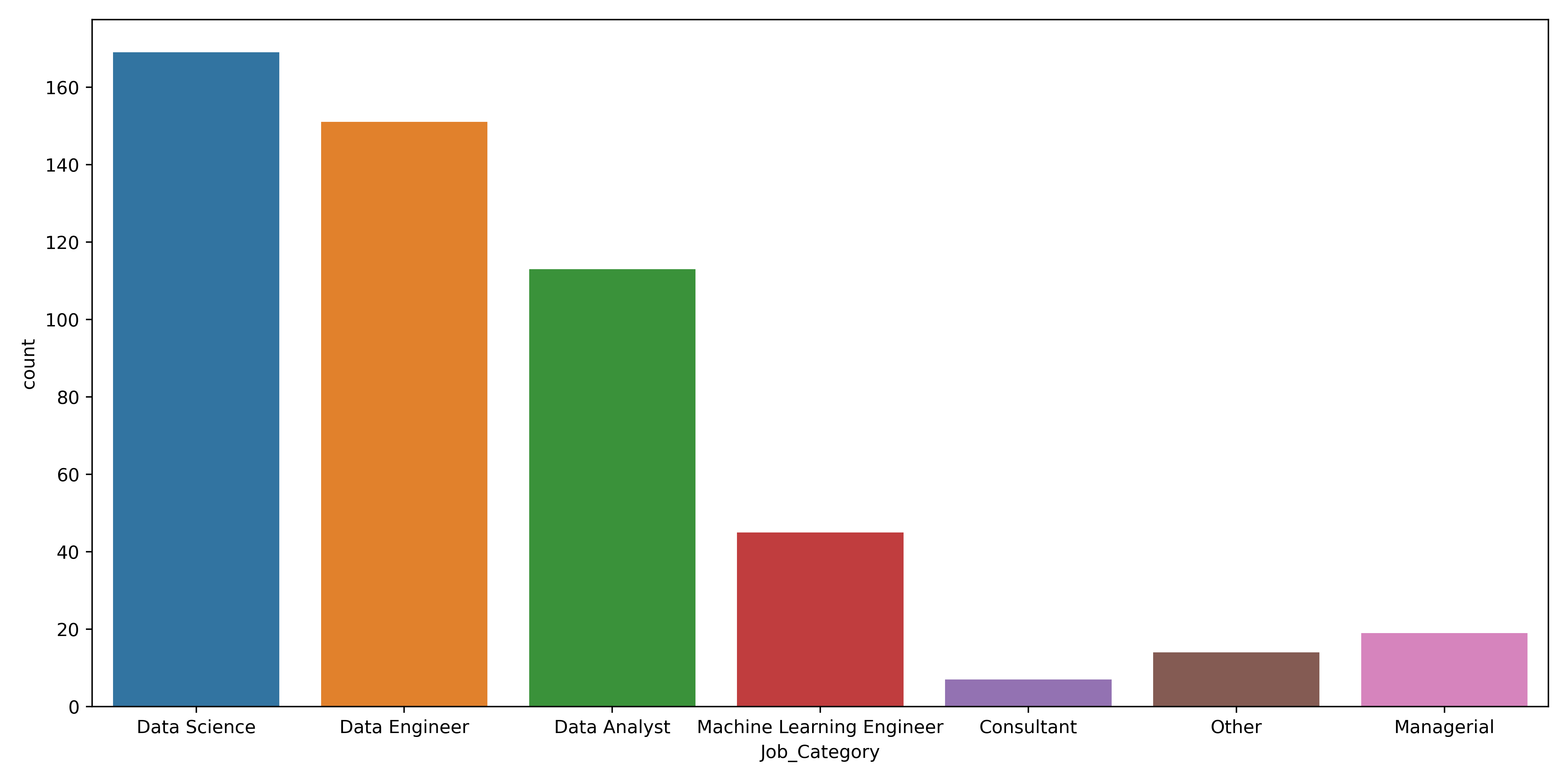
カテゴリ別の職種数を示す棒グラフ

Pythonで学ぶ探索的データ分析

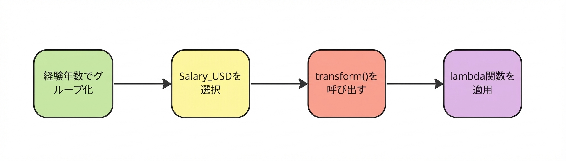
lambda 関数の適用

lambda 関数を適用

salaries["std_dev"] = salaries.groupby("Experience")["Salary_USD"].transform(lambda x: x.std())
Pythonで学ぶ探索的データ分析

外れ値への対処

sns.boxplot(data=salaries,
            y="Salary_USD")
plt.show()
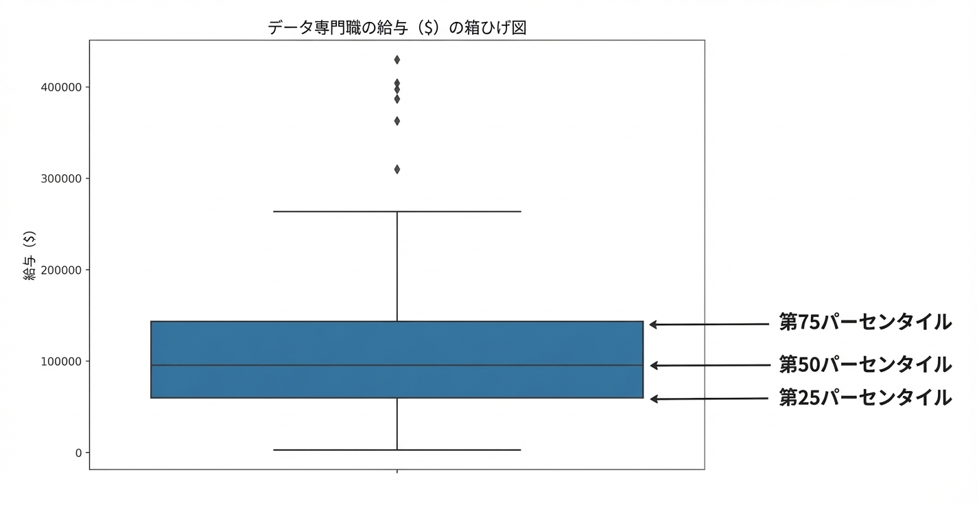
データ職の給与ボックスプロット。箱の下端が第1四分位、中央線が第2四分位、上端が第3四分位を示す

Pythonで学ぶ探索的データ分析

時系列のパターン

sns.lineplot(data=divorce, x="marriage_month", y="marriage_duration")
plt.show()
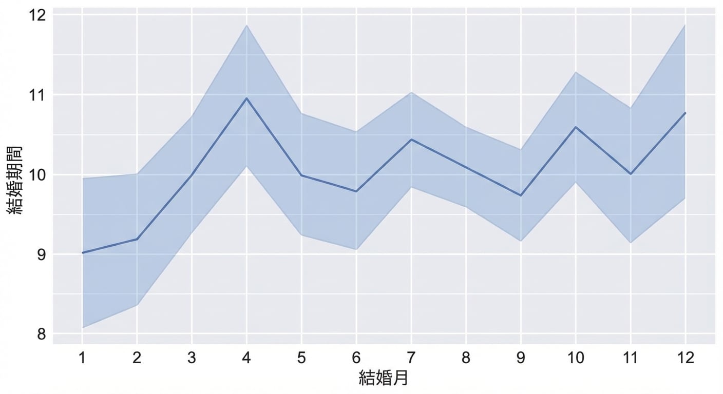
結婚月と結婚期間の関係を示す折れ線グラフ

Pythonで学ぶ探索的データ分析

相関

sns.heatmap(divorce.corr(numeric_only=True), annot=True)
plt.show()
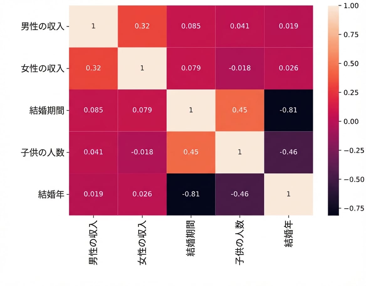
離婚データの相関ヒートマップ

Pythonで学ぶ探索的データ分析

分布

sns.kdeplot(data=divorce, x="marriage_duration", hue="education_man", cut=0)
plt.show()
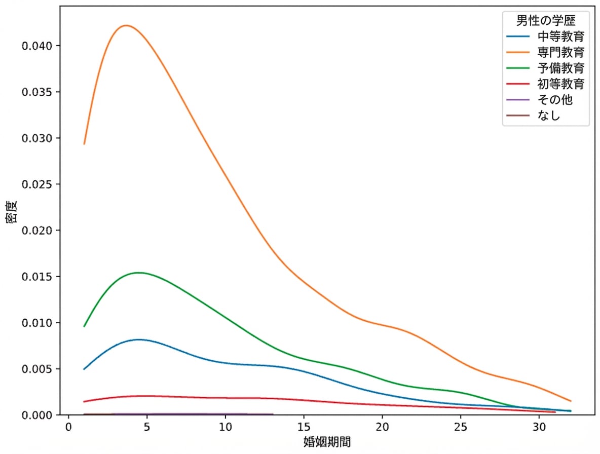
marriage_duration の KDE。hue は education_man、cut は 0

Pythonで学ぶ探索的データ分析

クロス集計

pd.crosstab(planes["Source"], planes["Destination"],
            values=planes["Price"], aggfunc="median")
Destination  Banglore   Cochin   Delhi  Hyderabad  Kolkata  New Delhi
Source                                                               
Banglore          NaN      NaN  4823.0        NaN      NaN    10976.5
Chennai           NaN      NaN     NaN        NaN   3850.0        NaN
Delhi             NaN  10262.0     NaN        NaN      NaN        NaN
Kolkata        9345.0      NaN     NaN        NaN      NaN        NaN
Mumbai            NaN      NaN     NaN     3342.0      NaN        NaN
Pythonで学ぶ探索的データ分析

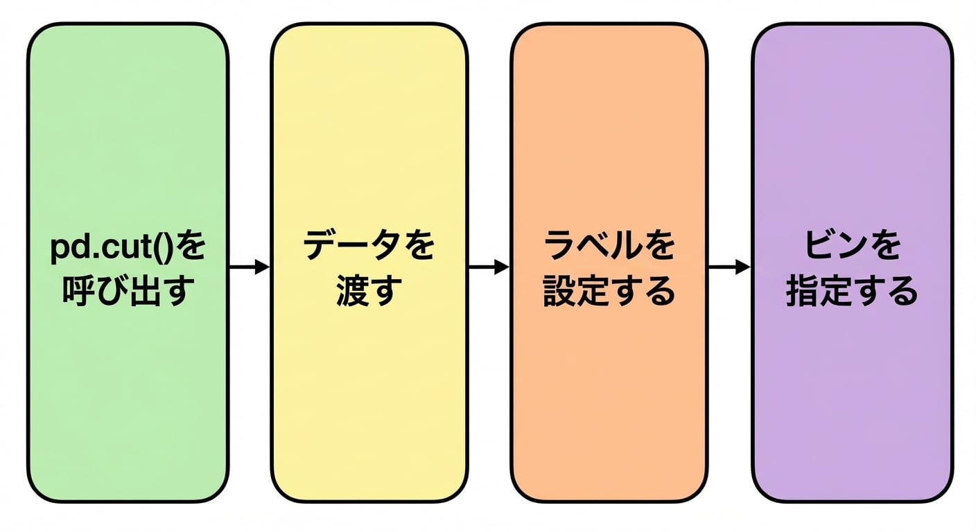
pd.cut()

ビンを指定

planes["Price_Category"] = pd.cut(planes["Price"],
                                  labels=labels,
                                  bins=bins)
Pythonで学ぶ探索的データ分析

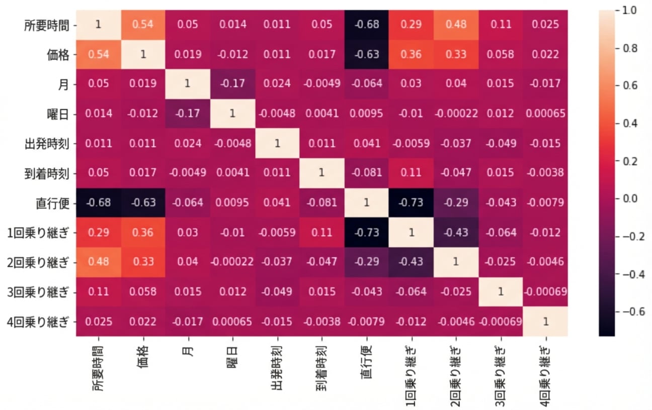
データスヌーピング

各経由回数ごとの相関係数のヒートマップ

Pythonで学ぶ探索的データ分析

仮説の生成

sns.barplot(data=planes, x="Airline", y="Duration")
plt.show()
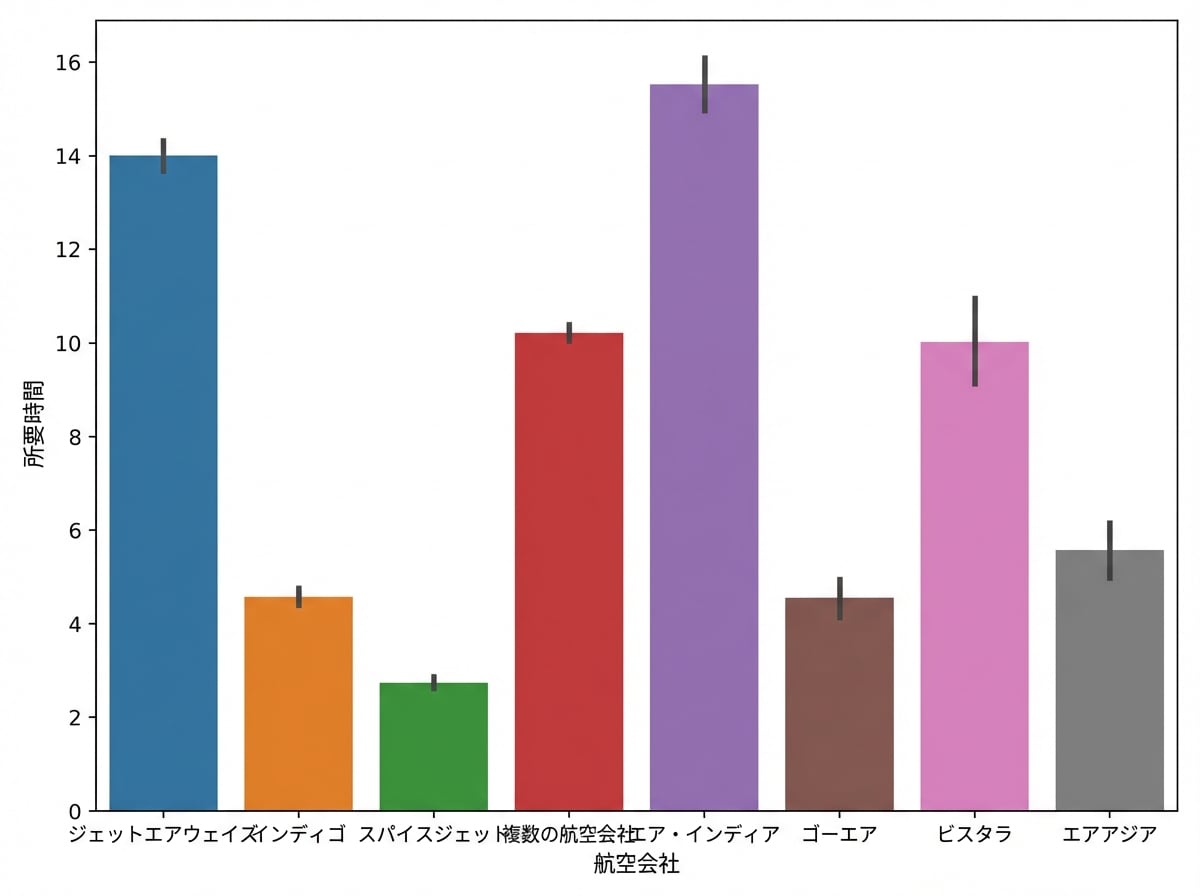
航空会社別の所要時間の棒グラフ

Pythonで学ぶ探索的データ分析

次のステップ

Pythonで学ぶ探索的データ分析

おめでとうございます!

Pythonで学ぶ探索的データ分析

Preparing Video For Download...