散布図

ggplot2 で始めるデータ可視化入門

Rick Scavetta

Founder, Scavetta Academy

48 のジオム

geom_*
abline contour dotplot jitter pointrange ribbon spoke
area count errorbar label polygon rug step
bar crossbar errorbarh line qq segment text
bin2d curve freqpoly linerange qq_line sf tile
blank density hex map quantile sf_label violin
boxplot density2d histogram path raster sf_text vline
col density_2d hline point rect smooth
ggplot2 で始めるデータ可視化入門

一般的なプロット

プロット種別 使用可能なジオム
散布図 points, jitter, abline, smooth, count
ggplot2 で始めるデータ可視化入門

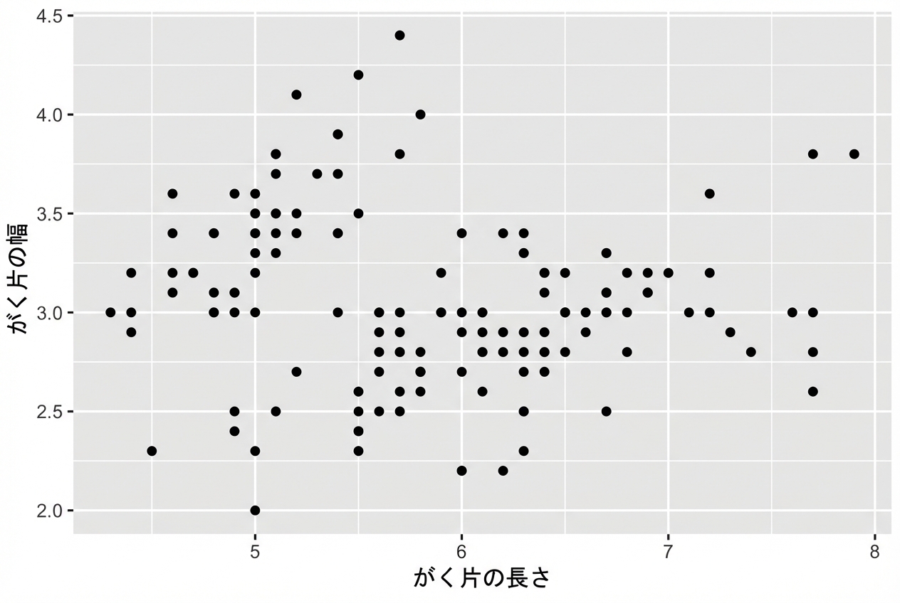
散布図

  • 各ジオムは特定の美的マッピングを受け付けます。例: geom_point()
必須
x,y
ggplot(iris, aes(x = Sepal.Length, 
                 y = Sepal.Width)) + 
  geom_point()
ggplot2 で始めるデータ可視化入門

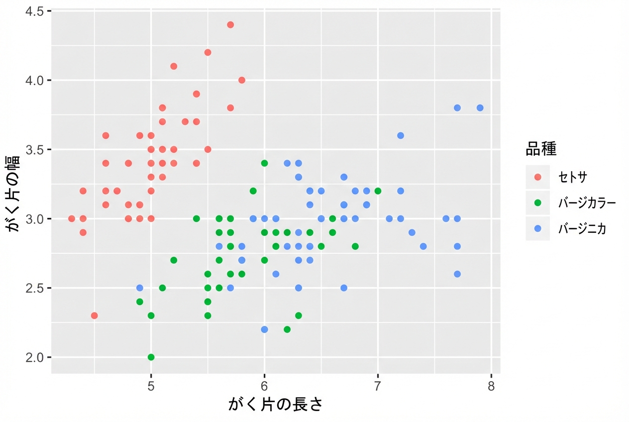
散布図

  • 各ジオムは特定の美的マッピングを受け付けます。例: geom_point()
必須 任意
x,y alpha, color, fill, shape, size, stroke
ggplot(iris, aes(x = Sepal.Length, 
                 y = Sepal.Width,
                 col = Species)) + 
  geom_point()
ggplot2 で始めるデータ可視化入門

ジオムごとの美的マッピング

# 同じプロットになります
ggplot(iris, aes(x = Sepal.Length, y = Sepal.Width, col = Species)) + 
  geom_point()

ggplot(iris, aes(x = Sepal.Length, y = Sepal.Width)) + 
  geom_point(aes(col = Species))

各レイヤーの美的属性は独立して指定できます:

ggplot2 で始めるデータ可視化入門
head(iris, 3) # 生データ
Species Sepal.Length Sepal.Width Petal.Length Petal.Width
1  setosa          5.1         3.5          1.4         0.2
2  setosa          4.9         3.0          1.4         0.2
3  setosa          4.7         3.2          1.3         0.2
iris %>%
  group_by(Species) %>% 
  summarise_all(mean) -> iris.summary

iris.summary # 要約統計量
# A tibble: 3 x 5
  Species    Sepal.Length Sepal.Width Petal.Length Petal.Width
  <fct>             <dbl>       <dbl>        <dbl>       <dbl>
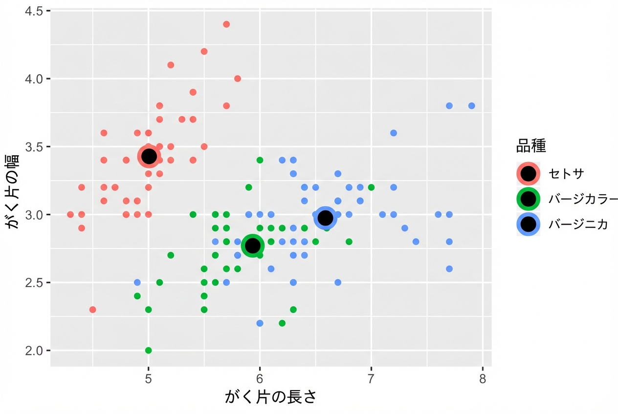
1 setosa             5.01        3.43         1.46       0.246
2 versicolor         5.94        2.77         4.26       1.33 
3 virginica          6.59        2.97         5.55       2.03
ggplot2 で始めるデータ可視化入門
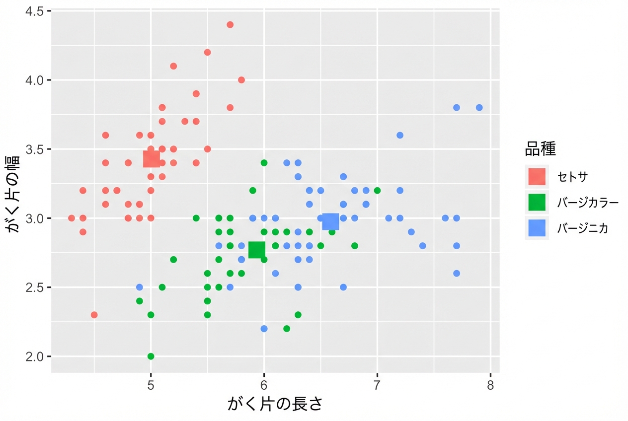
ggplot(iris, aes(x = Sepal.Length, y = Sepal.Width, col = Species)) +
  # ggplot() から data と aes を継承
  geom_point() + 
  # data は別、aes は継承
  geom_point(data = iris.summary, shape = 15, size = 5)
ggplot2 で始めるデータ可視化入門

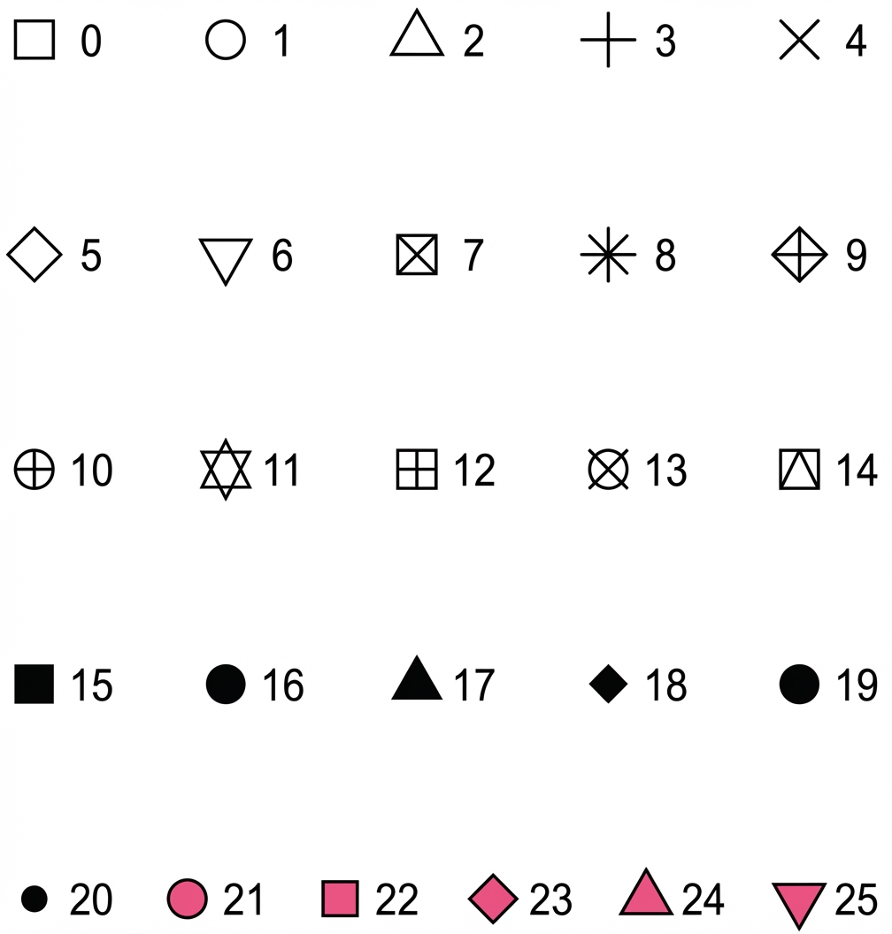
shape の値一覧

ggplot2 で始めるデータ可視化入門

ggplot(iris, aes(x = Sepal.Length, y = Sepal.Width, col = Species)) + 
  geom_point() +
  geom_point(data = iris.summary, shape = 21, size = 5, 
             fill = "black", stroke = 2)
ggplot2 で始めるデータ可視化入門

ggplot2 のオンデマンド統計

  • 統計レイヤーは第2コースで扱います。
  • 注意: 標準偏差などのばらつき指標なしに平均だけを描くのは避けましょう。

ggplot2 で始めるデータ可視化入門

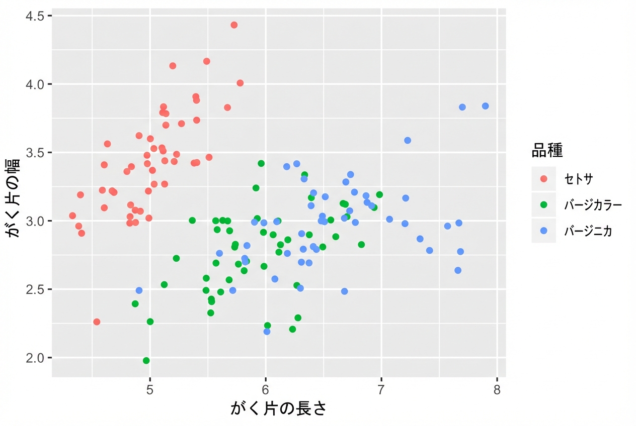
position = "jitter"

ggplot(iris, aes(x = Sepal.Length, y = Sepal.Width, col = Species)) + 
  geom_point(position = "jitter")
ggplot2 で始めるデータ可視化入門

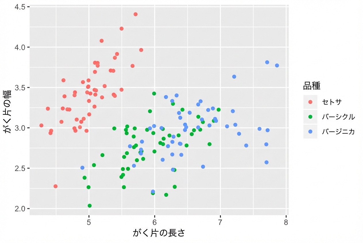
geom_jitter()

geom_point(position = "jitter") のショートカット

ggplot(iris, aes(x = Sepal.Length, y = Sepal.Width, col = Species)) + 
  geom_jitter()
ggplot2 で始めるデータ可視化入門

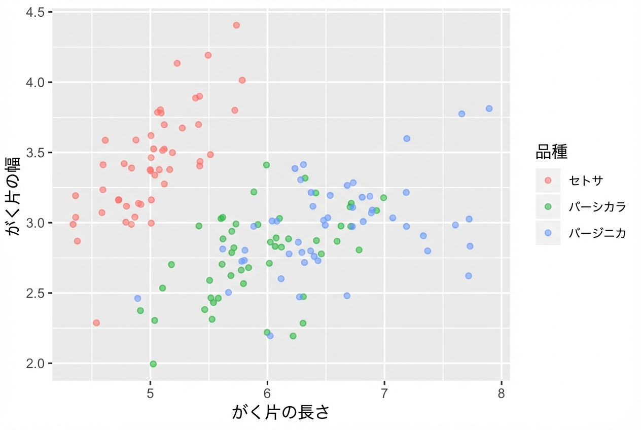
alpha の調整も忘れずに

  • 必要に応じてジッターとアルファ合成を併用
ggplot(iris, aes(x = Sepal.Length, y = Sepal.Width, col = Species)) + 
  geom_jitter(alpha = 0.6)
ggplot2 で始めるデータ可視化入門

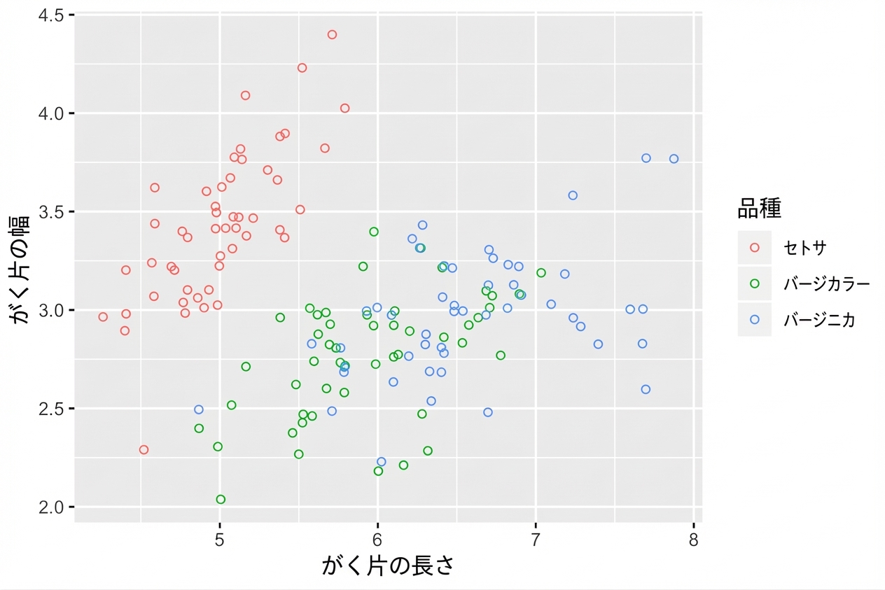
中抜きの円も有効

  • shape = 1 は中抜きの円です。
  • その場合はアルファ合成は不要です。
ggplot(iris, aes(x = Sepal.Length, y = Sepal.Width, col = Species)) + 
  geom_jitter(shape = 1)
ggplot2 で始めるデータ可視化入門

Passons à la pratique !

ggplot2 で始めるデータ可視化入門

Preparing Video For Download...