ggplot2 で始めるデータ可視化入門
Rick Scavetta
Founder, Scavetta Academy
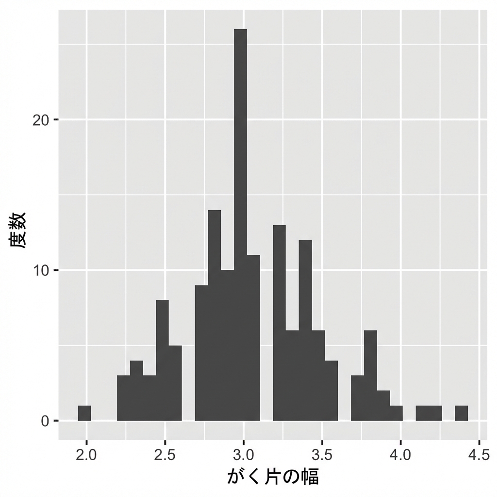
ggplot(iris, aes(x = Sepal.Width)) +
  geom_histogram()
`stat_bin()` using `bins = 30`.
Pick better value with `binwidth`.
# 既定のビン幅:
diff(range(iris$Sepal.Width))/30
[1] 0.08
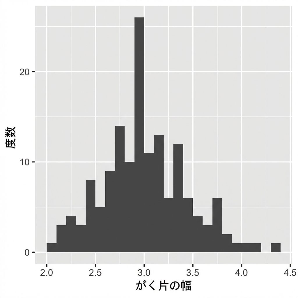
ggplot(iris, aes(x = Sepal.Width)) +
  geom_histogram(binwidth = 0.1)
データに合う意味のあるビン幅を設定。
棒の間に空白なし。
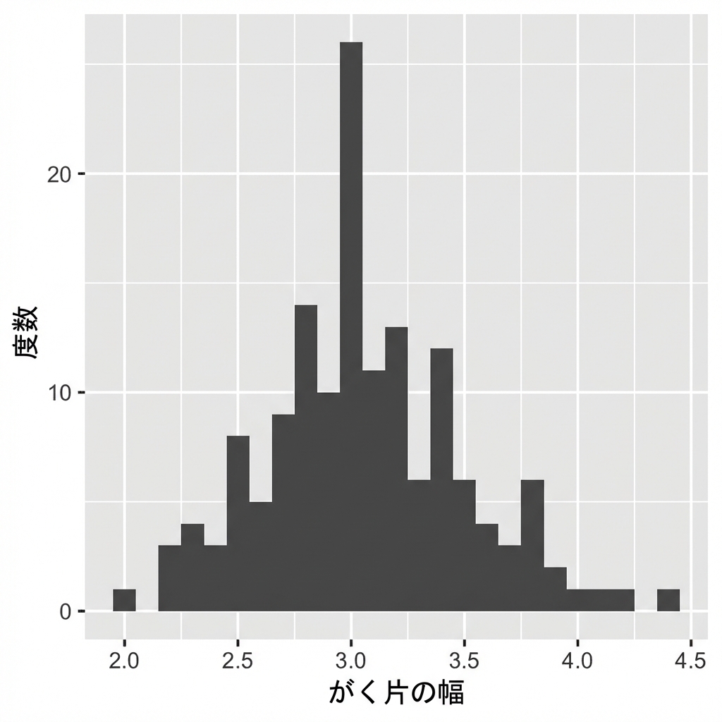
ggplot(iris, aes(x = Sepal.Width)) +
  geom_histogram(binwidth = 0.1,
                 center = 0.05)
X軸ラベルは棒の間に配置。
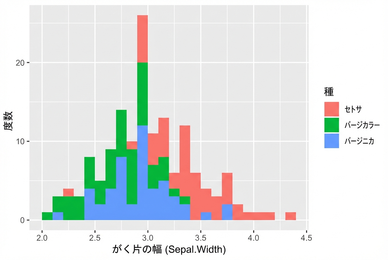
ggplot(iris, aes(x = Sepal.Width,
                 fill = Species)) +
  geom_histogram(binwidth = .1,
                 center = 0.05)
ggplot(iris, aes(x = Sepal.Width,
                 fill = Species)) +
  geom_histogram(binwidth = .1,
                 center = 0.05,
                 position = "stack")
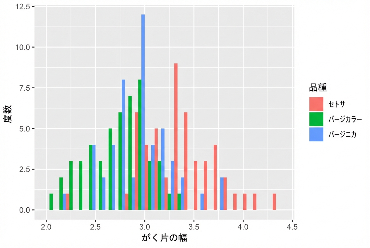
ggplot(iris, aes(x = Sepal.Width,
                 fill = Species)) +
  geom_histogram(binwidth = .1,
                 center = 0.05,
                 position = "dodge")
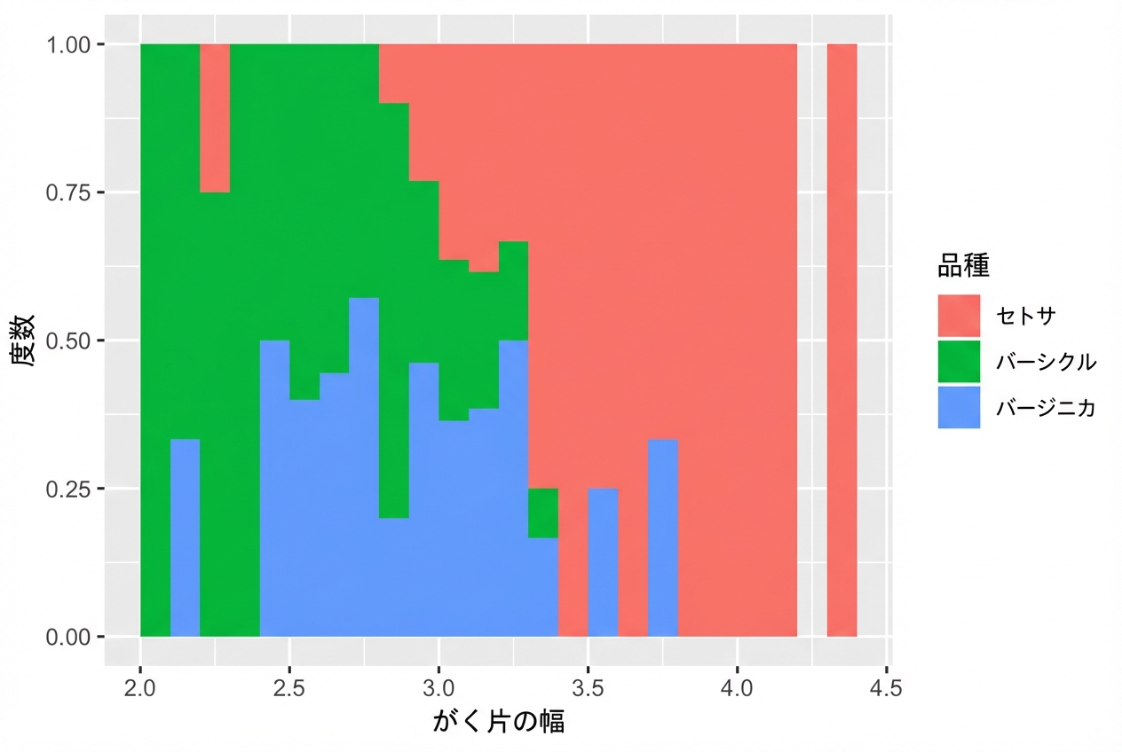
ggplot(iris, aes(x = Sepal.Width,
                 fill = Species)) +
  geom_histogram(binwidth = .1,
                 center = 0.05,
                 position = "fill")