ggplot2 で始めるデータ可視化入門
Rick Scavetta
Founder, Scavetta Academy
【3種類】
| 種類 |
|---|
| テキスト |
| 線 |
| 矩形 |
【3種類】
| 種類 | 変更に使う関数 |
|---|---|
| テキスト | element_text() |
| 線 | element_line() |
| 矩形 | element_rect() |
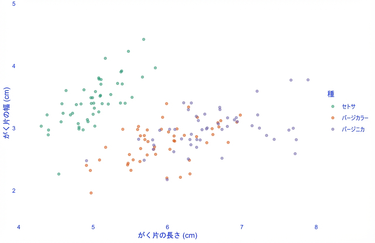
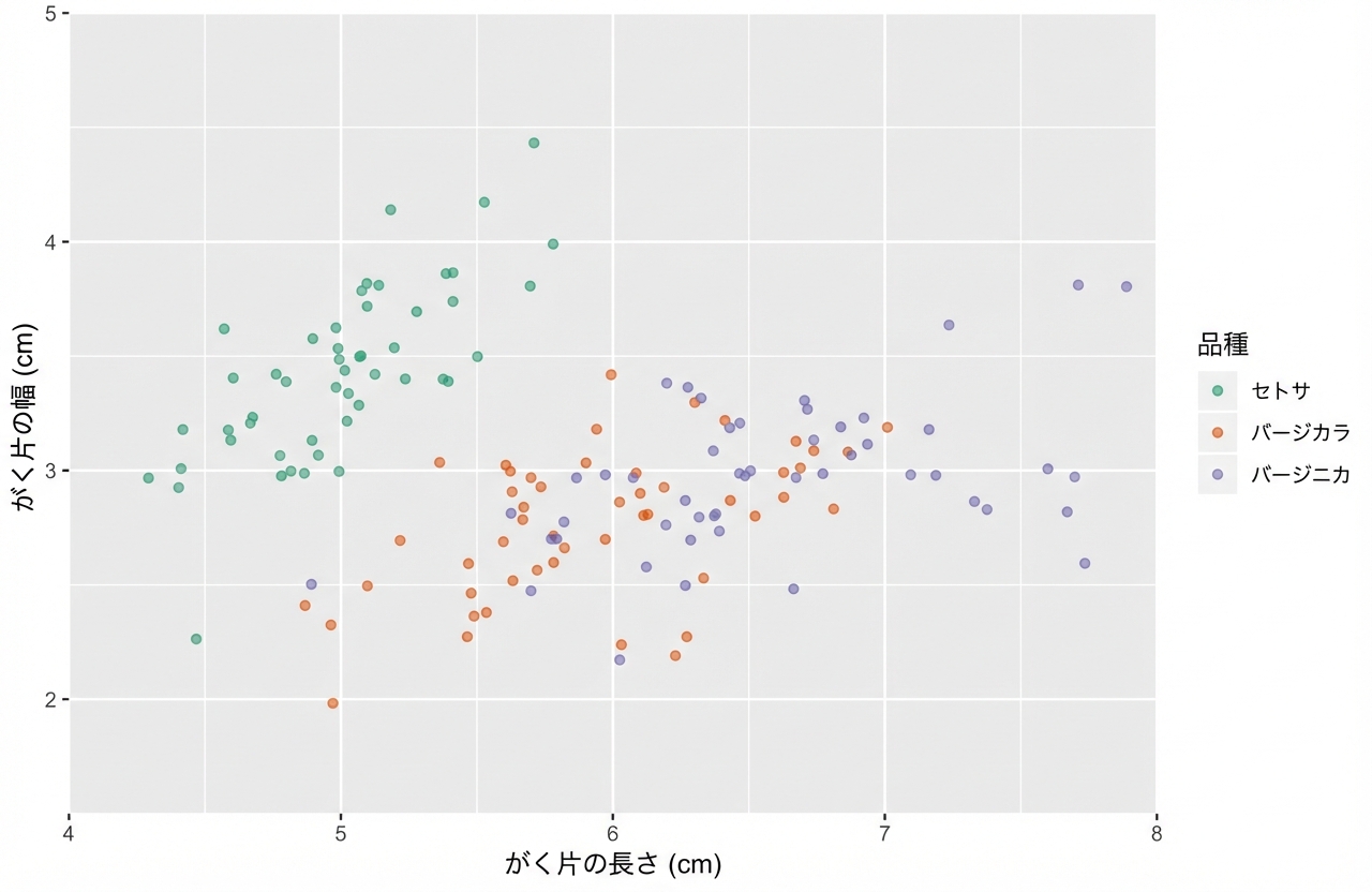
ggplot(iris, aes(x = Sepal.Length, y = Sepal.Width, color = Species)) +
geom_jitter(alpha = 0.6)

text
axis.title
axis.title.x
axis.title.x.top
axis.title.x.bottom
axis.title.y
axis.title.y.left
axis.title.y.right
title
legend.title
plot.title
plot.subtitle
plot.caption
plot.tag
axis.text
axis.text.x
axis.text.x.top
axis.text.x.bottom
axis.text.y
axis.text.y.left
axis.text.y.right
legend.text
strip.text
strip.text.x
strip.text.y

theme(
text,
axis.title,
axis.title.x,
axis.title.x.top,
axis.title.x.bottom,
axis.title.y,
axis.title.y.left,
axis.title.y.right,
title,
legend.title,
plot.title,
plot.subtitle,
plot.caption,
plot.tag,
axis.text,
axis.text.x,
axis.text.x.top,
axis.text.x.bottom,
axis.text.y,
axis.text.y.left,
axis.text.y.right,
legend.text,
strip.text,
strip.text.x,
strip.text.y)
ggplot(iris, aes(x = Sepal.Length, y = Sepal.Width, color = Species)) +
geom_jitter(alpha = 0.6) +
theme(axis.title = element_text(color = "blue"))
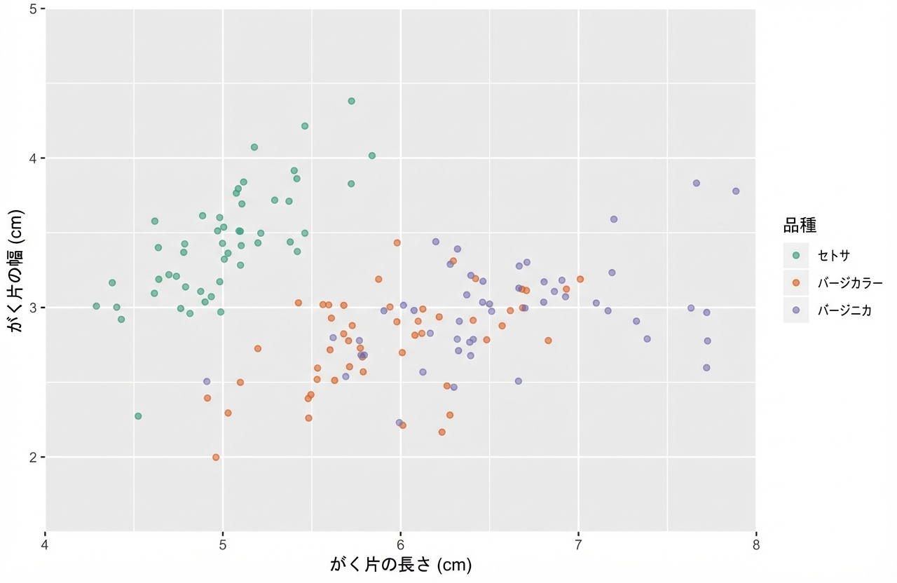
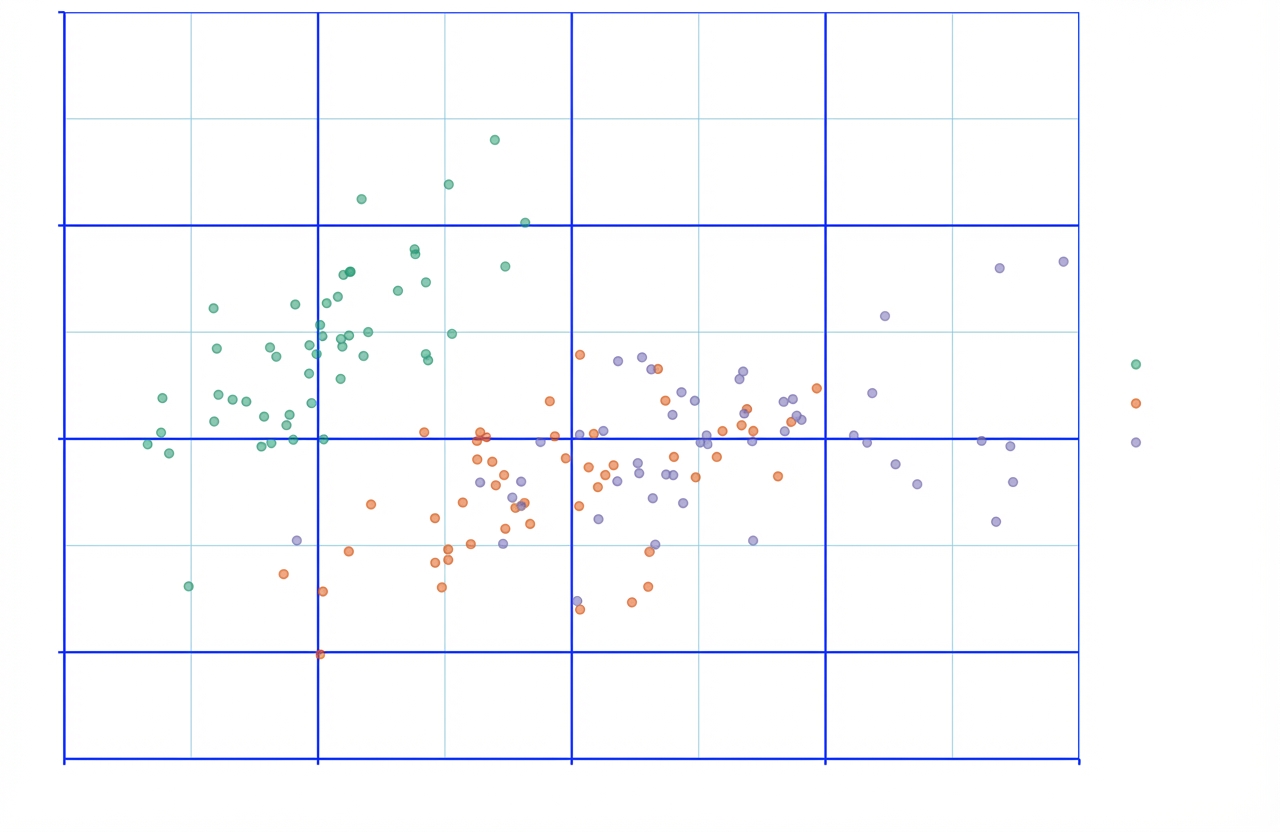
ggplot(iris, aes(x = Sepal.Length, y = Sepal.Width, color = Species)) +
geom_jitter(alpha = 0.6)


theme(
line,
axis.ticks,
axis.ticks.x,
axis.ticks.x.top,
axis.ticks.x.bottom,
axis.ticks.y,
axis.ticks.y.left,
axis.ticks.y.right,
axis.line,
axis.line.x,
axis.line.x.top,
axis.line.x.bottom,
axis.line.y,
axis.line.y.left,
axis.line.y.right,
panel.grid,
panel.grid.major,
panel.grid.major.x,
panel.grid.major.y,
panel.grid.minor,
panel.grid.minor.x,
panel.grid.minor.y)
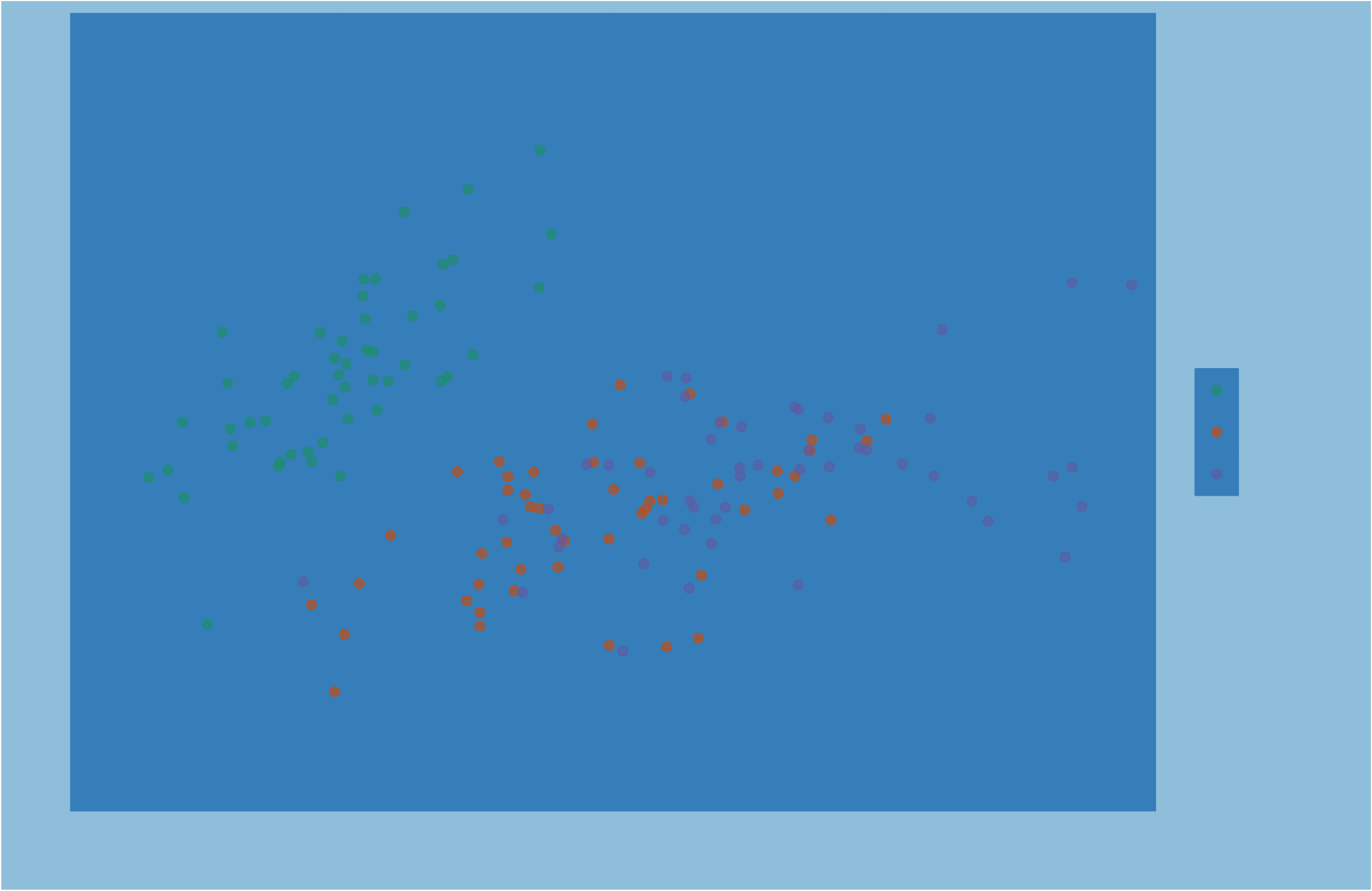
ggplot(iris, aes(x = Sepal.Length, y = Sepal.Width, color = Species)) +
geom_jitter(alpha = 0.6)


theme(
rect,
legend.background,
legend.key,
legend.box.background,
panel.background,
panel.border,
plot.background,
strip.background,
strip.background.x,
strip.background.y)
例: テキスト
text
axis.title
axis.title.x
axis.title.x.top
axis.title.x.bottom
axis.title.y
axis.title.y.left
axis.title.y.right
例: 線
line
axis.ticks
axis.ticks.x
axis.ticks.x.top
axis.ticks.x.bottom
axis.ticks.y
axis.ticks.y.left,
axis.ticks.y.right
axis.line
axis.line.x
axis.line.x.top
axis.line.x.bottom
axis.line.y
axis.line.y.left
axis.line.y.right
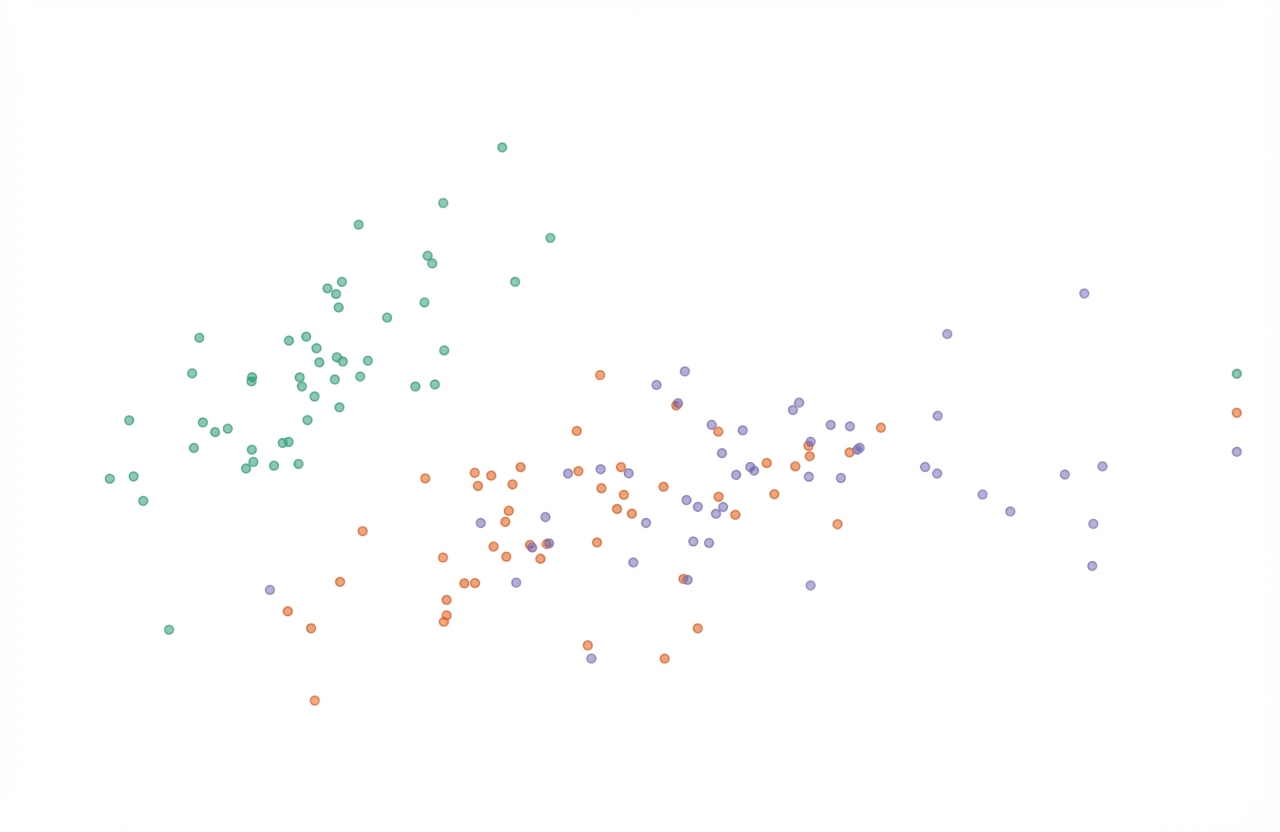
ggplot(iris, aes(x = Sepal.Length, y = Sepal.Width, color = Species)) +
geom_jitter(alpha = 0.6) +
theme(line = element_blank(),
rect = element_blank(),
text = element_blank())
ggplot2 で始めるデータ可視化入門