Matplotlib によるデータ可視化入門
Ariel Rokem
Data Scientist
summer_2016_medals["Sport"]
ID
62            Rowing
65         Taekwondo
73          Handball
             ...
134759      Handball
135132    Volleyball
135205        Boxing
Name: Sport, Length: 976, dtype: object
sports = summer_2016_medals["Sport"].unique()

print(sports)
sports = summer_2016_medals["Sport"].unique()
print(sports)
['Rowing' 'Taekwondo' 'Handball' 'Wrestling'
'Gymnastics' 'Swimming' 'Basketball' 'Boxing'
'Volleyball' 'Athletics']
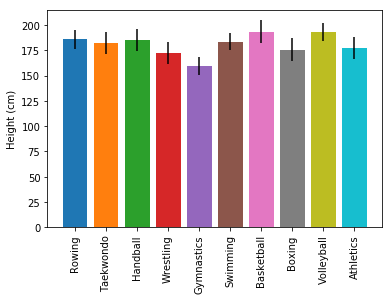
fig, ax = plt.subplots()

for sport in sports:
  sport_df = summer_2016_medals[summer_2016_medals["Sport"] == sport]

  ax.bar(sport, sport_df["Height"].mean(),
         yerr=sport_df["Height"].std())

ax.set_ylabel("Height (cm)")
ax.set_xticklabels(sports, rotation=90)
plt.show()
fig, ax = plt.subplots() for sport in sports: sport_df = summer_2016_medals[summer_2016_medals["Sport"] == sport]
ax.bar(sport, sport_df["Height"].mean(), yerr=sport_df["Height"].std())
ax.set_ylabel("Height (cm)") ax.set_xticklabels(sports, rotation=90) plt.show()