統計的プロット

Matplotlibで学ぶデータ可視化入門

Ariel Rokem

Data Scientist

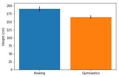
棒グラフに誤差範囲を追加

fig, ax = plt.subplots()

ax.bar("Rowing",
       mens_rowing["Height"].mean(),
       yerr=mens_rowing["Height"].std())

ax.bar("Gymnastics",
       mens_gymnastics["Height"].mean(),
       yerr=mens_gymnastics["Height"].std())

ax.set_ylabel("Height (cm)")

plt.show()
Matplotlibで学ぶデータ可視化入門

棒グラフの誤差範囲

Matplotlibで学ぶデータ可視化入門

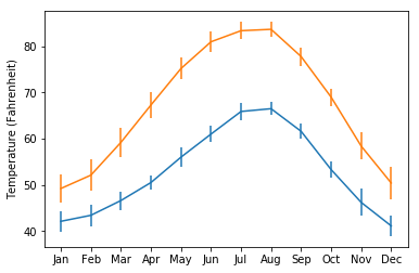
プロットに誤差範囲を追加

fig, ax = plt.subplots()

ax.errorbar(seattle_weather["MONTH"],
            seattle_weather["MLY-TAVG-NORMAL"],
            yerr=seattle_weather["MLY-TAVG-STDDEV"])

ax.errorbar(austin_weather["MONTH"],
            austin_weather["MLY-TAVG-NORMAL"],
            yerr=austin_weather["MLY-TAVG-STDDEV"])

ax.set_ylabel("Temperature (Fahrenheit)")

plt.show()
Matplotlibで学ぶデータ可視化入門

プロットの誤差範囲

Matplotlibで学ぶデータ可視化入門

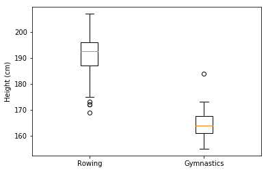
箱ひげ図を追加

fig, ax = plt.subplots()

ax.boxplot([mens_rowing["Height"], mens_gymnastics["Height"]])
ax.set_xticklabels(["Rowing", "Gymnastics"]) ax.set_ylabel("Height (cm)") plt.show()
Matplotlibで学ぶデータ可視化入門

箱ひげ図の読み取り

Matplotlibで学ぶデータ可視化入門

自分で試してみましょう

Matplotlibで学ぶデータ可視化入門

Preparing Video For Download...