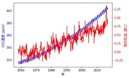
異なる変数の時系列をプロットする

Matplotlibで学ぶデータ可視化入門

Ariel Rokem

Data Scientist

2つの時系列を同時にプロット

import pandas as pd
climate_change = pd.read_csv('climate_change.csv', 
                             parse_dates=["date"],
                             index_col="date")
climate_change
              co2  relative_temp
date
1958-03-06  315.71           0.10
1958-04-06  317.45           0.01
1958-07-06  315.86           0.06
...            ...            ...
2016-11-06  403.55           0.93
2016-12-06  404.45           0.81

[706 rows x 2 columns]
Matplotlibで学ぶデータ可視化入門

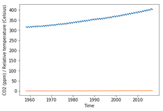
2つの時系列を同時にプロット

import matplotlib.pyplot as plt
fig, ax = plt.subplots()
ax.plot(climate_change.index, climate_change["co2"])

ax.plot(climate_change.index, climate_change["relative_temp"])
ax.set_xlabel('Time') ax.set_ylabel('CO2 (ppm) / Relative temperature') plt.show()
Matplotlibで学ぶデータ可視化入門

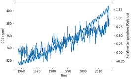
双子軸の使用

fig, ax = plt.subplots()
ax.plot(climate_change.index, climate_change["co2"])
ax.set_xlabel('Time')
ax.set_ylabel('CO2 (ppm)')

ax2 = ax.twinx()
ax2.plot(climate_change.index, climate_change["relative_temp"]) ax2.set_ylabel('Relative temperature (Celsius)') plt.show()
Matplotlibで学ぶデータ可視化入門

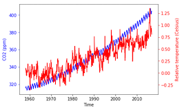
色で変数を分ける

fig, ax = plt.subplots()
ax.plot(climate_change.index, climate_change["co2"], color='blue')
ax.set_xlabel('Time')
ax.set_ylabel('CO2 (ppm)', color='blue')

ax2 = ax.twinx() ax2.plot(climate_change.index, climate_change["relative_temp"], color='red') ax2.set_ylabel('Relative temperature (Celsius)', color='red') plt.show()
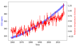
Matplotlibで学ぶデータ可視化入門

目盛りを色分けする

fig, ax = plt.subplots()
ax.plot(climate_change.index, climate_change["co2"], 
        color='blue')
ax.set_xlabel('Time')
ax.set_ylabel('CO2 (ppm)', color='blue')

ax.tick_params('y', colors='blue')
ax2 = ax.twinx() ax2.plot(climate_change.index, climate_change["relative_temp"], color='red') ax2.set_ylabel('Relative temperature (Celsius)', color='red')
ax2.tick_params('y', colors='red')
plt.show()
Matplotlibで学ぶデータ可視化入門

目盛りを色分けする

Matplotlibで学ぶデータ可視化入門

時系列を描画する関数

def plot_timeseries(axes, x, y, color, xlabel, ylabel):
  axes.plot(x, y, color=color)
  axes.set_xlabel(xlabel)
  axes.set_ylabel(ylabel, color=color)
  axes.tick_params('y', colors=color)
Matplotlibで学ぶデータ可視化入門

関数を使う

fig, ax = plt.subplots()
plot_timeseries(ax, climate_change.index, climate_change['co2'],
               'blue', 'Time', 'CO2 (ppm)')

ax2 = ax.twinx() plot_timeseries(ax2, climate_change.index, climate_change['relative_temp'], 'red', 'Time', 'Relative temperature (Celsius)')
plt.show()

Matplotlibで学ぶデータ可視化入門

自分の関数を作成

Matplotlibで学ぶデータ可視化入門

Preparing Video For Download...