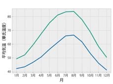
他の人と共有するためのFigureを準備する
Matplotlib によるデータ可視化入門

Ariel Rokem
Data Scientist
プロットスタイルの変更
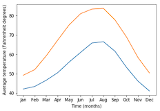
import matplotlib.pyplot as plt
fig, ax = plt.subplots()
ax.plot(seattle_weather["MONTH"], seattle_weather["MLY-TAVG-NORMAL"])
ax.plot(austin_weather["MONTH"], austin_weather["MLY-TAVG-NORMAL"])
ax.set_xlabel("Time (months)")
ax.set_ylabel("Average temperature (Fahrenheit degrees)")
plt.show()
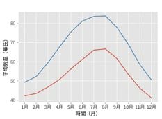
スタイルの選択
plt.style.use("ggplot")fig, ax = plt.subplots() ax.plot(seattle_weather["MONTH"], seattle_weather["MLY-TAVG-NORMAL"]) ax.plot(austin_weather["MONTH"], austin_weather["MLY-TAVG-NORMAL"]) ax.set_xlabel("Time (months)") ax.set_ylabel("Average temperature (Fahrenheit degrees)") plt.show()
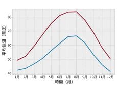
「bmh」スタイル
plt.style.use("bmh")fig, ax = plt.subplots() ax.plot(seattle_weather["MONTH"], seattle_weather["MLY-TAVG-NORMAL"]) ax.plot(austin_weather["MONTH"], austin_weather["MLY-TAVG-NORMAL"]) ax.set_xlabel("Time (months)") ax.set_ylabel("Average temperature (Fahrenheit degrees)") plt.show()
Seabornのスタイル
plt.style.use("seaborn-colorblind")fig, ax = plt.subplots() ax.plot(seattle_weather["MONTH"], seattle_weather["MLY-TAVG-NORMAL"]) ax.plot(austin_weather["MONTH"], austin_weather["MLY-TAVG-NORMAL"]) ax.set_xlabel("Time (months)") ax.set_ylabel("Average temperature (Fahrenheit degrees)") plt.show()