量的比較:散布図

Matplotlibで学ぶデータ可視化入門

Ariel Rokem

Data Scientist

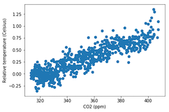
散布図の導入

fig, ax = plt.subplots()

ax.scatter(climate_change["co2"], climate_change["relative_temp"])
ax.set_xlabel("CO2 (ppm)") ax.set_ylabel("相対気温(摂氏)") plt.show()

Matplotlibで学ぶデータ可視化入門

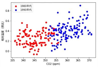
散布図のカスタマイズ

eighties = climate_change["1980-01-01":"1989-12-31"]
nineties = climate_change["1990-01-01":"1999-12-31"]

fig, ax = plt.subplots()
ax.scatter(eighties["co2"], eighties["relative_temp"], color="red", label="eighties")
ax.scatter(nineties["co2"], nineties["relative_temp"], color="blue", label="nineties")
ax.legend() ax.set_xlabel("CO2 (ppm)") ax.set_ylabel("相対気温(摂氏)") plt.show()
Matplotlibで学ぶデータ可視化入門

色で比較を表現する

Matplotlibで学ぶデータ可視化入門

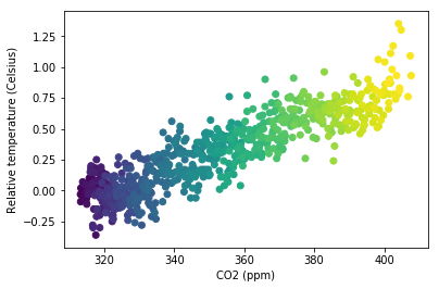
色で第3の変数を表現する

fig, ax = plt.subplots()

ax.scatter(climate_change["co2"], climate_change["relative_temp"], c=climate_change.index)
ax.set_xlabel("CO2 (ppm)") ax.set_ylabel("相対気温(摂氏)") plt.show()
Matplotlibで学ぶデータ可視化入門

色で時間を符号化する

Matplotlibで学ぶデータ可視化入門

散布図を自分で作って練習しましょう!

Matplotlibで学ぶデータ可視化入門

Preparing Video For Download...