Matplotlibで学ぶデータ可視化入門
Ariel Rokem
Data Scientist
,Gold, Silver, Bronze
United States, 137, 52, 67
Germany, 47, 43, 67
Great Britain, 64, 55, 26
Russia, 50, 28, 35
China, 44, 30, 35
France, 20, 55, 21
Australia, 23, 34, 25
Italy, 8, 38, 24
Canada, 4, 4, 61
Japan, 17, 13, 34
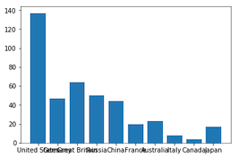
medals = pd.read_csv('medals_by_country_2016.csv', index_col=0)fig, ax = plt.subplots()ax.bar(medals.index, medals["Gold"]) plt.show()
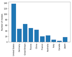
fig, ax = plt.subplots() ax.bar(medals.index, medals["Gold"])ax.set_xticklabels(medals.index, rotation=90) ax.set_ylabel("Number of medals")plt.show()
fig, ax = plt.subplots ax.bar(medals.index, medals["Gold"])ax.bar(medals.index, medals["Silver"], bottom=medals["Gold"])ax.set_xticklabels(medals.index, rotation=90) ax.set_ylabel("Number of medals") plt.show()
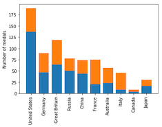
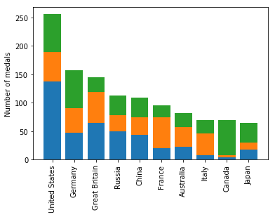
fig, ax = plt.subplots ax.bar(medals.index, medals["Gold"]) ax.bar(medals.index, medals["Silver"], bottom=medals["Gold"])ax.bar(medals.index, medals["Bronze"], bottom=medals["Gold"] + medals["Silver"])ax.set_xticklabels(medals.index, rotation=90) ax.set_ylabel("Number of medals") plt.show()

fig, ax = plt.subplots
ax.bar(medals.index, medals["Gold"])
ax.bar(medals.index, medals["Silver"], bottom=medals["Gold"])
ax.bar(medals.index, medals["Bronze"],
bottom=medals["Gold"] + medals["Silver"])
ax.set_xticklabels(medals.index, rotation=90)
ax.set_ylabel("Number of medals")
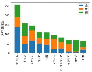
fig, ax = plt.subplots ax.bar(medals.index, medals["Gold"], label="Gold") ax.bar(medals.index, medals["Silver"], bottom=medals["Gold"], label="Silver") ax.bar(medals.index, medals["Bronze"], bottom=medals["Gold"] + medals["Silver"], label="Bronze") ax.set_xticklabels(medals.index, rotation=90) ax.set_ylabel("Number of medals")ax.legend() plt.show()

Matplotlibで学ぶデータ可視化入門