散布図のカスタマイズ

Seabornで学ぶデータ可視化入門

Content Team

DataCamp

散布図の概要

2つの量的変数の関係を可視化

既習:

  • サブプロット(colrow
  • 色でサブグループ(hue

新しいカスタマイズ:

  • 点サイズとスタイルでサブグループ
  • 点の透明度を変更

scatterplot()relplot() の両方で使用可能

Seabornで学ぶデータ可視化入門

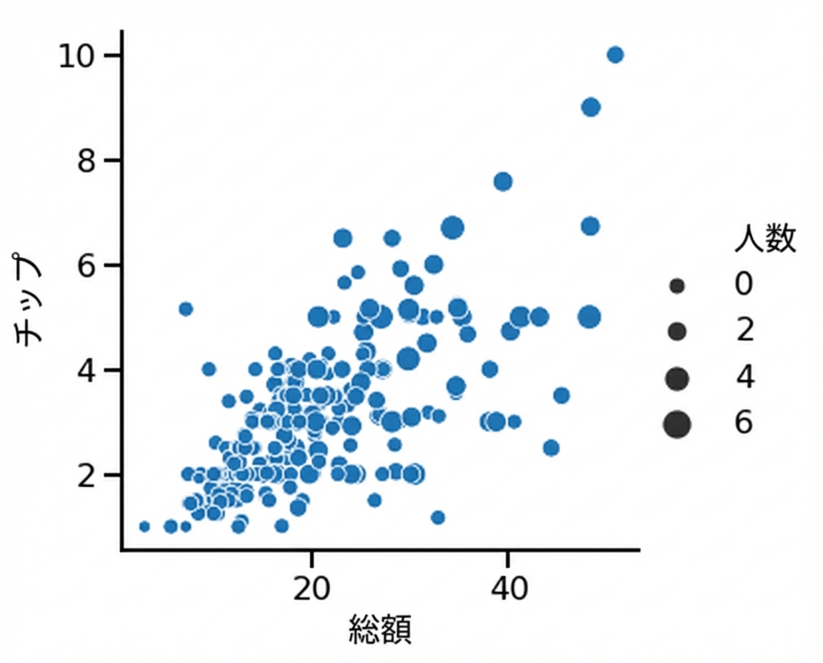
点サイズでサブグループ化

import seaborn as sns
import matplotlib.pyplot as plt

sns.relplot(x="total_bill", 
            y="tip", 
            data=tips, 
            kind="scatter", 
            size="size")

plt.show()

点サイズが異なる散布図

1 Waskom, M. L. (2021). seaborn: statistical data visualization. https://seaborn.pydata.org/
Seabornで学ぶデータ可視化入門

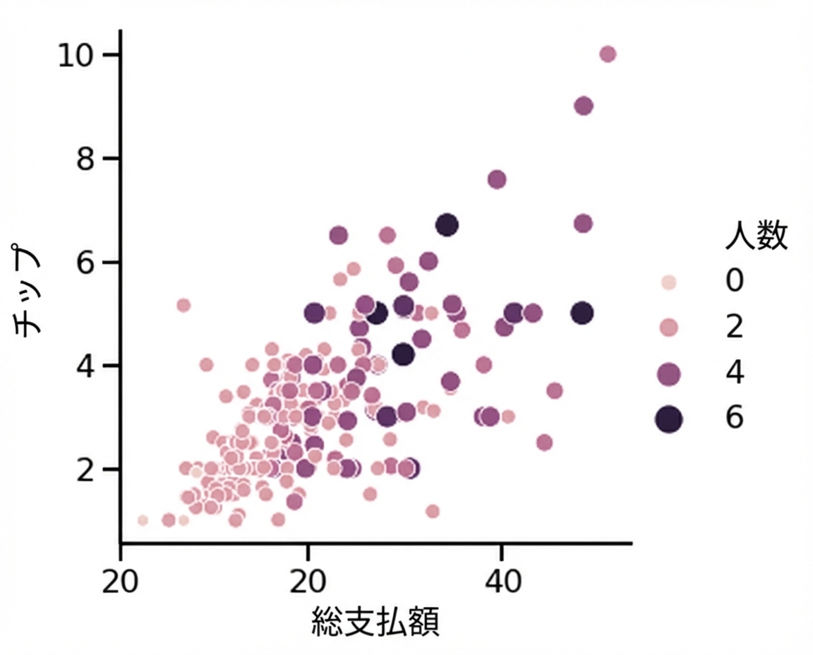
点サイズと色相

import seaborn as sns
import matplotlib.pyplot as plt

sns.relplot(x="total_bill", 
            y="tip", 
            data=tips, 
            kind="scatter", 
            size="size",
            hue="size")

plt.show()

点サイズと色が異なる散布図

1 Waskom, M. L. (2021). seaborn: statistical data visualization. https://seaborn.pydata.org/
Seabornで学ぶデータ可視化入門

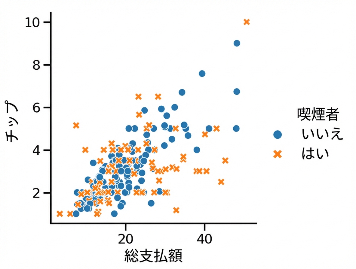
点スタイルでサブグループ化

import seaborn as sns
import matplotlib.pyplot as plt

sns.relplot(x="total_bill", 
            y="tip", 
            data=tips, 
            kind="scatter", 
            hue="smoker", 
            style="smoker")

plt.show()

色とスタイルで分けた散布図

1 Waskom, M. L. (2021). seaborn: statistical data visualization. https://seaborn.pydata.org/
Seabornで学ぶデータ可視化入門

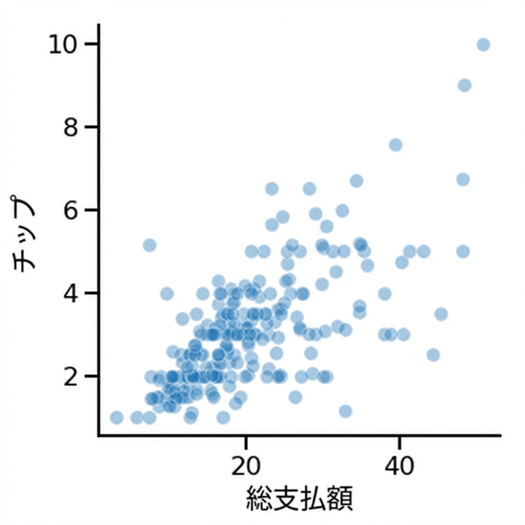
点の透明度を変更

import seaborn as sns
import matplotlib.pyplot as plt

# 透明度は 0〜1
sns.relplot(x="total_bill", 
            y="tip", 
            data=tips, 
            kind="scatter", 
            alpha=0.4)

plt.show()

点をより透明にした散布図

1 Waskom, M. L. (2021). seaborn: statistical data visualization. https://seaborn.pydata.org/
Seabornで学ぶデータ可視化入門

Passons à la pratique !

Seabornで学ぶデータ可視化入門

Preparing Video For Download...