Seabornで学ぶデータ可視化入門
Content Team
DataCamp
Seaborn のプロットは 2 種類のオブジェクトを作成します: FacetGrid と AxesSubplot
FacetGrid
AxesSubplot
g = sns.scatterplot(x="height", y="weight", data=df)

type(g)
g = sns.scatterplot(x="height", y="weight", data=df)
type(g)
> matplotlib.axes._subplots.AxesSubplot
relplot()
catplot()
scatterplot()
countplot()
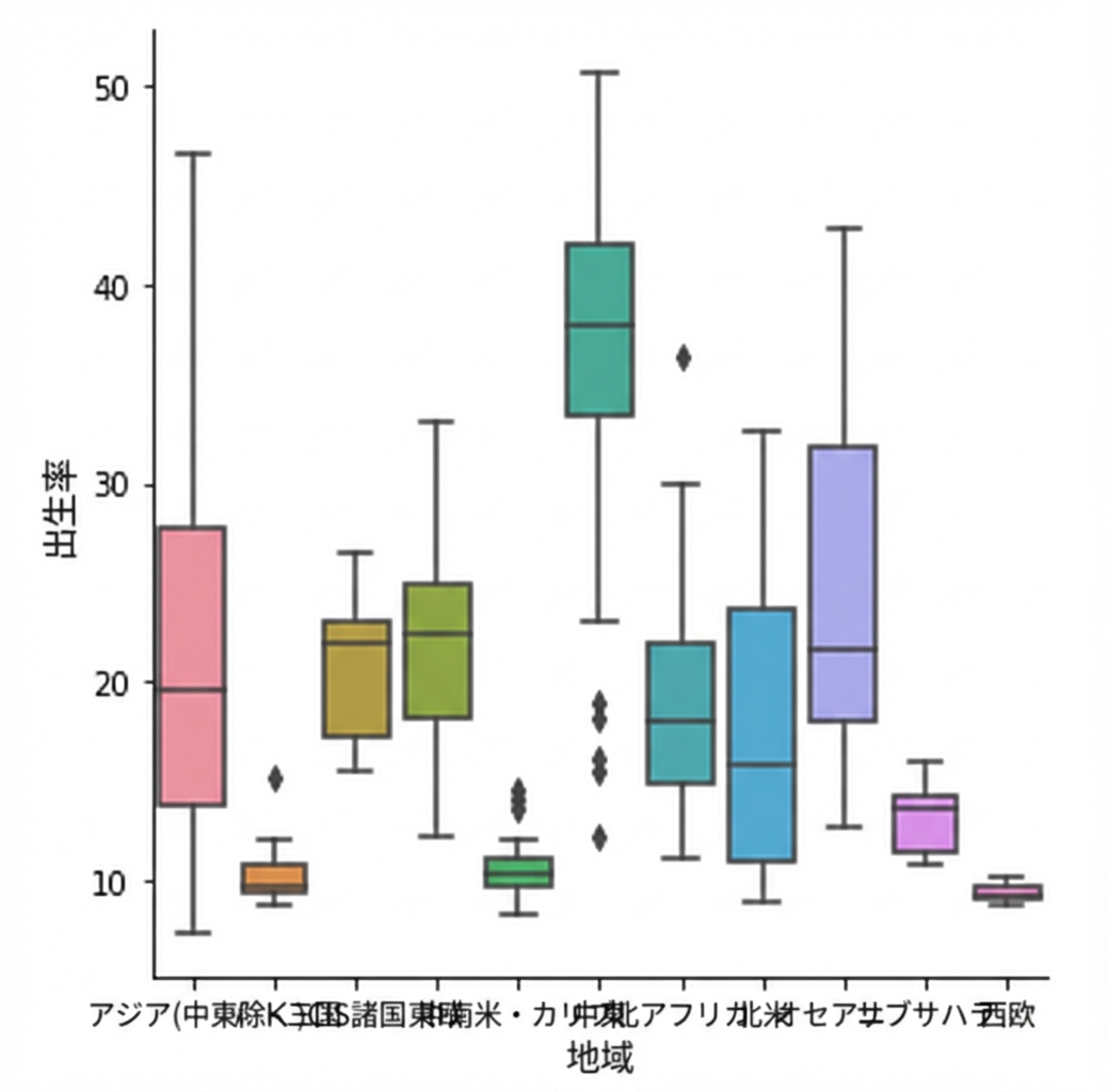
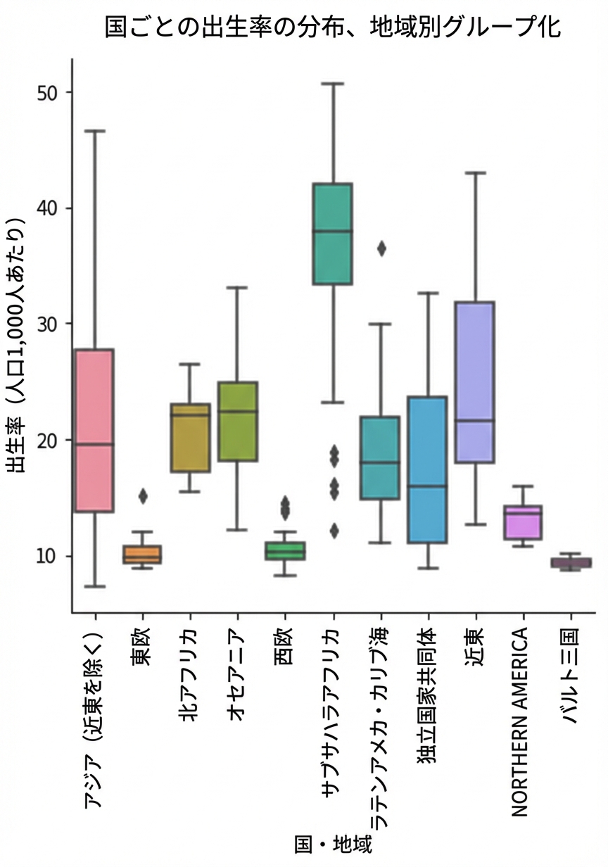
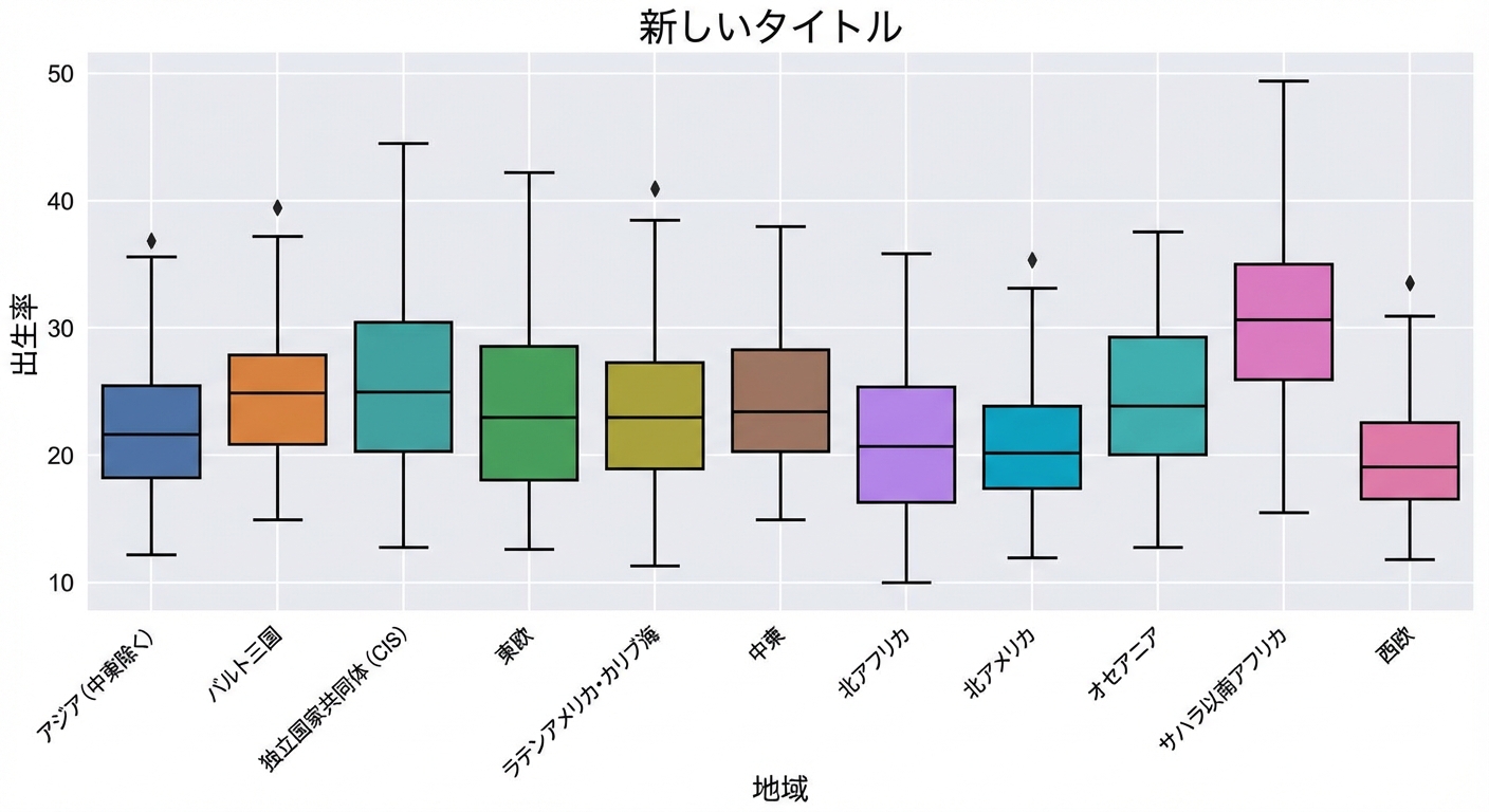
g = sns.catplot(x="Region",
                y="Birthrate",
                data=gdp_data,
                kind="box")

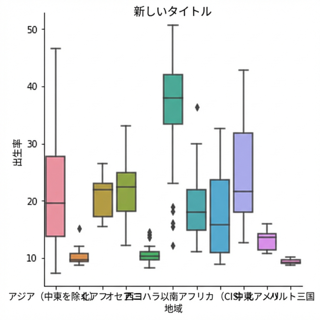
g.figure.suptitle("New Title")

plt.show()
g = sns.catplot(x="Region", y="Birthrate", data=gdp_data, kind="box")
g.figure.suptitle("New Title")
plt.show()
g = sns.catplot(x="Region",
                y="Birthrate",
                data=gdp_data,
                kind="box")

g.figure.suptitle("New Title",
               y=1.03)

plt.show()