hueで3つ目の変数を追加する

Seabornで学ぶデータ可視化入門

Content Team

DataCamp

tipsデータセット

import pandas as pd
import seaborn as sns

tips = sns.load_dataset("tips")
tips.head()
   total_bill   tip     sex smoker  day    time  size
0       16.99  1.01  Female     No  Sun  Dinner     2
1       10.34  1.66    Male     No  Sun  Dinner     3
2       21.01  3.50    Male     No  Sun  Dinner     3
3       23.68  3.31    Male     No  Sun  Dinner     2
4       24.59  3.61  Female     No  Sun  Dinner     4
1 Waskom, M. L. (2021). seaborn: statistical data visualization. https://seaborn.pydata.org/
Seabornで学ぶデータ可視化入門

基本的な散布図

import matplotlib.pyplot as plt
import seaborn as sns

sns.scatterplot(x="total_bill", 
                y="tip", 
                data=tips)

plt.show()

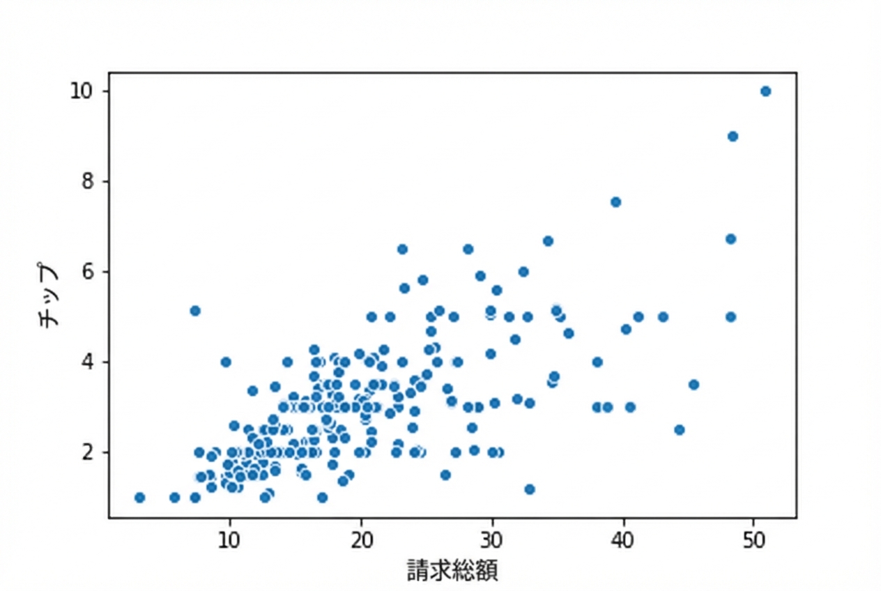
合計金額とチップ額の散布図

1 Waskom, M. L. (2021). seaborn: statistical data visualization. https://seaborn.pydata.org/
Seabornで学ぶデータ可視化入門

hueを使った散布図

import matplotlib.pyplot as plt
import seaborn as sns

sns.scatterplot(x="total_bill", 
                y="tip", 
                data=tips,
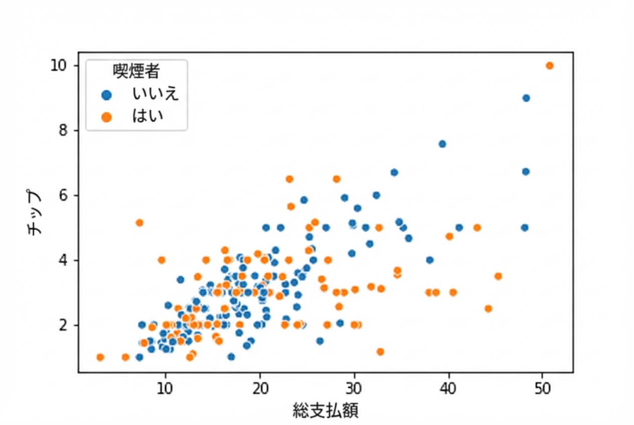
                hue="smoker")

plt.show()

喫煙状況で色分けされた散布図

1 Waskom, M. L. (2021). seaborn: statistical data visualization. https://seaborn.pydata.org/
Seabornで学ぶデータ可視化入門

hueの順序を設定する

import matplotlib.pyplot as plt
import seaborn as sns

sns.scatterplot(x="total_bill", 
                y="tip", 
                data=tips,
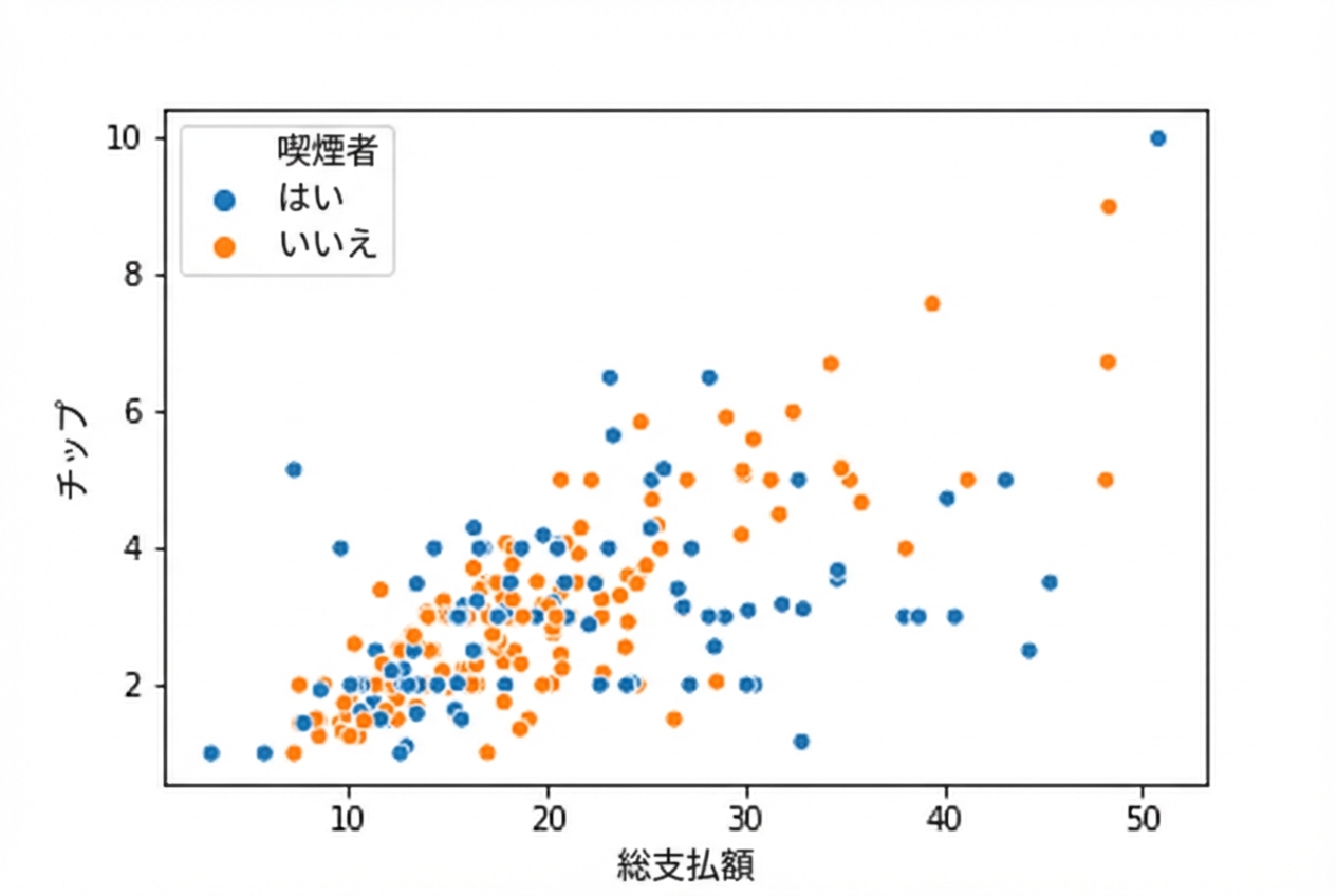
                hue="smoker",
                hue_order=["Yes", 
                           "No"])

plt.show()

凡例で喫煙者が非喫煙者より前に表示された散布図

1 Waskom, M. L. (2021). seaborn: statistical data visualization. https://seaborn.pydata.org/
Seabornで学ぶデータ可視化入門

hueの色を指定する

import matplotlib.pyplot as plt
import seaborn as sns

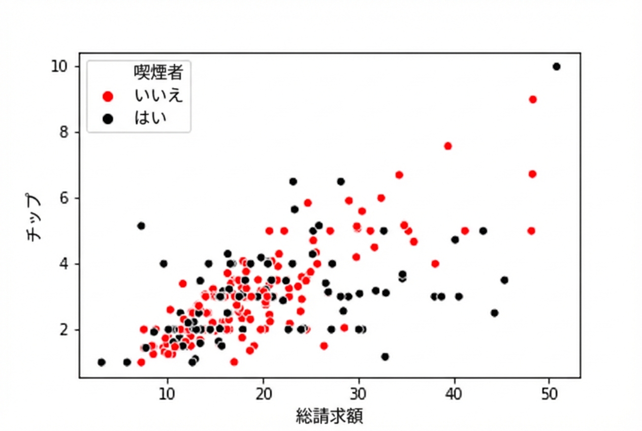
hue_colors = {"Yes": "black", "No": "red"}
sns.scatterplot(x="total_bill", y="tip", data=tips, hue="smoker", palette=hue_colors) plt.show()

黒と赤のhue色を使った散布図

1 Waskom, M. L. (2021). seaborn: statistical data visualization. https://seaborn.pydata.org/
Seabornで学ぶデータ可視化入門

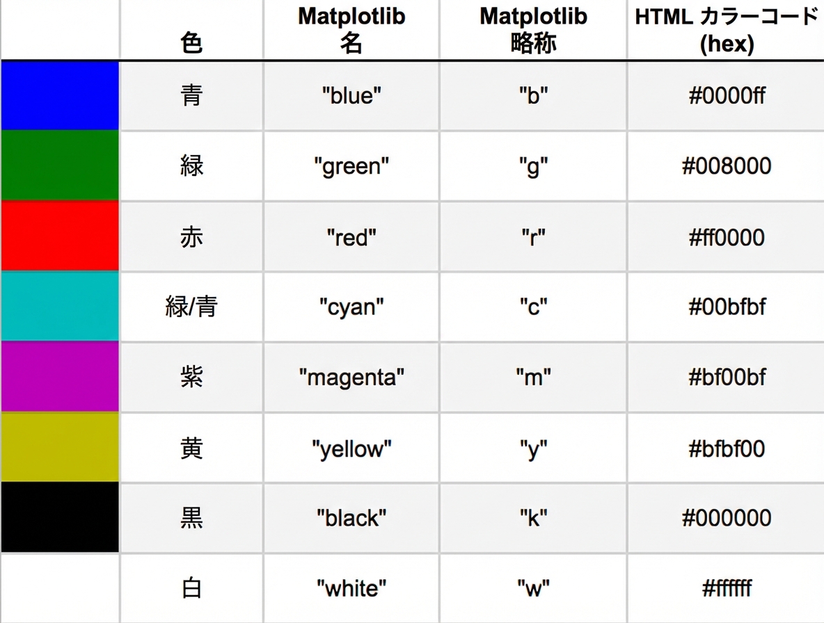
色名と16進数コードの表

Seabornで学ぶデータ可視化入門

hueにHTMLの16進数カラーコードを使う

import matplotlib.pyplot as plt
import seaborn as sns

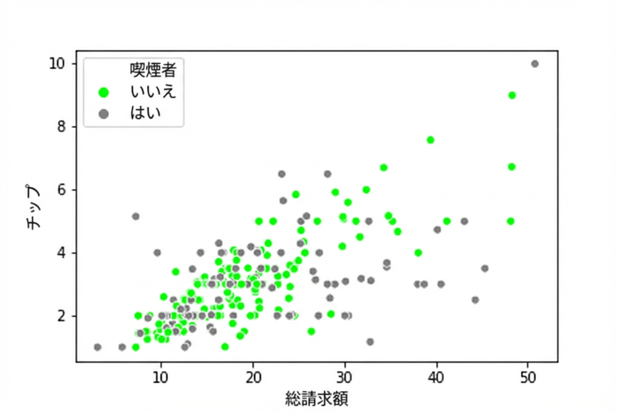
hue_colors = {"Yes": "#808080", 
              "No": "#00FF00"}

sns.scatterplot(x="total_bill", 
                y="tip", 
                data=tips,
                hue="smoker",
                palette=hue_colors)

plt.show()

16進数カラーコードを使った散布図

1 Waskom, M. L. (2021). seaborn: statistical data visualization. https://seaborn.pydata.org/
Seabornで学ぶデータ可視化入門

カウントプロットでhueを使う

import matplotlib.pyplot as plt
import seaborn as sns

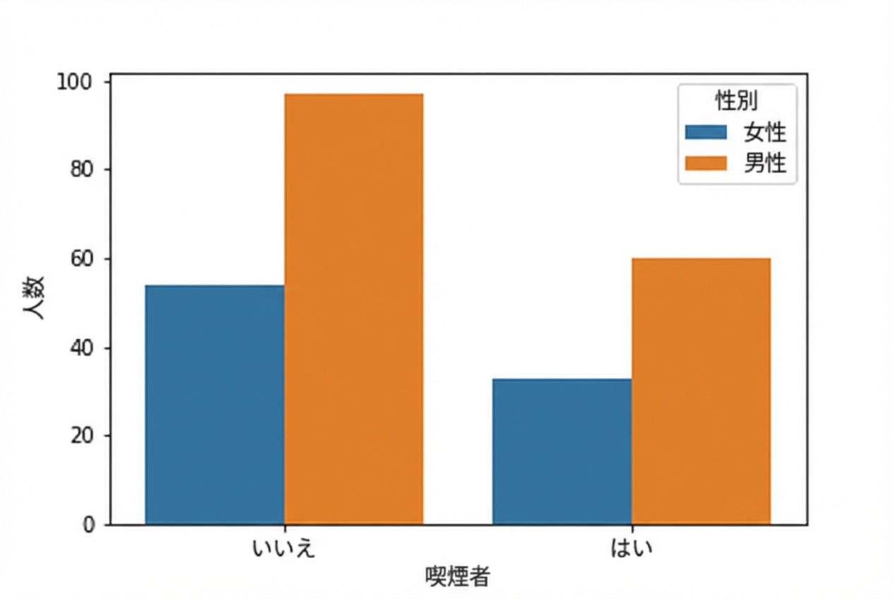
sns.countplot(x="smoker", 
              data=tips, 
              hue="sex")

plt.show()

男女別サブグループで喫煙状況を示したカウントプロット

1 Waskom, M. L. (2021). seaborn: statistical data visualization. https://seaborn.pydata.org/
Seabornで学ぶデータ可視化入門

練習しましょう!

Seabornで学ぶデータ可視化入門

Preparing Video For Download...