ファイナンスのためのPython入門
Adina Howe
Professor
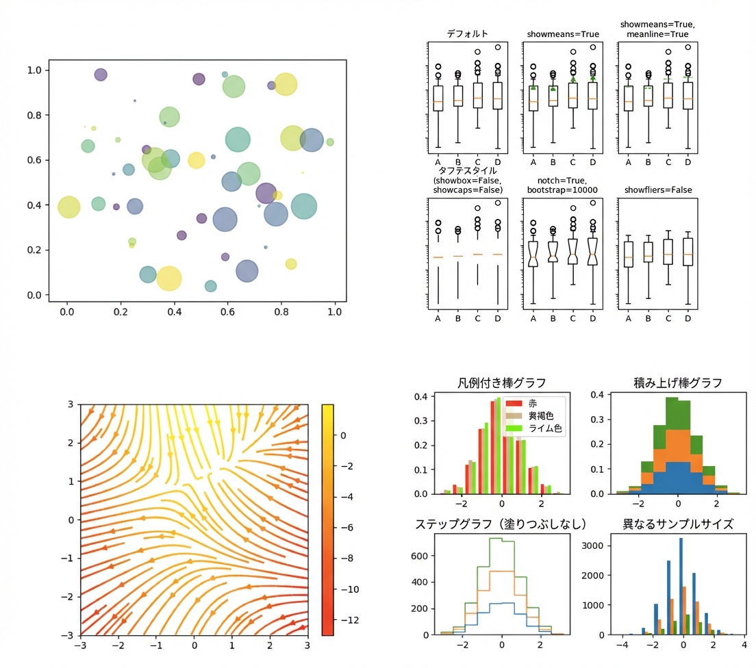
Matplotlib ギャラリーはこのリンクからご覧いただけます。
import matplotlib.pyplot as plt
plt.plot()
plt.show()
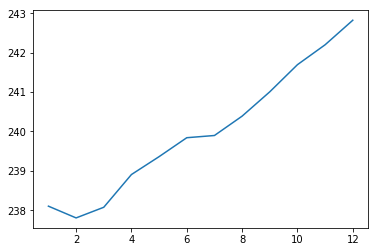
import matplotlib.pyplot as plt
plt.plot(months, prices)
plt.show()
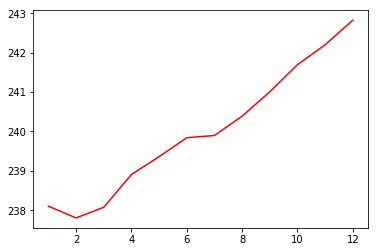
import matplotlib.pyplot as plt
plt.plot(months, prices, color = 'red')
plt.show()
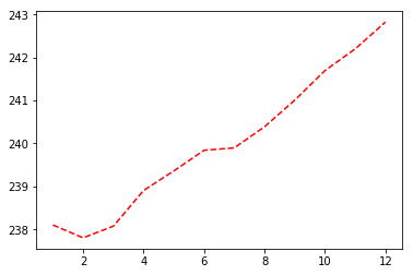
import matplotlib.pyplot as plt
plt.plot(months, prices, color = 'red', linestyle = '--')
plt.show()
色と線の詳細なドキュメントはこちらをご覧ください。
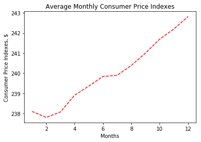
import matplotlib.pyplot as plt
plt.plot(months, prices, color = 'red', linestyle = '--')

# ラベルを追加
plt.xlabel('Months')
plt.ylabel('Consumer Price Indexes, $')
plt.title('Average Monthly Consumer Price Indexes')

# 表示
plt.show()
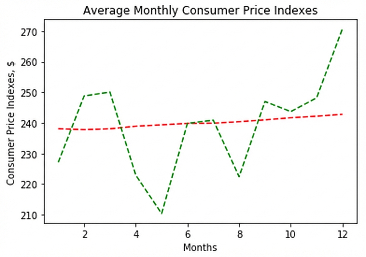
import matplotlib.pyplot as plt
plt.plot(months, prices, color = 'red', linestyle = '--')

# さらに線を追加
plt.plot(months, prices_new, color = 'green', linestyle = '--')

plt.xlabel('Months')
plt.ylabel('Consumer Price Indexes, $')
plt.title('Average Monthly Consumer Price Indexes')
plt.show()
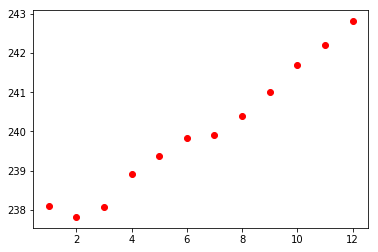
import matplotlib.pyplot as plt
plt.scatter(x = months, y = prices, color = 'red')
plt.show()