変数の変換

Rで学ぶ回帰入門

Richie Cotton

Data Evangelist at DataCamp

パーチのデータセット

library(dplyr)

perch <- fish %>%
  filter(species == "Perch")
species mass_g length_cm
Perch 5.9 7.5
Perch 32.0 12.5
Perch 40.0 13.8
Perch 51.5 15.0
Perch 70.0 15.7
... ... ...
Rで学ぶ回帰入門

線形関係ではない

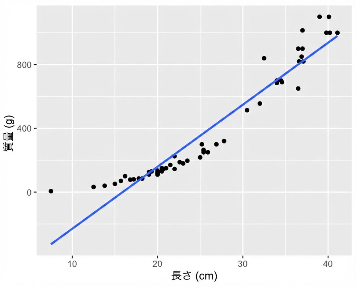
ggplot(perch, aes(length_cm, mass_g)) +
  geom_point() +
  geom_smooth(method = "lm", se = FALSE)

長さに対するパーチの質量の散布図(トレンド線あり)。長くなるほど線形より速く重くなり、上向きの曲線になる。

Rで学ぶ回帰入門

ブリーム vs パーチ

数匹のブリームが泳いでいる。ブリームは平たい。

数匹のパーチが泳いでいる。パーチは丸みがある。

Rで学ぶ回帰入門

質量 vs. 長さの3乗のプロット

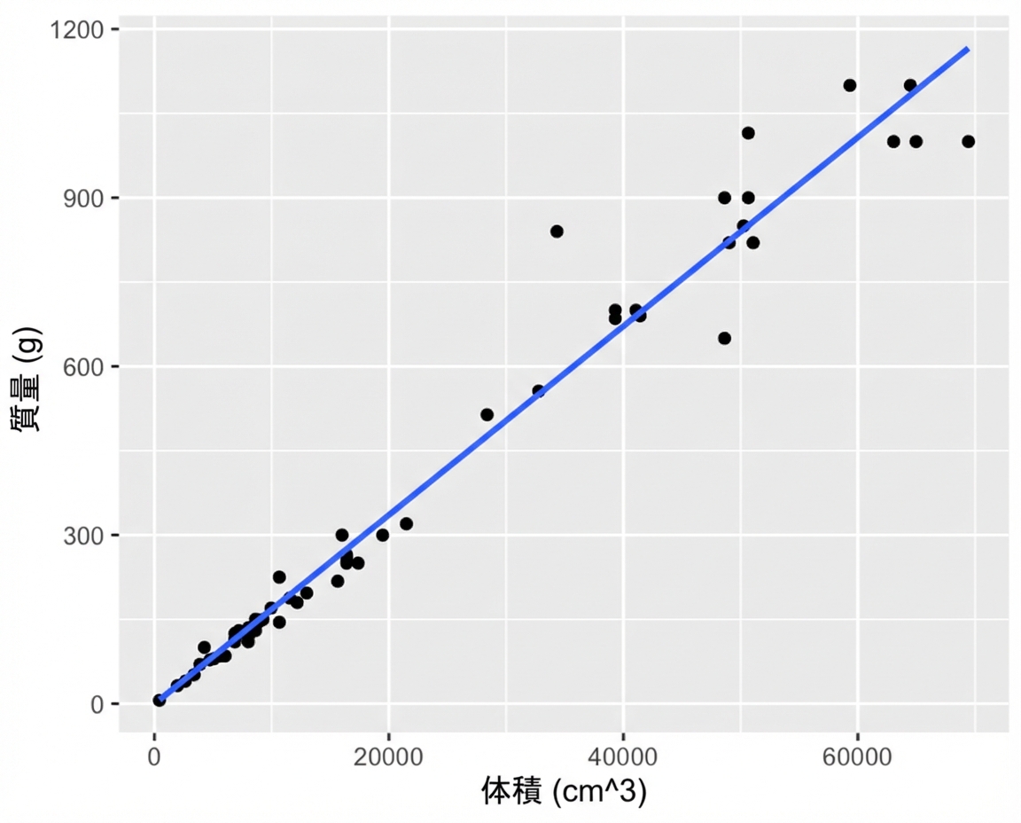
ggplot(perch, aes(length_cm ^ 3, mass_g)) +
  geom_point() +
  geom_smooth(method = "lm", se = FALSE)

長さの3乗に対するパーチの質量の散布図(トレンド線あり)。この変換後、点は概ねトレンド線に近い。

Rで学ぶ回帰入門

質量 vs. 長さの3乗のモデル化

mdl_perch <- lm(mass_g ~ I(length_cm ^ 3), data = perch)
Call:
lm(formula = mass_g ~ I(length_cm^3), data = perch)

Coefficients:
   (Intercept)  I(length_cm^3)  
       -0.1175          0.0168
Rで学ぶ回帰入門

質量 vs. 長さの3乗の予測

explanatory_data <- tibble(
  length_cm = seq(10, 40, 5)
)
prediction_data <- explanatory_data %>%
  mutate(
    mass_g = predict(mdl_perch, explanatory_data)
  )
# A tibble: 7 x 2
  length_cm mass_g
      <dbl>  <dbl>
1        10   16.7
2        15   56.6
3        20  134. 
4        25  262. 
5        30  453. 
6        35  720. 
7        40 1075.
Rで学ぶ回帰入門

質量 vs. 長さの3乗のプロット

ggplot(perch, aes(length_cm ^ 3, mass_g)) +
  geom_point() +
  geom_smooth(method = "lm", se = FALSE) +
  geom_point(data = prediction_data, color = "blue")
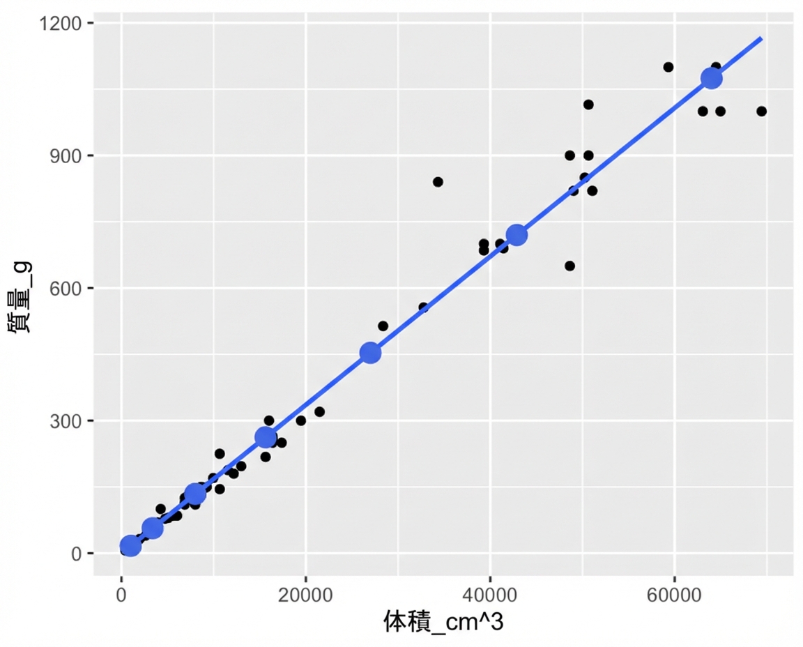
長さの3乗に対する質量の散布図(トレンド線あり)。predict() で計算した点を注記。点はトレンド線に完全に一致。

ggplot(perch, aes(length_cm, mass_g)) +
  geom_point() +
  geom_smooth(method = "lm", se = FALSE) +
  geom_point(data = prediction_data, color = "blue")
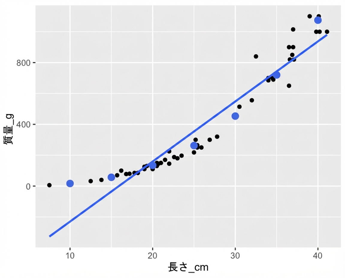
長さに対する質量の散布図(トレンド線あり)。predict() で計算した点を注記。点はトレンド線には沿わないが、データの曲線には沿う。

Rで学ぶ回帰入門

Facebook広告のデータセット

広告の仕組み

  1. Facebookに支払い、広告を配信。
  2. ユーザーが広告を見る(「インプレッション」)。
  3. 見た一部がクリック。


  • 936行
  • 各行は1件の広告
spent_usd n_impressions n_clicks
1.43 7350 1
1.82 17861 2
1.25 4259 1
1.29 4133 1
4.77 15615 3
... ... ...
Rで学ぶ回帰入門

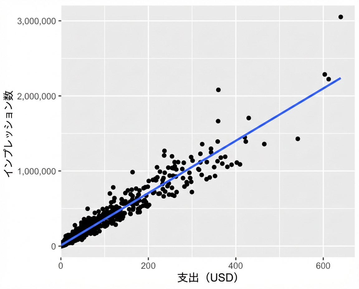
プロットが密集している

ggplot(
  ad_conversion, 
  aes(spent_usd, n_impressions)
) +
  geom_point() +
  geom_smooth(method = "lm", se = FALSE)

インプレッション数 vs 広告費の散布図(トレンド線あり)。多くの点が左下に密集している。

Rで学ぶ回帰入門

平方根 vs 平方根

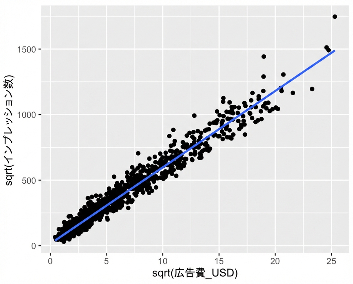
ggplot(
  ad_conversion, 
  aes(sqrt(spent_usd), sqrt(n_impressions))
) +
  geom_point() +
  geom_smooth(method = "lm", se = FALSE)

インプレッション数の平方根 vs 広告費の平方根の散布図(トレンド線あり)。点は図全体により均等に広がっている。

Rで学ぶ回帰入門

モデル化と予測

mdl_ad <- lm(
  sqrt(n_impressions) ~ sqrt(spent_usd), 
  data = ad_conversion
)
explanatory_data <- tibble(
  spent_usd = seq(0, 600, 100)
)
prediction_data <- explanatory_data %>% 
  mutate(
    sqrt_n_impressions = predict(
      mdl_ad, explanatory_data
    ),
    n_impressions = sqrt_n_impressions ^ 2
  )
# A tibble: 7 x 3
  spent_usd sqrt_n_impressions n_impressions
      <dbl>              <dbl>         <dbl>
1         0               15.3          235.
2       100              598.        357289.
3       200              839.        703890.
4       300             1024.       1048771.
5       400             1180.       1392762.
6       500             1318.       1736184.
7       600             1442.       2079202.
Rで学ぶ回帰入門

Passons à la pratique !

Rで学ぶ回帰入門

Preparing Video For Download...