축하합니다

Python으로 하는 탐색적 데이터 분석

George Boorman

Curriculum Manager, DataCamp

검사 및 검증
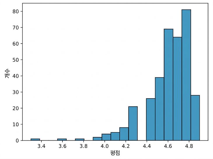
a histogram of book ratings

books["year"] = books["year"].astype(int)
books.dtypes
name       object
author     object
rating    float64
year        int64
genre      object
dtype: object
Python으로 하는 탐색적 데이터 분석

집계

books.groupby("genre").agg(
    mean_rating=("rating", "mean"),
    std_rating=("rating", "std"),
    median_year=("year", "median")
)
|  genre      | mean_rating | std_rating | median_year |
|-------------|-------------|------------|-------------|
|   Childrens |    4.780000 |   0.122370 |      2015.0 |
|     Fiction |    4.570229 |   0.281123 |      2013.0 |
| Non Fiction |    4.598324 |   0.179411 |      2013.0 |
Python으로 하는 탐색적 데이터 분석

결측 데이터 처리하기

print(salaries.isna().sum())
Working_Year            12
Designation             27
Experience              33
Employment_Status       31
Employee_Location       28
Company_Size            40
Remote_Working_Ratio    24
Salary_USD              60
dtype: int64
Python으로 하는 탐색적 데이터 분석

결측 데이터 처리하기

  • 결측값 삭제
  • 평균, 중앙값, 최빈값 대치
  • 하위 그룹별로 대치
salaries_dict = salaries.groupby("Experience")["Salary_USD"].median().to_dict()
salaries["Salary_USD"] = salaries["Salary_USD"].fillna(salaries["Experience"].map(salaries_dict))
Python으로 하는 탐색적 데이터 분석

범주형 데이터 분석

salaries["Job_Category"] = np.select(conditions, 
                                     job_categories, 
                                     default="Other")
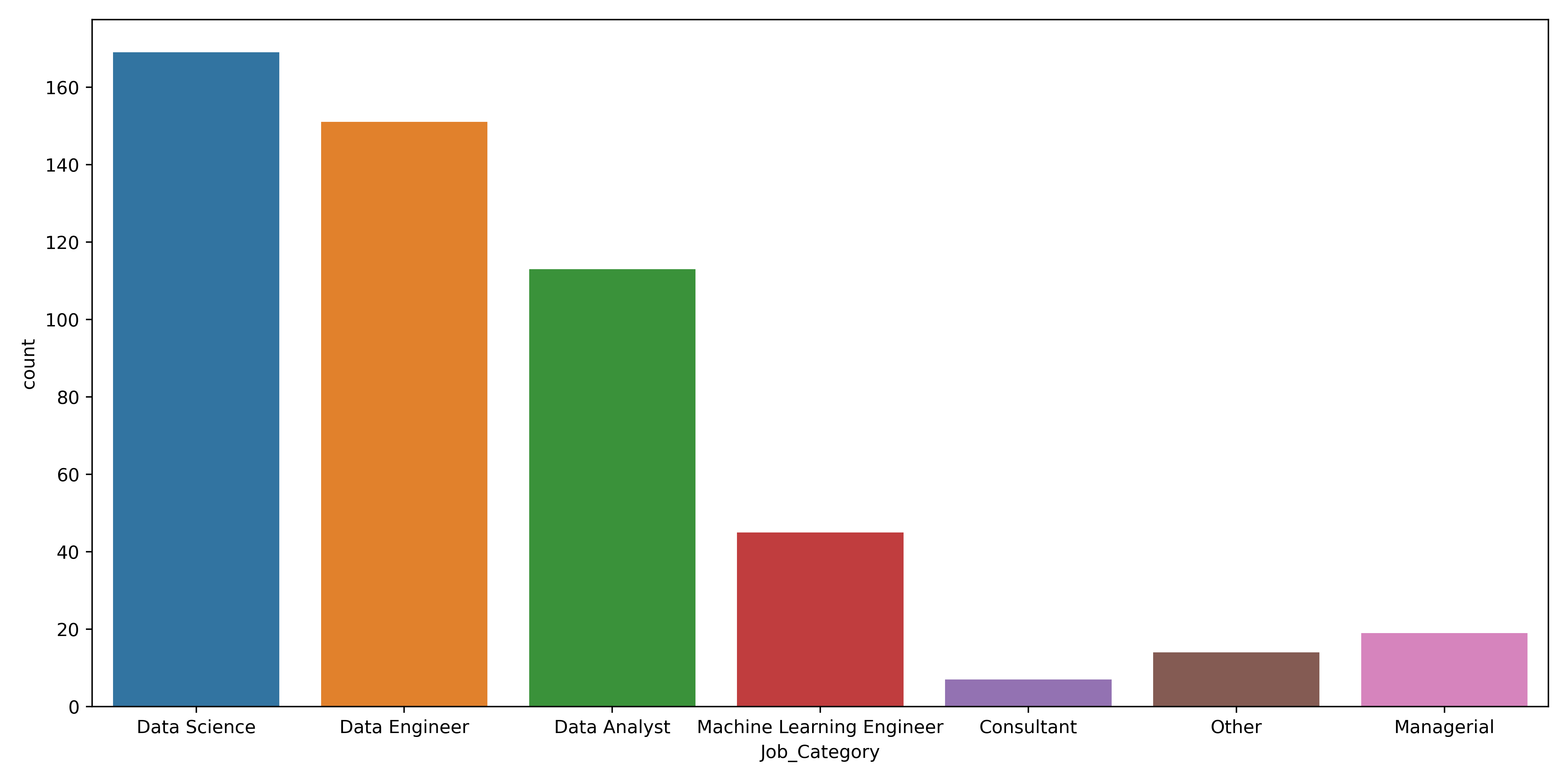
Bar plot displaying the count of jobs by category

Python으로 하는 탐색적 데이터 분석

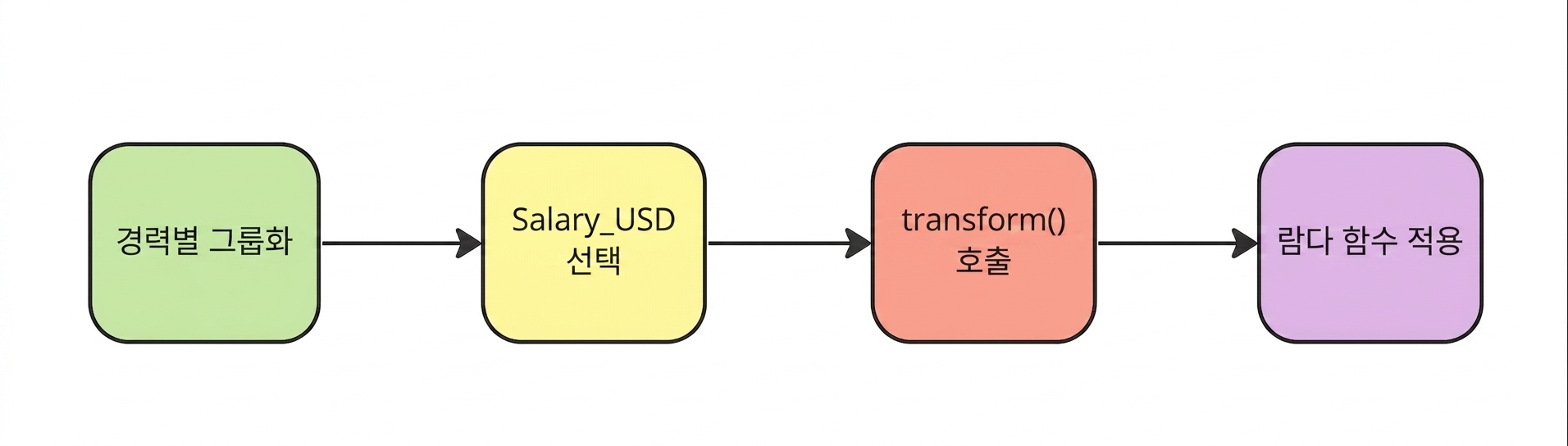
람다 함수 적용

Apply a lambda function

salaries["std_dev"] = salaries.groupby("Experience")["Salary_USD"].transform(lambda x: x.std())
Python으로 하는 탐색적 데이터 분석

이상치 처리하기

sns.boxplot(data=salaries,
            y="Salary_USD")
plt.show()
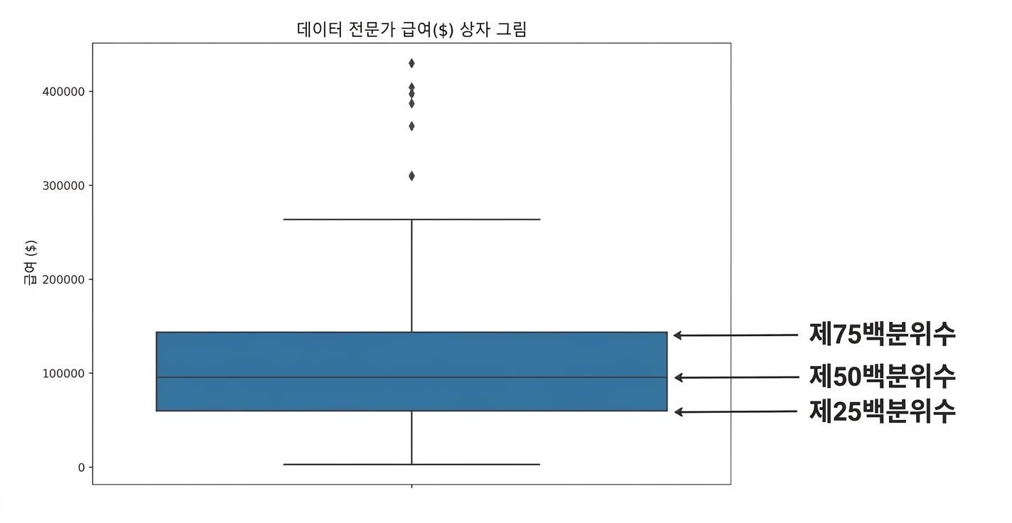
Box plot of salaries for data professionals, showing the 25th percentile at the bottom of the box, the 50th percentile as the middle line, and the 75th percentile at the top of the box

Python으로 하는 탐색적 데이터 분석

시간에 따른 패턴

sns.lineplot(data=divorce, x="marriage_month", y="marriage_duration")
plt.show()
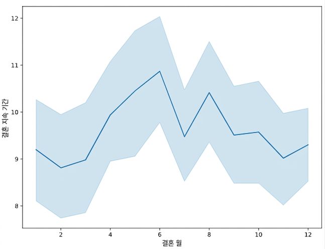
A line plot showing the relationship between month of marriage and marriage duration

Python으로 하는 탐색적 데이터 분석

상관관계

sns.heatmap(divorce.corr(numeric_only=True), annot=True)
plt.show()
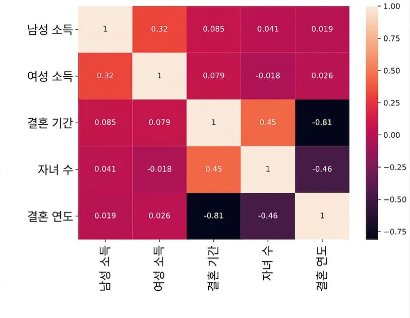
A heat map of divorce correlations

Python으로 하는 탐색적 데이터 분석

분포

sns.kdeplot(data=divorce, x="marriage_duration", hue="education_man", cut=0)
plt.show()

marriage duration kde with hue set to education_man and cut equal to zero

Python으로 하는 탐색적 데이터 분석

교차표

pd.crosstab(planes["Source"], planes["Destination"],
            values=planes["Price"], aggfunc="median")
Destination  Banglore   Cochin   Delhi  Hyderabad  Kolkata  New Delhi
Source                                                               
Banglore          NaN      NaN  4823.0        NaN      NaN    10976.5
Chennai           NaN      NaN     NaN        NaN   3850.0        NaN
Delhi             NaN  10262.0     NaN        NaN      NaN        NaN
Kolkata        9345.0      NaN     NaN        NaN      NaN        NaN
Mumbai            NaN      NaN     NaN     3342.0      NaN        NaN
Python으로 하는 탐색적 데이터 분석

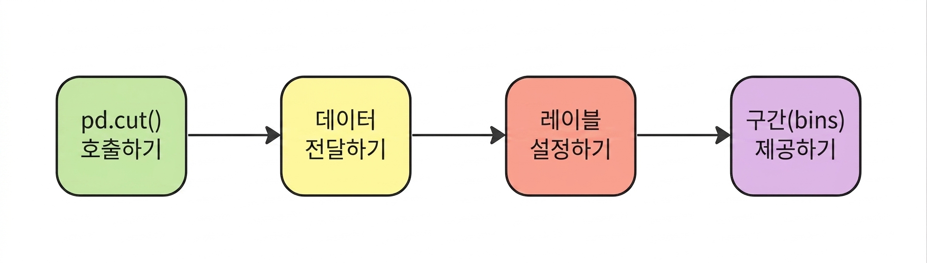
pd.cut()

Provide the bins

planes["Price_Category"] = pd.cut(planes["Price"],
                                  labels=labels,
                                  bins=bins)
Python으로 하는 탐색적 데이터 분석

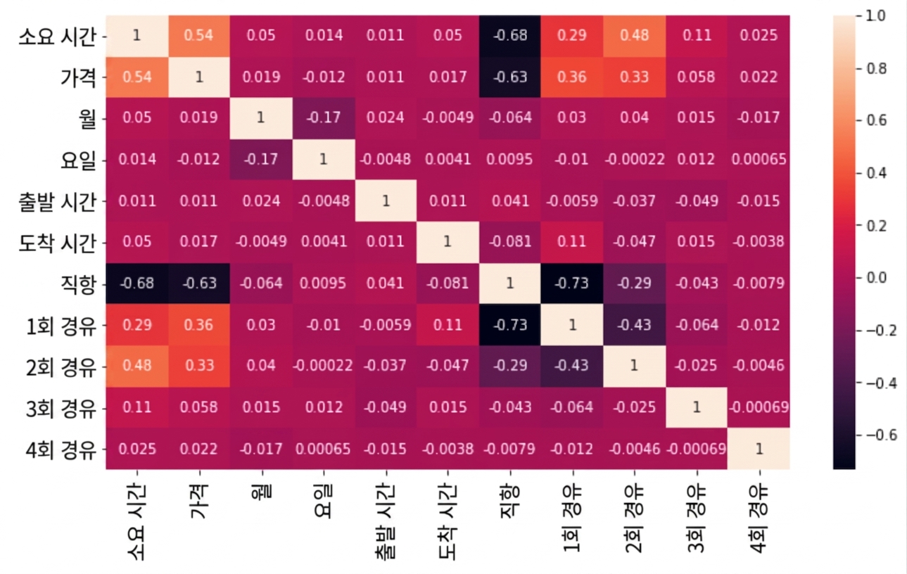
데이터 스누핑

Heatmap with correlation coefficient scores for each number of stops

Python으로 하는 탐색적 데이터 분석

가설 생성하기

sns.barplot(data=planes, x="Airline", y="Duration")
plt.show()
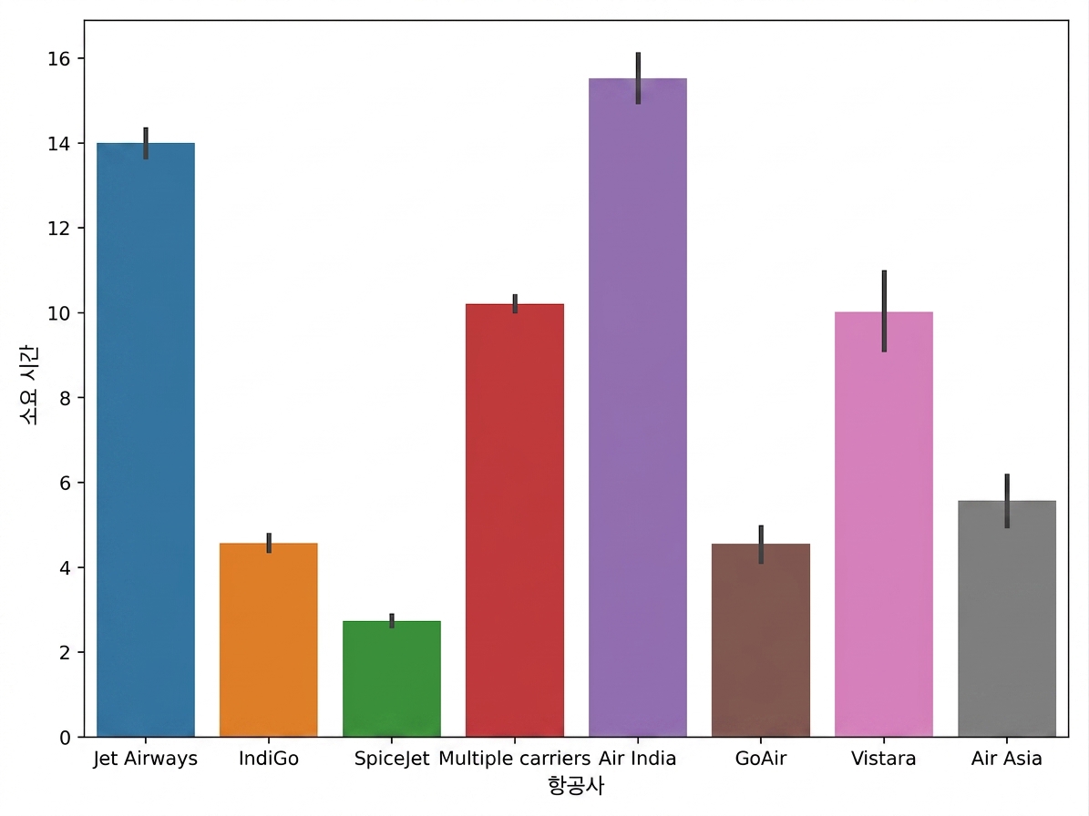
Bar plot of duration versus airline

Python으로 하는 탐색적 데이터 분석

다음 단계

Python으로 하는 탐색적 데이터 분석

축하합니다!

Python으로 하는 탐색적 데이터 분석

Preparing Video For Download...