가설 생성하기

Python으로 하는 탐색적 데이터 분석

George Boorman

Curriculum Manager, DataCamp

무엇을 알고 있나요?
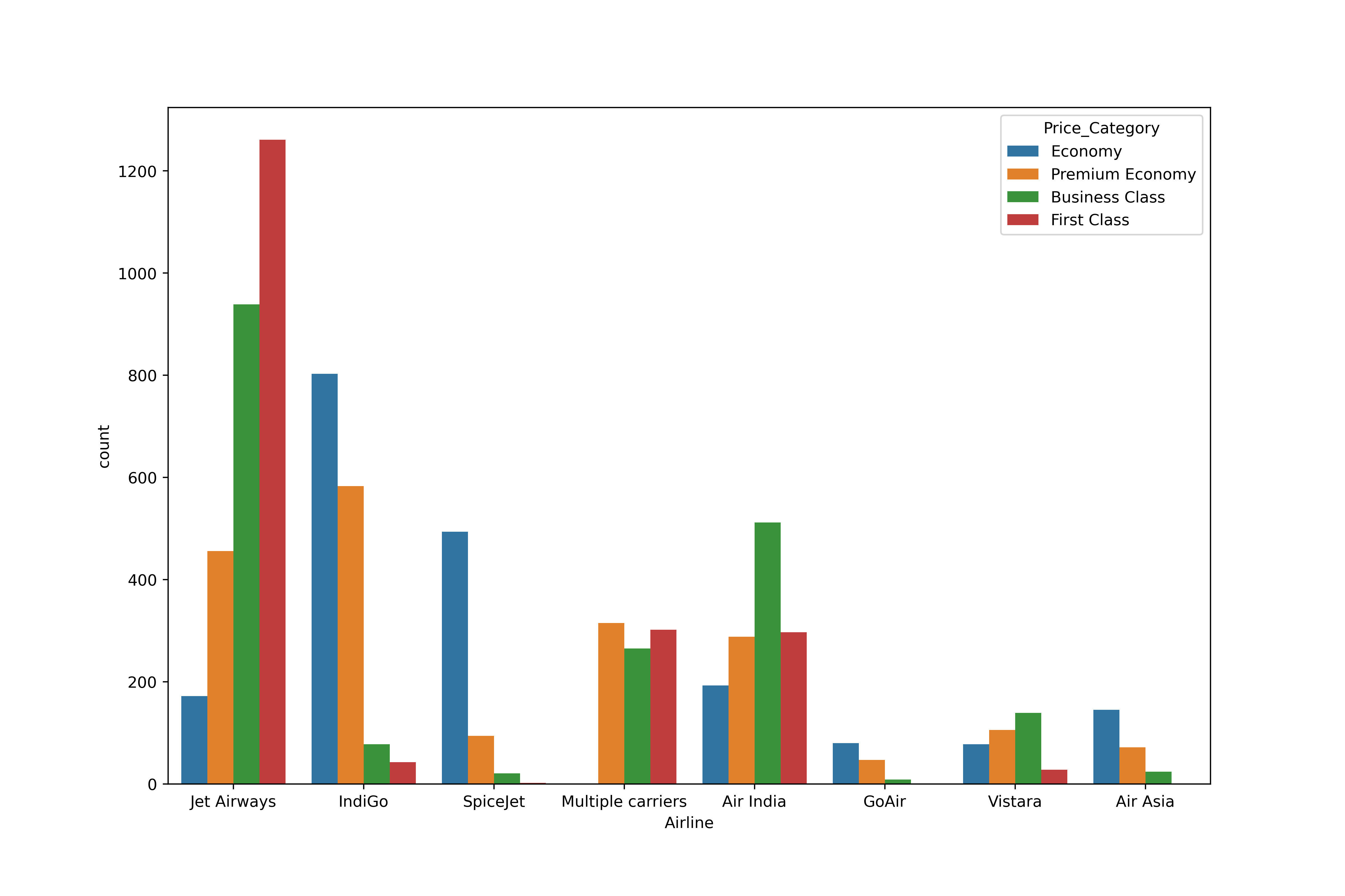
Countplot showing the number of flights per airline in different price categories, with Jet Airways having the largest number of First Class tickets

Python으로 하는 탐색적 데이터 분석

무엇을 알고 있나요?

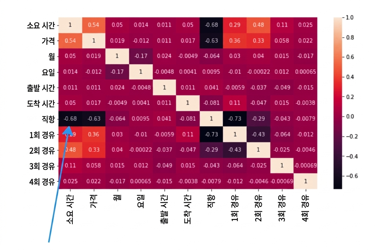
sns.heatmap(planes.corr(numeric_only=True), annot=True)
plt.show()
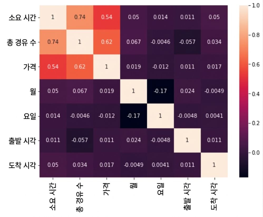
Heatmap showing Pearson correlation coefficient scores between variables in the planes dataset

Python으로 하는 탐색적 데이터 분석

허위 상관 관계

sns.scatterplot(data=planes, x="Duration", y="Price", hue="Total_Stops")
plt.show()
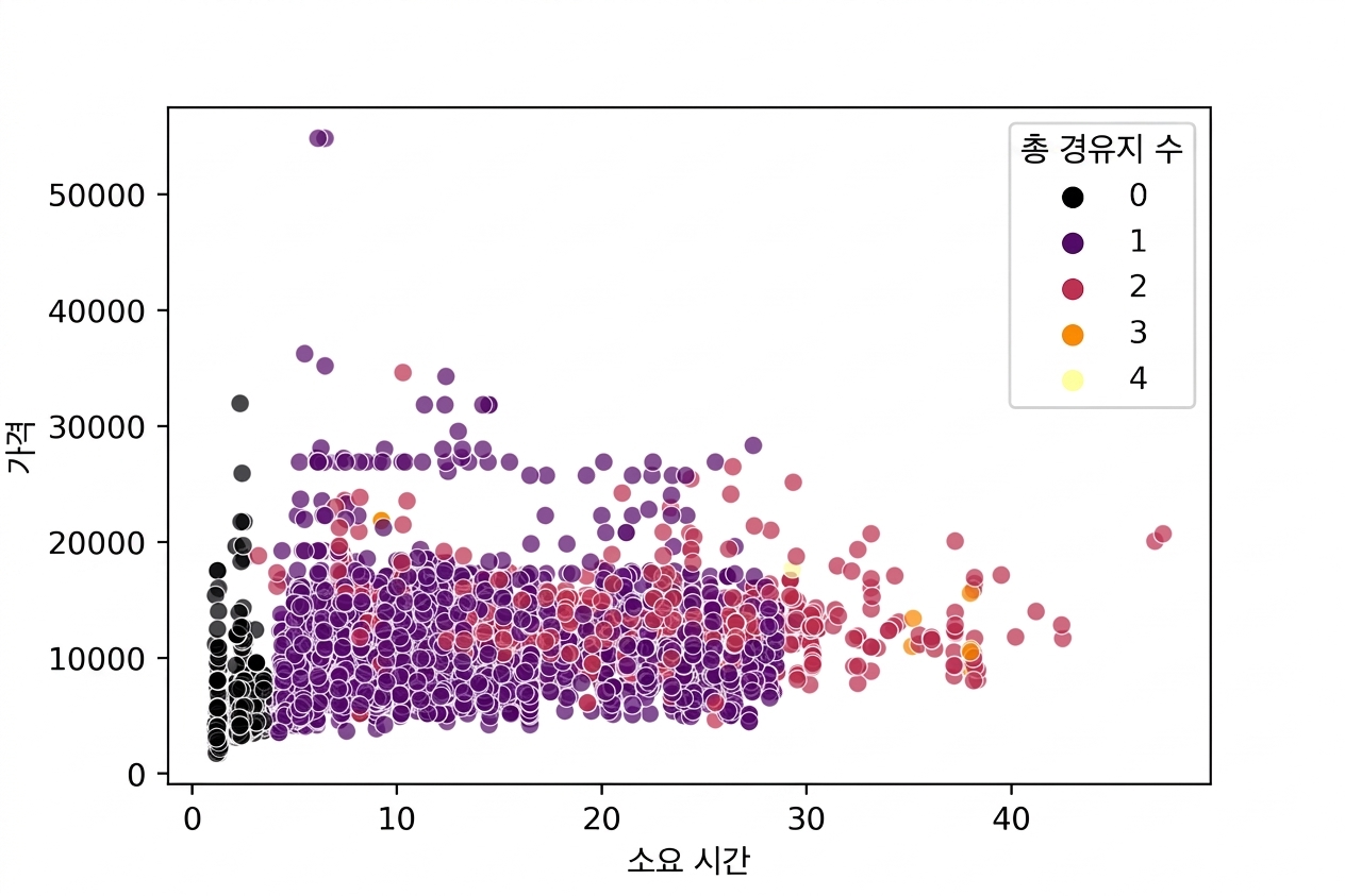
Scatter plot of Price versus Duration, factoring Total Stops

Python으로 하는 탐색적 데이터 분석

어떻게 알 수 있나요?

Heatmap with correlation coefficient scores for each number of stops

Python으로 하는 탐색적 데이터 분석

무엇이 사실일까요?

Typewriter displaying "Fake News"

  • 다른 시점의 데이터도 같은 결과를 낼까요?

  • 관계, 차이점, 패턴 감지:

    • 가설 검정을 사용합니다
  • 가설 검정은 데이터 수집 전에 준비가 필요합니다:

    • 가설 또는 질문 생성
    • 사용할 통계 검정 결정
1 이미지 출처: https://unsplash.com/@markuswinkler
Python으로 하는 탐색적 데이터 분석

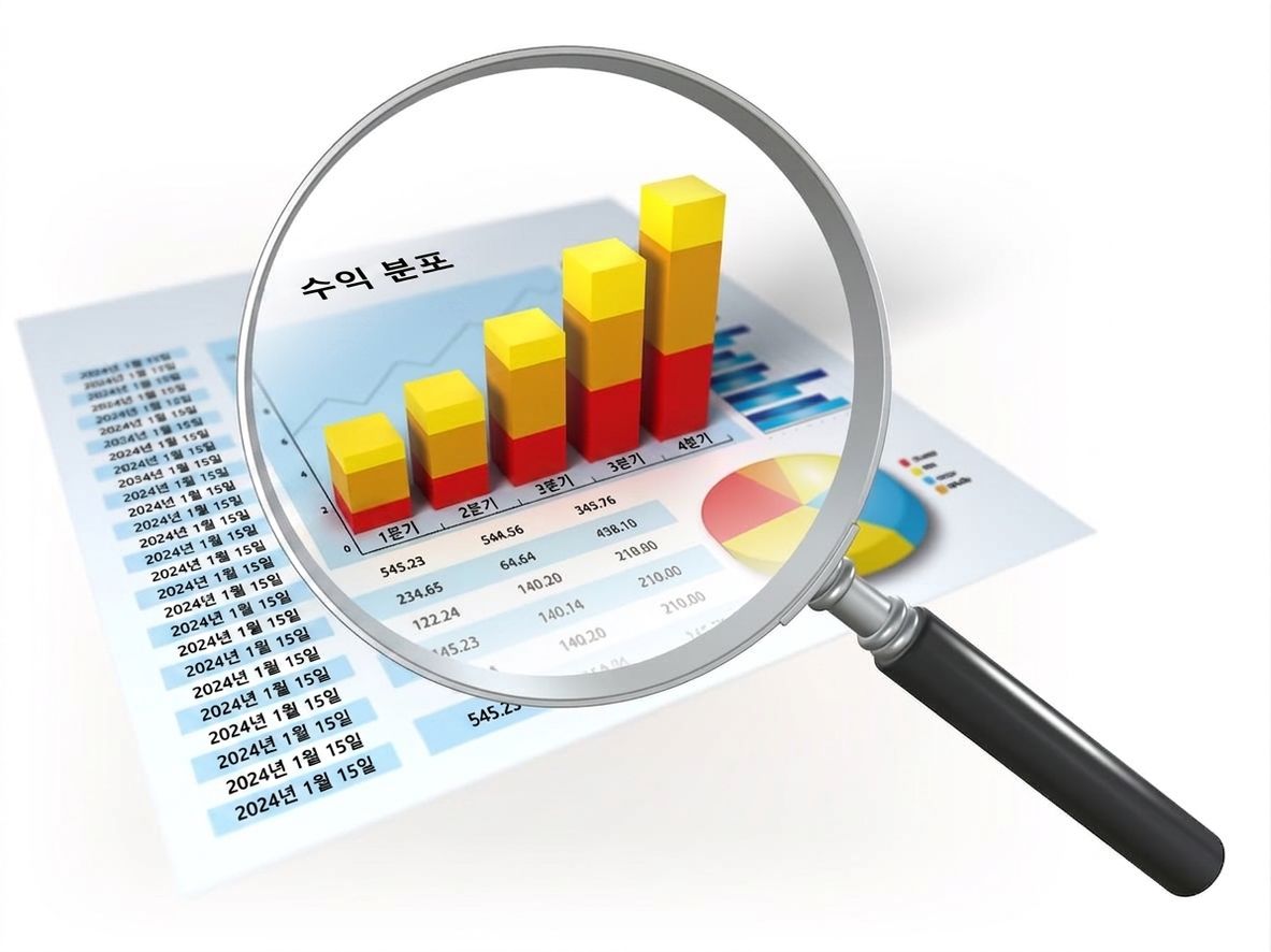
데이터 스누핑

office with a view looking out on to an airport runway

Magnifying glass looking into a bar chart

Python으로 하는 탐색적 데이터 분석

가설 생성하기

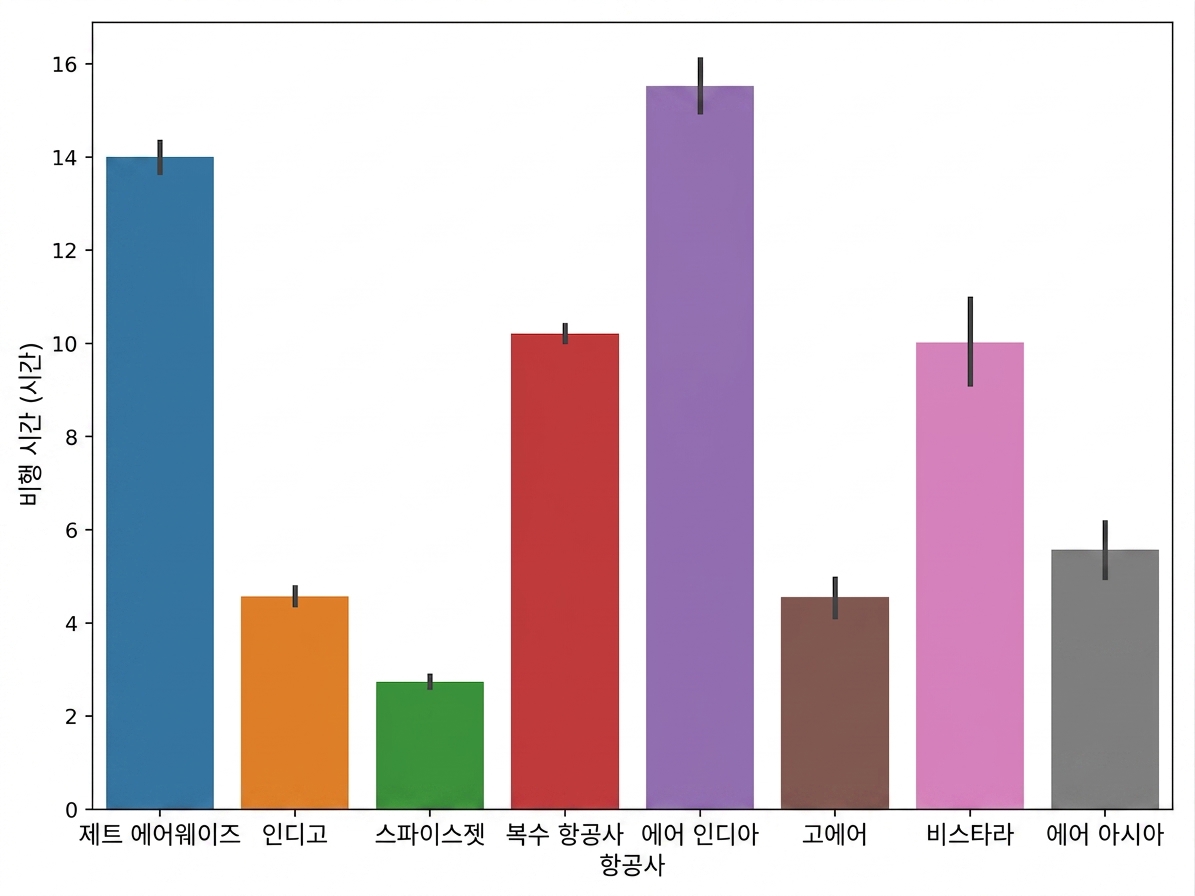
sns.barplot(data=planes, x="Airline", y="Duration")
plt.show()

Bar plot of duration versus airline

Python으로 하는 탐색적 데이터 분석

가설 생성하기

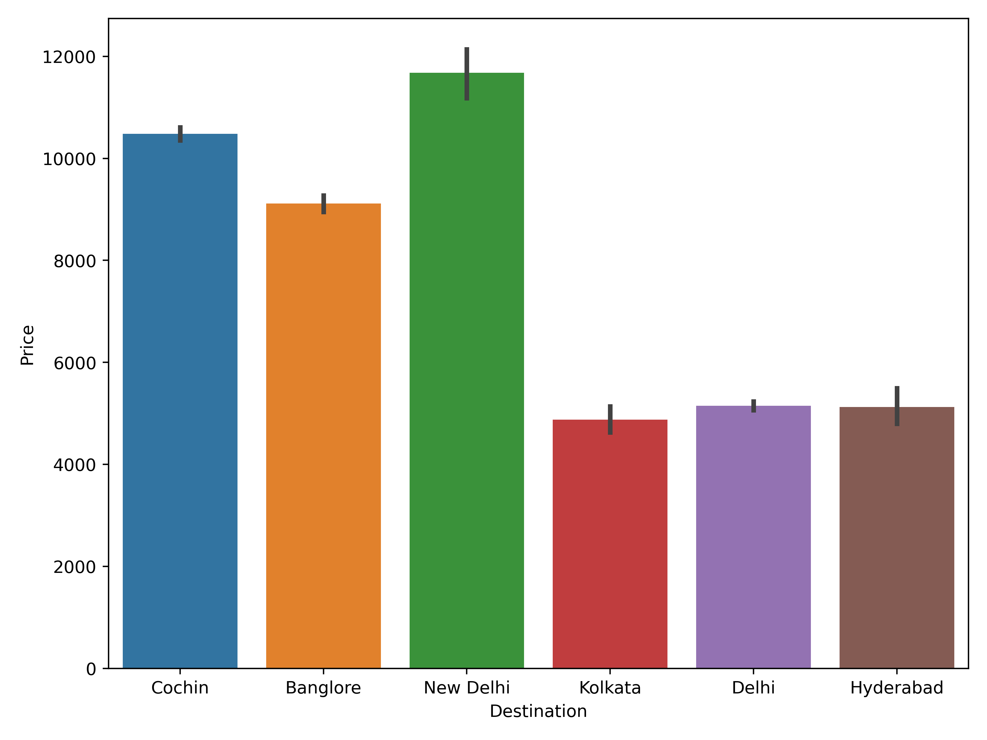
sns.barplot(data=planes, x="Destination", y="Price")
plt.show()

Bar plot showing average proce

Python으로 하는 탐색적 데이터 분석

다음 단계

실험 설계하기

  • 다음 단계:
    • 표본 선택하기
    • 필요한 데이터 포인트 수 계산
    • 사용할 통계 검정 결정하기
Python으로 하는 탐색적 데이터 분석

연습해 봅시다!

Python으로 하는 탐색적 데이터 분석

Preparing Video For Download...