산포도 그래프

ggplot2로 시작하는 데이터 시각화

Rick Scavetta

Founder, Scavetta Academy

48가지 기하 요소

geom_*
abline contour dotplot jitter pointrange ribbon spoke
area count errorbar label polygon rug step
bar crossbar errorbarh line qq segment text
bin2d curve freqpoly linerange qq_line sf tile
blank density hex map quantile sf_label violin
boxplot density2d histogram path raster sf_text vline
col density_2d hline point rect smooth
ggplot2로 시작하는 데이터 시각화

자주 쓰는 그래프 유형

그래프 유형 가능한 Geom
산포도 points, jitter, abline, smooth, count
ggplot2로 시작하는 데이터 시각화

산포도 그래프

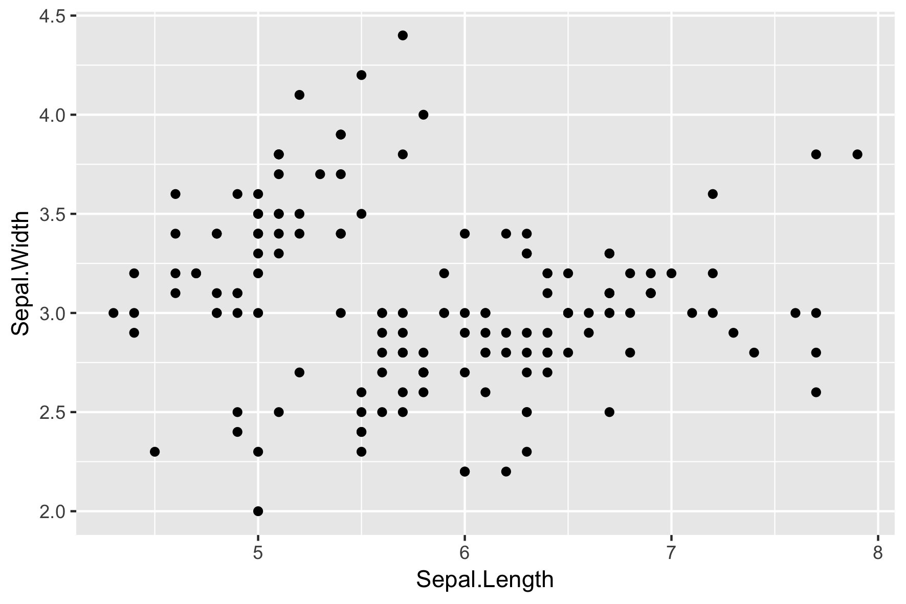
  • 각 geom은 특정 미적 매핑을 받을 수 있습니다. 예: geom_point()
필수
x,y
ggplot(iris, aes(x = Sepal.Length, 
                 y = Sepal.Width)) + 
  geom_point()
ggplot2로 시작하는 데이터 시각화

산포도 그래프

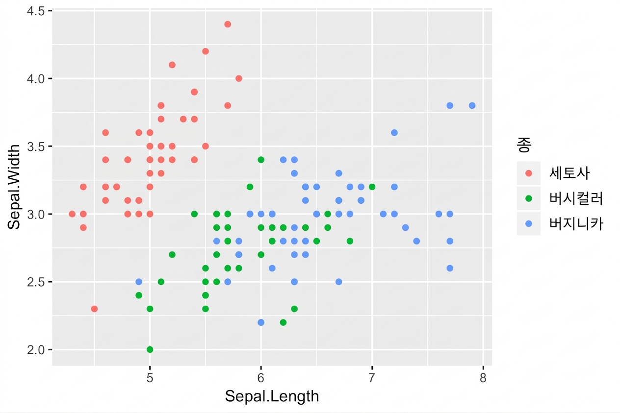
  • 각 geom은 특정 미적 매핑을 받을 수 있습니다. 예: geom_point()
필수 선택
x,y alpha, color, fill, shape, size, stroke
ggplot(iris, aes(x = Sepal.Length, 
                 y = Sepal.Width,
                 col = Species)) + 
  geom_point()
ggplot2로 시작하는 데이터 시각화

기하 요소 특화 미적 매핑

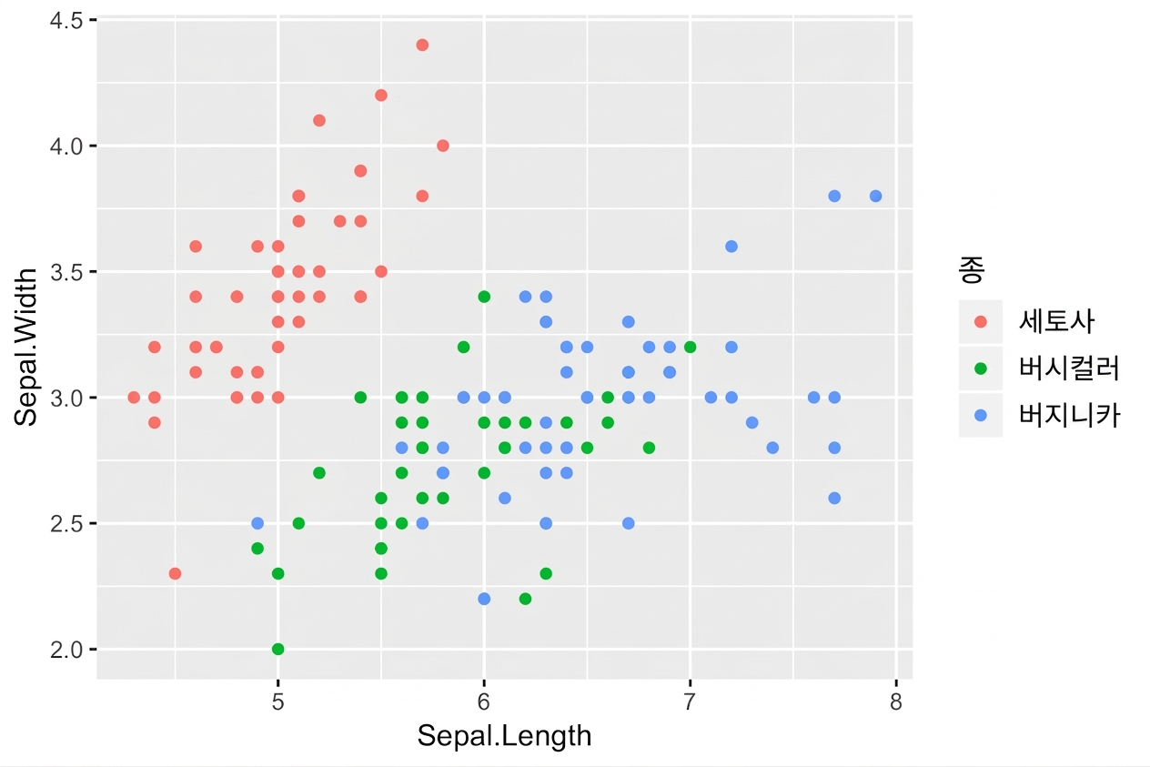
# These result in the same plot! 
ggplot(iris, aes(x = Sepal.Length, y = Sepal.Width, col = Species)) + 
  geom_point()

ggplot(iris, aes(x = Sepal.Length, y = Sepal.Width)) + 
  geom_point(aes(col = Species))

각 레이어의 미적 매핑을 개별적으로 제어:
ggplot2로 시작하는 데이터 시각화
head(iris, 3) # Raw data
Species Sepal.Length Sepal.Width Petal.Length Petal.Width
1  setosa          5.1         3.5          1.4         0.2
2  setosa          4.9         3.0          1.4         0.2
3  setosa          4.7         3.2          1.3         0.2
iris %>%
  group_by(Species) %>% 
  summarise_all(mean) -> iris.summary

iris.summary # Summary statistics
# A tibble: 3 x 5
  Species    Sepal.Length Sepal.Width Petal.Length Petal.Width
  <fct>             <dbl>       <dbl>        <dbl>       <dbl>
1 setosa             5.01        3.43         1.46       0.246
2 versicolor         5.94        2.77         4.26       1.33 
3 virginica          6.59        2.97         5.55       2.03
ggplot2로 시작하는 데이터 시각화
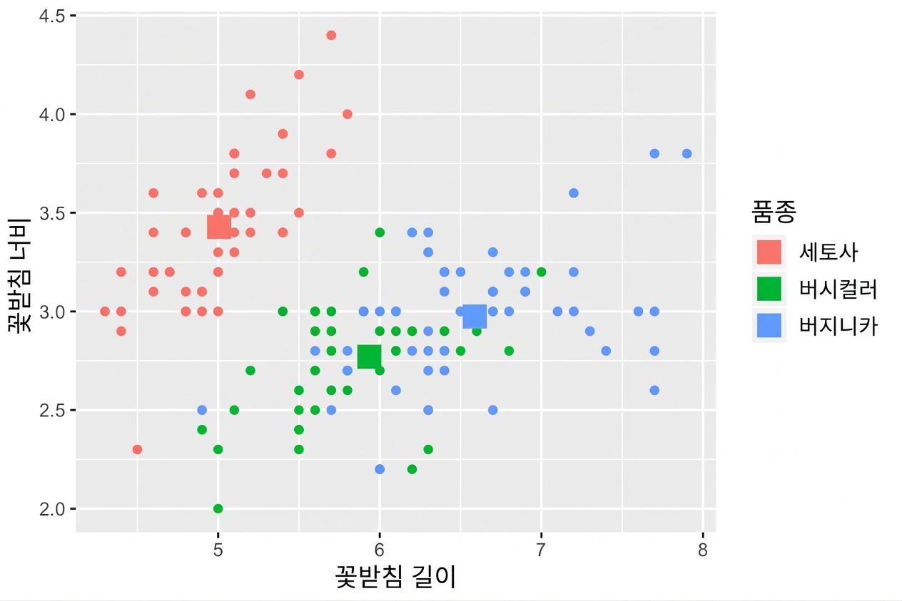
ggplot(iris, aes(x = Sepal.Length, y = Sepal.Width, col = Species)) +
  # Inherits both data and aes from ggplot() 
  geom_point() + 
  # Different data, but inherited aes
  geom_point(data = iris.summary, shape = 15, size = 5)
ggplot2로 시작하는 데이터 시각화

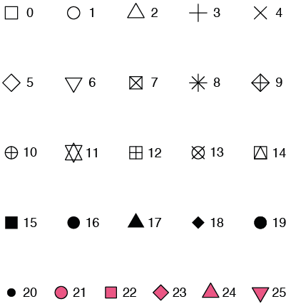
shape 속성 값

ggplot2로 시작하는 데이터 시각화

예시

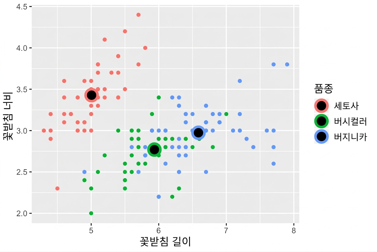
ggplot(iris, aes(x = Sepal.Length, y = Sepal.Width, col = Species)) + 
  geom_point() +
  geom_point(data = iris.summary, shape = 21, size = 5, 
             fill = "black", stroke = 2)
ggplot2로 시작하는 데이터 시각화

ggplot2의 실시간 통계 처리

  • stats 레이어는 두 번째 강의를 참조하세요.
  • 참고: 평균만 그래프로 표시하지 말고, 표준 편차와 같은 분산 측정값도 함께 표시하세요.

ggplot2로 시작하는 데이터 시각화

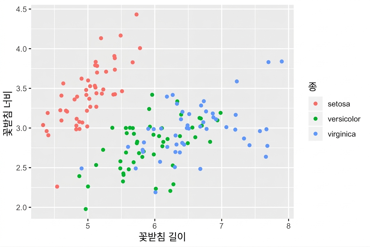
position = "jitter"

ggplot(iris, aes(x = Sepal.Length, y = Sepal.Width, col = Species)) + 
  geom_point(position = "jitter")
ggplot2로 시작하는 데이터 시각화

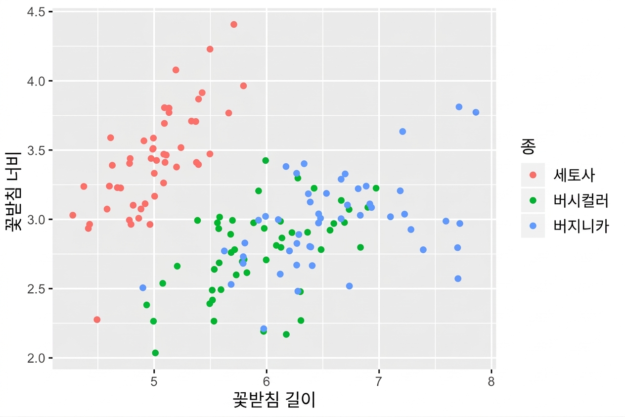
geom_jitter()

geom_point(position = "jitter")의 단축형

ggplot(iris, aes(x = Sepal.Length, y = Sepal.Width, col = Species)) + 
  geom_jitter()
ggplot2로 시작하는 데이터 시각화

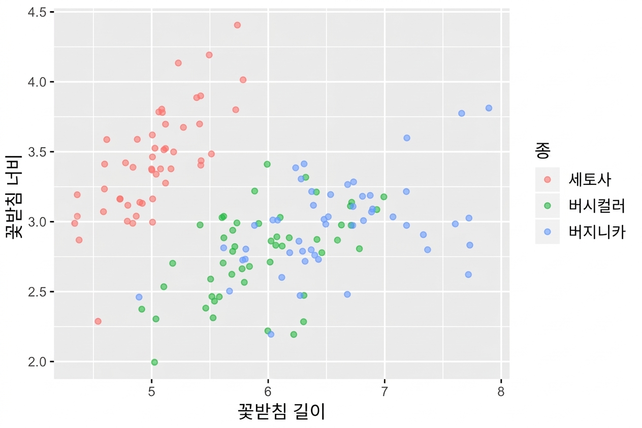
alpha 조정도 잊지 마세요

  • 필요한 경우 지터링과 알파 블렌딩을 결합해 사용
ggplot(iris, aes(x = Sepal.Length, y = Sepal.Width, col = Species)) + 
  geom_jitter(alpha = 0.6)
ggplot2로 시작하는 데이터 시각화

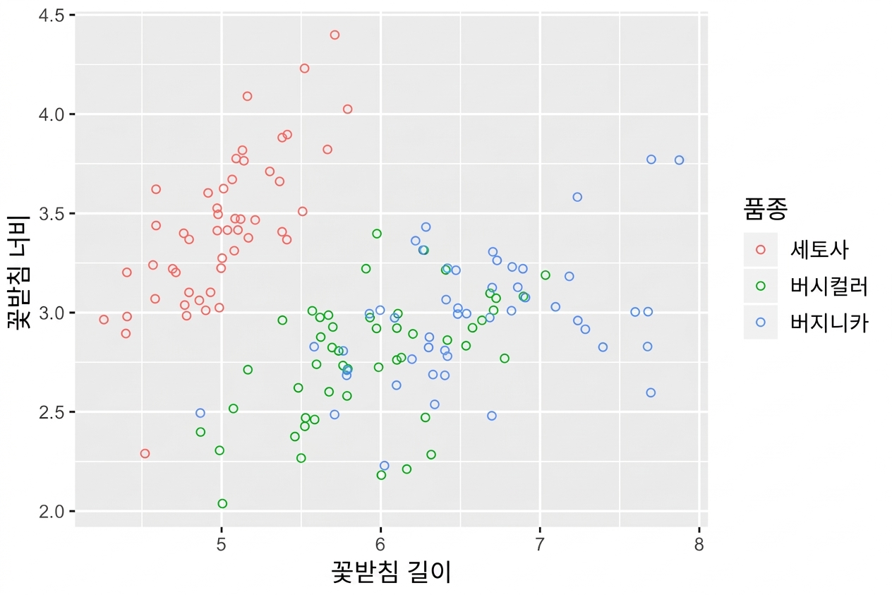
빈 원도 유용합니다

  • shape = 1은 속이 빈 원입니다.
  • 알파 블렌딩을 사용할 필요는 없습니다.
ggplot(iris, aes(x = Sepal.Length, y = Sepal.Width, col = Species)) + 
  geom_jitter(shape = 1)
ggplot2로 시작하는 데이터 시각화

연습해 봅시다!

ggplot2로 시작하는 데이터 시각화

Preparing Video For Download...