ggplot2로 시작하는 데이터 시각화
Rick Scavetta
Founder, Scavetta Academy
| 그래프 유형 | 가능한 Geom |
|---|---|
| 산포도 | points, jitter, abline, smooth, count |
| 막대 그래프 | histogram, bar, col, errorbar |
| 선 그래프 | line, path |
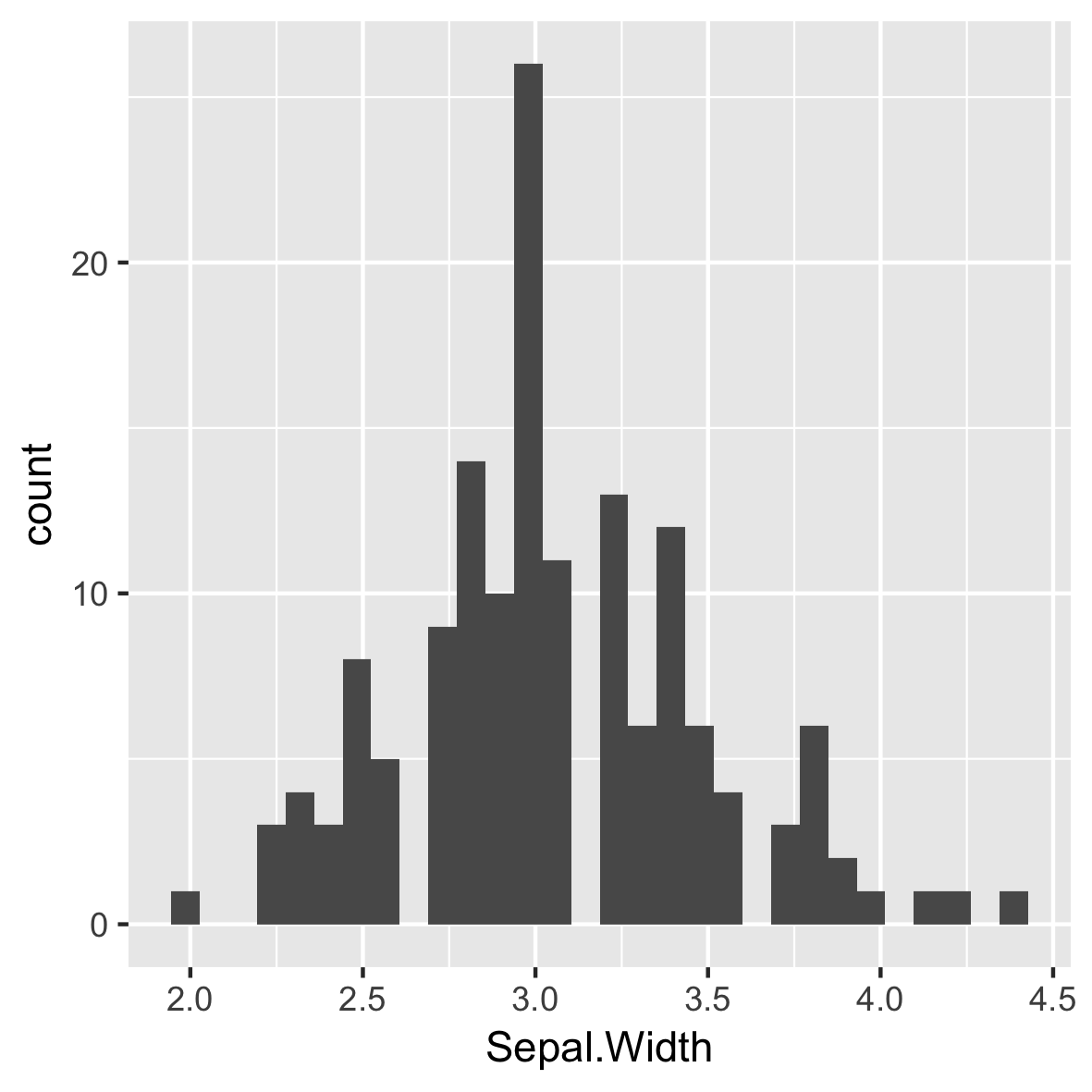
ggplot(iris, aes(x = Sepal.Width)) +
geom_histogram()
`stat_bin()` using `bins = 30`.
Pick better value with `binwidth`.

ggplot(iris, aes(x = Sepal.Width)) +
geom_histogram()
# Default bin width:
diff(range(iris$Sepal.Width))/30
[1] 0.08

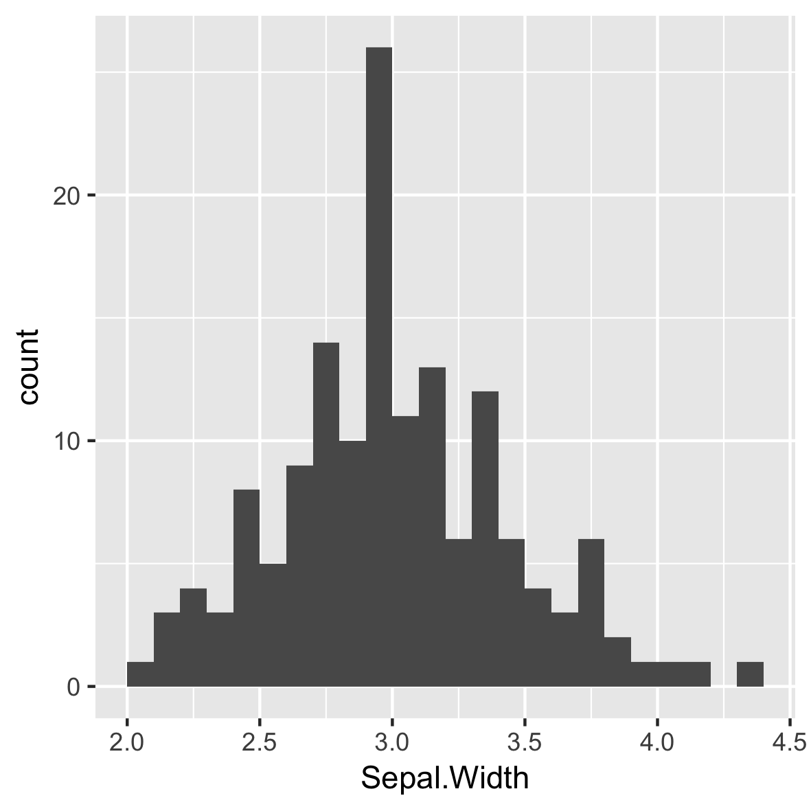
ggplot(iris, aes(x = Sepal.Width)) +
geom_histogram(binwidth = 0.1)
항상 데이터에 의미 있는 빈 너비를 설정하세요.
막대 사이 공백 없음.

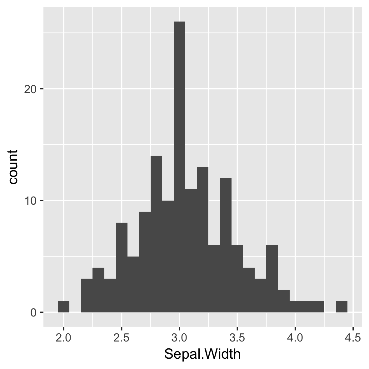
ggplot(iris, aes(x = Sepal.Width)) +
geom_histogram(binwidth = 0.1,
center = 0.05)
항상 데이터에 의미 있는 빈 너비를 설정하세요.
막대 사이 공백 없음.
X축 레이블은 막대 사이에 있습니다.

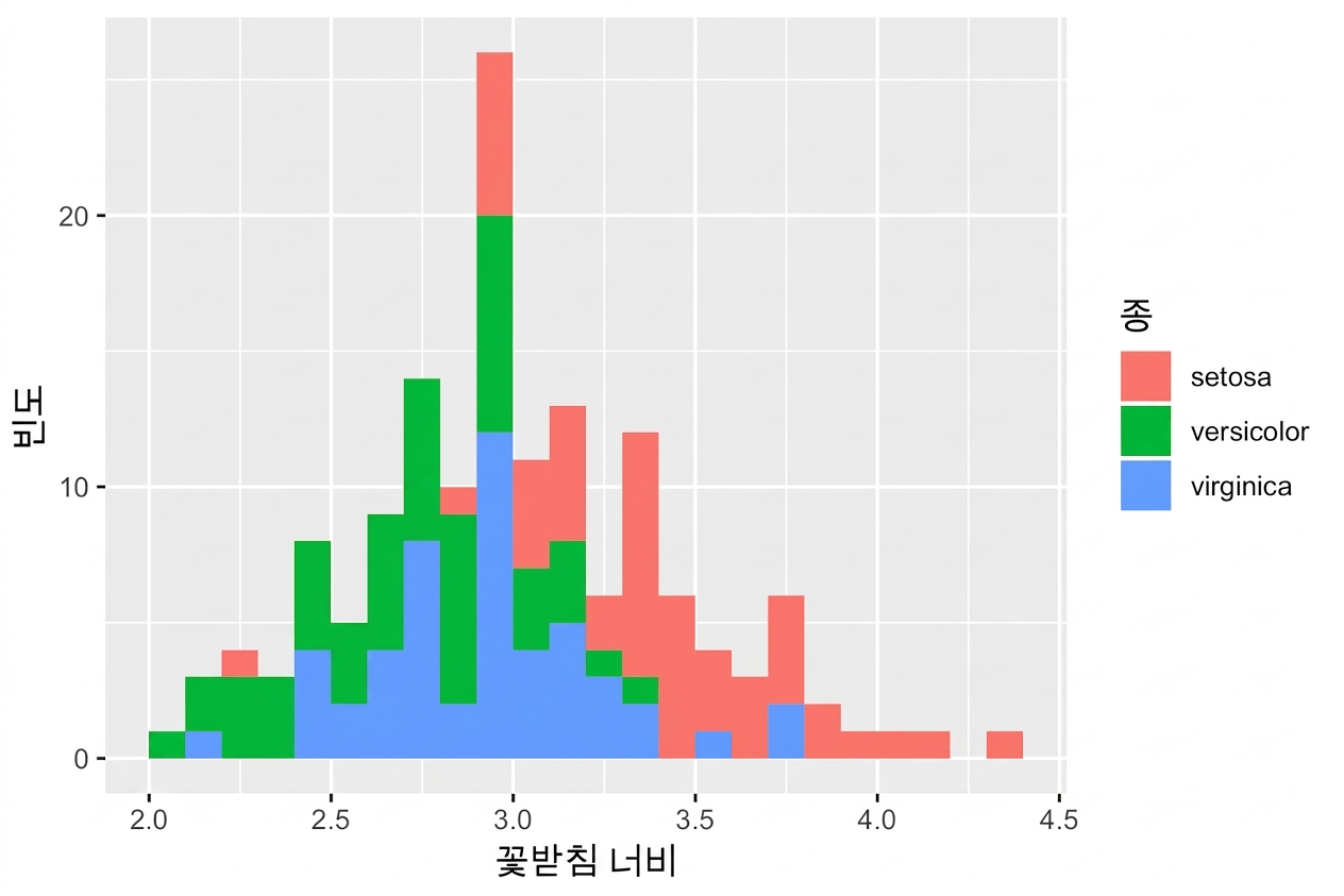
ggplot(iris, aes(x = Sepal.Width,
fill = Species)) +
geom_histogram(binwidth = .1,
center = 0.05)

ggplot(iris, aes(x = Sepal.Width,
fill = Species)) +
geom_histogram(binwidth = .1,
center = 0.05,
position = "stack")

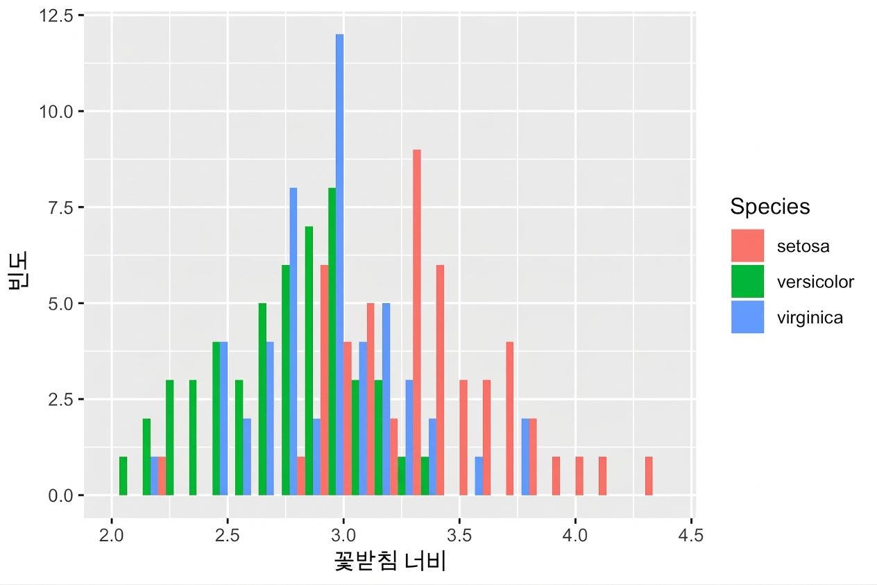
ggplot(iris, aes(x = Sepal.Width,
fill = Species)) +
geom_histogram(binwidth = .1,
center = 0.05,
position = "dodge")

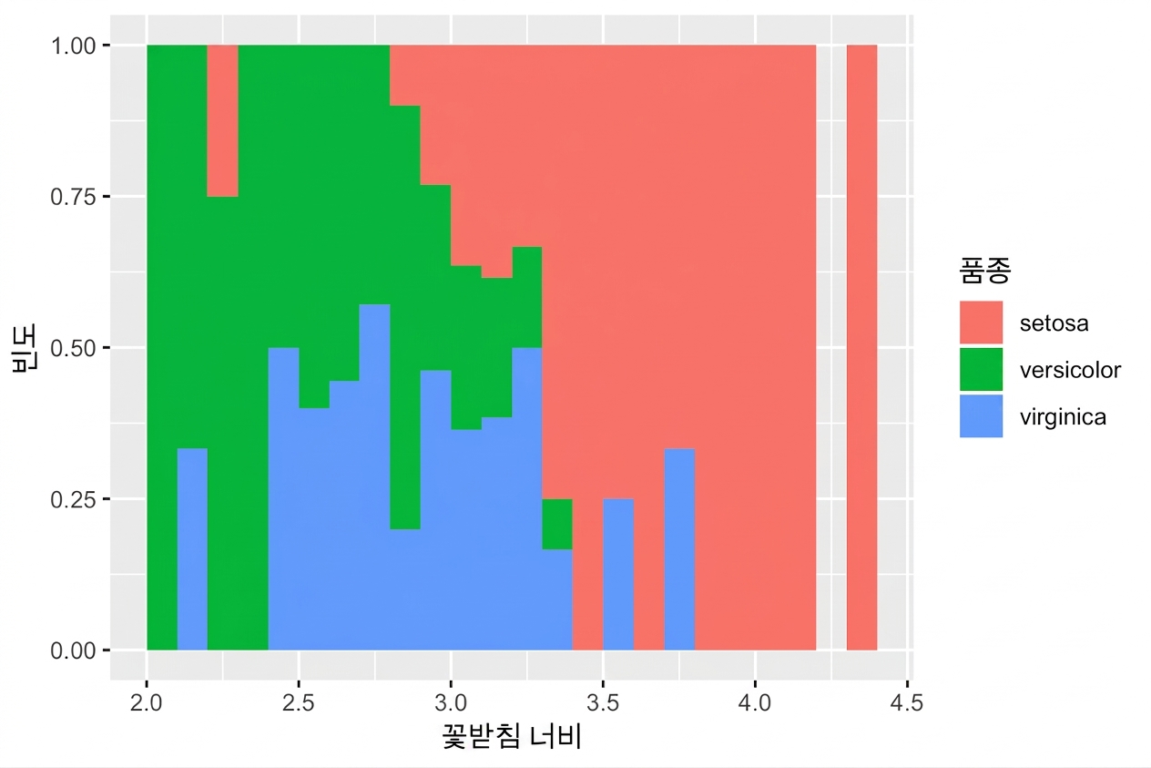
ggplot(iris, aes(x = Sepal.Width,
fill = Species)) +
geom_histogram(binwidth = .1,
center = 0.05,
position = "fill")

ggplot2로 시작하는 데이터 시각화