Matplotlib으로 시작하는 데이터 시각화
Ariel Rokem
Data Scientist
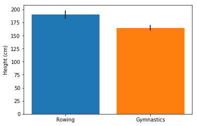
fig, ax = plt.subplots()

ax.bar("Rowing",
       mens_rowing["Height"].mean(),
       yerr=mens_rowing["Height"].std())

ax.bar("Gymnastics",
       mens_gymnastics["Height"].mean(),
       yerr=mens_gymnastics["Height"].std())

ax.set_ylabel("Height (cm)")

plt.show()
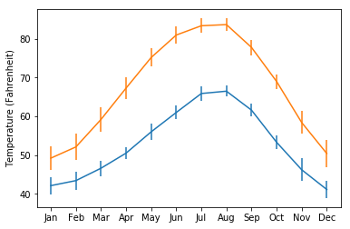
fig, ax = plt.subplots()

ax.errorbar(seattle_weather["MONTH"],
            seattle_weather["MLY-TAVG-NORMAL"],
            yerr=seattle_weather["MLY-TAVG-STDDEV"])

ax.errorbar(austin_weather["MONTH"],
            austin_weather["MLY-TAVG-NORMAL"],
            yerr=austin_weather["MLY-TAVG-STDDEV"])

ax.set_ylabel("Temperature (Fahrenheit)")

plt.show()
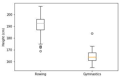
fig, ax = plt.subplots()

ax.boxplot([mens_rowing["Height"],
            mens_gymnastics["Height"]])

ax.set_xticklabels(["Rowing", "Gymnastics"])
ax.set_ylabel("Height (cm)")

plt.show()
fig, ax = plt.subplots()
ax.boxplot([mens_rowing["Height"], mens_gymnastics["Height"]])
ax.set_xticklabels(["Rowing", "Gymnastics"]) ax.set_ylabel("Height (cm)") plt.show()