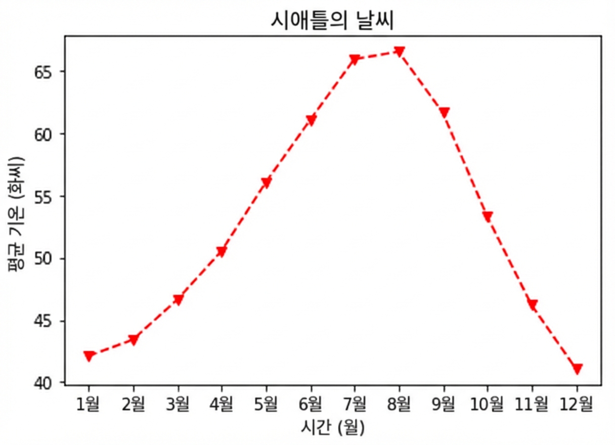
플롯 사용자 지정
Matplotlib으로 시작하는 데이터 시각화

Ariel Rokem
Data Scientist
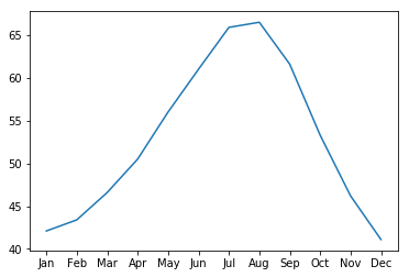
데이터 모양 사용자 지정
ax.plot(seattle_weather["MONTH"],
        seattle_weather["MLY-PRCP-NORMAL"])
plt.show()
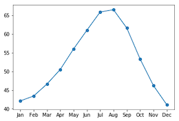
마커 추가
ax.plot(seattle_weather["MONTH"],
        seattle_weather["MLY-PRCP-NORMAL"],
        marker="o")
plt.show()
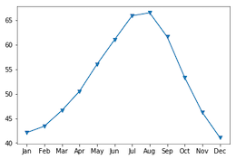
마커 선택
ax.plot(seattle_weather["MONTH"],
        seattle_weather["MLY-PRCP-NORMAL"],
        marker="v")
plt.show()
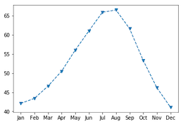
선 스타일 설정
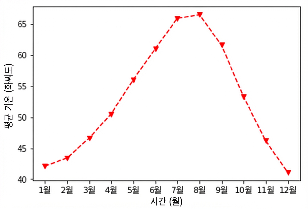
fig, ax = plt.subplots()
ax.plot(seattle_weather["MONTH"],
        seattle_weather["MLY-TAVG-NORMAL"],
        marker="v", linestyle="--")
plt.show()

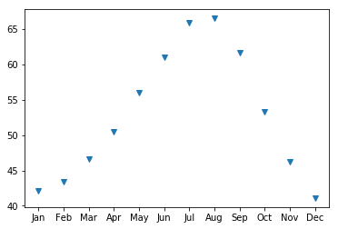
linestyle로 선 제거
fig, ax = plt.subplots()
ax.plot(seattle_weather["MONTH"],
        seattle_weather["MLY-TAVG-NORMAL"],
        marker="v", linestyle="None")
plt.show()
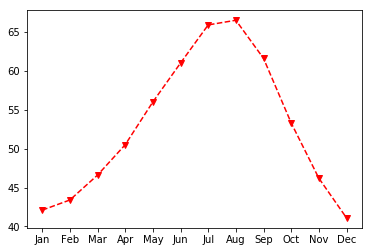
색상 선택
fig, ax = plt.subplots()
ax.plot(seattle_weather["MONTH"],
        seattle_weather["MLY-TAVG-NORMAL"],
        marker="v", linestyle="--", color="r")
plt.show()
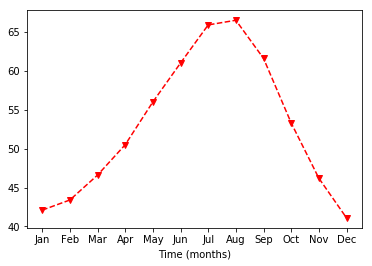
축 레이블 사용자 지정
ax.set_xlabel("Time (months)")
plt.show()
y축 레이블 설정
ax.set_xlabel("Time (months)")
ax.set_ylabel("Average temperature (Fahrenheit degrees)")
plt.show()
제목 추가
ax.set_title("Weather in Seattle")
plt.show()