다른 사람과 공유할 그림 준비하기
Matplotlib으로 시작하는 데이터 시각화

Ariel Rokem
Data Scientist
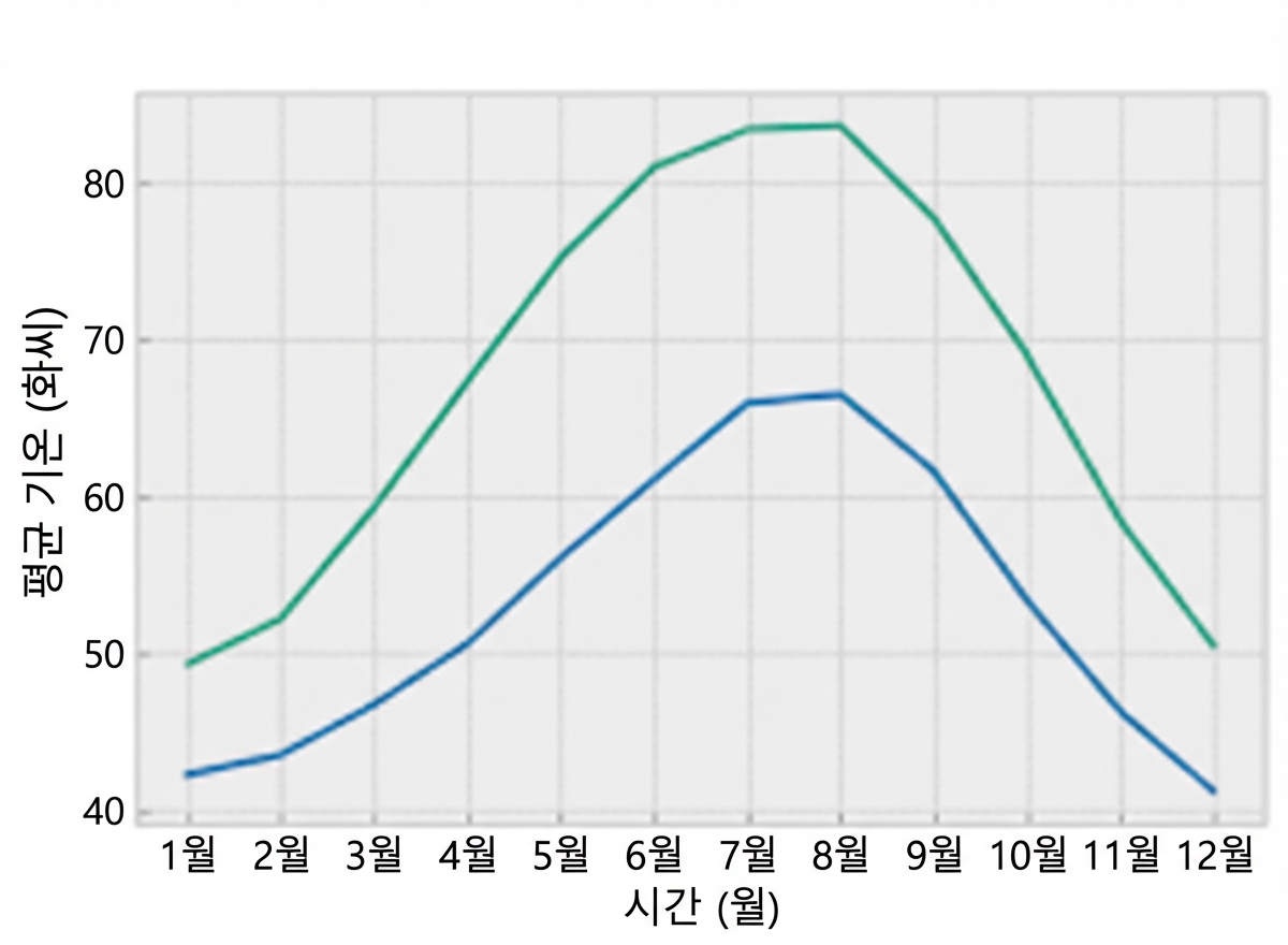
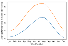
플롯 스타일 변경하기
import matplotlib.pyplot as plt
fig, ax = plt.subplots()
ax.plot(seattle_weather["MONTH"], seattle_weather["MLY-TAVG-NORMAL"])
ax.plot(austin_weather["MONTH"], austin_weather["MLY-TAVG-NORMAL"])
ax.set_xlabel("Time (months)")
ax.set_ylabel("Average temperature (Fahrenheit degrees)")
plt.show()
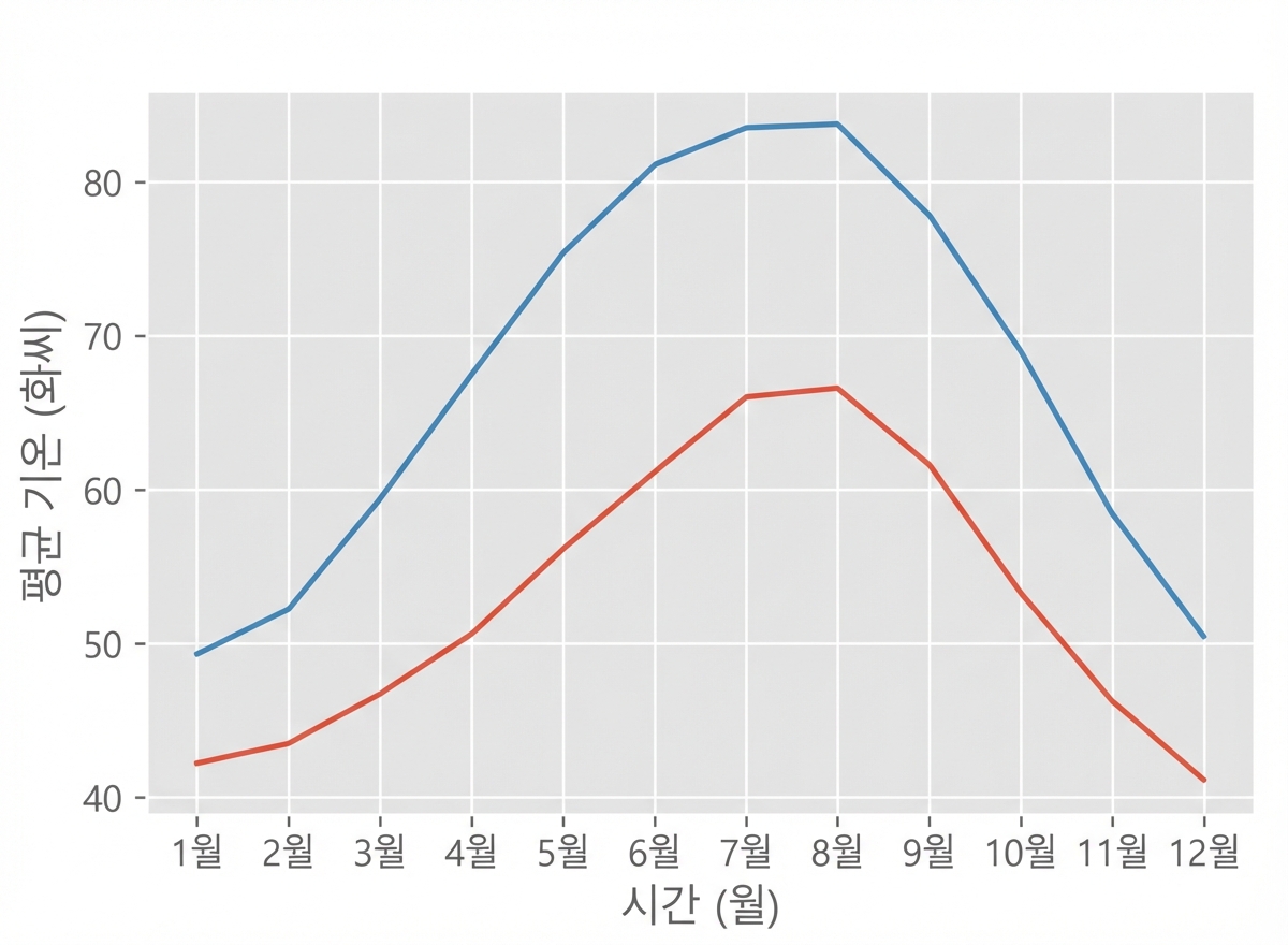
스타일 선택하기
plt.style.use("ggplot")fig, ax = plt.subplots() ax.plot(seattle_weather["MONTH"], seattle_weather["MLY-TAVG-NORMAL"]) ax.plot(austin_weather["MONTH"], austin_weather["MLY-TAVG-NORMAL"]) ax.set_xlabel("Time (months)") ax.set_ylabel("Average temperature (Fahrenheit degrees)") plt.show()
"bmh" 스타일
plt.style.use("bmh")fig, ax = plt.subplots() ax.plot(seattle_weather["MONTH"], seattle_weather["MLY-TAVG-NORMAL"]) ax.plot(austin_weather["MONTH"], austin_weather["MLY-TAVG-NORMAL"]) ax.set_xlabel("Time (months)") ax.set_ylabel("Average temperature (Fahrenheit degrees)") plt.show()
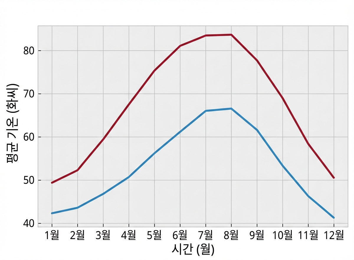
Seaborn 스타일
plt.style.use("seaborn-colorblind")fig, ax = plt.subplots() ax.plot(seattle_weather["MONTH"], seattle_weather["MLY-TAVG-NORMAL"]) ax.plot(austin_weather["MONTH"], austin_weather["MLY-TAVG-NORMAL"]) ax.set_xlabel("Time (months)") ax.set_ylabel("Average temperature (Fahrenheit degrees)") plt.show()