정량 비교: 산점도

Matplotlib으로 시작하는 데이터 시각화

Ariel Rokem

Data Scientist

산점도 소개

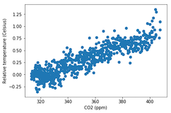
fig, ax = plt.subplots()

ax.scatter(climate_change["co2"], climate_change["relative_temp"])
ax.set_xlabel("CO2 (ppm)") ax.set_ylabel("상대 온도(섭씨)") plt.show()
Matplotlib으로 시작하는 데이터 시각화

산점도 사용자 정의

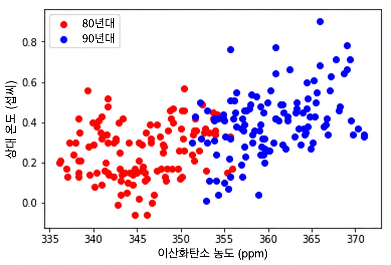
eighties = climate_change["1980-01-01":"1989-12-31"]
nineties = climate_change["1990-01-01":"1999-12-31"]

fig, ax = plt.subplots()
ax.scatter(eighties["co2"], eighties["relative_temp"], color="red", label="eighties")
ax.scatter(nineties["co2"], nineties["relative_temp"], color="blue", label="nineties")
ax.legend() ax.set_xlabel("CO2 (ppm)") ax.set_ylabel("상대 온도(섭씨)") plt.show()
Matplotlib으로 시작하는 데이터 시각화

색으로 비교 인코딩

Matplotlib으로 시작하는 데이터 시각화

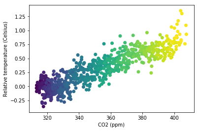
세 번째 변수를 색으로 인코딩

fig, ax = plt.subplots()

ax.scatter(climate_change["co2"], climate_change["relative_temp"], c=climate_change.index)
ax.set_xlabel("CO2 (ppm)") ax.set_ylabel("상대 온도(섭씨)") plt.show()
Matplotlib으로 시작하는 데이터 시각화

시간을 색으로 인코딩

Matplotlib으로 시작하는 데이터 시각화

직접 산점도를 만들어 봅시다!

Matplotlib으로 시작하는 데이터 시각화

Preparing Video For Download...