정량 비교: 막대그래프

Matplotlib으로 시작하는 데이터 시각화

Ariel Rokem

Data Scientist

올림픽 메달

,Gold, Silver, Bronze
United States, 137, 52, 67
Germany, 47, 43, 67
Great Britain, 64, 55, 26
Russia, 50, 28, 35
China, 44, 30, 35
France, 20, 55, 21
Australia, 23, 34, 25
Italy, 8, 38, 24
Canada, 4, 4, 61
Japan, 17, 13, 34
Matplotlib으로 시작하는 데이터 시각화

올림픽 메달: 데이터 시각화

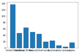
medals = pd.read_csv('medals_by_country_2016.csv', index_col=0)

fig, ax = plt.subplots()
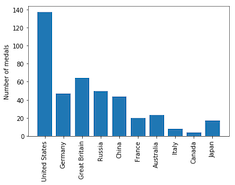
ax.bar(medals.index, medals["Gold"]) plt.show()
Matplotlib으로 시작하는 데이터 시각화

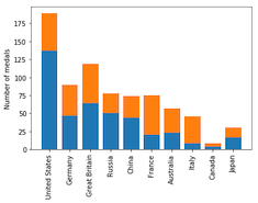
중간 단계: 눈금 레이블 회전

fig, ax = plt.subplots()
ax.bar(medals.index, medals["Gold"])

ax.set_xticklabels(medals.index, rotation=90) ax.set_ylabel("Number of medals")
plt.show()
Matplotlib으로 시작하는 데이터 시각화

올림픽 메달: 다른 메달 시각화

fig, ax = plt.subplots
ax.bar(medals.index, medals["Gold"])

ax.bar(medals.index, medals["Silver"], bottom=medals["Gold"])
ax.set_xticklabels(medals.index, rotation=90) ax.set_ylabel("Number of medals") plt.show()

Matplotlib으로 시작하는 데이터 시각화

올림픽 메달: 세 가지 모두 시각화

fig, ax = plt.subplots
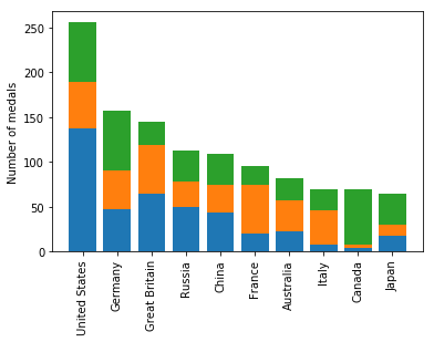
ax.bar(medals.index, medals["Gold"])

ax.bar(medals.index, medals["Silver"], bottom=medals["Gold"])

ax.bar(medals.index, medals["Bronze"], bottom=medals["Gold"] + medals["Silver"])
ax.set_xticklabels(medals.index, rotation=90) ax.set_ylabel("Number of medals") plt.show()
Matplotlib으로 시작하는 데이터 시각화

누적 막대그래프

Matplotlib으로 시작하는 데이터 시각화

범례 추가

fig, ax = plt.subplots
ax.bar(medals.index, medals["Gold"])
ax.bar(medals.index, medals["Silver"], bottom=medals["Gold"])
ax.bar(medals.index, medals["Bronze"],
       bottom=medals["Gold"] + medals["Silver"])

ax.set_xticklabels(medals.index, rotation=90)
ax.set_ylabel("Number of medals")
Matplotlib으로 시작하는 데이터 시각화

범례 추가

fig, ax = plt.subplots
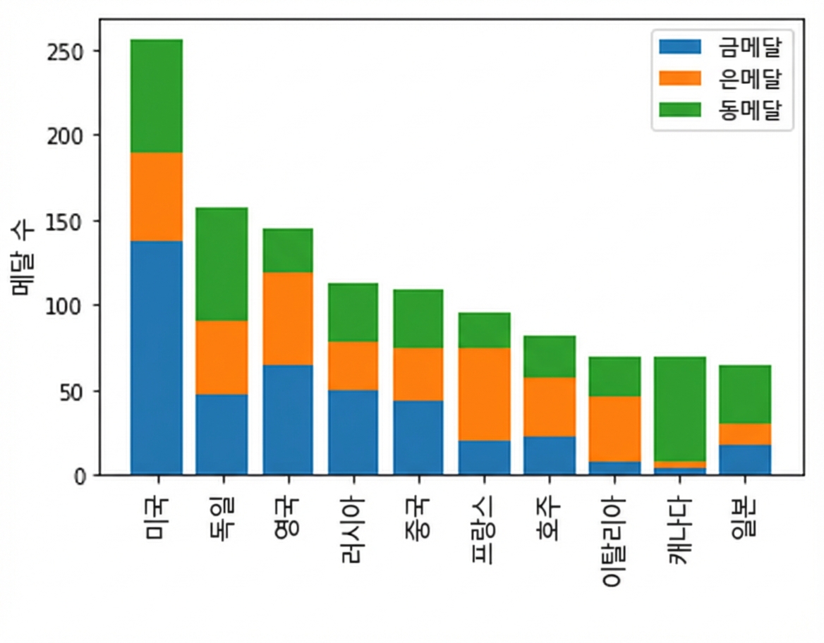
ax.bar(medals.index, medals["Gold"], label="Gold")
ax.bar(medals.index, medals["Silver"], bottom=medals["Gold"], 
       label="Silver")
ax.bar(medals.index, medals["Bronze"],
       bottom=medals["Gold"] + medals["Silver"], 
       label="Bronze")

ax.set_xticklabels(medals.index, rotation=90)
ax.set_ylabel("Number of medals")

ax.legend() plt.show()
Matplotlib으로 시작하는 데이터 시각화

범례가 있는 누적 막대그래프

Matplotlib으로 시작하는 데이터 시각화

막대그래프 만들기!

Matplotlib으로 시작하는 데이터 시각화

Preparing Video For Download...