산점도 커스터마이즈
Seaborn으로 시작하는 데이터 시각화

Content Team
DataCamp
포인트 크기로 하위 그룹 표시
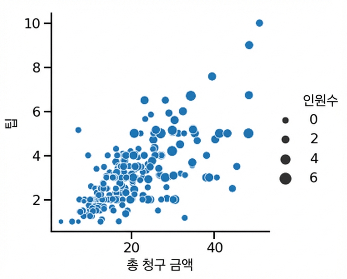
1 Waskom, M. L. (2021). seaborn: statistical data visualization. https://seaborn.pydata.org/
포인트 크기와 색상
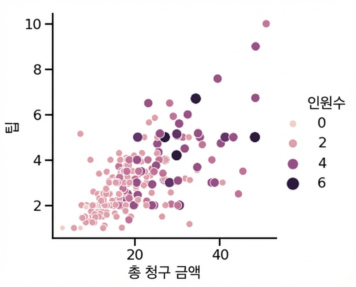
1 Waskom, M. L. (2021). seaborn: statistical data visualization. https://seaborn.pydata.org/
포인트 스타일로 하위 그룹 표시
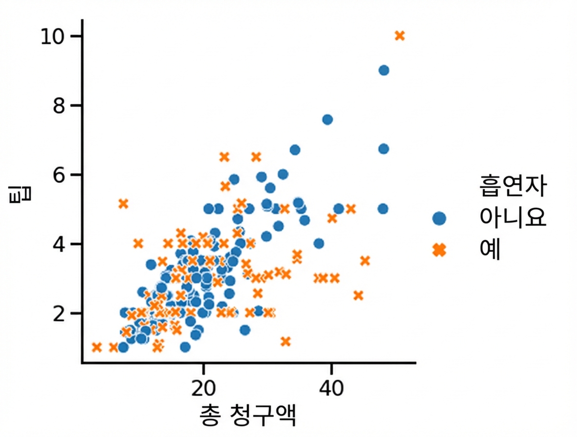
1 Waskom, M. L. (2021). seaborn: statistical data visualization. https://seaborn.pydata.org/
포인트 투명도 변경
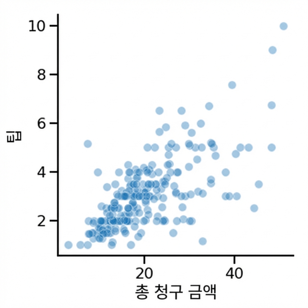
1 Waskom, M. L. (2021). seaborn: statistical data visualization. https://seaborn.pydata.org/

