Seaborn으로 시작하는 데이터 시각화
Content Team
DataCamp
Seaborn 가져오기:
import seaborn as sns
Matplotlib 가져오기:
import matplotlib.pyplot as plt
플롯 표시:
plt.show()
sns.relplot(x="x_variable_name",
y="y_variable_name",
data=pandas_df,
kind="scatter")
sns.catplot(x="x_variable_name",
y="y_variable_name",
data=pandas_df,
kind="bar")
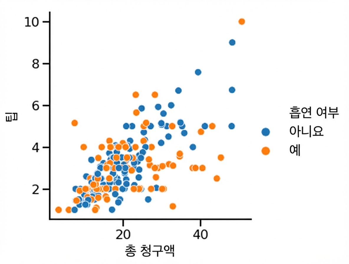
hue를 설정하면 하위 그룹이 하나의 플롯에서 다른 색으로 표시됩니다.

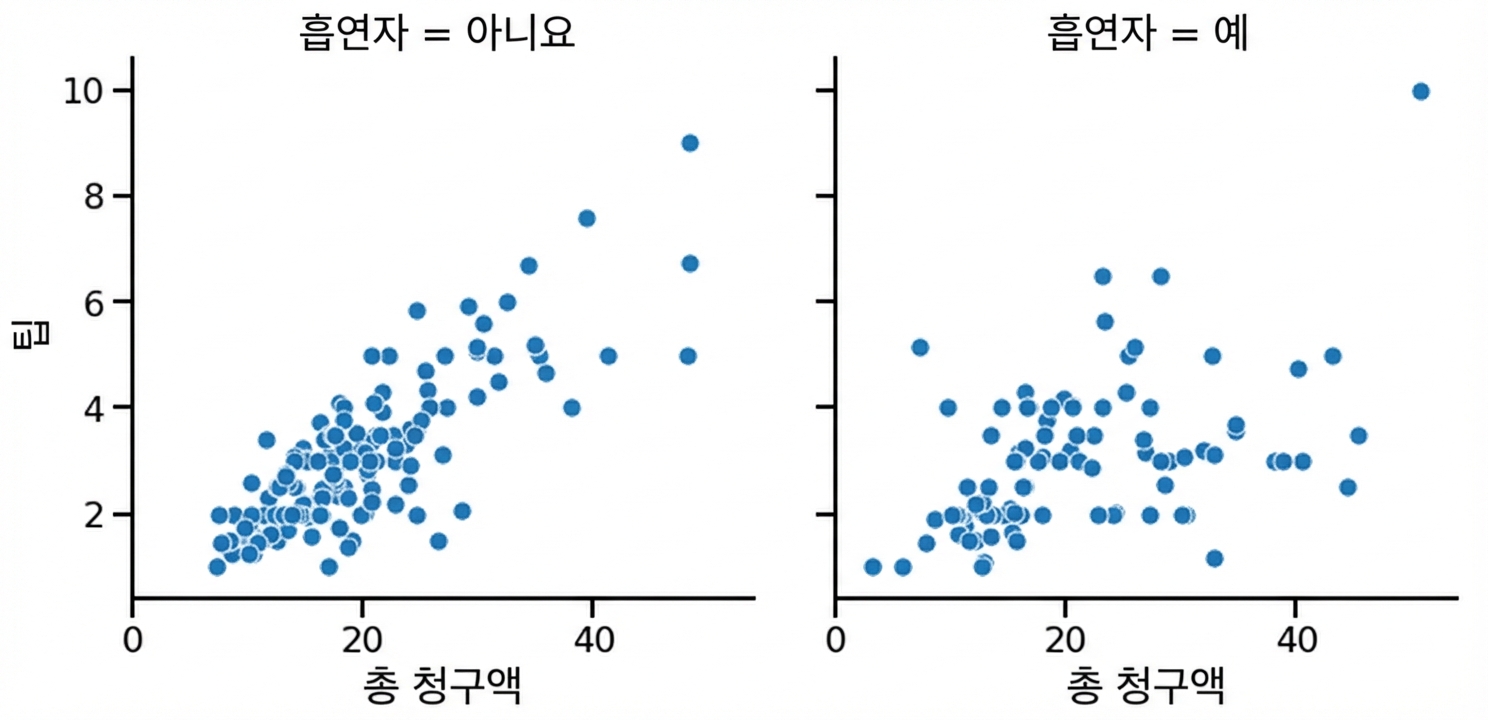
relplot() 또는 catplot()에서 row/col을 설정하면 하위 그룹을 별도 서브플롯에 표시합니다.

sns.set_style()sns.set_palette()sns.set_context()| Object Type | Plot Types | How to Add Title |
|---|---|---|
FacetGrid |
relplot(), catplot() |
g.figure.suptitle() |
AxesSubplot |
scatterplot(), countplot(), etc. |
g.set_title() |
x/y축 레이블 추가:
g.set(xlabel="new x-axis label",
ylabel="new y-axis label")
x축 눈금 레이블 회전:
plt.xticks(rotation=90)
Seaborn으로 시작하는 데이터 시각화