중심 측도

R로 시작하는 통계학 입문

Maggie Matsui

Content Developer, DataCamp

포유류 수면 데이터

msleep
# A tibble: 83 x 11
   name             genus       vore  order        sleep_total sleep_rem sleep_cycle awake
   <chr>            <chr>       <chr> <chr>              <dbl>     <dbl>       <dbl> <dbl>
 1 Cheetah          Acinonyx    carni Carnivora           12.1      NA         NA     11.9
 2 Owl monkey       Aotus       omni  Primates            17         1.8       NA      7 
 3 Mountain beaver  Aplodontia  herbi Rodentia            14.4       2.4       NA      9.6
 4 Greater short... Blarina     omni  Soricomorpha        14.9       2.3       0.133   9.1 
 5 Cow              Bos         herbi Artiodactyla         4         0.7       0.667  20  
 6 Three-toed sloth Bradypus    herbi Pilosa              14.4       2.2       0.767   9.6 
 7 Northern fur...  Callorhinus carni Carnivora            8.7       1.4       0.383  15.3 
# ... with 76 more rows, and 2 more variables: brainwt <dbl>, bodywt <dbl>
R로 시작하는 통계학 입문

히스토그램

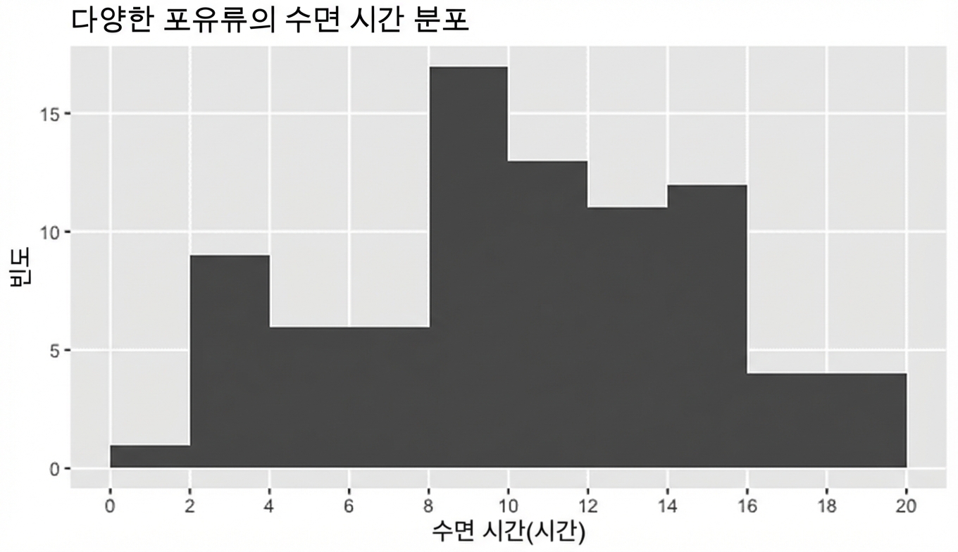
포유류 수면 시간 히스토그램

R로 시작하는 통계학 입문

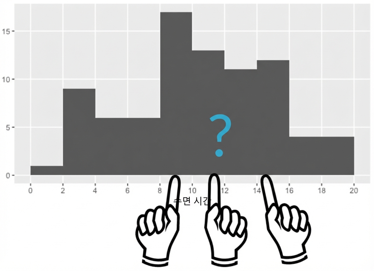
이 데이터셋의 포유류는 보통 얼마나 잘까요?

일반적인 값은 무엇인가요?

데이터의 중심은 어디인가요?

  • 평균
  • 중앙값
  • 최빈값

물음표와 손가락이 가리키는 히스토그램

R로 시작하는 통계학 입문

중심 측도: 평균

  name                       sleep_total
1 Cheetah                           12.1
2 Owl monkey                        17.0 
3 Mountain beaver                   14.4
4 Greater short-tailed shrew        14.9
...

$$\text{Mean sleep time}=\frac{12.1 + 17.0 + 14.4 + 14.9 + ...}{83} = 10.43$$

mean(msleep$sleep_total)
10.43373
R로 시작하는 통계학 입문

중심 측도: 중앙값

sort(msleep$sleep_total)
 [1]  1.9  2.7  2.9  3.0  3.1  3.3  3.5  3.8  3.9  4.0  4.4  5.2  5.3  5.3  5.4  5.6  6.2
...
[52] 11.5 12.1 12.5 12.5 12.5 12.5 12.8 12.8 13.0 13.5 13.7 13.8 14.2 14.3 14.4 14.4 14.5
[69] 14.6 14.9 14.9 15.6 15.8 15.8 15.9 16.6 17.0 17.4 18.0 18.1 19.4 19.7 19.9


sort(msleep$sleep_total)[42]
10.1


median(msleep$sleep_total)
10.1
R로 시작하는 통계학 입문

중심 측도: 최빈값

가장 빈번한 값

# Count and sort 'sleep_total' descending
msleep %>% count(sleep_total, sort = TRUE)
   sleep_total     n
         <dbl> <int>
 1        12.5     4
 2        10.1     3
 3         5.3     2
 4         6.3     2
 ...


# Count and sort 'vore' descending
msleep %>% count(vore, sort = TRUE)
  vore        n
  <chr>   <int>
1 herbi      32
2 omni       20
3 carni      19
4 NA          7
5 insecti     5
R로 시작하는 통계학 입문

식충 동물 필터링 데이터

msleep %>% 
  filter(vore == "insecti")
  name                  genus        vore    order        sleep_total
  <chr>                 <chr>        <chr>   <chr>              <dbl>
1 Big brown bat         Eptesicus    insecti Chiroptera          19.7
2 Little brown bat      Myotis       insecti Chiroptera          19.9
3 Giant armadillo       Priodontes   insecti Cingulata           18.1
4 Eastern american mole Scalopus     insecti Soricomorpha         8.4
R로 시작하는 통계학 입문

식충 동물 수면 통계 요약

msleep %>% 
  filter(vore == "insecti") %>%

summarize(mean_sleep = mean(sleep_total), median_sleep = median(sleep_total))
  mean_sleep median_sleep
       <dbl>        <dbl> 
1      16.52         18.9
R로 시작하는 통계학 입문

이상값 추가

msleep %>% 
  filter(vore == "insecti")
  name                  genus        vore    order        sleep_total
  <chr>                 <chr>        <chr>   <chr>              <dbl>
1 Big brown bat         Eptesicus    insecti Chiroptera          19.7
2 Little brown bat      Myotis       insecti Chiroptera          19.9
3 Giant armadillo       Priodontes   insecti Cingulata           18.1
4 Eastern american mole Scalopus     insecti Soricomorpha         8.4
5 Mystery insectivore   ...          ...     ...                  0.0
R로 시작하는 통계학 입문

이상값 추가 후 요약 통계

msleep %>% 
  filter(vore == "insecti") %>%

summarize(mean_sleep = mean(sleep_total), median_sleep = median(sleep_total))
  mean_sleep median_sleep
       <dbl>        <dbl>
1      13.22         18.1

평균: 16.5 → 13.2

중앙값: 18.9 → 18.1

R로 시작하는 통계학 입문

어떤 측도를 사용해야 할까요?

# Create histogram of insecti
msleep %>% 
  filter(vore == "insecti") %>%
  ggplot(aes(insecti)) +
    geom_histogram()

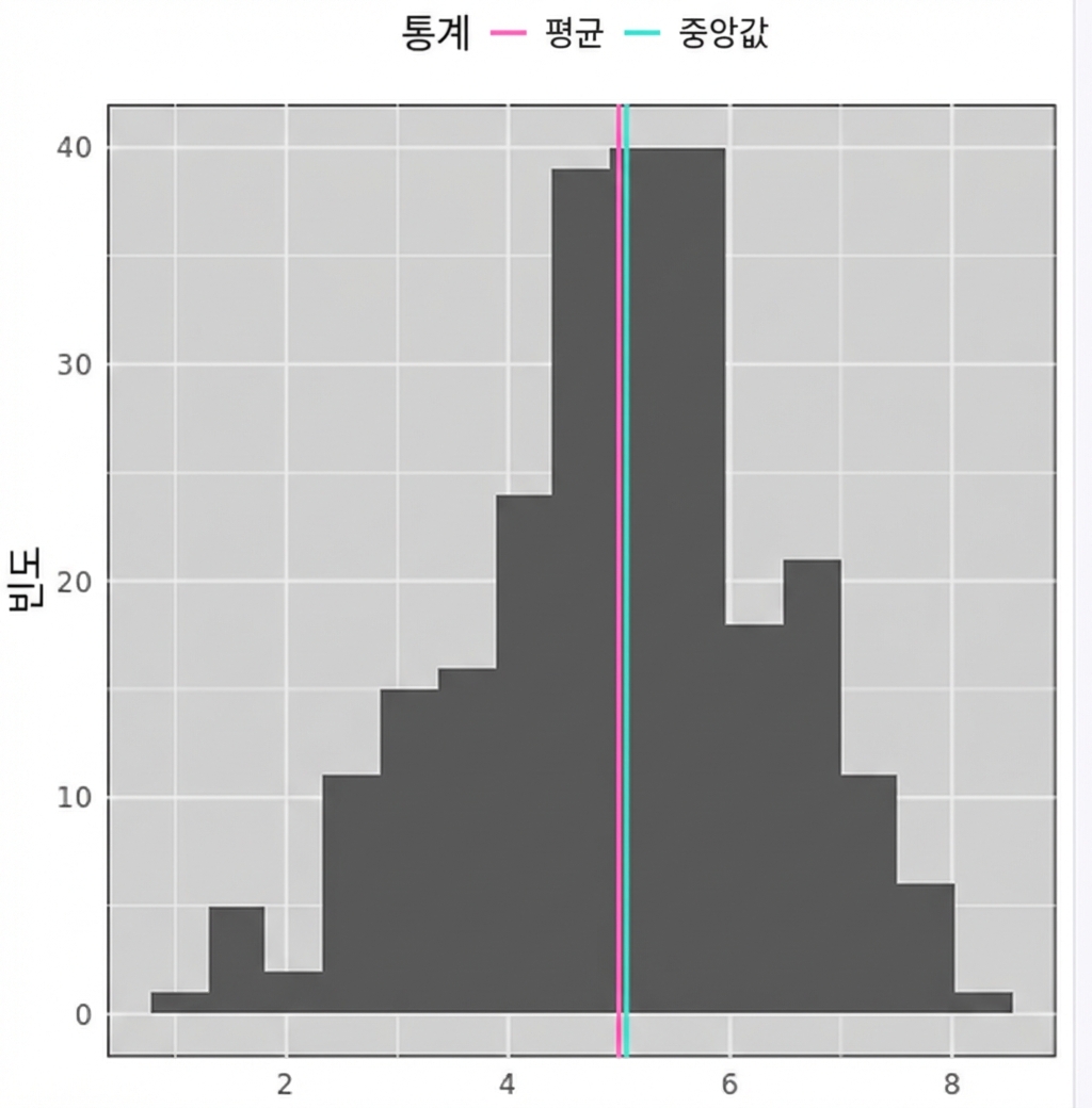
종 모양의 데이터를 보여주는 히스토그램으로, 데이터 중심 근처에 파란색과 빨간색 선이 있습니다. 빨간색은 평균, 파란색은 중앙값을 나타냅니다.

R로 시작하는 통계학 입문

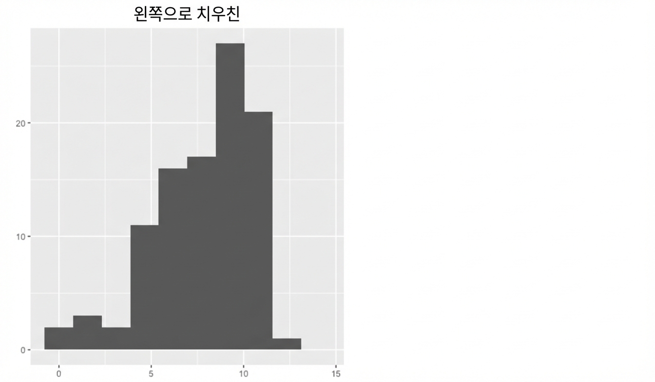
왜도

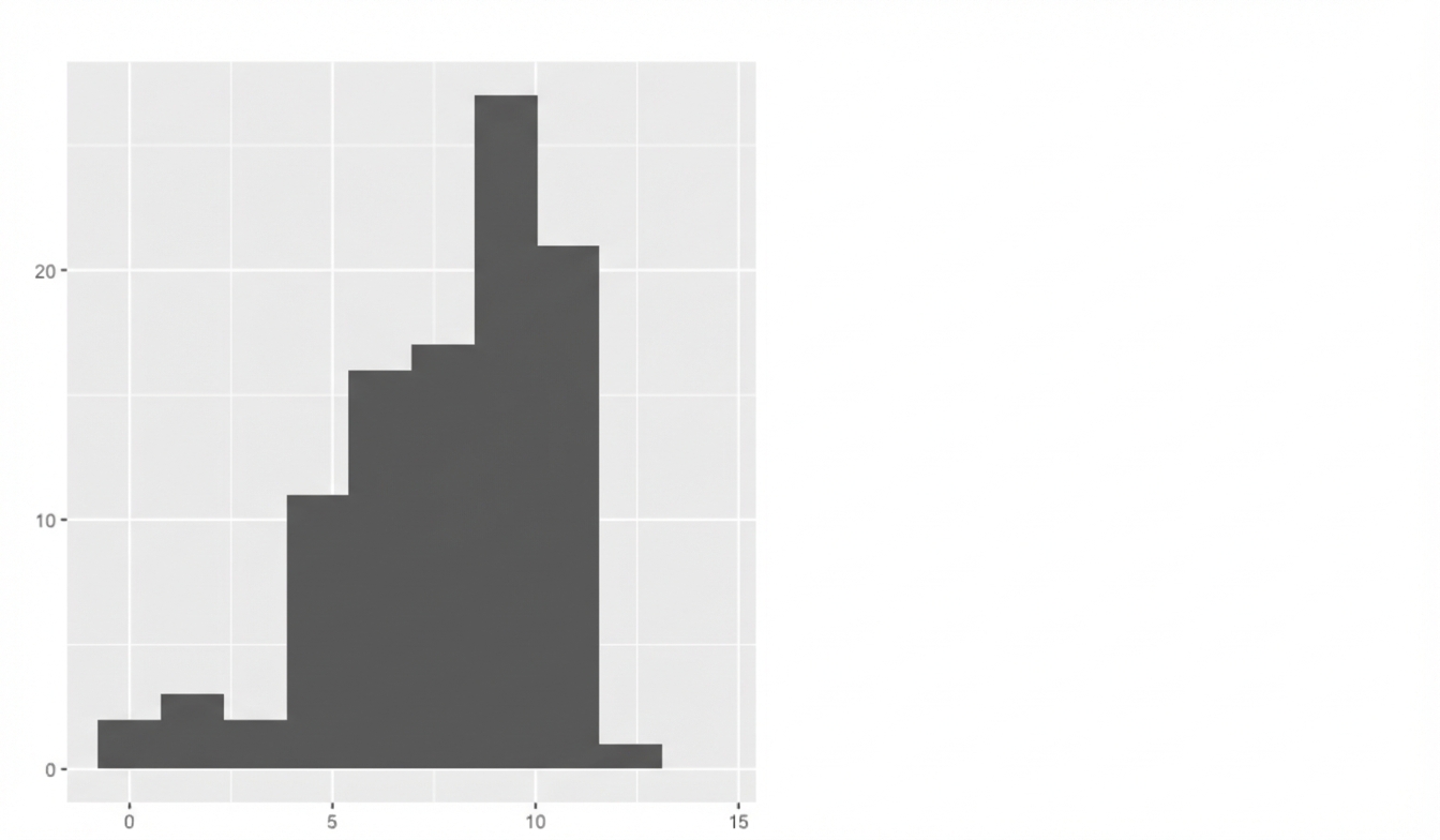
왼쪽에 값이 적고 오른쪽으로 갈수록 값이 많아지는 히스토그램.

R로 시작하는 통계학 입문

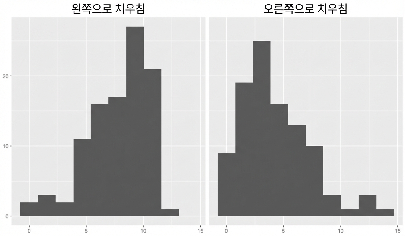
왜도

왼쪽에 값이 적고 오른쪽으로 갈수록 값이 많아지는 히스토그램 (왼쪽 왜도)

R로 시작하는 통계학 입문

왜도

왼쪽에 값이 많고 오른쪽으로 갈수록 값이 적어지는 히스토그램 (오른쪽 왜도)

R로 시작하는 통계학 입문

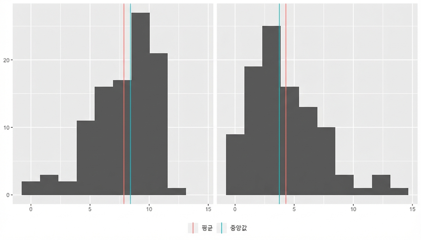
어떤 측도를 사용해야 할까요?

이전 슬라이드의 히스토그램에 평균(빨간색)과 중앙값(파란색) 선이 추가됨. 왼쪽 왜도에서는 평균 < 중앙값, 오른쪽 왜도에서는 평균 > 중앙값.

R로 시작하는 통계학 입문

연습해 봅시다!

R로 시작하는 통계학 입문

Preparing Video For Download...