Finance를 위한 Python 입문
Adina Howe
Professor
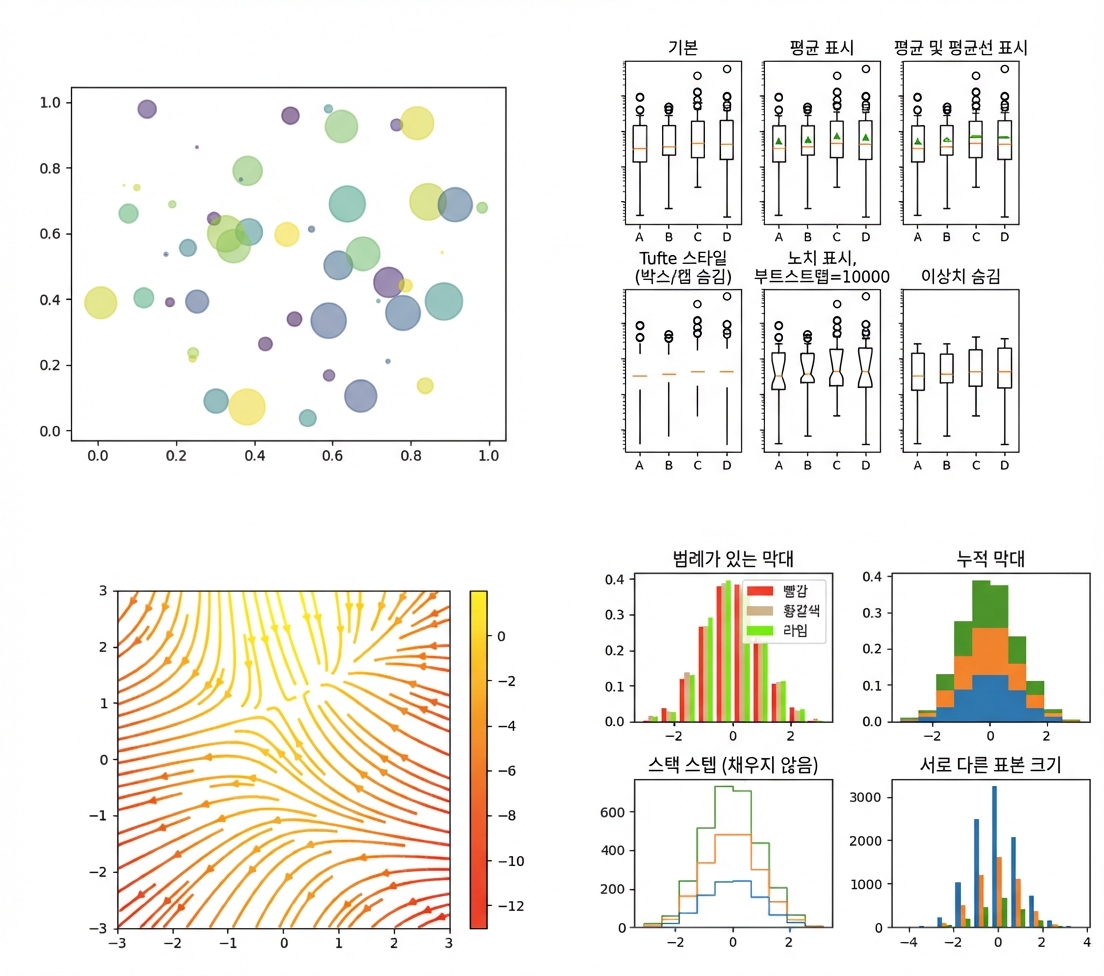
Matplotlib 갤러리를 더 보려면 이 링크를 클릭하십시오.
import matplotlib.pyplot as plt
plt.plot()
plt.show()
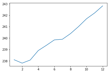
import matplotlib.pyplot as plt
plt.plot(months, prices)
plt.show()
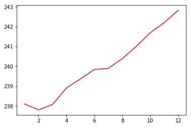
import matplotlib.pyplot as plt
plt.plot(months, prices, color = 'red')
plt.show()
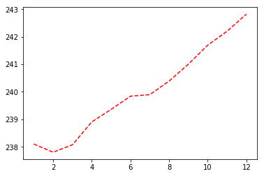
import matplotlib.pyplot as plt
plt.plot(months, prices, color = 'red', linestyle = '--')
plt.show()
색상과 선 스타일에 대한 자세한 문서는 여기에서 확인하실 수 있습니다.
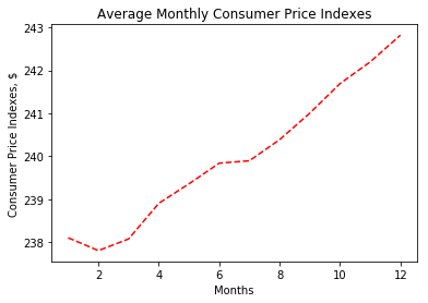
import matplotlib.pyplot as plt
plt.plot(months, prices, color = 'red', linestyle = '--')

# Add labels
plt.xlabel('Months')
plt.ylabel('Consumer Price Indexes, $')
plt.title('Average Monthly Consumer Price Indexes')

# Show plot
plt.show()
import matplotlib.pyplot as plt
plt.plot(months, prices, color = 'red', linestyle = '--')

# adding an additional line
plt.plot(months, prices_new, color = 'green', linestyle = '--')

plt.xlabel('Months')
plt.ylabel('Consumer Price Indexes, $')
plt.title('Average Monthly Consumer Price Indexes')
plt.show()
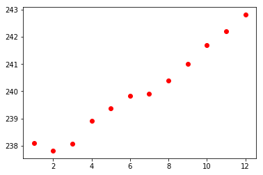
import matplotlib.pyplot as plt
plt.scatter(x = months, y = prices, color = 'red')
plt.show()