변수 변환

R로 시작하는 회귀 분석

Richie Cotton

Data Evangelist at DataCamp

농어(perch) 데이터셋

library(dplyr)

perch <- fish %>%
  filter(species == "Perch")
species mass_g length_cm
Perch 5.9 7.5
Perch 32.0 12.5
Perch 40.0 13.8
Perch 51.5 15.0
Perch 70.0 15.7
... ... ...
R로 시작하는 회귀 분석

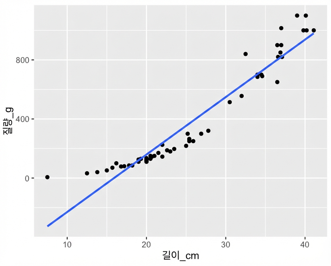
선형 관계가 아님

ggplot(perch, aes(length_cm, mass_g)) +
  geom_point() +
  geom_smooth(method = "lm", se = FALSE)

길이 대비 농어 질량 산점도와 추세선. 길어질수록 선형보다 더 빠르게 무거워져 위로 굽습니다.

R로 시작하는 회귀 분석

도미 vs 농어

몇 마리의 도미가 헤엄치는 모습. 도미는 몸이 납작합니다.

몇 마리의 농어가 헤엄치는 모습. 농어는 몸이 둥급니다.

R로 시작하는 회귀 분석

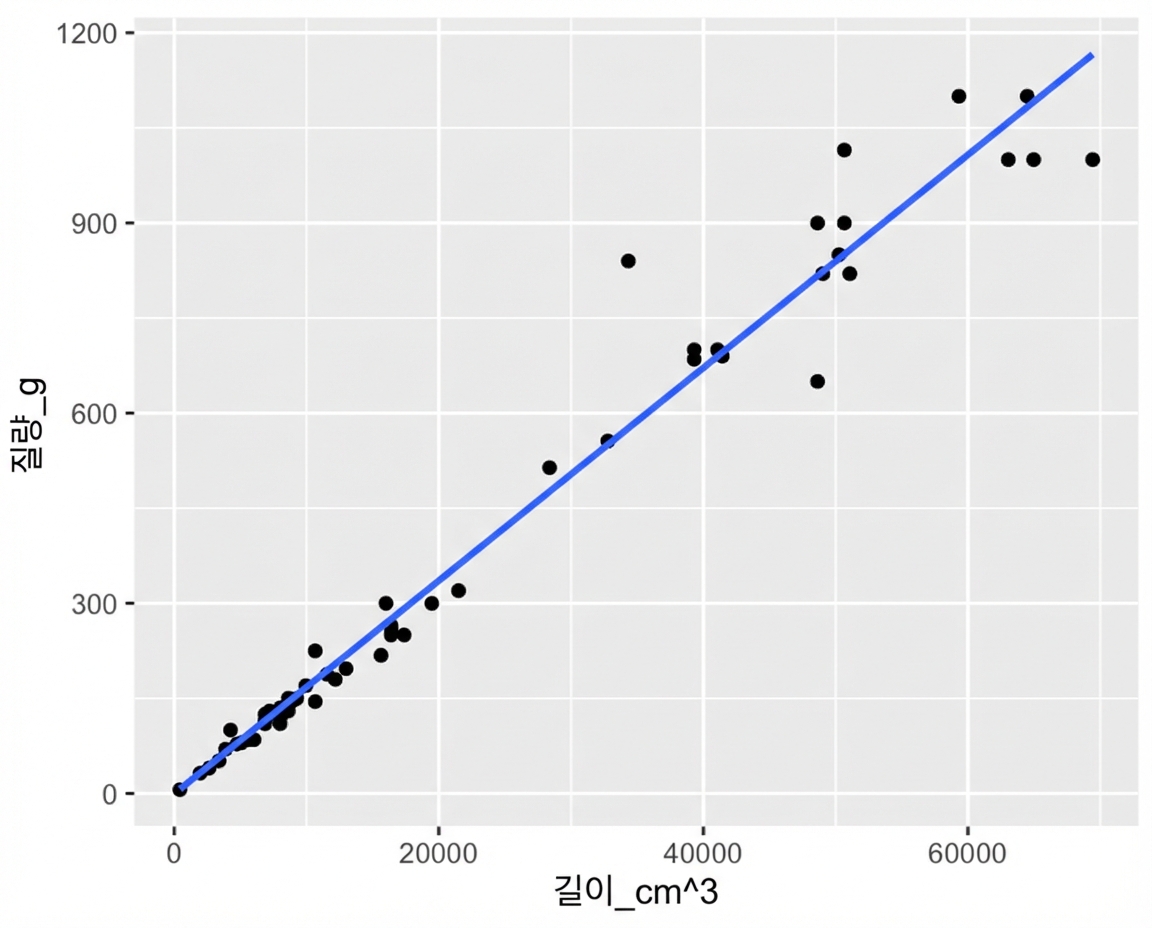
질량 vs 길이^3 그리기

ggplot(perch, aes(length_cm ^ 3, mass_g)) +
  geom_point() +
  geom_smooth(method = "lm", se = FALSE)

농어 질량 대 길이 세제곱 산점도와 추세선. 변환 후 점들이 대부분 추세선에 가깝습니다.

R로 시작하는 회귀 분석

질량 vs 길이^3 모델링

mdl_perch <- lm(mass_g ~ I(length_cm ^ 3), data = perch)
Call:
lm(formula = mass_g ~ I(length_cm^3), data = perch)

Coefficients:
   (Intercept)  I(length_cm^3)  
       -0.1175          0.0168
R로 시작하는 회귀 분석

질량 vs 길이^3 예측

explanatory_data <- tibble(
  length_cm = seq(10, 40, 5)
)
prediction_data <- explanatory_data %>%
  mutate(
    mass_g = predict(mdl_perch, explanatory_data)
  )
# A tibble: 7 x 2
  length_cm mass_g
      <dbl>  <dbl>
1        10   16.7
2        15   56.6
3        20  134. 
4        25  262. 
5        30  453. 
6        35  720. 
7        40 1075.
R로 시작하는 회귀 분석

질량 vs 길이^3 그리기

ggplot(perch, aes(length_cm ^ 3, mass_g)) +
  geom_point() +
  geom_smooth(method = "lm", se = FALSE) +
  geom_point(data = prediction_data, color = "blue")
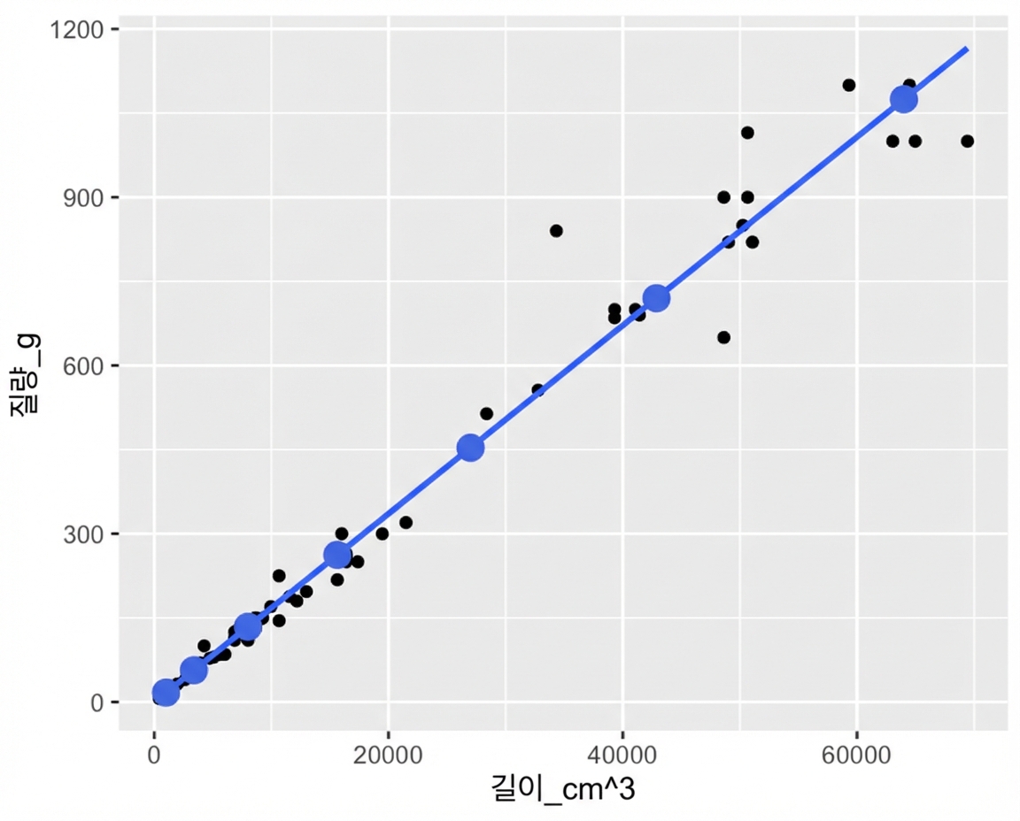
길이 세제곱 대비 질량 산점도와 추세선에 predict()로 계산한 점을 표시. 점들이 추세선을 정확히 따릅니다.

ggplot(perch, aes(length_cm, mass_g)) +
  geom_point() +
  geom_smooth(method = "lm", se = FALSE) +
  geom_point(data = prediction_data, color = "blue")
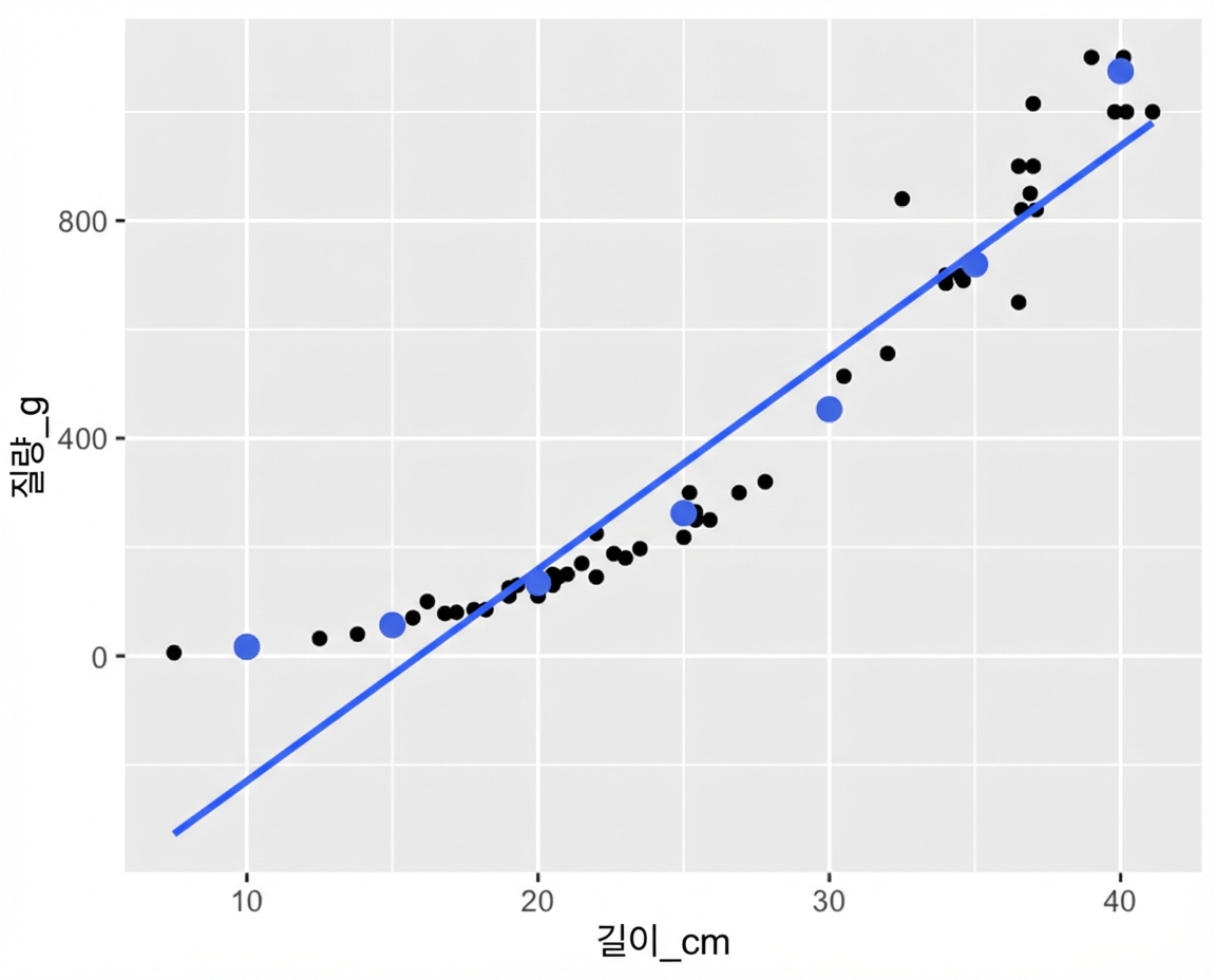
길이 대비 질량 산점도와 추세선에 predict()로 계산한 점을 표시. 점들은 추세선은 따르지 않지만 데이터 곡선을 따릅니다.

R로 시작하는 회귀 분석

Facebook 광고 데이터셋

광고가 동작하는 방식

  1. Facebook에 비용을 지불해 광고를 집행합니다.
  2. 사람들이 광고를 봅니다(노출, "impressions").
  3. 본 사람 중 일부가 클릭합니다.


  • 936행
  • 각 행은 광고 1개를 나타냅니다
spent_usd n_impressions n_clicks
1.43 7350 1
1.82 17861 2
1.25 4259 1
1.29 4133 1
4.77 15615 3
... ... ...
R로 시작하는 회귀 분석

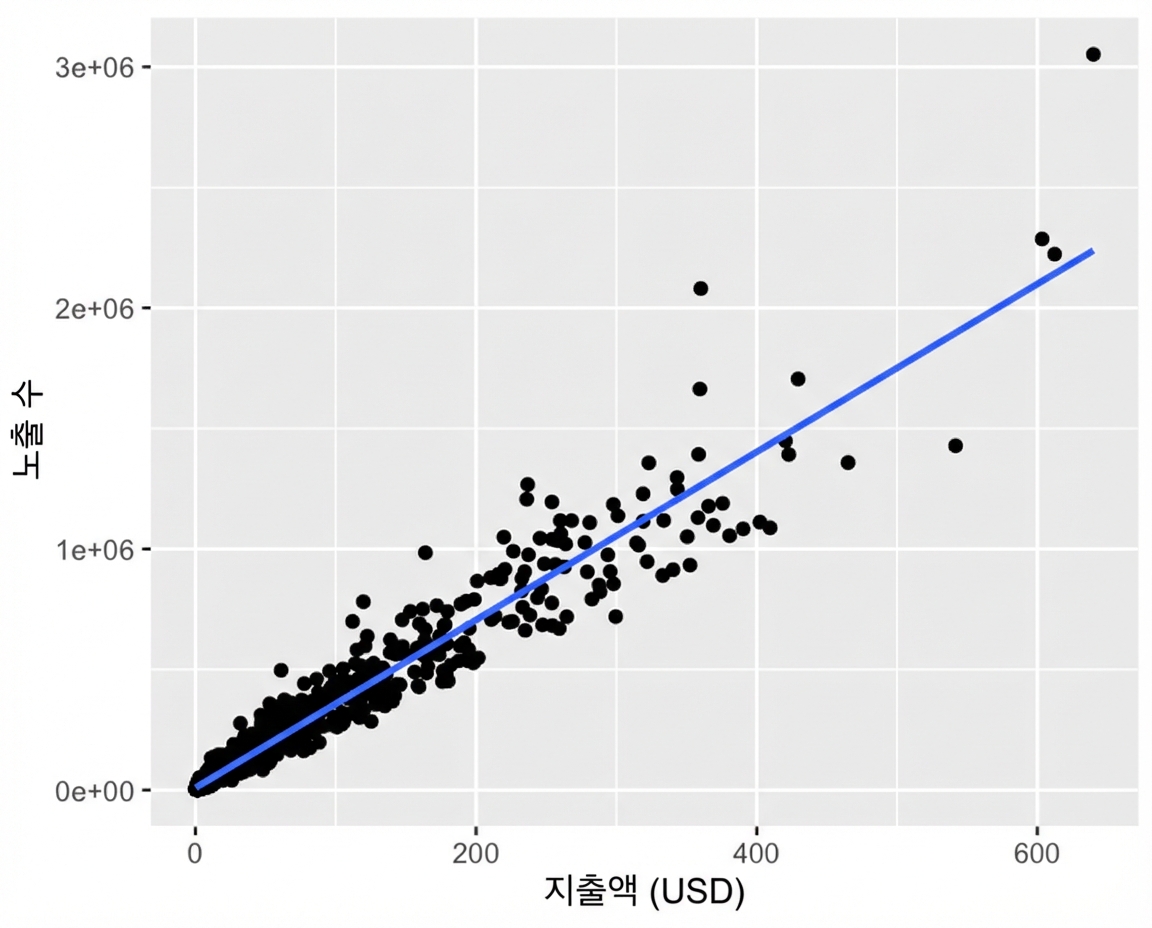
그래프가 비좁음

ggplot(
  ad_conversion, 
  aes(spent_usd, n_impressions)
) +
  geom_point() +
  geom_smooth(method = "lm", se = FALSE)

노출 수 대 광고 지출 산점도와 추세선. 대부분의 점이 그래프 왼쪽 아래에 몰려 있습니다.

R로 시작하는 회귀 분석

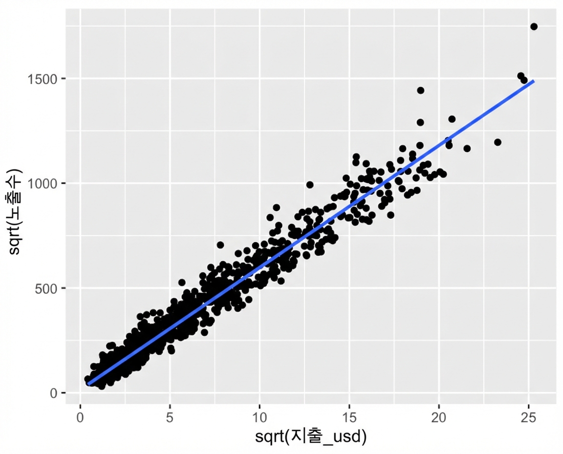
제곱근 vs 제곱근

ggplot(
  ad_conversion, 
  aes(sqrt(spent_usd), sqrt(n_impressions))
) +
  geom_point() +
  geom_smooth(method = "lm", se = FALSE)

노출 수의 제곱근 대 광고 지출의 제곱근 산점도와 추세선. 점들이 그래프 전반에 더 고르게 퍼집니다.

R로 시작하는 회귀 분석

모델링과 예측

mdl_ad <- lm(
  sqrt(n_impressions) ~ sqrt(spent_usd), 
  data = ad_conversion
)
explanatory_data <- tibble(
  spent_usd = seq(0, 600, 100)
)
prediction_data <- explanatory_data %>% 
  mutate(
    sqrt_n_impressions = predict(
      mdl_ad, explanatory_data
    ),
    n_impressions = sqrt_n_impressions ^ 2
  )
# A tibble: 7 x 3
  spent_usd sqrt_n_impressions n_impressions
      <dbl>              <dbl>         <dbl>
1         0               15.3          235.
2       100              598.        357289.
3       200              839.        703890.
4       300             1024.       1048771.
5       400             1180.       1392762.
6       500             1318.       1736184.
7       600             1442.       2079202.
R로 시작하는 회귀 분석

연습해 봅시다!

R로 시작하는 회귀 분석

Preparing Video For Download...