추가 catplot() 옵션

Python으로 범주형 데이터 다루기

Kasey Jones

Research Data Scientist

범주형 플롯의 어려움

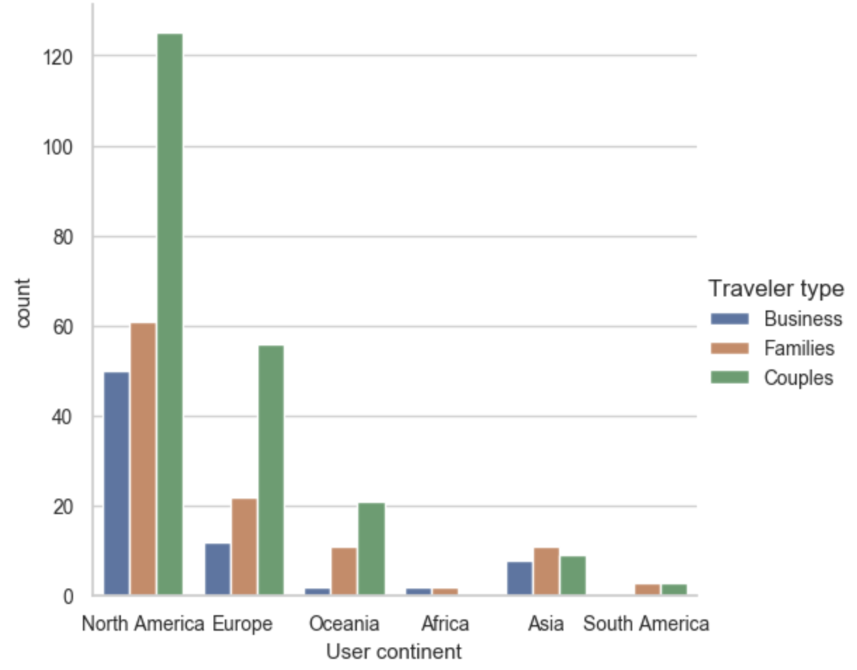
seaborn으로 작성한 카운트 플롯. 사용자 대륙과 여행자 유형별 리뷰 수를 집계합니다.

Python으로 범주형 데이터 다루기

catplot()의 FacetGrid 사용

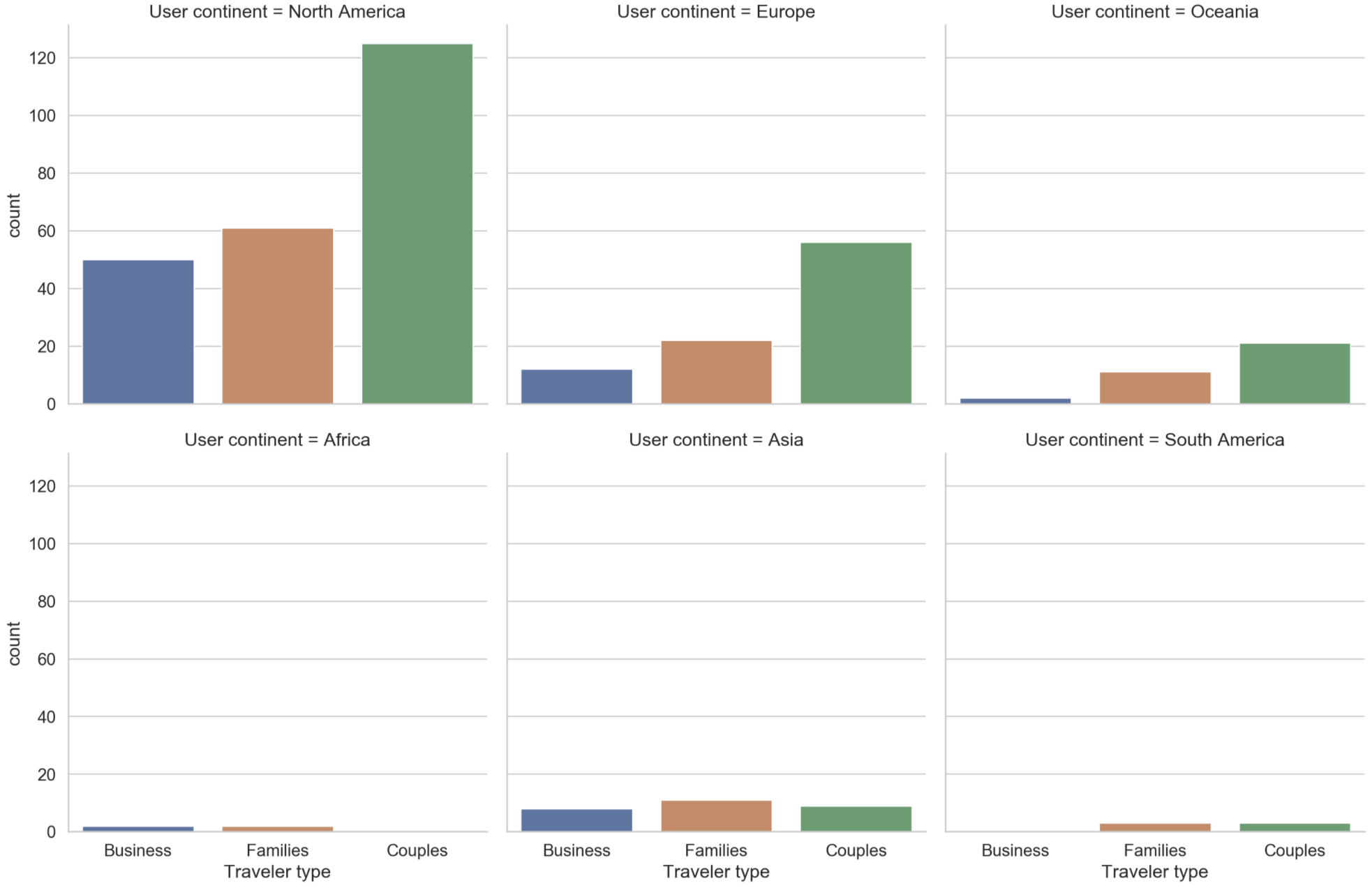
한 열의 서로 다른 범주에 대해 동일한 시각화를 생성한 예시입니다. 이전 그래픽과 동일한 정보를 담되, 이제 사용자 대륙별로 플롯이 나뉩니다.

Python으로 범주형 데이터 다루기

다른 인자 사용하기

sns.catplot(x="Traveler type", kind="count",

col="User continent",
col_wrap=3,
palette=sns.color_palette("Set1"), data=reviews)
  • x: "Traveler type"
  • kind: "count"
  • col: "User continent"
  • col_wrap: 3
  • palette: sns.color_palette("Set1")
  • 자주 쓰는 팔레트: "Set", "Set2", "Tab10", "Paired"
1 http://seaborn.pydata.org/tutorial/color_palettes.html
Python으로 범주형 데이터 다루기

한 번 더 확인

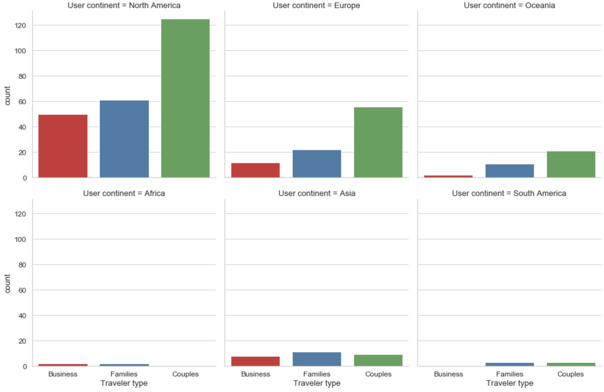
이전 슬라이드의 시각화를 다른 색 구성으로 업데이트했습니다. 각 사용자 대륙별 카운트 플롯이 있습니다.

Python으로 범주형 데이터 다루기

플롯 업데이트하기

  • 설정: 그래프를 객체 ax로 저장
  • 플롯 제목: ax.fig.suptitle("My title")
  • 축 라벨: ax.set_axis_labels("x-axis-label", "y-axis-label")
  • 제목 높이: plt.subplots_adjust(top=.9)
ax = sns.catplot(x="Traveler type", col="User continent", col_wrap=3,
    kind="count", palette=sns.color_palette("Set1"), data=reviews)
ax.fig.suptitle("Hotel Score by Traveler Type & User Continent")
ax.set_axis_labels("Traveler Type", "Number of Reviews")
plt.subplots_adjust(top=.9)
plt.show()
Python으로 범주형 데이터 다루기

완성 결과물

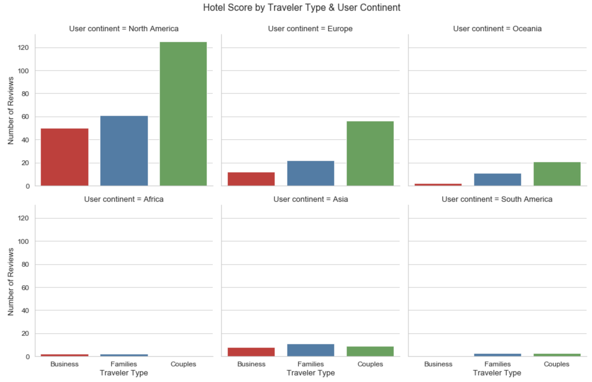
이 장의 최종 시각화입니다. 축 라벨과 제목이 업데이트되었습니다.

Python으로 범주형 데이터 다루기

catplot() 연습

Python으로 범주형 데이터 다루기

Preparing Video For Download...