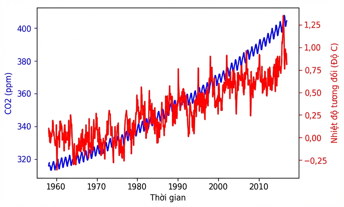
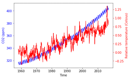
Vẽ chuỗi thời gian với các biến khác nhau

Nhập môn trực quan hóa dữ liệu với Matplotlib

Ariel Rokem

Data Scientist

Vẽ hai chuỗi thời gian cùng lúc

import pandas as pd
climate_change = pd.read_csv('climate_change.csv', 
                             parse_dates=["date"],
                             index_col="date")
climate_change
              co2  relative_temp
date
1958-03-06  315.71           0.10
1958-04-06  317.45           0.01
1958-07-06  315.86           0.06
...            ...            ...
2016-11-06  403.55           0.93
2016-12-06  404.45           0.81

[706 rows x 2 columns]
Nhập môn trực quan hóa dữ liệu với Matplotlib

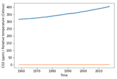
Vẽ hai chuỗi thời gian cùng lúc

import matplotlib.pyplot as plt
fig, ax = plt.subplots()
ax.plot(climate_change.index, climate_change["co2"])

ax.plot(climate_change.index, climate_change["relative_temp"])
ax.set_xlabel('Time') ax.set_ylabel('CO2 (ppm) / Relative temperature') plt.show()
Nhập môn trực quan hóa dữ liệu với Matplotlib

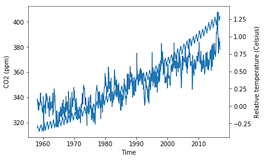
Dùng trục đôi (twin axes)

fig, ax = plt.subplots()
ax.plot(climate_change.index, climate_change["co2"])
ax.set_xlabel('Time')
ax.set_ylabel('CO2 (ppm)')

ax2 = ax.twinx()
ax2.plot(climate_change.index, climate_change["relative_temp"]) ax2.set_ylabel('Relative temperature (Celsius)') plt.show()
Nhập môn trực quan hóa dữ liệu với Matplotlib

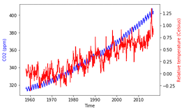
Phân biệt biến bằng màu sắc

fig, ax = plt.subplots()
ax.plot(climate_change.index, climate_change["co2"], color='blue')
ax.set_xlabel('Time')
ax.set_ylabel('CO2 (ppm)', color='blue')

ax2 = ax.twinx() ax2.plot(climate_change.index, climate_change["relative_temp"], color='red') ax2.set_ylabel('Relative temperature (Celsius)', color='red') plt.show()
Nhập môn trực quan hóa dữ liệu với Matplotlib

Tô màu các vạch tick

fig, ax = plt.subplots()
ax.plot(climate_change.index, climate_change["co2"], 
        color='blue')
ax.set_xlabel('Time')
ax.set_ylabel('CO2 (ppm)', color='blue')

ax.tick_params('y', colors='blue')
ax2 = ax.twinx() ax2.plot(climate_change.index, climate_change["relative_temp"], color='red') ax2.set_ylabel('Relative temperature (Celsius)', color='red')
ax2.tick_params('y', colors='red')
plt.show()
Nhập môn trực quan hóa dữ liệu với Matplotlib

Tô màu các vạch tick

Nhập môn trực quan hóa dữ liệu với Matplotlib

Hàm vẽ chuỗi thời gian

def plot_timeseries(axes, x, y, color, xlabel, ylabel):
  axes.plot(x, y, color=color)
  axes.set_xlabel(xlabel)
  axes.set_ylabel(ylabel, color=color)
  axes.tick_params('y', colors=color)
Nhập môn trực quan hóa dữ liệu với Matplotlib

Dùng hàm của chúng ta

fig, ax = plt.subplots()
plot_timeseries(ax, climate_change.index, climate_change['co2'],
               'blue', 'Time', 'CO2 (ppm)')

ax2 = ax.twinx() plot_timeseries(ax2, climate_change.index, climate_change['relative_temp'], 'red', 'Time', 'Relative temperature (Celsius)')
plt.show()

Nhập môn trực quan hóa dữ liệu với Matplotlib

Tự tạo hàm của bạn!

Nhập môn trực quan hóa dữ liệu với Matplotlib

Preparing Video For Download...