Tùy chỉnh biểu đồ
Nhập môn trực quan hóa dữ liệu với Matplotlib

Ariel Rokem
Data Scientist
Tùy chỉnh cách hiển thị dữ liệu
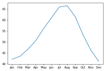
ax.plot(seattle_weather["MONTH"],
        seattle_weather["MLY-PRCP-NORMAL"])
plt.show()
Thêm marker
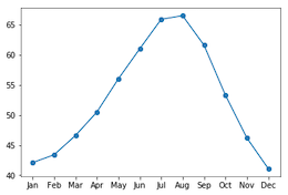
ax.plot(seattle_weather["MONTH"],
        seattle_weather["MLY-PRCP-NORMAL"],
        marker="o")
plt.show()
Chọn marker
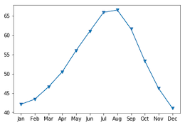
ax.plot(seattle_weather["MONTH"],
        seattle_weather["MLY-PRCP-NORMAL"],
        marker="v")
plt.show()
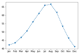
Đặt kiểu đường (linestyle)
fig, ax = plt.subplots()
ax.plot(seattle_weather["MONTH"],
        seattle_weather["MLY-TAVG-NORMAL"],
        marker="v", linestyle="--")
plt.show()

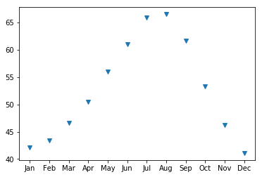
Loại bỏ đường bằng linestyle
fig, ax = plt.subplots()
ax.plot(seattle_weather["MONTH"],
        seattle_weather["MLY-TAVG-NORMAL"],
        marker="v", linestyle="None")
plt.show()
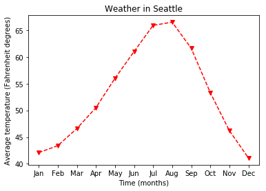
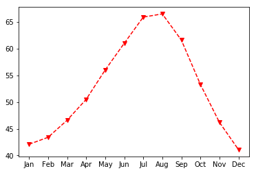
Chọn màu
fig, ax = plt.subplots()
ax.plot(seattle_weather["MONTH"],
        seattle_weather["MLY-TAVG-NORMAL"],
        marker="v", linestyle="--", color="r")
plt.show()
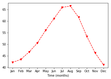
Tùy chỉnh nhãn trục
ax.set_xlabel("Thời gian (tháng)")
plt.show()
Đặt nhãn trục y
ax.set_xlabel("Thời gian (tháng)")
ax.set_ylabel("Nhiệt độ trung bình (độ Fahrenheit)")
plt.show()

Thêm tiêu đề
ax.set_title("Thời tiết ở Seattle")
plt.show()